Repository navigation
fix(bulma-ui): color TimeInput's wheels from the color prop - #832
Conversation


TimeInput passes `color` to the time wheels, which put `is-<color>` on each
wheel, but _timeinput.scss had no rule for it, so the value did nothing there
and the wheels stayed primary.

The partial now re-points a colored wheel's selection variables, the way
Switch, Slider and Checkbox color their active state: the band takes the
color and the selected value its `-invert`. The wheel's focus ring reads the
band's variable instead of `primary`, so a colored wheel keeps one accent.
That variable still defaults to primary, so an uncolored wheel looks as it
did.

DateTimeInput passes `color` to the same wheels and picks this up. Its
calendar has the same gap and is left for its own change.

Tests cover the class on every wheel (inline, popover and prefixed), the
compiled partial's variables for each color, and a stylesheet check that
every color the wheels accept ships a rule. The TSDoc, the docs page and a
new InlineColors story show the colored wheels.

Closes #701

|
Warning Review limit reachedNext included review available in 24 minutes. View limit detailsLimit details: You’ve used the included review currently available. You've used all free OSS reviews for now. Wait for the free limit to reset to keep reviewing this public repository. Review configuration: ⚙️ Run configurationConfiguration used: Repository: allxsmith/bestax/.coderabbit.yaml Review profile: CHILL Plan: Advanced Run ID: 📒 Files selected for processing (12)
Thanks for using CodeRabbit! It's free for OSS, and your support helps us grow. If you like it, consider giving us a shout-out. Comment |

Preview DeploymentPreview URL: https://9bd815cf.bestax.pages.dev |
![claude[bot]](https://avatars.githubusercontent.com/in/1236702?s=60&v=4)

There was a problem hiding this comment.
Deep review — 0 blocking · 4 advisory
| # | Severity | Area | Finding | Location |
|---|---|---|---|---|
| 1 | 🔵 Advisory | Accessibility | The wheel's :focus-visible ring now takes the chosen color, so warning (hsl(42, 100%, 53%)) lands around 1.7:1 against scheme-main — under SC 1.4.11's 3:1. The old hard-coded primary was already ~2:1, and Switch/Checkbox/Radio color their rings the same way, so this extends an existing shortfall rather than creating one. |
bulma-ui/src/scss/form/_timeinput.scss:118 |
| 2 | 🔵 Advisory | Robustness | Pre-existing, disclosed in the PR body: the mobile block writes --bestax-timeinput-wheel-width / -gap / -mask, but every reader is var(--bulma-timeinput-wheel-*). Confirmed in dist/bestax.css — the three mobile overrides resolve to nothing. Left alone here. |
bulma-ui/src/scss/form/_timeinput.scss:299 |
| 3 | 🔵 Advisory | API | DateTimeInputBase forwards color into the same TimeWheels (line 566), so its wheels change behavior too, but its own color TSDoc still reads "Bulma color modifier." and no story, docs example or test covers colored wheels under DateTimeInput. |
bulma-ui/src/form/DateTimeInputBase.tsx:136 |
| 4 | 🔵 Advisory | Robustness | is-<color> still lands on three siblings with no rule — .timeinput (TimeWheels.tsx:778), .timeinput-wheel-band (:659) and the selected .timeinput-wheel-item (:656). Harmless today because the variables inherit down from .timeinput-wheel, but it is the same dead-modifier shape #701 reported, and the new guard only asks for the .timeinput-wheel compound. |
bulma-ui/src/form/_pickerInternals/TimeWheels.tsx:658 |
Overall: The change is sound and the mechanism is the right one — .timeinput-wheel.is-<color> re-points two registered variables, and the band, the selected value and the ring all already read them, so no new selectors or CSS variables were needed. I built the package and confirmed the six rules ship in both dist/bestax.css and dist/versions/bestax-prefixed.css with the correct bestax- class prefix and the unchanged --bulma- variable prefix, that all six --bulma-<color>-invert variables exist, and that the dark theme redefines none of the color lightnesses (one --bulma-primary-l: in the whole sheet), which is what the PR body claims. The riskiest part is the focus-ring switch from a constant to a themeable variable — it is the one thing a consumer can observe change without opting in — and row 1 is where a human should look first.
Residual risk:
- Could a colour still render nothing on the wheels? No.
scripts/color-tuple-css.test.mjsreads the union offTimeWheelsProps.colorand I replicated the extraction: it yields all six literals, and each is asserted against the shipped sheet. Widening any caller's union without wideningTimeWheelsPropsis a type error (typecheck:testspasses), so that read is the true narrowest gate, as its comment claims. - Is the new jest styles test vacuous under jsdom? No. The negative case in the same suite returns an empty string for an uncoloured wheel (jsdom does not inherit custom properties), so the positive cases'
var(--bulma-<color>)can only come from a rule matching the wheel element itself. - Open:
Calendar.tsx:191putsis-<color>on.dateinput, and greppingdist/bestax.cssfinds only.dateinput.is-small|medium|large— the calendar'scoloris still dead, exactly as the PR body says. The new guard is wheel-specific, so nothing will catch it; the follow-up needs its own case. - Open: on mobile,
.timeinput-footer-donehard-codescv.getVar('primary')for both its fill and its own focus ring, so acolor="danger"picker shows danger wheels next to a primary confirm button. Invisible to jsdom and to the desktop stories. - Forced colors:
_switch.scss,_checkbox.scssand_radio.scsseach pinoutline-color: Highlightunder@media (forced-colors: active);_timeinput.scsshas no such block. Unchanged by this PR — the ring was equally unpinned when it wasprimary.
🏄 Clean little set wave, brah — the class was already paddling out, this just gave it a board. Rules ship in both builds, tests actually bite, nothing gnarly lurking under the lip. Good to go.
…rules

The max-width 768px block in _timeinput.scss set
--bestax-timeinput-wheel-width, -gap and -mask on .timeinput, and
--bestax-picker-popover-radius on the popover holding a time panel. Every
rule reads the --bulma- names, so none of the four did anything: small
viewports kept the desktop wheel width, gap and mask, and the popover kept
its usual radius.

They now go through cv.register-vars and cv.register-var, the same
mechanism that registers the defaults, so the built CSS sets
--bulma-timeinput-wheel-width, -gap, -mask and --bulma-picker-popover-radius
in that block, in the default and prefixed builds alike.

TimeInput.styles.test.tsx now collects the custom properties the
small-viewport block sets and fails on any that no var() in the full
stylesheet reads. Against the old partial it lists all four --bestax-
names.

Found while fixing #701.
DateTimeInputBase forwards `color` into the same time wheels as TimeInput,
so since #701 it colors their selection band and focus ring too. Its TSDoc
now says so in the same words as TimeInputBase's, and notes that the
calendar does not take the color. pnpm gen carries it into the API page's
props table and the MCP index.

Refs #701

|
deep-review: fresh Two commits landed after the first review, answering its advisories: 74889d0 makes the small-viewport block register the |
Preview DeploymentPreview URL: https://ea757955.bestax.pages.dev |
There was a problem hiding this comment.
Deep review — 0 blocking · 6 advisory
| # | Severity | Area | Finding | Location |
|---|---|---|---|---|
| 1 | 🔵 Advisory | API | Three wheel variables are registered and documented as themeable but no var() in the shipped sheet reads any of them: --bulma-timeinput-wheel-bg, --bulma-timeinput-wheel-hover-bg, --bulma-timeinput-wheel-item-height. Same failure class as #701 and as the small-viewport block 74889d0 just fixed, in the same partial. The new guard only inspects max-width media blocks, so it cannot see these. |
bulma-ui/src/scss/form/_timeinput.scss:34 |
| 2 | 🔵 Advisory | Accessibility | The wheel's :focus-visible ring now takes the chosen colour, so warning lands around 1.7:1 against scheme-main — under SC 1.4.11's 3:1. The old hard-coded primary was already ~2:1, and Switch/Checkbox/Radio colour their rings the same way, so this extends an existing shortfall rather than creating one. |
bulma-ui/src/scss/form/_timeinput.scss:119 |
| 3 | 🔵 Advisory | Robustness | is-<colour> still lands on three siblings with no rule — .timeinput (TimeWheels.tsx:778), .timeinput-wheel-band (:659) and the selected .timeinput-wheel-item (:656). Harmless today because the variables inherit down from .timeinput-wheel, but it is the same dead-modifier shape #701 reported, and the new guard only asks for the .timeinput-wheel compound. |
bulma-ui/src/form/_pickerInternals/TimeWheels.tsx:658 |
| 4 | 🔵 Advisory | Coverage | DateTimeInput's TSDoc now promises coloured wheels, but nothing exercises it — no story, no docs example, no test. The now-live small-viewport block also widens DateTimeInput's wheels, since they share the .timeinput root, which the PR body describes only in TimeInput terms. |
bulma-ui/src/form/DateTimeInputBase.tsx:136 |
| 5 | 🔵 Advisory | Robustness | On small viewports the confirm button hard-codes primary for both its fill and its own focus ring, so a color="danger" picker shows danger wheels next to a primary check. Invisible to jsdom and to the desktop stories. |
bulma-ui/src/scss/form/_timeinput.scss:388 |
| 6 | 🔵 Advisory | Robustness | The new guard asks whether a name appears in a var() anywhere in the sheet, not whether the reader sits inside the subtree of the element that sets it, and it matches on max-width only. An override set on the wrong element, or a small-viewport block expressed as min-width, would still pass. |
bulma-ui/src/form/__tests__/TimeInput.styles.test.tsx:98 |
Overall: Both fixes are sound, and I verified them end to end rather than by reading. The colour loop re-points two already-registered variables that the band, the selected value and the ring all read, so it needed no new selectors and no new CSS variables; the small-viewport commit swaps four raw --bestax-* writes for cv.register-vars/cv.register-var, and the built sheet now carries --bulma-timeinput-wheel-width:4rem, -gap, -mask and --bulma-picker-popover-radius:calc(var(--bulma-radius-large) * 4) in both the default and the bestax--prefixed builds, after their defaults in source order so the cascade lands. The riskiest part is that the small-viewport block is new behaviour nobody has looked at — the mask widens its transparent band from 18%/82% to 28%/72%, and the desktop default's own comment warns to keep that band thin so the fade and the mask do not compound; one look in a narrow window settles it. After that, row 1 is where a human should go first.
Residual risk:
- Can the "override registered under a name nothing reads" shape still exist elsewhere? Refuted for the source tree:
grep -rn -- "--bestax-" bulma-ui/src/scss/returns nothing, and no partial writes a--bulma-*or interpolated custom property outsidecv.getVar/cv.register-var/cv.register-vars. The four in_timeinput.scsswere the only ones. - Is the new guard actually seeing all four, or silently skipping the
:has()rule? Refuted empirically. I ran the same collection over the compiled partial under jsdom 26 / rrweb-cssom and it returns exactly--bulma-timeinput-wheel-width,-gap,-maskand--bulma-picker-popover-radius—.picker-popover:has(.timeinput-panel)parses and its property is collected. Against the pre-fix partial those four read--bestax-*, none of which appear in avar()inbestax.scss, so the test bites rather than passing vacuously. - Do the now-live overrides win the cascade? Refuted. In
dist/bestax.cssthe default--bulma-timeinput-wheel-width:3remsits at byte 809307 and the override4remat 813519; the popover's default radius at 798204 and the:has()override at 814037 — later in source order, and:has(.timeinput-panel)is 0-2-0 against 0-1-0 besides. - Do the wider wheels overflow DateTimeInput's floating time card? Refuted.
.timeinput-wheelsetsoverflow: hidden, so its automatic minimum size is 0 and it shrinks as a flex item; a 12-hour-plus-seconds DateTimeInput inside amax-width: 100%time card narrows its wheels instead of spilling. - Can a colour the wheels accept still render nothing? Refuted.
scripts/color-tuple-css.test.mjsreads the union offTimeWheelsProps.color— the narrowest gate, since every feeder must pass a value that type admits — and asserts each of the six against the built sheet; all seven cases pass after a build. - Open, row 1:
--bulma-timeinput-wheel-bg,-hover-bgand-item-heightare declared in the built sheet and read by nothing, whiletimeinput.md:1075-1080,datetimeinput.md:948-953andskills/bestax-theming/references/css-variables.md:381-384all advertise them. A consumer who sets one sees no change. - Open:
Calendar.tsx:191putsis-<colour>on.dateinputanddist/bestax.cssships only.dateinput.is-small,.is-mediumand.is-large, so the calendar'scoloris still dead — exactly as the PR body says. The new node test is wheel-specific, so nothing will catch it.
Gates I ran green: build, TimeInput plus DateTimeInput jest (178), TimeInput.styles.test.tsx (8), node --test scripts/color-tuple-css.test.mjs (7), check:conformance (all 20), gen:mcp:check, gen:catalog:check, typecheck:tests, format:check.
🏄 Two clean rides on one wave, dude — the colour loop was already a glassy little set, and the second commit bailed out four overrides that had been paddling with no board for who knows how long. Nothing gnarly in the water; just peek at that mask on a narrow screen before you call it a day.
|
On the fresh review's advisories:
|
 allxsmith
added
the
needs-human-review
allxsmith
added
the
needs-human-review
📸 Story screenshots at handoff —
|
| Light | Dark |
|---|---|
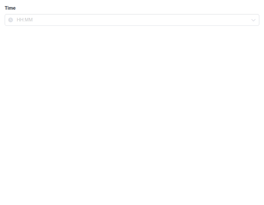 |
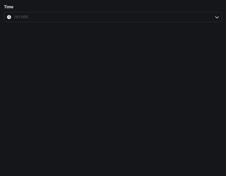 |
form-timeinput--controlled · Form/TimeInput · Controlled
| Light | Dark |
|---|---|
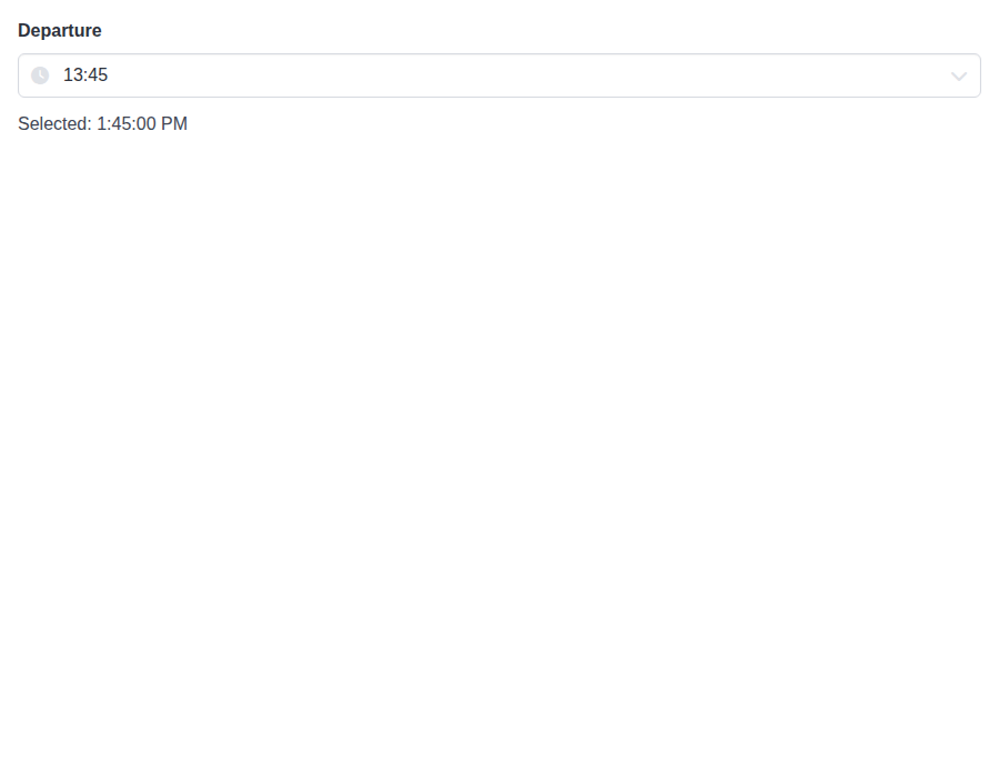 |
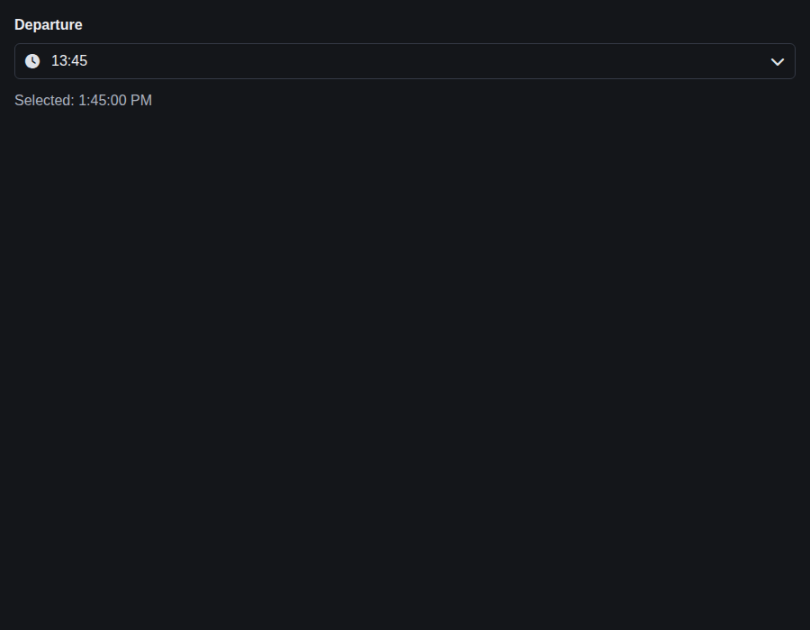 |
form-timeinput--sizes · Form/TimeInput · Sizes
| Light | Dark |
|---|---|
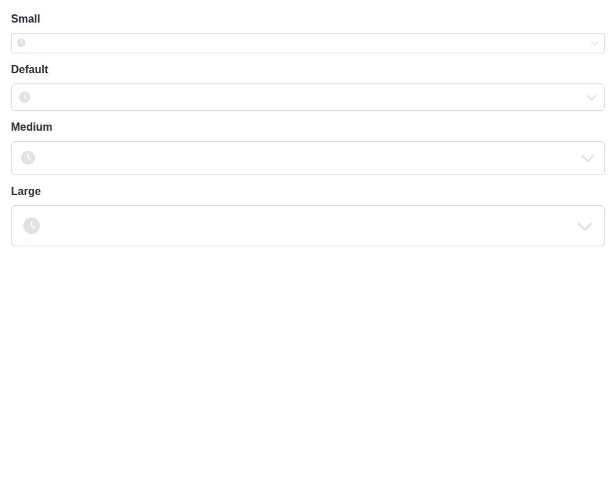 |
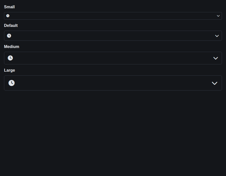 |
form-timeinput--format-12-h · Form/TimeInput · Format 12 H
| Light | Dark |
|---|---|
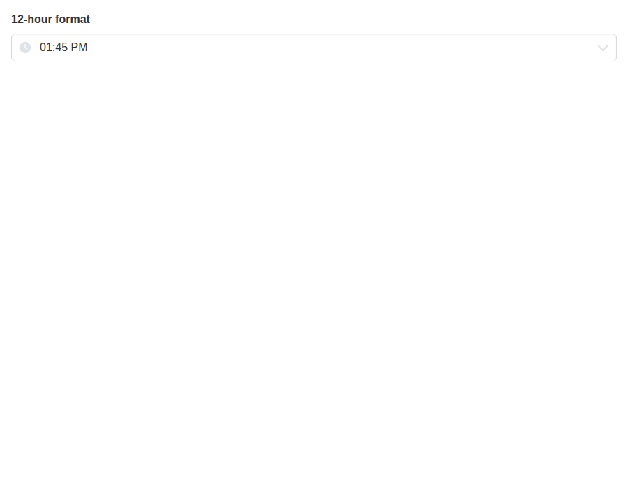 |
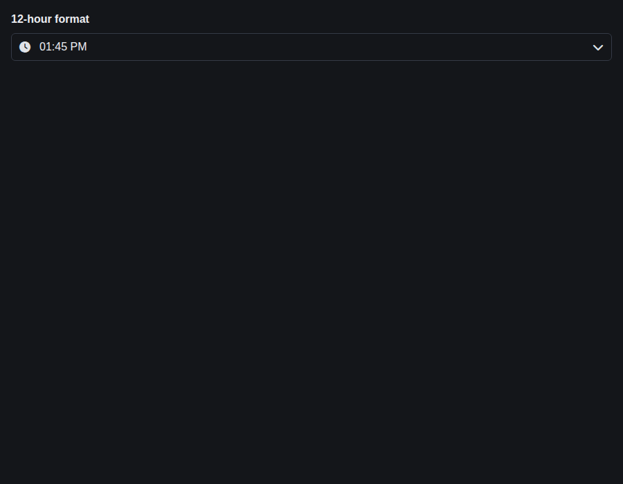 |
form-timeinput--with-seconds · Form/TimeInput · With Seconds
| Light | Dark |
|---|---|
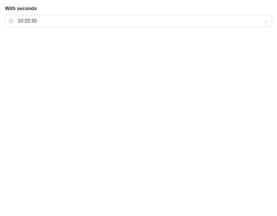 |
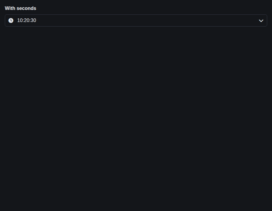 |
form-timeinput--increment-steps · Form/TimeInput · Increment Steps
| Light | Dark |
|---|---|
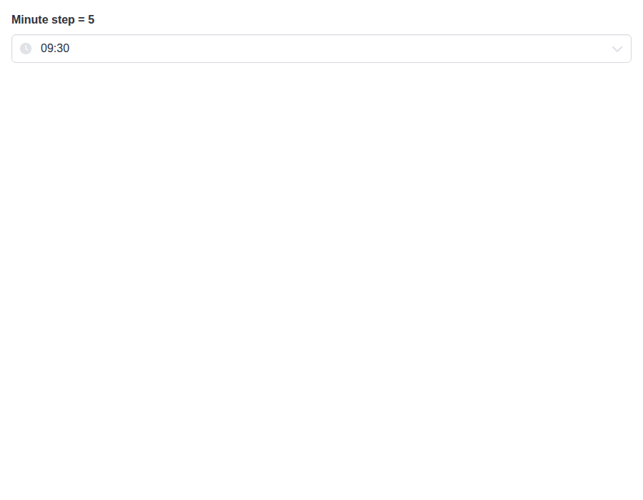 |
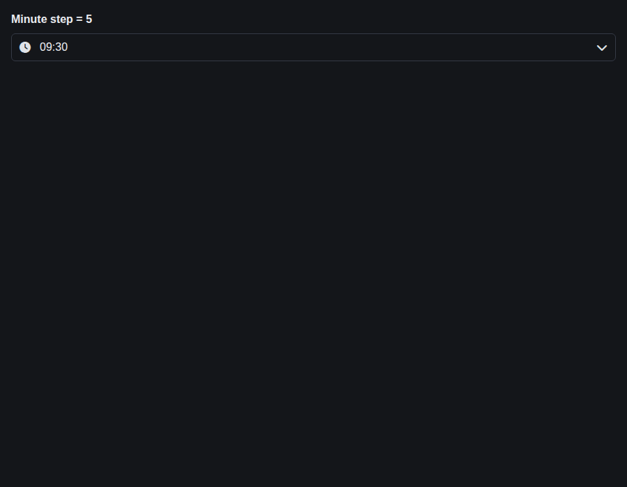 |

A focus ring that follows `color` is only as visible as the color. On a
white surface plain `info`, `success`, `warning` and `danger` all fall below
the 3:1 a focus indicator needs, `warning` at 1.75:1, and that held for the
calendar ring added in this branch and for the wheel ring since #832.

Under `is-<color>` both rings now read the color's `-on-scheme` variant,
which Bulma darkens or lightens until it contrasts with `scheme-main`. The
wheels get a `--bulma-timeinput-wheel-focus-ring-color` of their own for it,
defaulting to the band, so an uncolored wheel keeps the ring it had. Unset
rings are unchanged on both. The cost is that `color="primary"` now puts a
slightly different ring from no color at all, which the `color` TSDoc says.

Also corrects two strings: the DateTimeInput inline example no longer says a
popover carries the color, and the wheel hover comment gives the real reason
the fill does not animate.
…shows it

The wheel's keyboard focus ring was an outline on the wheel itself, offset
outside its border box. The wheel also carries a `mask-image` for its fade,
and the mask clips everything outside the border box, so the ring never
painted, in any color or none. It predates #832; the colour work only made
the missing ring's colour correct. Keyboard users had the band alone to tell
which wheel had focus, and every wheel has a band.

Draw the ring inset on the band of the focused wheel instead, where the mask
is fully opaque. It sits on the selection fill, so it takes the selected
value's colour (`--bulma-timeinput-wheel-selected-color`, the fill's
`-invert`), the way the calendar's selected cell now does: at least 4.79:1
against the band for every colour, light and dark. The band is stationary, so
the ring does not slide with the values.

This drops `--bulma-timeinput-wheel-focus-ring-color` from earlier in this
branch, which no longer has anything to colour. It was never released.

## [5.18.1](https://github.com/allxsmith/bestax/compare/@allxsmith/bestax-bulma@5.18.0...@allxsmith/bestax-bulma@5.18.1) (2026-09-30)

### Bug Fixes

* **bestax-migrate:** keep a page link as markup when its li is a component's only child ([0e72683](0e72683))
* **bestax-migrate:** rename rbx innerRef to ref on a plain Navbar.Item too ([bb6ace0](bb6ace0)), closes [#734](#734)
* **bestax-migrate:** write a File text with a backslash as a string ([212831e](212831e))
* **bestax-migrate:** write isFullwidth from react-bulma-components too ([01da047](01da047))
* **bestax-migrate:** write isFullwidth rather than its deprecated alias from bloomer ([c2a1d22](c2a1d22)), closes [#680](#680)
* **bulma-ui:** color TimeInput's wheels from the color prop ([#832](#832)) ([ad370c9](ad370c9))
* **bulma-ui:** document the checkbox, radio and switch color and size tuples ([bd39ff3](bd39ff3))
* **bulma-ui:** Dropdown items withhold attributes by tag and answer Enter and Space ([#827](#827)) ([f6aeb2d](f6aeb2d))
* **bulma-ui:** keep radiusless zeroing the radius inside a Theme ([07db6a3](07db6a3)), closes [#829](#829) [#694](#694)
* **bulma-ui:** key the Avatar link warning on the element and attributes ([e628eba](e628eba)), closes [#733](#733) [#733](#733)
* **bulma-ui:** leave rel out of the Avatar link attribute warning ([b059476](b059476)), closes [#733](#733) [#733](#733)
* **bulma-ui:** let several isRoot Themes share the :root style element ([04f399f](04f399f)), closes [#736](#736)
* **bulma-ui:** let warnOnce decide when the Avatar link warning fires ([1a5965c](1a5965c)), closes [#733](#733)
* **bulma-ui:** make Theme's radius the helper it is typed as ([36c73d3](36c73d3)), closes [#694](#694)
* **bulma-ui:** name custom elements among the targets that get Avatar's target and rel ([a962259](a962259)), closes [#733](#733)
* **bulma-ui:** show toasts, notifications and dialogs raised before their container mounts ([#828](#828)) ([2ab4493](2ab4493))
* **bulma-ui:** skip the Avatar target warning on elements with their own target ([27b58f4](27b58f4)), closes [#733](#733)
* **bulma-ui:** strip the Avatar link warning from production builds ([a243fa5](a243fa5)), closes [#733](#733)
* **bulma-ui:** warn about a dropped Avatar href only for an as the caller wrote ([c93b27c](c93b27c)), closes [#733](#733)
* **bulma-ui:** warn in development when Avatar drops an href on a non-link as ([c76e632](c76e632)), closes [#733](#733)
* **bulma-ui:** warn when Avatar drops a target or rel on a non-link as ([50c385e](50c385e)), closes [#733](#733) [#733](#733)
* **eslint-plugin:** report .file as a class the codemod converts ([72a32c9](72a32c9))
* **eslint-plugin:** report the pagination links and ellipsis as classes the codemod converts ([54ba0b3](54ba0b3))
* **eslint-plugin:** report Theme's deprecated radius route accurately ([5605816](5605816)), closes [#694](#694)
* **eslint-plugin:** suggest radiusless for a near miss on Theme ([21aa9a7](21aa9a7)), closes [#694](#694)

### Features

* **bestax-mcp:** say when a component renders the li around its element, or its own text ([8fd3faf](8fd3faf))
* **bestax-mcp:** say when a component renders the whole .file tree from props ([976d8a3](976d8a3))
* **bestax-migrate:** convert .file inside a Field, building its tree from props ([724dff5](724dff5)), closes [#809](#809)
* **bestax-migrate:** convert .icon-text, building its icons from props ([#823](#823)) ([933868f](933868f))
* **bestax-migrate:** convert Pagination's page links and ellipsis in their li's place ([ae720fa](ae720fa)), closes [#809](#809)
|
🎉 This PR is included in version 5.18.1 🎉 The release is available on: Your semantic-release bot 📦🚀 |
# [2.24.0](https://github.com/allxsmith/bestax/compare/bestax-migrate@2.23.1...bestax-migrate@2.24.0) (2026-09-30)

### Bug Fixes

* **bestax-migrate:** write a File text with a backslash as a string ([212831e](212831e))
* **bulma-ui:** color TimeInput's wheels from the color prop ([#832](#832)) ([ad370c9](ad370c9))
* **bulma-ui:** document the checkbox, radio and switch color and size tuples ([bd39ff3](bd39ff3))
* **bulma-ui:** Dropdown items withhold attributes by tag and answer Enter and Space ([#827](#827)) ([f6aeb2d](f6aeb2d))
* **bulma-ui:** keep radiusless zeroing the radius inside a Theme ([07db6a3](07db6a3)), closes [#829](#829) [#694](#694)
* **bulma-ui:** key the Avatar link warning on the element and attributes ([e628eba](e628eba)), closes [#733](#733) [#733](#733)
* **bulma-ui:** leave rel out of the Avatar link attribute warning ([b059476](b059476)), closes [#733](#733) [#733](#733)
* **bulma-ui:** let several isRoot Themes share the :root style element ([04f399f](04f399f)), closes [#736](#736)
* **bulma-ui:** let warnOnce decide when the Avatar link warning fires ([1a5965c](1a5965c)), closes [#733](#733)
* **bulma-ui:** make Theme's radius the helper it is typed as ([36c73d3](36c73d3)), closes [#694](#694)
* **bulma-ui:** name custom elements among the targets that get Avatar's target and rel ([a962259](a962259)), closes [#733](#733)
* **bulma-ui:** show toasts, notifications and dialogs raised before their container mounts ([#828](#828)) ([2ab4493](2ab4493))
* **bulma-ui:** skip the Avatar target warning on elements with their own target ([27b58f4](27b58f4)), closes [#733](#733)
* **bulma-ui:** strip the Avatar link warning from production builds ([a243fa5](a243fa5)), closes [#733](#733)
* **bulma-ui:** warn about a dropped Avatar href only for an as the caller wrote ([c93b27c](c93b27c)), closes [#733](#733)
* **bulma-ui:** warn in development when Avatar drops an href on a non-link as ([c76e632](c76e632)), closes [#733](#733)
* **bulma-ui:** warn when Avatar drops a target or rel on a non-link as ([50c385e](50c385e)), closes [#733](#733) [#733](#733)
* **eslint-plugin:** report .file as a class the codemod converts ([72a32c9](72a32c9))
* **eslint-plugin:** report Theme's deprecated radius route accurately ([5605816](5605816)), closes [#694](#694)
* **eslint-plugin:** suggest radiusless for a near miss on Theme ([21aa9a7](21aa9a7)), closes [#694](#694)

### Features

* **bestax-mcp:** say when a component renders the whole .file tree from props ([976d8a3](976d8a3))
* **bestax-migrate:** convert .file inside a Field, building its tree from props ([724dff5](724dff5)), closes [#809](#809)
|
🎉 This PR is included in version 2.24.0 🎉 The release is available on: Your semantic-release bot 📦🚀 |
# [1.13.0](https://github.com/allxsmith/bestax/compare/bestax-mcp@1.12.0...bestax-mcp@1.13.0) (2026-09-30)

### Bug Fixes

* **bestax-migrate:** rename rbx innerRef to ref on a plain Navbar.Item too ([bb6ace0](bb6ace0)), closes [#734](#734)
* **bestax-migrate:** write a File text with a backslash as a string ([212831e](212831e))
* **bestax-migrate:** write isFullwidth from react-bulma-components too ([01da047](01da047))
* **bestax-migrate:** write isFullwidth rather than its deprecated alias from bloomer ([c2a1d22](c2a1d22)), closes [#680](#680)
* **bulma-ui:** color TimeInput's wheels from the color prop ([#832](#832)) ([ad370c9](ad370c9))
* **bulma-ui:** document the checkbox, radio and switch color and size tuples ([bd39ff3](bd39ff3))
* **bulma-ui:** Dropdown items withhold attributes by tag and answer Enter and Space ([#827](#827)) ([f6aeb2d](f6aeb2d))
* **bulma-ui:** keep radiusless zeroing the radius inside a Theme ([07db6a3](07db6a3)), closes [#829](#829) [#694](#694)
* **bulma-ui:** key the Avatar link warning on the element and attributes ([e628eba](e628eba)), closes [#733](#733) [#733](#733)
* **bulma-ui:** leave rel out of the Avatar link attribute warning ([b059476](b059476)), closes [#733](#733) [#733](#733)
* **bulma-ui:** let several isRoot Themes share the :root style element ([04f399f](04f399f)), closes [#736](#736)
* **bulma-ui:** let warnOnce decide when the Avatar link warning fires ([1a5965c](1a5965c)), closes [#733](#733)
* **bulma-ui:** make Theme's radius the helper it is typed as ([36c73d3](36c73d3)), closes [#694](#694)
* **bulma-ui:** name custom elements among the targets that get Avatar's target and rel ([a962259](a962259)), closes [#733](#733)
* **bulma-ui:** show toasts, notifications and dialogs raised before their container mounts ([#828](#828)) ([2ab4493](2ab4493))
* **bulma-ui:** skip the Avatar target warning on elements with their own target ([27b58f4](27b58f4)), closes [#733](#733)
* **bulma-ui:** strip the Avatar link warning from production builds ([a243fa5](a243fa5)), closes [#733](#733)
* **bulma-ui:** warn about a dropped Avatar href only for an as the caller wrote ([c93b27c](c93b27c)), closes [#733](#733)
* **bulma-ui:** warn in development when Avatar drops an href on a non-link as ([c76e632](c76e632)), closes [#733](#733)
* **bulma-ui:** warn when Avatar drops a target or rel on a non-link as ([50c385e](50c385e)), closes [#733](#733) [#733](#733)
* **eslint-plugin:** report .file as a class the codemod converts ([72a32c9](72a32c9))
* **eslint-plugin:** report Theme's deprecated radius route accurately ([5605816](5605816)), closes [#694](#694)
* **eslint-plugin:** suggest radiusless for a near miss on Theme ([21aa9a7](21aa9a7)), closes [#694](#694)

### Features

* **bestax-mcp:** say when a component renders the whole .file tree from props ([976d8a3](976d8a3))
* **bestax-migrate:** convert .file inside a Field, building its tree from props ([724dff5](724dff5)), closes [#809](#809)
* **bestax-migrate:** convert .icon-text, building its icons from props ([#823](#823)) ([933868f](933868f))
|
🎉 This PR is included in version 1.13.0 🎉 The release is available on: Your semantic-release bot 📦🚀 |
## [1.1.9](https://github.com/allxsmith/bestax/compare/@allxsmith/eslint-plugin-bestax@1.1.8...@allxsmith/eslint-plugin-bestax@1.1.9) (2026-09-30)

### Bug Fixes

* **bestax-migrate:** rename rbx innerRef to ref on a plain Navbar.Item too ([bb6ace0](bb6ace0)), closes [#734](#734)
* **bestax-migrate:** write a File text with a backslash as a string ([212831e](212831e))
* **bestax-migrate:** write isFullwidth from react-bulma-components too ([01da047](01da047))
* **bestax-migrate:** write isFullwidth rather than its deprecated alias from bloomer ([c2a1d22](c2a1d22)), closes [#680](#680)
* **bulma-ui:** color TimeInput's wheels from the color prop ([#832](#832)) ([ad370c9](ad370c9))
* **bulma-ui:** document the checkbox, radio and switch color and size tuples ([bd39ff3](bd39ff3))
* **bulma-ui:** Dropdown items withhold attributes by tag and answer Enter and Space ([#827](#827)) ([f6aeb2d](f6aeb2d))
* **bulma-ui:** keep radiusless zeroing the radius inside a Theme ([07db6a3](07db6a3)), closes [#829](#829) [#694](#694)
* **bulma-ui:** key the Avatar link warning on the element and attributes ([e628eba](e628eba)), closes [#733](#733) [#733](#733)
* **bulma-ui:** leave rel out of the Avatar link attribute warning ([b059476](b059476)), closes [#733](#733) [#733](#733)
* **bulma-ui:** let several isRoot Themes share the :root style element ([04f399f](04f399f)), closes [#736](#736)
* **bulma-ui:** let warnOnce decide when the Avatar link warning fires ([1a5965c](1a5965c)), closes [#733](#733)
* **bulma-ui:** make Theme's radius the helper it is typed as ([36c73d3](36c73d3)), closes [#694](#694)
* **bulma-ui:** name custom elements among the targets that get Avatar's target and rel ([a962259](a962259)), closes [#733](#733)
* **bulma-ui:** show toasts, notifications and dialogs raised before their container mounts ([#828](#828)) ([2ab4493](2ab4493))
* **bulma-ui:** skip the Avatar target warning on elements with their own target ([27b58f4](27b58f4)), closes [#733](#733)
* **bulma-ui:** strip the Avatar link warning from production builds ([a243fa5](a243fa5)), closes [#733](#733)
* **bulma-ui:** warn about a dropped Avatar href only for an as the caller wrote ([c93b27c](c93b27c)), closes [#733](#733)
* **bulma-ui:** warn in development when Avatar drops an href on a non-link as ([c76e632](c76e632)), closes [#733](#733)
* **bulma-ui:** warn when Avatar drops a target or rel on a non-link as ([50c385e](50c385e)), closes [#733](#733) [#733](#733)
* **eslint-plugin:** report .file as a class the codemod converts ([72a32c9](72a32c9))
* **eslint-plugin:** report Theme's deprecated radius route accurately ([5605816](5605816)), closes [#694](#694)
* **eslint-plugin:** suggest radiusless for a near miss on Theme ([21aa9a7](21aa9a7)), closes [#694](#694)

### Features

* **bestax-mcp:** say when a component renders the whole .file tree from props ([976d8a3](976d8a3))
* **bestax-migrate:** convert .file inside a Field, building its tree from props ([724dff5](724dff5)), closes [#809](#809)
* **bestax-migrate:** convert .icon-text, building its icons from props ([#823](#823)) ([933868f](933868f))
# [5.19.0](https://github.com/allxsmith/bestax/compare/@allxsmith/bestax-bulma@5.18.2...@allxsmith/bestax-bulma@5.19.0) (2026-10-01)

### Bug Fixes

* **bulma-ui:** announce polite notifications through a status region kept from mount ([#835](#835)) ([c93478d](c93478d))
* **bulma-ui:** color the calendar from the color prop and read TimeInput's wheel variables ([2251e67](2251e67)), closes [#832](#832)
* **bulma-ui:** draw the time wheel focus ring where the wheel's mask shows it ([e1d8c9f](e1d8c9f)), closes [#832](#832)
* **bulma-ui:** give the selected calendar cell a ring that shows on its fill ([b3eecc6](b3eecc6))
* **bulma-ui:** keep button defaults through a spread, and type the buttons that had none ([#853](#853)) ([0810482](0810482))
* **bulma-ui:** keep the picker focus rings visible in every color ([612aa09](612aa09))
* **bulma-ui:** read clicks and focus inside a shadow root ([474f2cc](474f2cc))
* **bulma-ui:** restore a portaled Modal's focus to an opener in a shadow root ([c564bd3](c564bd3))

### Features

* **bulma-ui:** add Bulma's position, overflow, radius and aspect-ratio helper props ([#845](#845)) ([64fb91c](64fb91c))
# [1.14.0](https://github.com/allxsmith/bestax/compare/bestax-mcp@1.13.0...bestax-mcp@1.14.0) (2026-10-03)

### Bug Fixes

* **bulma-ui:** announce polite notifications through a status region kept from mount ([#835](#835)) ([c93478d](c93478d))
* **bulma-ui:** answer the granularity review on native input and blur ([7a17486](7a17486))
* **bulma-ui:** color the calendar from the color prop and read TimeInput's wheel variables ([2251e67](2251e67)), closes [#832](#832)
* **bulma-ui:** draw the time wheel focus ring where the wheel's mask shows it ([e1d8c9f](e1d8c9f)), closes [#832](#832)
* **bulma-ui:** fall back when useFocusTrap's initialFocusRef can't take focus ([c191931](c191931))
* **bulma-ui:** give the selected calendar cell a ring that shows on its fill ([b3eecc6](b3eecc6))
* **bulma-ui:** hold Portal to looking a selector up on each render ([8fe02ce](8fe02ce))
* **bulma-ui:** judge image map areas by their image in useFocusTrap ([af7bc59](af7bc59))
* **bulma-ui:** keep button defaults through a spread, and type the buttons that had none ([#853](#853)) ([0810482](0810482))
* **bulma-ui:** keep button types and Avatar's accessible name through a spread ([#826](#826)) ([dc798d4](dc798d4))
* **bulma-ui:** keep the picker focus rings visible in every color ([612aa09](612aa09))
* **bulma-ui:** make useFocusTrap follow radio groups and initialFocusRef past the trap ([d6219d4](d6219d4))
* **bulma-ui:** place toasts and notifications at the position they were shown with ([#834](#834)) ([62feab9](62feab9))
* **bulma-ui:** read clicks and focus inside a shadow root ([474f2cc](474f2cc))
* **bulma-ui:** restore a portaled Modal's focus to an opener in a shadow root ([c564bd3](c564bd3))
* **bulma-ui:** settle Popover's deep review findings ([feadaf4](feadaf4))
* **bulma-ui:** stop Bulma's spinners under reduced motion in every stylesheet ([b234712](b234712)), closes [#770](#770)
* **bulma-ui:** stop TimeInput reopening on the focus its popover hands back ([1c87c15](1c87c15))

### Features

* **bestax-mcp:** publish to the official MCP Registry ([74efc7f](74efc7f))
* **bulma-ui:** add Bulma's position, overflow, radius and aspect-ratio helper props ([#845](#845)) ([64fb91c](64fb91c))
* **bulma-ui:** add Collapses, an accordion group for Collapse ([#849](#849)) ([a12c823](a12c823))
* **bulma-ui:** add Loader, Bulma's inline spinner ([c5e9eb0](c5e9eb0)), closes [#770](#770)
* **bulma-ui:** add month and year pickers to DateInput through granularity ([c4cfc2b](c4cfc2b)), closes [#773](#773)
* **bulma-ui:** add Popover ([2e17fac](2e17fac)), closes [#776](#776)
* **bulma-ui:** export ClientOnly and useIsHydrated ([2c0c1e6](2c0c1e6))
* **bulma-ui:** export Portal ([346d8c2](346d8c2))
* **bulma-ui:** export useFocusTrap, counting the stops the browser's Tab visits ([c304fef](c304fef)), closes [#772](#772)
# [1.2.0](https://github.com/allxsmith/bestax/compare/@allxsmith/eslint-plugin-bestax@1.1.9...@allxsmith/eslint-plugin-bestax@1.2.0) (2026-10-03)

### Bug Fixes

* **bulma-ui:** announce polite notifications through a status region kept from mount ([#835](#835)) ([c93478d](c93478d))
* **bulma-ui:** answer the granularity review on native input and blur ([7a17486](7a17486))
* **bulma-ui:** color the calendar from the color prop and read TimeInput's wheel variables ([2251e67](2251e67)), closes [#832](#832)
* **bulma-ui:** draw the time wheel focus ring where the wheel's mask shows it ([e1d8c9f](e1d8c9f)), closes [#832](#832)
* **bulma-ui:** fall back when useFocusTrap's initialFocusRef can't take focus ([c191931](c191931))
* **bulma-ui:** give the selected calendar cell a ring that shows on its fill ([b3eecc6](b3eecc6))
* **bulma-ui:** hold Portal to looking a selector up on each render ([8fe02ce](8fe02ce))
* **bulma-ui:** judge image map areas by their image in useFocusTrap ([af7bc59](af7bc59))
* **bulma-ui:** keep button defaults through a spread, and type the buttons that had none ([#853](#853)) ([0810482](0810482))
* **bulma-ui:** keep button types and Avatar's accessible name through a spread ([#826](#826)) ([dc798d4](dc798d4))
* **bulma-ui:** keep the picker focus rings visible in every color ([612aa09](612aa09))
* **bulma-ui:** make useFocusTrap follow radio groups and initialFocusRef past the trap ([d6219d4](d6219d4))
* **bulma-ui:** place toasts and notifications at the position they were shown with ([#834](#834)) ([62feab9](62feab9))
* **bulma-ui:** read clicks and focus inside a shadow root ([474f2cc](474f2cc))
* **bulma-ui:** restore a portaled Modal's focus to an opener in a shadow root ([c564bd3](c564bd3))
* **bulma-ui:** settle Popover's deep review findings ([feadaf4](feadaf4))
* **bulma-ui:** stop Bulma's spinners under reduced motion in every stylesheet ([b234712](b234712)), closes [#770](#770)
* **bulma-ui:** stop TimeInput reopening on the focus its popover hands back ([1c87c15](1c87c15))
* **eslint-plugin:** judge Columns' gap by its own steps, and lengths as lengths ([4786c8d](4786c8d))

### Features

* **bestax-mcp:** publish to the official MCP Registry ([74efc7f](74efc7f))
* **bulma-ui:** add Bulma's gap helper props to every component ([#877](#877)) ([1bd4abc](1bd4abc))
* **bulma-ui:** add Bulma's position, overflow, radius and aspect-ratio helper props ([#845](#845)) ([64fb91c](64fb91c))
* **bulma-ui:** add Collapses, an accordion group for Collapse ([#849](#849)) ([a12c823](a12c823))
* **bulma-ui:** add Loader, Bulma's inline spinner ([c5e9eb0](c5e9eb0)), closes [#770](#770)
* **bulma-ui:** add month and year pickers to DateInput through granularity ([c4cfc2b](c4cfc2b)), closes [#773](#773)
* **bulma-ui:** add Popover ([2e17fac](2e17fac)), closes [#776](#776)
* **bulma-ui:** export ClientOnly and useIsHydrated ([2c0c1e6](2c0c1e6))
* **bulma-ui:** export Portal ([346d8c2](346d8c2))
* **bulma-ui:** export useFocusTrap, counting the stops the browser's Tab visits ([c304fef](c304fef)), closes [#772](#772)
* **bulma-ui:** make columnGap the column gap helper on Theme ([eb2c611](eb2c611)), closes [#694](#694)
* **eslint-plugin:** check the gap helper props ([b53a749](b53a749))
# [2.25.0](https://github.com/allxsmith/bestax/compare/bestax-migrate@2.24.0...bestax-migrate@2.25.0) (2026-10-07)

### Bug Fixes

* **bulma-ui:** announce polite notifications through a status region kept from mount ([#835](#835)) ([c93478d](c93478d))
* **bulma-ui:** answer the granularity review on native input and blur ([7a17486](7a17486))
* **bulma-ui:** attach useFocusTrap to a container that mounts after it turns on ([17a944d](17a944d))
* **bulma-ui:** bring File and Taginput under the bare-Control Field rule ([cdaa6c2](cdaa6c2))
* **bulma-ui:** clear a picker's unused seed whenever its popover closes ([cbe86c5](cbe86c5))
* **bulma-ui:** color the calendar from the color prop and read TimeInput's wheel variables ([2251e67](2251e67)), closes [#832](#832)
* **bulma-ui:** commit nothing when a picker popover is dismissed ([0a46209](0a46209))
* **bulma-ui:** commit nothing when Enter confirms untouched picker text ([773e146](773e146))
* **bulma-ui:** commit nothing when focus leaves a picker untouched ([30b4849](30b4849))
* **bulma-ui:** draw the time wheel focus ring where the wheel's mask shows it ([e1d8c9f](e1d8c9f)), closes [#832](#832)
* **bulma-ui:** fall back when useFocusTrap's initialFocusRef can't take focus ([c191931](c191931))
* **bulma-ui:** fire the pickers' onOpen and onClose once under StrictMode ([#896](#896)) ([20b51ed](20b51ed))
* **bulma-ui:** give the selected calendar cell a ring that shows on its fill ([b3eecc6](b3eecc6))
* **bulma-ui:** hide a picker's launcher for a loading Control it sits in ([9a3888e](9a3888e))
* **bulma-ui:** hide a picker's launcher only for the spinner it draws ([7a28a0e](7a28a0e))
* **bulma-ui:** hold Portal to looking a selector up on each render ([8fe02ce](8fe02ce))
* **bulma-ui:** hold the year-1 floor under a max before it ([4f6eb18](4f6eb18))
* **bulma-ui:** judge image map areas by their image in useFocusTrap ([af7bc59](af7bc59))
* **bulma-ui:** keep a tab stop in the year list when the year falls outside it ([fe028c1](fe028c1))
* **bulma-ui:** keep an empty picker's seed while a portaled popover is open ([1e66528](1e66528))
* **bulma-ui:** keep an inline date picker's calendar on its released id ([c26da07](c26da07)), closes [#897](#897) [#897](#897)
* **bulma-ui:** keep button defaults through a spread, and type the buttons that had none ([#853](#853)) ([0810482](0810482))
* **bulma-ui:** keep button types and Avatar's accessible name through a spread ([#826](#826)) ([dc798d4](dc798d4))
* **bulma-ui:** keep the Field for horizontal and fieldClassName in a bare Control ([e4dc513](e4dc513))
* **bulma-ui:** keep the picker focus rings visible in every color ([612aa09](612aa09))
* **bulma-ui:** let focus follow the keys in an inline calendar, and skip disabled days for the tab stop ([#885](#885)) ([f55af27](f55af27))
* **bulma-ui:** let the picker bases give way to a loading Control too ([66e803a](66e803a))
* **bulma-ui:** let useFocusTrap go of a container that leaves while it is on ([8c56d7a](8c56d7a))
* **bulma-ui:** make auto leave room for an in-place picker panel's themed offset ([8c534bd](8c534bd)), closes [#904](#904)
* **bulma-ui:** make Theme colorMode switch the scheme under the prefixed builds ([#894](#894)) ([2bd6ec2](2bd6ec2))
* **bulma-ui:** make useFocusTrap follow radio groups and initialFocusRef past the trap ([d6219d4](d6219d4))
* **bulma-ui:** match a picker's opening focus only inside its calendar ([e3c22ed](e3c22ed))
* **bulma-ui:** place a portaled picker panel by its coordinates alone ([#886](#886)) ([040299b](040299b))
* **bulma-ui:** place toasts and notifications at the position they were shown with ([#834](#834)) ([62feab9](62feab9))
* **bulma-ui:** read clicks and focus inside a shadow root ([474f2cc](474f2cc))
* **bulma-ui:** read picker bounds and months in years 0 to 99 as written ([#890](#890)) ([02fb619](02fb619))
* **bulma-ui:** restore a portaled Modal's focus to an opener in a shadow root ([c564bd3](c564bd3))
* **bulma-ui:** return focus to the input when a date picker closes ([b741264](b741264))
* **bulma-ui:** settle Popover's deep review findings ([feadaf4](feadaf4))
* **bulma-ui:** start a date picker's focus on the focused cell ([#897](#897)) ([6a55714](6a55714))
* **bulma-ui:** stop Bulma's spinners under reduced motion in every stylesheet ([b234712](b234712)), closes [#770](#770)
* **bulma-ui:** stop form wrappers nesting a Field in a bare Control ([2c6d295](2c6d295))
* **bulma-ui:** stop the date pickers at year 1 ([853142a](853142a))
* **bulma-ui:** stop the indeterminate progress bar and skeleton pulse under reduced motion ([bcf5407](bcf5407))
* **bulma-ui:** stop the Rate pop and DateTimeInput scrim under reduced motion ([3a59129](3a59129))
* **bulma-ui:** stop TimeInput reopening on the focus its popover hands back ([1c87c15](1c87c15))
* **bulma-ui:** warn when a root Theme drops its className and helpers ([05c10e0](05c10e0))
* **eslint-plugin:** judge Columns' gap by its own steps, and lengths as lengths ([4786c8d](4786c8d))

### Features

* **bestax-mcp:** publish to the official MCP Registry ([74efc7f](74efc7f))
* **bestax-migrate:** convert the gap, position, overflow, radius and aspect-ratio helpers ([13dcf63](13dcf63))
* **bulma-ui:** add Bulma's gap helper props to every component ([#877](#877)) ([1bd4abc](1bd4abc))
* **bulma-ui:** add Bulma's position, overflow, radius and aspect-ratio helper props ([#845](#845)) ([64fb91c](64fb91c))
* **bulma-ui:** add Collapses, an accordion group for Collapse ([#849](#849)) ([a12c823](a12c823))
* **bulma-ui:** add Loader, Bulma's inline spinner ([c5e9eb0](c5e9eb0)), closes [#770](#770)
* **bulma-ui:** add month and year pickers to DateInput through granularity ([c4cfc2b](c4cfc2b)), closes [#773](#773)
* **bulma-ui:** add Popover ([2e17fac](2e17fac)), closes [#776](#776)
* **bulma-ui:** export ClientOnly and useIsHydrated ([2c0c1e6](2c0c1e6))
* **bulma-ui:** export Portal ([346d8c2](346d8c2))
* **bulma-ui:** export useFocusTrap, counting the stops the browser's Tab visits ([c304fef](c304fef)), closes [#772](#772)
* **bulma-ui:** make columnGap the column gap helper on Theme ([eb2c611](eb2c611)), closes [#694](#694)
* **eslint-plugin:** check the gap helper props ([b53a749](b53a749))
## [4.2.13](https://github.com/allxsmith/bestax/compare/create-bestax@4.2.12...create-bestax@4.2.13) (2026-10-08)

### Bug Fixes

* **bestax-mcp:** give .image's ratios their reason in the lookup ([3ea4d0c](3ea4d0c))
* **bestax-mcp:** say an .image converts around elements written out, not an expression ([49bb27b](49bb27b))
* **bestax-migrate:** convert an .image around its children only when they're elements ([ff99907](ff99907))
* **bestax-migrate:** flag react-bulma-components Pagination's delta={0} rather than renaming it ([e339ff1](e339ff1))
* **bestax-migrate:** keep a .menu-list around a bestax Menu.List as markup ([2119c3f](2119c3f))
* **bestax-migrate:** keep a Modal part as markup inside an existing bestax Modal ([cfd5f15](cfd5f15))
* **bestax-migrate:** keep a named anchor as markup instead of saying its name does nothing ([74dc360](74dc360)), closes [#fragment](https://github.com/allxsmith/bestax/issues/fragment)
* **bestax-migrate:** keep a page link as markup when its li is a component's only child ([0e72683](0e72683))
* **bestax-migrate:** know a bestax part imported under its flat export ([7a325ee](7a325ee))
* **bestax-migrate:** leave a wrapper tag alone when none of its classes would become a prop ([2397b9d](2397b9d))
* **bestax-migrate:** leave a wrapper tag with no helper class alone, TODOs and all ([1167a29](1167a29))
* **bestax-migrate:** map react-bulma-components Pagination onto the props it now renders from ([6cd4b51](6cd4b51))
* **bestax-migrate:** rename rbx innerRef to ref on a plain Navbar.Item too ([bb6ace0](bb6ace0)), closes [#734](#734)
* **bestax-migrate:** say why .image's ratios stay classes ([2fbfbd5](2fbfbd5))
* **bestax-migrate:** write a File text with a backslash as a string ([212831e](212831e))
* **bestax-migrate:** write a tabIndex string as a number on every root ([546bf8a](546bf8a)), closes [#814](#814)
* **bestax-migrate:** write isFullwidth from react-bulma-components too ([01da047](01da047))
* **bestax-migrate:** write isFullwidth rather than its deprecated alias from bloomer ([c2a1d22](c2a1d22)), closes [#680](#680)
* **bulma-ui:** announce polite notifications through a status region kept from mount ([#835](#835)) ([c93478d](c93478d))
* **bulma-ui:** answer the granularity review on native input and blur ([7a17486](7a17486))
* **bulma-ui:** apply textColor helper class on Navbar Menu, Start, End, and Burger ([#792](#792)) ([feb83c8](feb83c8))
* **bulma-ui:** attach useFocusTrap to a container that mounts after it turns on ([17a944d](17a944d))
* **bulma-ui:** avoid empty class attribute on several components ([#793](#793)) ([7c5c316](7c5c316))
* **bulma-ui:** bring File and Taginput under the bare-Control Field rule ([cdaa6c2](cdaa6c2))
* **bulma-ui:** clear a picker's unused seed whenever its popover closes ([cbe86c5](cbe86c5))
* **bulma-ui:** close a picker's popover on Alt+ArrowUp from inside it ([b6da4ef](b6da4ef))
* **bulma-ui:** color the calendar from the color prop and read TimeInput's wheel variables ([2251e67](2251e67)), closes [#832](#832)
* **bulma-ui:** color TimeInput's wheels from the color prop ([#832](#832)) ([ad370c9](ad370c9))
* **bulma-ui:** commit nothing when a picker popover is dismissed ([0a46209](0a46209))
* **bulma-ui:** commit nothing when Enter confirms untouched picker text ([773e146](773e146))
* **bulma-ui:** commit nothing when focus leaves a picker untouched ([30b4849](30b4849))
* **bulma-ui:** document the checkbox, radio and switch color and size tuples ([bd39ff3](bd39ff3))
* **bulma-ui:** draw the time wheel focus ring where the wheel's mask shows it ([e1d8c9f](e1d8c9f)), closes [#832](#832)
* **bulma-ui:** drop the openOnFocus TSDoc reason that only holds for segments ([efde0d9](efde0d9))
* **bulma-ui:** Dropdown items withhold attributes by tag and answer Enter and Space ([#827](#827)) ([f6aeb2d](f6aeb2d))
* **bulma-ui:** fall back when useFocusTrap's initialFocusRef can't take focus ([c191931](c191931))
* **bulma-ui:** fire the pickers' onOpen and onClose once under StrictMode ([#896](#896)) ([20b51ed](20b51ed))
* **bulma-ui:** give the calendar's day grid rows of a week ([971a196](971a196)), closes [#774](#774)
* **bulma-ui:** give the selected calendar cell a ring that shows on its fill ([b3eecc6](b3eecc6))
* **bulma-ui:** hide a picker's launcher for a loading Control it sits in ([9a3888e](9a3888e))
* **bulma-ui:** hide a picker's launcher only for the spinner it draws ([7a28a0e](7a28a0e))
* **bulma-ui:** hold Portal to looking a selector up on each render ([8fe02ce](8fe02ce))
* **bulma-ui:** hold the year-1 floor under a max before it ([4f6eb18](4f6eb18))
* **bulma-ui:** judge image map areas by their image in useFocusTrap ([af7bc59](af7bc59))
* **bulma-ui:** keep a range's end while the start's digits are coming ([8d1f862](8d1f862))
* **bulma-ui:** keep a read-only date or time picker closed on ArrowDown ([ba74bf7](ba74bf7))
* **bulma-ui:** keep a tab stop in the year list when the year falls outside it ([fe028c1](fe028c1))
* **bulma-ui:** keep an empty picker's seed while a portaled popover is open ([1e66528](1e66528))
* **bulma-ui:** keep an inline date picker's calendar on its released id ([c26da07](c26da07)), closes [#897](#897) [#897](#897)
* **bulma-ui:** keep button defaults through a spread, and type the buttons that had none ([#853](#853)) ([0810482](0810482))
* **bulma-ui:** keep button types and Avatar's accessible name through a spread ([#826](#826)) ([dc798d4](dc798d4))
* **bulma-ui:** keep menuitemcheckbox and menuitemradio items in Dropdown's arrow-key order ([#786](#786)) ([064155a](064155a))
* **bulma-ui:** keep Numberinput's buttons in a row inside Field > Control ([4dff84c](4dff84c))
* **bulma-ui:** keep Numberinput's Field examples in a row and labelled ([c937c88](c937c88))
* **bulma-ui:** keep radiusless zeroing the radius inside a Theme ([07db6a3](07db6a3)), closes [#829](#829) [#694](#694)
* **bulma-ui:** keep the calendar behind DateTimeInput's time wheels out of reach ([c7f674c](c7f674c))
* **bulma-ui:** keep the clock's seconds out of a picked date and time ([0af2e71](0af2e71))
* **bulma-ui:** keep the Field for horizontal and fieldClassName in a bare Control ([e4dc513](e4dc513))
* **bulma-ui:** keep the picker focus rings visible in every color ([612aa09](612aa09))
* **bulma-ui:** keep the range band under the pointer in the calendar ([c1f2008](c1f2008))
* **bulma-ui:** key the Avatar link warning on the element and attributes ([e628eba](e628eba)), closes [#733](#733) [#733](#733)
* **bulma-ui:** key the Control-level warning by its advice ([24cda3d](24cda3d))
* **bulma-ui:** leave keys on a control inside a tab to that control ([4a9f7b6](4a9f7b6))
* **bulma-ui:** leave rel out of the Avatar link attribute warning ([b059476](b059476)), closes [#733](#733) [#733](#733)
* **bulma-ui:** let Autocomplete's clear button give way to a loading spinner ([5c11fb2](5c11fb2))
* **bulma-ui:** let Escape in a popover's year dropdown go back to the grid ([a8b1dbf](a8b1dbf)), closes [#901](#901)
* **bulma-ui:** let File's picked-files count be reworded, and document its name in the label ([e86545c](e86545c))
* **bulma-ui:** let focus follow the keys in an inline calendar, and skip disabled days for the tab stop ([#885](#885)) ([f55af27](f55af27))
* **bulma-ui:** let several isRoot Themes share the :root style element ([04f399f](04f399f)), closes [#736](#736)
* **bulma-ui:** let the arrow keys move through the calendar's year dropdown ([6abc329](6abc329)), closes [#901](#901)
* **bulma-ui:** let the picker bases give way to a loading Control too ([66e803a](66e803a))
* **bulma-ui:** let useFocusTrap go of a container that leaves while it is on ([8c56d7a](8c56d7a))
* **bulma-ui:** let warnOnce decide when the Avatar link warning fires ([1a5965c](1a5965c)), closes [#733](#733)
* **bulma-ui:** make ArrowUp raise a time wheel's value ([c27c310](c27c310))
* **bulma-ui:** make auto leave room for an in-place picker panel's themed offset ([8c534bd](8c534bd)), closes [#904](#904)
* **bulma-ui:** make Tabs keyboard operable with the WAI-ARIA tabs pattern ([fe0e7ef](fe0e7ef))
* **bulma-ui:** make Theme colorMode switch the scheme under the prefixed builds ([#894](#894)) ([2bd6ec2](2bd6ec2))
* **bulma-ui:** make Theme's radius the helper it is typed as ([36c73d3](36c73d3)), closes [#694](#694)
* **bulma-ui:** make useFocusTrap follow radio groups and initialFocusRef past the trap ([d6219d4](d6219d4))
* **bulma-ui:** match a picker's opening focus only inside its calendar ([e3c22ed](e3c22ed))
* **bulma-ui:** merge className into Navbar.Divider instead of overwriting it ([#791](#791)) ([fcc0d51](fcc0d51))
* **bulma-ui:** move focus into DateTimeInput's time wheels as they open ([adfa9db](adfa9db))
* **bulma-ui:** move the year dropdown's tab stop with the arrow keys ([f56daf5](f56daf5))
* **bulma-ui:** name a picker's default icon when its icon size or column moves ([6f6de39](6f6de39))
* **bulma-ui:** name custom elements among the targets that get Avatar's target and rel ([a962259](a962259)), closes [#733](#733)
* **bulma-ui:** name DateRangeInput's default icon in its Control-level warning ([15cbbb8](15cbbb8)), closes [#952](#952)
* **bulma-ui:** name DateRangeInput's default icon in its Control-level warning ([9cbe7ca](9cbe7ca)), closes [#952](#952)
* **bulma-ui:** name Pagination's page links, and read a count that's no number as its default ([0a1cf06](0a1cf06))
* **bulma-ui:** open DateRangeInput's popover on Alt+ArrowDown, as the other pickers ([c0e22ec](c0e22ec))
* **bulma-ui:** open the date and time popovers on Alt+ArrowDown ([6db22cc](6db22cc))
* **bulma-ui:** order the Tabs fallback stop by index and style disabled tabs ([eefd283](eefd283))
* **bulma-ui:** pick a DateInput day at midnight by key as by click ([92c27ca](92c27ca))
* **bulma-ui:** place a portaled picker panel by its coordinates alone ([#886](#886)) ([040299b](040299b))
* **bulma-ui:** place toasts and notifications at the position they were shown with ([#834](#834)) ([62feab9](62feab9))
* **bulma-ui:** prefix the is-current and is-disabled classes on Pagination's parts ([c9a5fae](c9a5fae))
* **bulma-ui:** reach Taginput's delete buttons and Autocomplete's clear button ([21a064b](21a064b))
* **bulma-ui:** read a Pagination current page that's no number as the first ([68e963b](68e963b))
* **bulma-ui:** read clicks and focus inside a shadow root ([474f2cc](474f2cc))
* **bulma-ui:** read picker bounds and months in years 0 to 99 as written ([#890](#890)) ([02fb619](02fb619))
* **bulma-ui:** render the four burger spans Bulma v1 positions ([#785](#785)) ([8e4e1e6](8e4e1e6))
* **bulma-ui:** restore a portaled Modal's focus to an opener in a shadow root ([c564bd3](c564bd3))
* **bulma-ui:** return focus to the input when a date picker closes ([b741264](b741264))
* **bulma-ui:** say a picked DateTimeInput day keeps milliseconds and meets the bounds ([3536467](3536467))
* **bulma-ui:** say Tab reaches DateRangeInput's end input only when typing ([d2d3d1a](d2d3d1a))
* **bulma-ui:** say where Numberinput goes bare and test bare={false} in a Field ([0461631](0461631))
* **bulma-ui:** send a press on DateRangeInput's field to the nearer input ([f06b2b0](f06b2b0))
* **bulma-ui:** settle Popover's deep review findings ([feadaf4](feadaf4))
* **bulma-ui:** show the picked file with File's hasName and add a keyboard focus ring ([7881db4](7881db4))
* **bulma-ui:** show toasts, notifications and dialogs raised before their container mounts ([#828](#828)) ([2ab4493](2ab4493))
* **bulma-ui:** skip the Avatar target warning on elements with their own target ([27b58f4](27b58f4)), closes [#733](#733)
* **bulma-ui:** start a date picker's focus on the focused cell ([#897](#897)) ([6a55714](6a55714))
* **bulma-ui:** stop Bulma's spinners under reduced motion in every stylesheet ([b234712](b234712)), closes [#770](#770)
* **bulma-ui:** stop form wrappers nesting a Field in a bare Control ([2c6d295](2c6d295))
* **bulma-ui:** stop shipping test-only exports, and document notification() ([#781](#781)) ([5f95398](5f95398))
* **bulma-ui:** stop the date pickers at year 1 ([853142a](853142a))
* **bulma-ui:** stop the indeterminate progress bar and skeleton pulse under reduced motion ([bcf5407](bcf5407))
* **bulma-ui:** stop the Rate pop and DateTimeInput scrim under reduced motion ([3a59129](3a59129))
* **bulma-ui:** stop TimeInput reopening on the focus its popover hands back ([1c87c15](1c87c15))
* **bulma-ui:** strip the Avatar link warning from production builds ([a243fa5](a243fa5)), closes [#733](#733)
* **bulma-ui:** warn about a dropped Avatar href only for an as the caller wrote ([c93b27c](c93b27c)), closes [#733](#733)
* **bulma-ui:** warn in development when Avatar drops an href on a non-link as ([c76e632](c76e632)), closes [#733](#733)
* **bulma-ui:** warn when a root Theme drops its className and helpers ([05c10e0](05c10e0))
* **bulma-ui:** warn when a wrapper inside a Control drops its Control-level props ([cbf434b](cbf434b)), closes [#921](#921)
* **bulma-ui:** warn when an inline picker drops its Control-level props ([f0494bd](f0494bd)), closes [#921](#921)
* **bulma-ui:** warn when Avatar drops a target or rel on a non-link as ([50c385e](50c385e)), closes [#733](#733) [#733](#733)
* **create-bestax:** check the react ranges fit the library's peers, not equal them ([8ae5a0c](8ae5a0c)), closes [#950](#950)
* **create-bestax:** import the icon CSS for every Bulma flavor, not only complete ([a712b91](a712b91)), closes [#946](#946)
* **create-bestax:** install react and react-dom so Yarn 1 reports no unmet peers ([9c9814c](9c9814c)), closes [#644](#644) [#950](#950)
* **create-bestax:** name the files the overwrite prompt removes, and stop on a file path ([39b6232](39b6232)), closes [#945](#945)
* **create-bestax:** never empty a non-empty folder under -y, and validate flags first ([917f195](917f195)), closes [#950](#950) [#945](#945) [#950](#950)
* **create-bestax:** warn when the icon CSS import has nowhere to go ([f7f0b64](f7f0b64)), closes [#946](#946) [#946](#946)
* **eslint-plugin:** judge Columns' gap by its own steps, and lengths as lengths ([4786c8d](4786c8d))
* **eslint-plugin:** report .file as a class the codemod converts ([72a32c9](72a32c9))
* **eslint-plugin:** report .image with the message for a class the codemod converts ([d27c19b](d27c19b))
* **eslint-plugin:** report .menu, .menu-label and .menu-list with the converts message ([8ffaccc](8ffaccc))
* **eslint-plugin:** report .select and .breadcrumb as converted ([a9d8082](a9d8082))
* **eslint-plugin:** report Bulma form markup as classes the codemod converts ([128e832](128e832))
* **eslint-plugin:** report Bulma skeletons as converted ([04ca4ee](04ca4ee))
* **eslint-plugin:** report Modal's parts with the message for a class the codemod converts ([87f3c08](87f3c08))
* **eslint-plugin:** report Pagination's converting parts with the converts message ([6b94f14](6b94f14))
* **eslint-plugin:** report the pagination links and ellipsis as classes the codemod converts ([54ba0b3](54ba0b3))
* **eslint-plugin:** report Theme's deprecated radius route accurately ([5605816](5605816)), closes [#694](#694)
* **eslint-plugin:** suggest radiusless for a near miss on Theme ([21aa9a7](21aa9a7)), closes [#694](#694)

### Features

* **bestax-mcp:** look up .image as Image, with the props it takes from its <img> ([3e63230](3e63230))
* **bestax-mcp:** look up .menu and its label and list as Menu's parts ([f9fe7cd](f9fe7cd))
* **bestax-mcp:** look up Card's title and footer items on the tags their as takes ([ba8193e](ba8193e))
* **bestax-mcp:** look up Modal's parts as components ([b71583a](b71583a))
* **bestax-mcp:** look up Pagination, its list and its previous and next links as components ([f1298df](f1298df))
* **bestax-mcp:** look up the bestax component and props for a Bulma class string ([4a4b246](4a4b246)), closes [#744](#744)
* **bestax-mcp:** publish to the official MCP Registry ([74efc7f](74efc7f))
* **bestax-mcp:** say a Bulma field wraps its children only when horizontal ([929bc82](929bc82))
* **bestax-mcp:** say an .image converts around anything but a bare <img> ([60e9219](60e9219))
* **bestax-mcp:** say Menu.List renders .menu-list only at the top level ([dcce74f](dcce74f))
* **bestax-mcp:** say when a component renders the children from a count ([b60c295](b60c295))
* **bestax-mcp:** say when a component renders the element inside it ([4ced25c](4ced25c))
* **bestax-mcp:** say when a component renders the li around its element, or its own text ([8fd3faf](8fd3faf))
* **bestax-mcp:** say when a component renders the whole .file tree from props ([976d8a3](976d8a3))
* **bestax-migrate:** convert .file inside a Field, building its tree from props ([724dff5](724dff5)), closes [#809](#809)
* **bestax-migrate:** convert .icon-text, building its icons from props ([#823](#823)) ([933868f](933868f))
* **bestax-migrate:** convert .menu, its labels and its top-level lists ([02f4db6](02f4db6))
* **bestax-migrate:** convert .select and .breadcrumb with the element inside them ([d76c569](d76c569))
* **bestax-migrate:** convert .tabs and .icon around their children ([#815](#815)) ([3967a80](3967a80))
* **bestax-migrate:** convert a menu list's items to Menu.Item ([#816](#816)) ([b385687](b385687))
* **bestax-migrate:** convert an .image and its <img> to Image ([d4f3673](d4f3673)), closes [#793](#793)
* **bestax-migrate:** convert an .image around anything but a bare <img> ([0a31c5b](0a31c5b)), closes [#801](#801)
* **bestax-migrate:** convert Bulma cards built from their parts ([#752](#752)) ([1b08e17](1b08e17))
* **bestax-migrate:** convert Bulma form fields, controls, inputs and textareas ([3da788d](3da788d)), closes [#743](#743)
* **bestax-migrate:** convert Bulma grids and cells ([#760](#760)) ([22adc7c](22adc7c)), closes [#743](#743)
* **bestax-migrate:** convert Bulma navbars ([#754](#754)) ([02fdd72](02fdd72))
* **bestax-migrate:** convert Bulma skeletons ([2574ace](2574ace))
* **bestax-migrate:** convert Card's title and footer items on the tags their as takes ([20bc0c6](20bc0c6)), closes [#794](#794)
* **bestax-migrate:** convert conditional classes in clsx and classnames calls ([8948cce](8948cce))
* **bestax-migrate:** convert Modal's parts element by element ([4d41ad2](4d41ad2)), closes [#805](#805)
* **bestax-migrate:** convert navbar dividers with classes, and navbar text colors ([#796](#796)) ([c97c7e9](c97c7e9))
* **bestax-migrate:** convert Pagination, its list and its previous and next links ([d75bc70](d75bc70)), closes [#807](#807)
* **bestax-migrate:** convert Pagination's page links and ellipsis in their li's place ([ae720fa](ae720fa)), closes [#809](#809)
* **bestax-migrate:** convert Panel and its heading, tabs and blocks ([#811](#811)) ([0694e54](0694e54))
* **bestax-migrate:** convert the gap, position, overflow, radius and aspect-ratio helpers ([13dcf63](13dcf63))
* **bestax-migrate:** fold .table-container and .fixed-grid into the component inside ([#761](#761)) ([72504f5](72504f5)), closes [#743](#743)
* **bulma-ui:** add Bulma's gap helper props to every component ([#877](#877)) ([1bd4abc](1bd4abc))
* **bulma-ui:** add Bulma's position, overflow, radius and aspect-ratio helper props ([#845](#845)) ([64fb91c](64fb91c))
* **bulma-ui:** add Collapses, an accordion group for Collapse ([#849](#849)) ([a12c823](a12c823))
* **bulma-ui:** add DateRangeInput ([50fcba7](50fcba7)), closes [#774](#774)
* **bulma-ui:** add Loader, Bulma's inline spinner ([c5e9eb0](c5e9eb0)), closes [#770](#770)
* **bulma-ui:** add month and year pickers to DateInput through granularity ([c4cfc2b](c4cfc2b)), closes [#773](#773)
* **bulma-ui:** add Popover ([2e17fac](2e17fac)), closes [#776](#776)
* **bulma-ui:** export ClientOnly and useIsHydrated ([2c0c1e6](2c0c1e6))
* **bulma-ui:** export Portal ([346d8c2](346d8c2))
* **bulma-ui:** export useFocusTrap, counting the stops the browser's Tab visits ([c304fef](c304fef)), closes [#772](#772)
* **bulma-ui:** let Card.Header.Title and Card.FooterItem render Bulma's own tags ([#794](#794)) ([47ecdb6](47ecdb6))
* **bulma-ui:** make columnGap the column gap helper on Theme ([eb2c611](eb2c611)), closes [#694](#694)
* **bulma-ui:** render Pagination from total, current and onPageChange ([f7ddf04](f7ddf04)), closes [#813](#813)
* **eslint-plugin:** add an opt-in rule for plain elements styled with a Bulma component class ([#750](#750)) ([0bb4d80](0bb4d80))
* **eslint-plugin:** check the gap helper props ([b53a749](b53a749))
|
🎉 This PR is included in version 4.2.13 🎉 The release is available on: Your semantic-release bot 📦🚀 |
1 participant

Closes #701, by styling the class rather than dropping it.
TimeInput put
is-<color>on each time wheel, but no CSS styled it, so the wheels stayed primary whatevercolorsaid._timeinput.scssnow has a color loop in the same shape as Switch, Slider and Checkbox. For each color, a wheel withis-<color>re-points its two selection variables:timeinput-wheel-selected-bgbecomes the color;timeinput-wheel-selected-colorbecomes the color's invert.No new CSS variables, so the theming lists don't change. What changes on screen:
--bulma-timeinput-wheel-selected-bg: their ring now follows it.The
colorTSDoc now mentions the wheels, the TimeInput page gets an inline example, and there's a newInlineColorsstory, since the existing one only shows the wheels once the popover opens.Tests:
color-tuple-css.test.mjschecks the shipped CSS has a rule for every color the wheels accept. Removing a rule on purpose fails it.Also in this PR, after the first review:
max-width: 768pxblock in_timeinput.scssset--bestax-*variables that no rule read, so it did nothing. It now registers the--bulma-*names the rules read, the way the defaults do. On screens 768px wide or narrower, the wheels get their intended width, gap and mask, and a TimeInput popover gets its larger corner radius. That's a visible change there, and what the code always meant. A styles test fails on any custom property a small-viewport block sets that nothing reads.colorTSDoc now says it colors the wheels too, since it passescolorto the same ones.Noticed and left alone: DateInput's calendar has the same dead
is-<color>. It's a natural follow-up with the same loop.pnpm allpasses locally.