Repository navigation
fix(bulma-ui): color the calendar from the color prop and read TimeInput's wheel variables - #846
Conversation


…put's wheel variables

The calendar put `is-<colour>` on its root whenever DateInput or
DateTimeInput passed `color`, and `_dateinput.scss` had no rule for it: the
selected date, today's date and the focus rings all read `primary`. So a
DateTimeInput coloured its time wheels (#832) and left its calendar primary.

Give the calendar the colour loop the wheels got in #832. Each
`.dateinput.is-<colour>` points the selection fill (with its `-invert` for the
selected value), today's tint and a new `--bulma-dateinput-focus-ring-color`
at the colour. The rings on the cells, the month trigger and the nav arrows
read that variable instead of `primary`, so they follow too. It is a variable
of its own rather than the selection's, so a theme that recoloured only the
selection keeps the rings it has.

TimeInput registered wheel variables that nothing read. The wheel now paints
`--bulma-timeinput-wheel-bg`, whose default becomes `transparent`: the wheel
sits on the popover, the inline frame or DateTimeInput's time card, each with
a background variable of its own, and the old `scheme-main` default would have
painted over whichever of those a theme had changed. A non-selected item takes
`--bulma-timeinput-wheel-hover-bg` as a fill on hover, at its existing default,
the calendar's cell hover, so both halves of a DateTimeInput answer the pointer
alike. `--bulma-timeinput-wheel-item-height` stays registered and unread: the
wheels position items from a height the component passes them, and dropping
the Sass variable would break a build that configures it. The API pages and
the theming skill now say so.

An uncoloured picker renders as before, and `color="primary"` renders the same
as no colour.

|
Warning Review limit reachedYou've used all free OSS reviews for now. Wait for the free limit to reset to keep reviewing this public repository. Next included review available in 58 minutes. View limit detailsLimit details: You’ve used the included review currently available. Review configuration: ⚙️ Run configurationConfiguration used: Repository: allxsmith/bestax/.coderabbit.yaml Review profile: CHILL Plan: Advanced Run ID: 📒 Files selected for processing (20)
Thanks for using CodeRabbit! It's free for OSS, and your support helps us grow. If you like it, consider giving us a shout-out. Comment |

Preview DeploymentPreview URL: https://aee9edda.bestax.pages.dev |
![claude[bot]](https://avatars.githubusercontent.com/in/1236702?s=60&v=4)

There was a problem hiding this comment.
Deep review — 0 blocking · 5 advisory
| # | Severity | Area | Finding | Location |
|---|---|---|---|---|
| 1 | 🔵 Advisory | Accessibility | The calendar's keyboard focus ring now follows color, so warning (~1.65:1) and success (~1.9:1) put it below SC 1.4.11's 3:1 against scheme-main; the body acknowledges the contrast for today's text but not for the ring. |
bulma-ui/src/scss/form/_dateinput.scss:191 |
| 2 | 🔵 Advisory | API | $timeinput-wheel-bg's documented default changes (var(--bulma-scheme-main) → transparent) in a fix-scoped patch release. |
bulma-ui/src/scss/form/_timeinput.scss:14 |
| 3 | 🔵 Advisory | Robustness | The wheel-item hover fill is the one change to default rendering, and a static screenshot cannot evidence a :hover state. |
bulma-ui/src/scss/form/_timeinput.scss:169 |
| 4 | 🔵 Advisory | Coverage | Three is-<color> emissions in TimeWheels.tsx still have no rule; inert today, and the new stylesheet case guards only the two roots. |
bulma-ui/src/form/_pickerInternals/TimeWheels.tsx:656 |
| 5 | 🔵 Advisory | Correctness | Two imprecise strings: an inline example introduced as "the popover carries the color", and a new comment citing the calendar's transition rationale for excluding only the fill. |
docs/docs/api/form/datetime/datetimeinput.md:578 |
Overall: The change is sound and the mechanism is the right one — pointing four accent variables at the colour on .dateinput.is-<colour> and having every paint read a variable means the colour travels with the calendar even when the popover is portalled to document.body, which a descendant-selector approach would have broken. I verified the claims rather than read them: both DateInputBase and DateTimeInputBase do pass color to <Calendar> (DateInputBase.tsx:392, DateTimeInputBase.tsx:547); dist/bestax.css carries all six .dateinput.is-<colour> rules with the -invert pairing; grep over src/scss/form/ confirms the only remaining direct primary reads in the picker chrome are exactly the ones the body names (_datetimeinput.scss:130,142-143,178-179,188 and _timeinput.scss:402-403,412); and the new tests fail loud rather than fail vacuous. The riskiest part is not the code but the a11y consequence of honouring warning/success on a focus indicator (row 1) — worth a maintainer decision rather than a revert, since #832 set the precedent for the wheels and this file already shows contrast awareness where it swaps the selected cell's ring to scheme-main.
Residual risk:
- Another picker element carrying a dead
is-<colour>— enumerated all five emission sites..dateinput(Calendar.tsx:191) and.timeinput-wheel(TimeWheels.tsx:648) now have rules, andscripts/color-tuple-css.test.mjsguards both from the props type (ran it: 8/8 pass, including the new.dateinput.is-<colour>case). The other three —.timeinput-wheel-item(656),.timeinput-wheel-band(659), the.timeinputroot (778) — render nothing of their own and are inert because the wheel root's variables do the work. Pre-existing from #832; row 4. - An element left on
primarythat the docs claim followscolor— refuted by grep: the footer time pill, the two Done buttons and their focus outlines are the complete set, and both the TSDoc and the API pages say so.TimeInputBase's owncolorTSDoc claims only the band and the wheel ring, so the mobile Done button stayingprimarydoes not make it false. - The prefixed flavour silently missing the loop — refuted:
DateInput.styles.test.tsxcompiles_dateinput.scssunder abestax-class prefix, asserts the root carriesbestax-is-danger, and asserts the computed accents; it passes. - A new knob registered but unread (the defect class this PR set out to close) — both style tests now enumerate registered properties and compare against every
var()inbestax.scss.--bulma-timeinput-wheel-item-heightis the single declared exception and the assertion is an equality, so it fails if that stops being true in either direction. - Generated artefacts drifting —
pnpm gen:api-docsreports "0 updated" and leaves the tree clean;gen:mcp:checkandgen:eslint-meta:checkboth pass.check:conformancefails only onversion-regression, which is this checkout's shallow clone rather than anything in the diff.src/__tests__plus the DateInput/DateTimeInput/TimeInput suites are 431/431 green. - Open: sticky
:hoveron touch. The new wheel-item fill can persist after a tap on browsers that leave:hoveron the last-touched element.:not(.is-selected)masks it for the item that ends up centred, but not for one a drag leaves off-centre. jsdom cannot show this and no test exercises it. - Open: theme-override specificity. With
colorset,.dateinput.is-<colour>(0,2,0) outranks a consumer's own single-class override of the same variables on the calendar root. Inherent to the colour-modifier pattern and already flagged by the‡footnote on the API pages, but it is newly reachable for--bulma-dateinput-cell-selected-bg,-selected-colorand-today-color.
🏄 Total clean-up set, dude — the calendar was out there paddling in primary while its own time wheels were already lit up in danger, and now the whole board matches. Rides smooth, the tests actually bite instead of just nodding along, and nothing shifts for anyone who never touched
color. Only thing to eyeball before you paddle out is that yellow focus ring — it's a little washed out against the white foam.
A focus ring that follows `color` is only as visible as the color. On a
white surface plain `info`, `success`, `warning` and `danger` all fall below
the 3:1 a focus indicator needs, `warning` at 1.75:1, and that held for the
calendar ring added in this branch and for the wheel ring since #832.

Under `is-<color>` both rings now read the color's `-on-scheme` variant,
which Bulma darkens or lightens until it contrasts with `scheme-main`. The
wheels get a `--bulma-timeinput-wheel-focus-ring-color` of their own for it,
defaulting to the band, so an uncolored wheel keeps the ring it had. Unset
rings are unchanged on both. The cost is that `color="primary"` now puts a
slightly different ring from no color at all, which the `color` TSDoc says.

Also corrects two strings: the DateTimeInput inline example no longer says a
popover carries the color, and the wheel hover comment gives the real reason
the fill does not animate.

|
On the advisories, handled in 612aa09:
|
|
deep-review: fresh 612aa09 moves both pickers' colored focus rings onto the -on-scheme variants and adds a wheel ring variable. Review the PR as it stands now. |
Preview DeploymentPreview URL: https://874a389e.bestax.pages.dev |
There was a problem hiding this comment.
Deep review — 1 blocking · 5 advisory
| # | Severity | Area | Finding | Location |
|---|---|---|---|---|
| 1 | 🟠 Major | Accessibility | The selected cell's ring stays scheme-main, so the newly colored fill leaves it at 1.73–2.80:1 for info/success/warning/danger — the defect the second commit removed everywhere else. The focused year cell is always is-selected, so it never gets the fixed ring at all. |
bulma-ui/src/scss/form/_dateinput.scss:207 |
| 2 | 🔵 Advisory | Accessibility | Today's digit takes the plain color, so it reads at 1.73:1 (info), 1.74:1 (warning), 2.14:1 (success) and 2.80:1 (danger) on scheme-main — four of six below 4.5:1, not just the one the body names. Mitigated by aria-current="date" plus weight-semibold, and the Bulma has-text-* precedent is real, so recording rather than blocking. |
bulma-ui/src/scss/form/_dateinput.scss:290 |
| 3 | 🔵 Advisory | Robustness | The wheel-item hover fill is the one change to default rendering, and pixel-identical screenshots cannot evidence a :hover state; no test exercises it, and on touch it can stick on an off-center item that :not(.is-selected) does not mask. |
bulma-ui/src/scss/form/_timeinput.scss:169 |
| 4 | 🔵 Advisory | API | $timeinput-wheel-bg's documented default changes (var(--bulma-scheme-main) to transparent) in a fix-scoped patch release. Inert because nothing read it, but it is a published Sass default. |
bulma-ui/src/scss/form/_timeinput.scss:14 |
| 5 | 🔵 Advisory | Coverage | Three is-<color> emissions still have no rule — .timeinput-wheel-item (656), .timeinput-wheel-band (659), the .timeinput root (778). Inert today, pre-existing from #832, and the new stylesheet case guards only the two roots that paint. |
bulma-ui/src/form/_pickerInternals/TimeWheels.tsx:656 |
| 6 | 🔵 Advisory | Correctness | PR body, for the maintainer — "every colored ring is at least 5.83:1 on light and 5.65:1 on dark" is false as written: the selected-cell / focused-year ring is 1.73–2.80:1 on light. Finding 1 is the code half; the body claim needs narrowing to the rings that read the new variable, or dropping. | PR description |
Overall: The mechanism is right, and I verified it rather than read it — .dateinput.is-<color> re-pointing four accent variables travels with a portalled popover where a descendant selector would not, --bulma-<name>-on-scheme really is emitted for all six colors in both themes (dist/bestax.css:331,437,543,649,755,861, and again under the dark theme), and my own luminance model reproduces the PR body's figures to two digits (danger-on-scheme 5.83:1). Tests are green and they bite: 27/27 in the two style suites, 283/283 across the five picker suites, 8/8 in color-tuple-css.test.mjs (it needs dist/bestax.css, which I compiled), typecheck:tests clean, and check:conformance failing only on version-regression, which is this checkout's shallow clone. Fix finding 1 first: the commit titled "keep the picker focus rings visible in every color" left the ring on the cell a keyboard user lands on first reading scheme-main against a fill that is no longer primary, and the one-token change to --bulma-dateinput-cell-selected-color is byte-identical for the default on light and better on dark.
Residual risk:
- A picker element whose
is-<color>still styles nothing — enumerated all five emission sites myself..dateinput(Calendar.tsx:191) and.timeinput-wheel(TimeWheels.tsx:647) now have rules, andcolor-tuple-css.test.mjsderives both from the props types rather than a hand list (ran it; the new.dateinput.is-<colour>case passes and its failure message names the partial). The other three paint nothing of their own — row 5. - The wheel variables not reaching DateTimeInput's wheels — refuted, and this was the shape I most expected to break, because
DateTimeInputBase.tsx:566rendersTimeWheelsinto.datetimeinput-time-cardand_datetimeinput.scssregisters no--bulma-timeinput-*. The outerTimeWheelscomponent emits the.timeinputroot itself (TimeWheels.tsx:777), which is where the register block lives, so the wheels are always inside it. Without that, the newoutline: 2px solid var(--bulma-timeinput-wheel-focus-ring-color)would be invalid-at-computed-value-time and the whole shorthand would fall back tooutline-style: none— a ring that vanishes rather than one that is faint. -on-schemebeing frozen at build time — confirmed, and correctly described:--bulma-warning-on-schemeis anhsla()built from the hue and saturation vars plus a literal--bulma-warning-on-scheme-l: 23%, so a runtimeThemechange moves the hue but not the contrast adjustment. Same as Bulma's own--bulma-link-textand--bulma-code.- The prefixed and extras flavors missing the loop — refuted:
DateInput.styles.test.tsxcompiles_dateinput.scssunder abestax-class prefix, asserts the root carriesbestax-is-danger, and asserts the four computed accents;extras.scssreads-on-schemefrom the consumer's Bulma exactly as it already readsprimary. - A knob registered but unread (the class this PR set out to close) — both style suites now enumerate registered properties and compare against every
var()inbestax.scss, with--bulma-timeinput-wheel-item-heightthe single declared exception asserted by equality, so it fails in either direction. Note that the_dateinput.scsswalker does not recurse into@media, which is fine only while that partial has no media block. - Open: the wheel ring may be clipped by its own mask.
.timeinput-wheelcarriesmask-imagewith the defaultmask-repeat: repeat, and its:focus-visibleoutline sits atoutline-offset: 2px— outside the border box the mask is sized to. The repeated tile's transparent ends land on the ring's top and bottom edges, and the in-boxtransparent 0toblack 18%taper thins its sides. If so, the-on-schemerecolor of the wheel ring is less visible than the measured ratio implies. jsdom cannot render a mask and no test covers it; pre-existing since before #832, so the diff does not worsen it — but it is the one place the PR's central claim stays unverified. - Open: theme-override specificity. With
colorset,.dateinput.is-<color>(0,2,0) outranks a consumer's own single-class override of the same variables on the calendar root. Inherent to the color-modifier pattern and covered by the dagger footnote on the API pages, but newly reachable for--bulma-dateinput-cell-selected-bg,-selected-colorand-today-color.
🏄 Nice cleanup set, dude — the calendar finally rides the same wave as its own time wheels, and swapping the rings onto
-on-schemetookwarningfrom a 1.75 whisper to a 7-to-1 shout. One wipeout left, though: tab onto the day you already picked and the ring goes white on pale yellow, the same soup the commit came to drain. Fix that one line and it is good to paddle out.
…ts fill

The ring on a focused selected cell was `scheme-main`, which only contrasted
with a `primary` fill. With the fill now following `color`, it fell to
1.73:1 on `info`, 1.75:1 on `warning`, 2.14:1 on `success` and 2.80:1 on
`danger`. The year view is worse off, because the focused year is always the
selected one, so its ring was always this one.

Both selected rings now take `--bulma-dateinput-cell-selected-color`, the
selected value's own colour, which Bulma picks to contrast with the fill: at
least 4.79:1 for every colour, light and dark. On light this is the same white
the default drew before. On dark the default changes from `scheme-main` to that
white, which lifts it from 3.16:1 to 5.74:1.

Today's date takes the colour's `-on-scheme` variant under `is-<color>`, like
the ring, so four of the six colours stop reading at under 3:1 on a light
surface. The uncoloured calendar keeps plain `primary`.

The wheel hover fill now sits behind `@media (hover: hover)`, so a touch
browser that leaves `:hover` on the last item a finger lifted from cannot
leave the fill on an item a drag moved off the band.
…shows it

The wheel's keyboard focus ring was an outline on the wheel itself, offset
outside its border box. The wheel also carries a `mask-image` for its fade,
and the mask clips everything outside the border box, so the ring never
painted, in any color or none. It predates #832; the colour work only made
the missing ring's colour correct. Keyboard users had the band alone to tell
which wheel had focus, and every wheel has a band.

Draw the ring inset on the band of the focused wheel instead, where the mask
is fully opaque. It sits on the selection fill, so it takes the selected
value's colour (`--bulma-timeinput-wheel-selected-color`, the fill's
`-invert`), the way the calendar's selected cell now does: at least 4.79:1
against the band for every colour, light and dark. The band is stationary, so
the ring does not slide with the values.

This drops `--bulma-timeinput-wheel-focus-ring-color` from earlier in this
branch, which no longer has anything to colour. It was never released.
Preview DeploymentPreview URL: https://40f909a6.bestax.pages.dev |
There was a problem hiding this comment.
Deep review — 0 blocking · 6 advisory
| # | Severity | Area | Finding | Location |
|---|---|---|---|---|
| 1 | 🔵 Advisory | API | --bulma-dateinput-focus-ring-color does not govern every calendar focus ring — the selected day and the focused year read --bulma-dateinput-cell-selected-color instead. Deliberate (that ring sits on the fill), but neither the variable table nor the color TSDoc says so, so a themer who sets the ring variable recolors four ring sites out of six. |
bulma-ui/src/scss/form/_dateinput.scss:207 |
| 2 | 🔵 Advisory | API | The published Sass default for $timeinput-wheel-bg changes from var(--bulma-scheme-main) to transparent in a fix-scoped patch release. Inert, because nothing read it before — but it is a published default, and a Sass build that relied on it now inherits a different value. |
bulma-ui/src/scss/form/_timeinput.scss:14 |
| 3 | 🔵 Advisory | Coverage | Three is-<color> emissions still reach the DOM with no rule behind them: .timeinput-wheel-item (656), .timeinput-wheel-band (659) and the .timeinput root (778). Pre-existing from #832; the new color-tuple-css.test.mjs case guards only the two roots that paint. |
bulma-ui/src/form/_pickerInternals/TimeWheels.tsx:656 |
| 4 | 🔵 Advisory | Robustness | The wheel-item hover fill is the one change to default rendering in this PR, and the only test on it is structural — which media block the declaration sits in. jsdom cannot exercise :hover, so the fill itself, and the touch-stick case the gate exists for, are unverified by CI. |
bulma-ui/src/scss/form/_timeinput.scss:174 |
| 5 | 🔵 Advisory | Coverage | In DateInput.styles.test.tsx, setProperties and focusRules walk only top-level rules, where the TimeInput counterpart handles media blocks with a second walker. Correct today only because _dateinput.scss has no @media block; a media-nested ring or registration would be skipped in silence. |
bulma-ui/src/form/__tests__/DateInput.styles.test.tsx:446 |
| 6 | 🔵 Advisory | Correctness | PR body, for the maintainer — "Nothing changes by default. The compiled CSS for every flavor differs only in the new color rules, the ring variable, the transparent wheel background and the hover fill" omits the two default focus-ring changes the body itself names two paragraphs earlier. Deleting that sentence leaves the rest true. | PR description |
Overall: Sound, and the numbers hold up under independent arithmetic rather than under reading. I recomputed every ratio from the compiled bestax.css channels: -on-scheme against white is 5.83 (danger) at worst and 8.17 (success) at best, matching the body exactly; the plain colors it replaces are 1.73 (info), 1.74 (warning), 2.14 (success) and 2.80 (danger), also matching; and the selected-fill ring in -invert is 4.77 (link) at worst. The Major I raised last round — the selected cell and the focused year keeping a scheme-main ring against a fill that no longer had to be primary — is fixed at _dateinput.scss:207 and :269, now has a test of its own, and I have resolved that thread. The riskiest part left is the wheel ring, because it is the newest change and the one CI can least see: the mask-clipping diagnosis is right (mask-clip defaults to border-box, and the old ring lived at outline-offset: 2px, outside it), and the band at 40–60% of the wheel sits well inside the opaque 18–82% window of the desktop mask and the 28–72% window of the mobile one — but no automated check covers either fact. Look at a focused wheel in a real browser first; everything else here is either tested or arithmetic.
Residual risk:
- A picker element whose
is-<color>still styles nothing — enumerated all five emission sites in_pickerInternals/..dateinput(Calendar.tsx:191) and.timeinput-wheel(TimeWheels.tsx:648) now have rules, andcolor-tuple-css.test.mjsderives both from the props interfaces rather than from a hand list — I ran it, 8/8, and the new.dateinput.is-<colour>case names_dateinput.scssin its failure message. The other three paint nothing of their own: row 3. -on-schememissing from a flavor or from a consumer Bulma install — refuted. This is the first use of a Bulma-on-schemevariable anywhere in this repo, so I checked the floor rather than the lockfile: the mixin is atnode_modules/bulma/sass/utilities/css-variables.scss:82in 1.0.4, exactly the minimum the^1.0.4range inbulma-uiadmits, and all six colors emit both channels in light and dark in the compiled sheet.- The band ring being clipped the way the wheel ring was — refuted by geometry, not by test.
containerHeight = visibleCount * itemHeightand the band is centred atitemHeighttall, so it spans(n−1)/2nto(n+1)/2n: 40–60% at the defaultvisibleCount: 5, 33–67% at 3. Both fit inside the desktop (18–82%) and mobile (28–72%) mask windows.visibleCountis internal toTimeWheelsand no picker exposes it, so a consumer cannot push it to 1, where the band would reach the taper. - The ring hidden behind the items or the vignette — refuted. The band is
z-index: 0and the itemsz-index: 1, but every item isbackground: transparentexcept a hovered non-selected one, which by construction is off the band; the::aftervignette ishsla(0, 0%, 0%, 0)at the 50% mark where the band sits. -on-schemefrozen at build time — confirmed, and correctly described in the body.--bulma-warning-on-schemeis anhsla()over the live-h/-schannels plus a literal--bulma-warning-on-scheme-l: 23%, so a runtimeThemechange moves the hue but not the contrast adjustment. It degrades gracefully rather than failing — 23% is dark whatever the hue — and it is the same behavior as thehas-text-*helpers in Bulma.- Generated artefacts drifting — refuted by running them:
gen-mcp-index.mjsrewrotebestax-mcp/datato a cleangit status, andcheck-conformance.mjspasses all 21 checks exceptversion-regression, which is the shallow clone in this checkout rather than the diff. - Open: no behavioral coverage of the two
:hover/:focus-visiblechanges. jsdom asserts which rule exists and where, not what paints. Rows 3 and 4 are the standing gaps, and a browser-driven check is out of scope for this PR. - Open: theme-override specificity. With
colorset,.dateinput.is-<color>(0,2,0) outranks a single-class override by a consumer of--bulma-dateinput-cell-selected-bg,-selected-color,-today-coloror the new ring variable on the calendar root. Inherent to the color-modifier pattern and covered by the dagger footnote, but newly reachable for four more variables.
🏄 Clean set, dude — that last commit found the ring had been wiping out behind the mask the whole time and nobody saw it, which is the kind of thing you only notice when you actually paddle out instead of reading the forecast. Calendar and wheels ride the same color now, the contrast math checks out to the second digit, and the one blocker from last round is genuinely buried. Good to go.
|
On the fresh review's advisories: 6 is fixed, the body's default-rendering paragraph now names the focus and hover differences instead of saying nothing changes. 1 ( |
 allxsmith
added
the
needs-human-review
allxsmith
added
the
needs-human-review
📸 Story screenshots at handoff —
|
| Light | Dark |
|---|---|
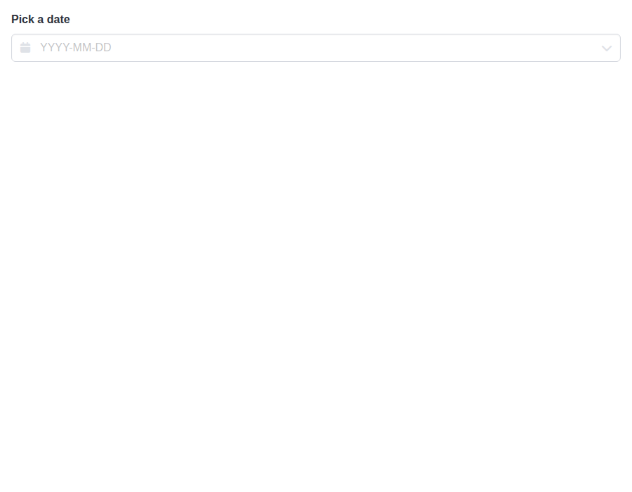 |
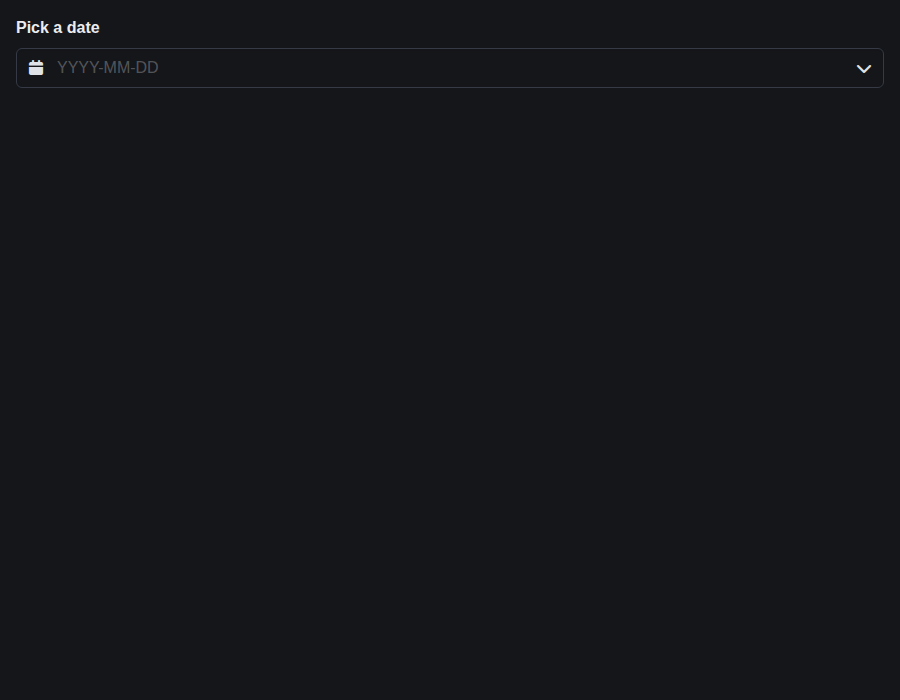 |
form-dateinput--controlled · Form/DateInput · Controlled
| Light | Dark |
|---|---|
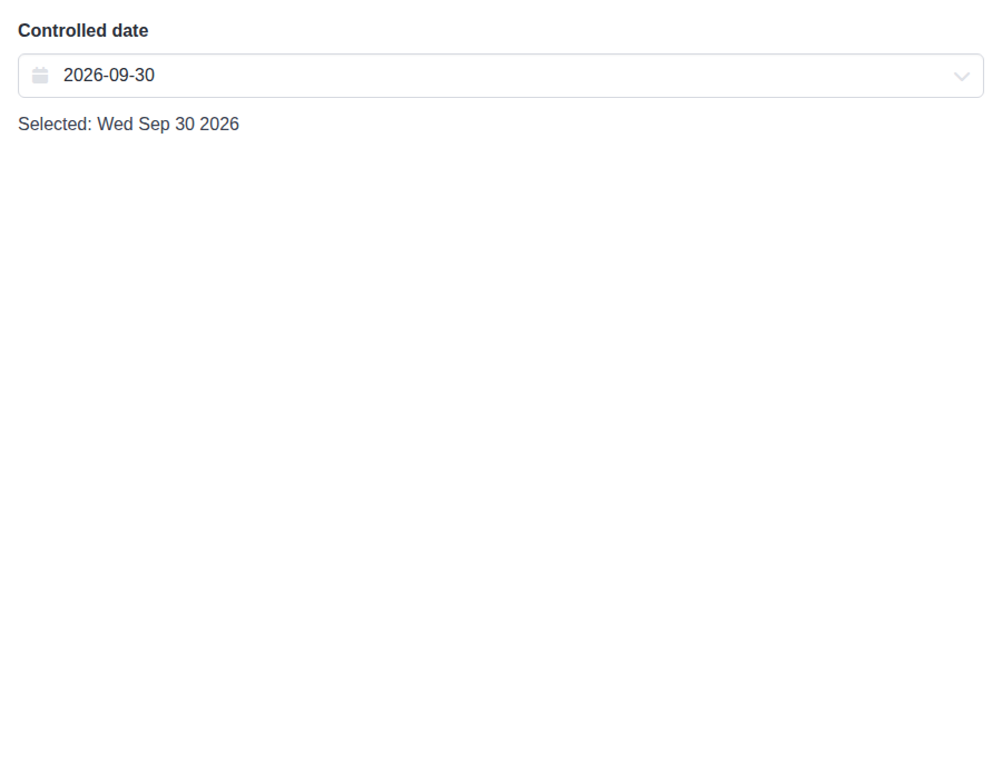 |
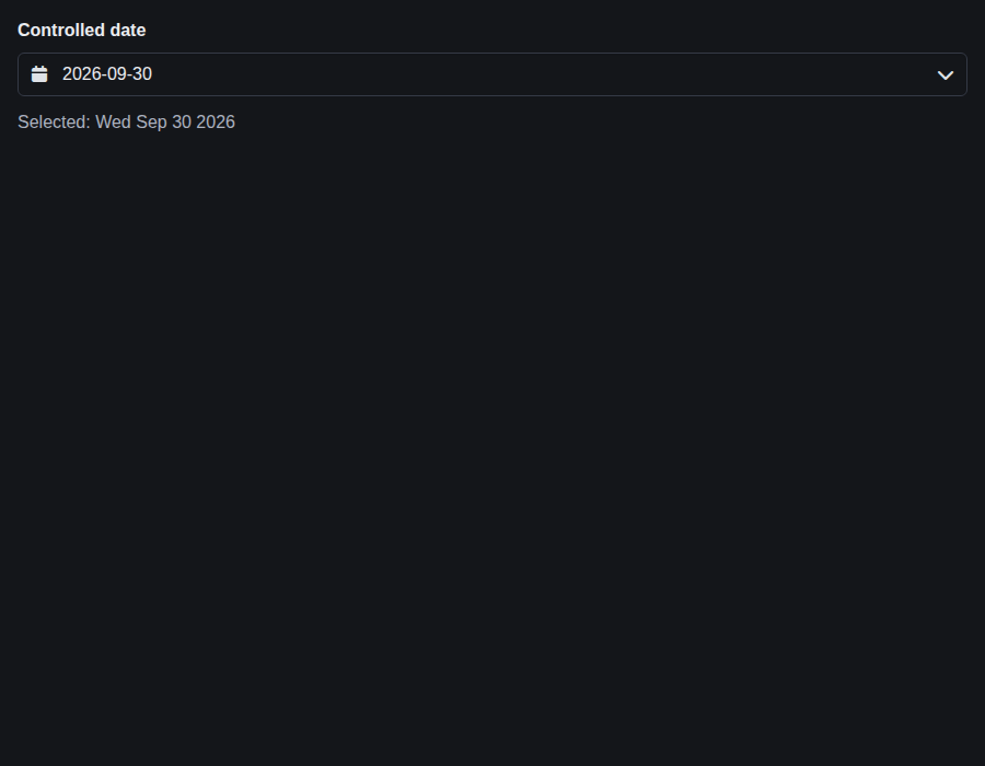 |
form-dateinput--sizes · Form/DateInput · Sizes
| Light | Dark |
|---|---|
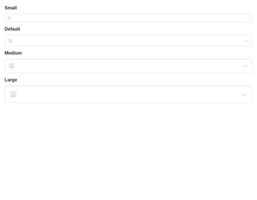 |
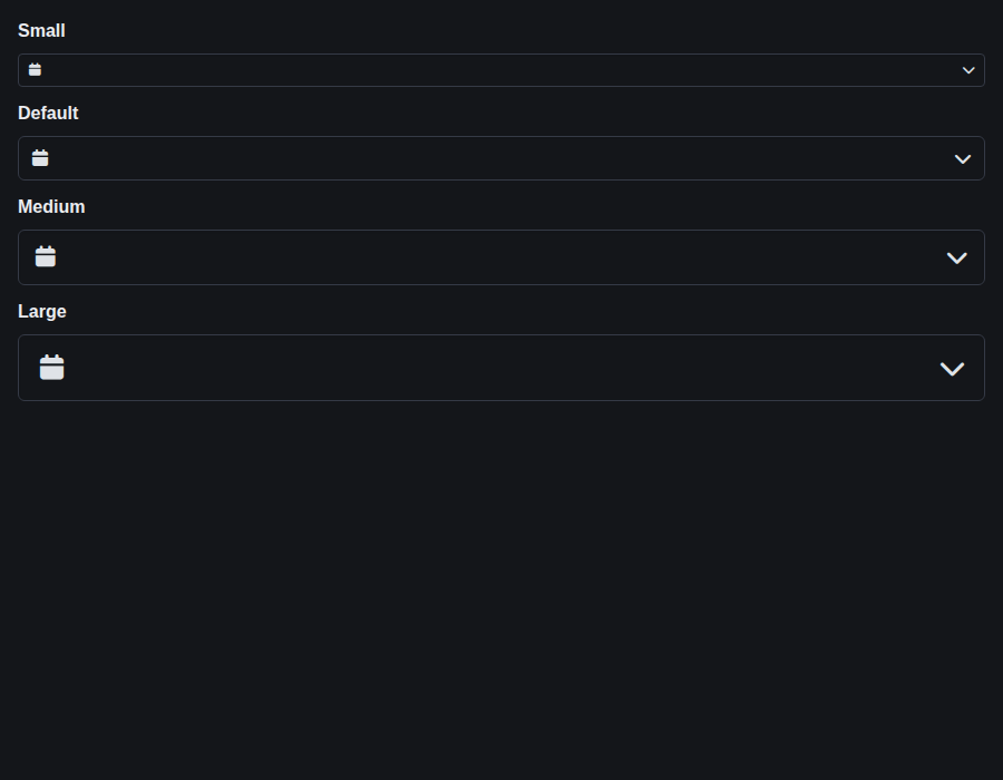 |
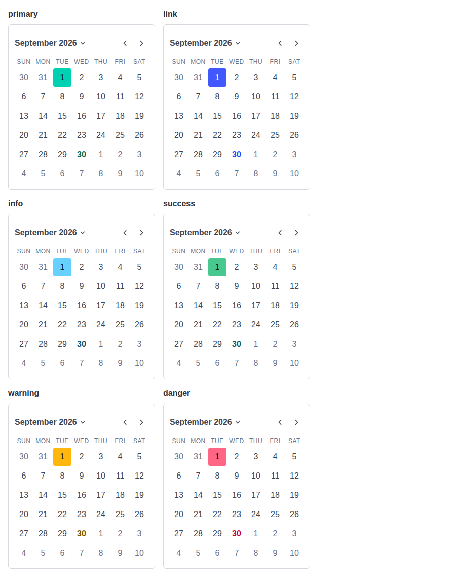
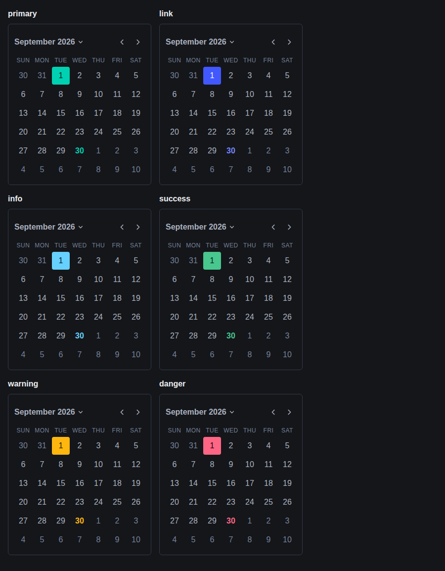
form-dateinput--colors · Form/DateInput · Colors
| Light | Dark |
|---|---|
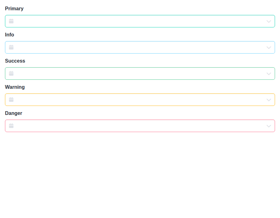 |
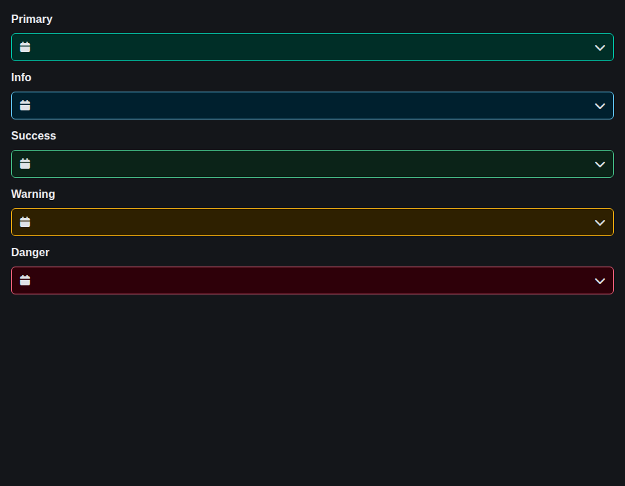 |
form-dateinput--inline-colors · Form/DateInput · Inline Colors
| Light | Dark |
|---|---|
 |
 |
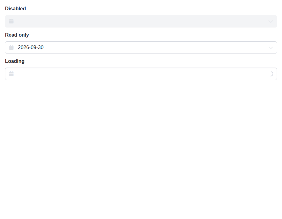
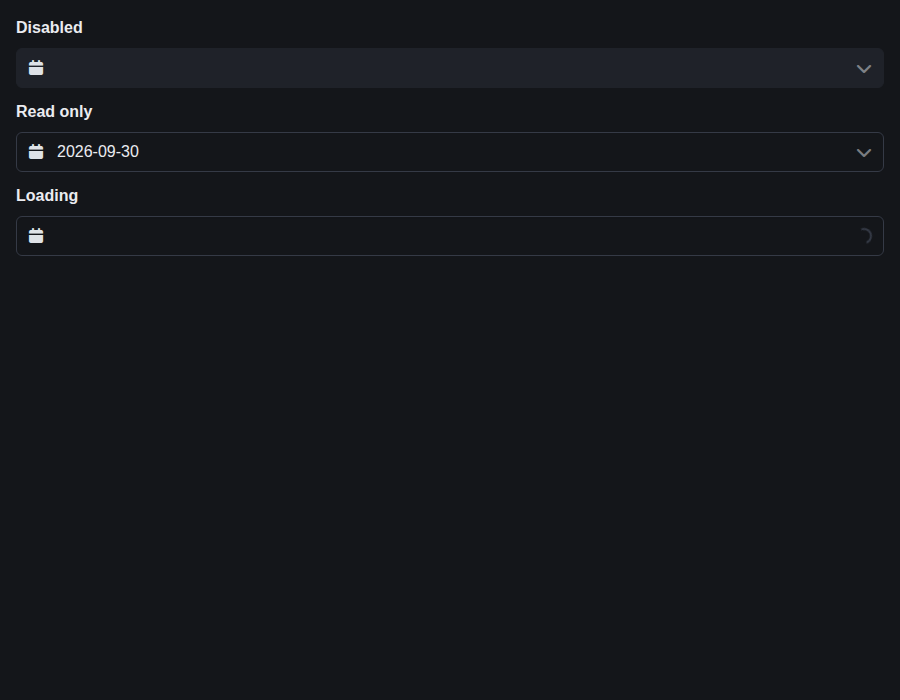
form-dateinput--states · Form/DateInput · States
| Light | Dark |
|---|---|
 |
 |
form-datetimeinput--default · Form/DateTimeInput · Default
| Light | Dark |
|---|---|
 |
 |
form-datetimeinput--controlled · Form/DateTimeInput · Controlled
| Light | Dark |
|---|---|
 |
 |
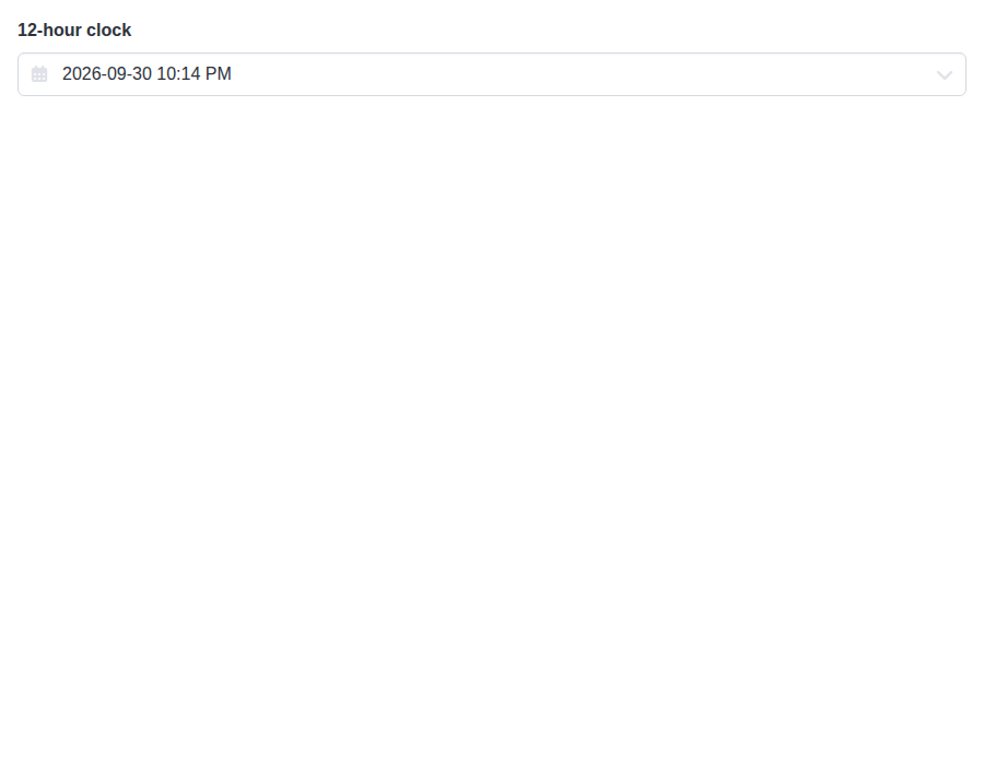
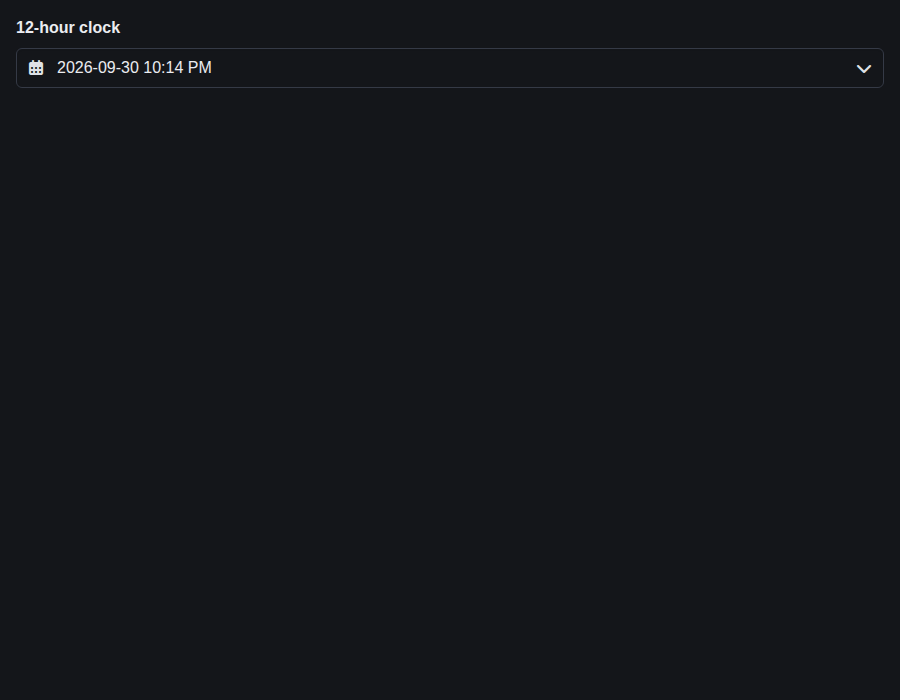
form-datetimeinput--format-12-h · Form/DateTimeInput · Format 12 H
| Light | Dark |
|---|---|
 |
 |
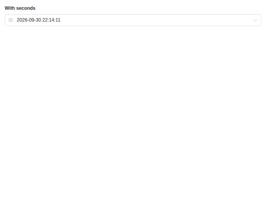
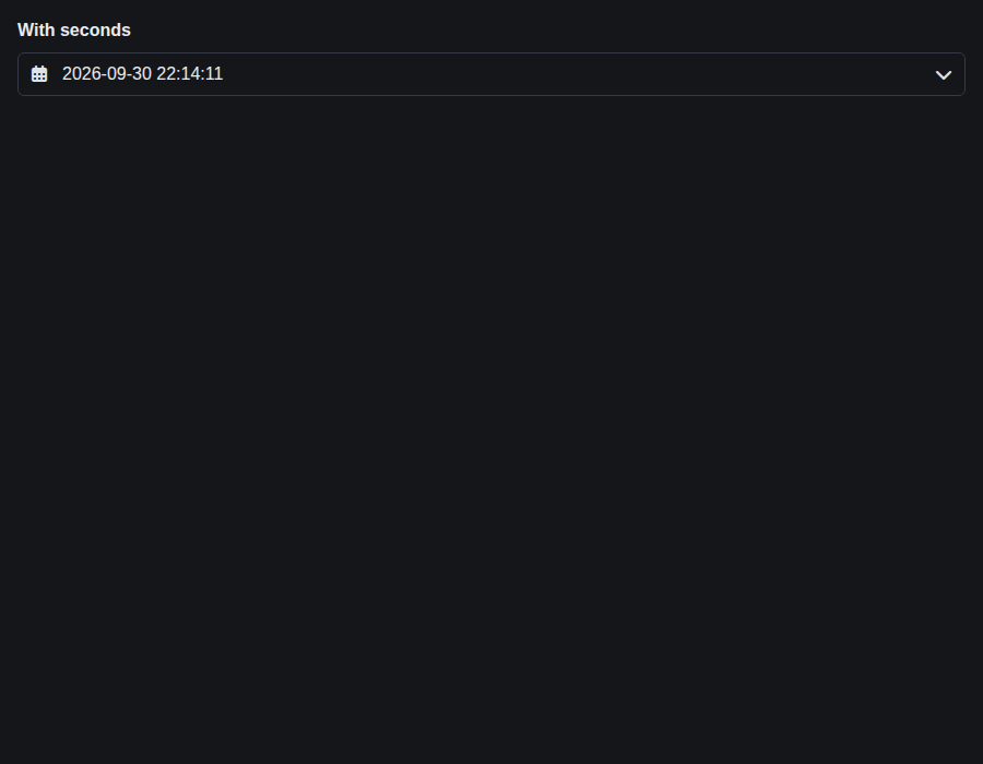
form-datetimeinput--with-seconds · Form/DateTimeInput · With Seconds
| Light | Dark |
|---|---|
 |
 |
form-datetimeinput--format-12-h-with-seconds · Form/DateTimeInput · 12-hour with seconds
| Light | Dark |
|---|---|
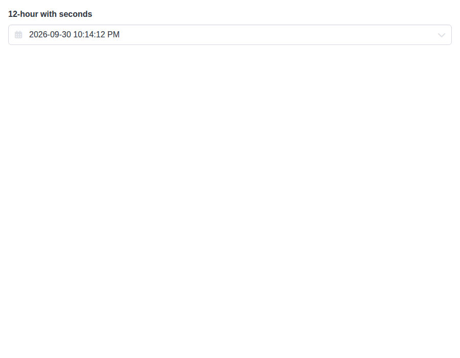 |
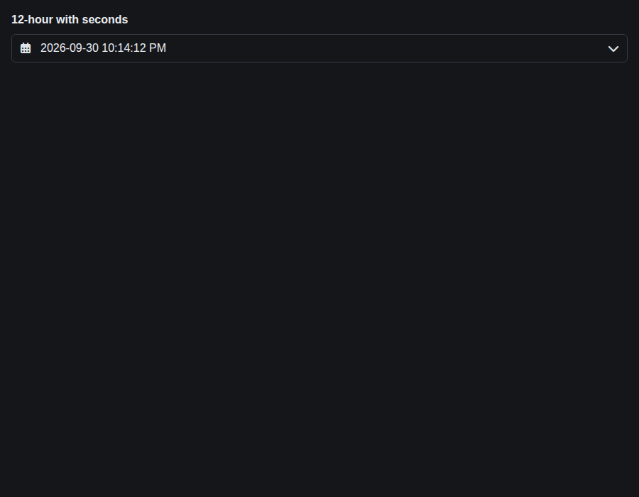 |
form-datetimeinput--formats · Form/DateTimeInput · Formats (compare)
| Light | Dark |
|---|---|
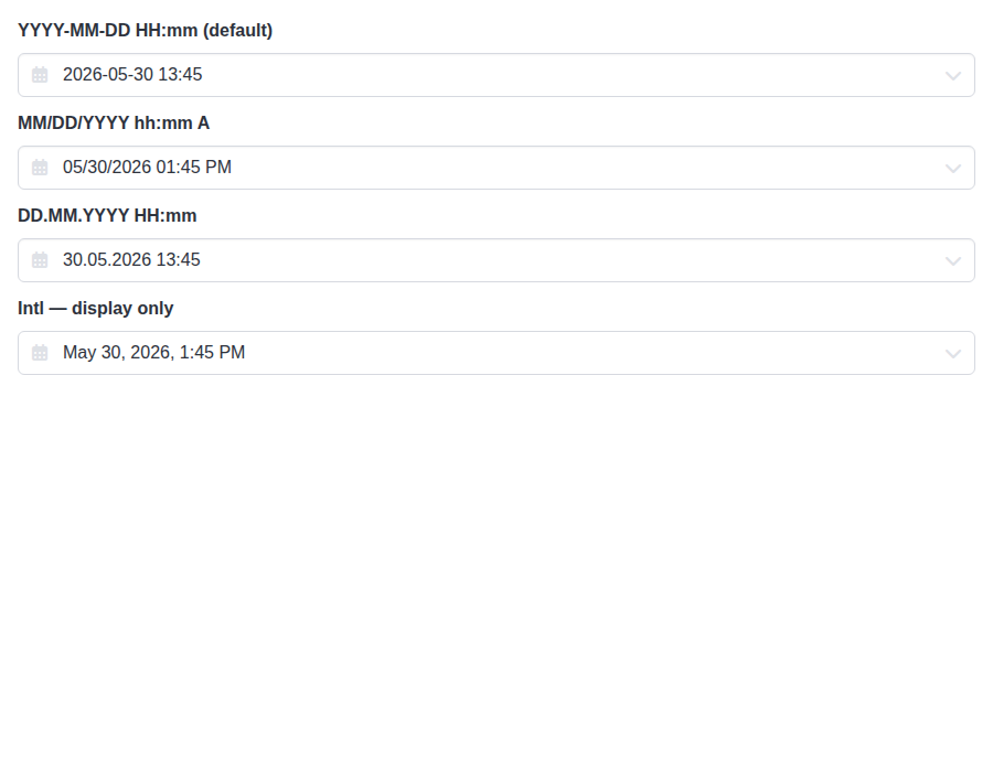 |
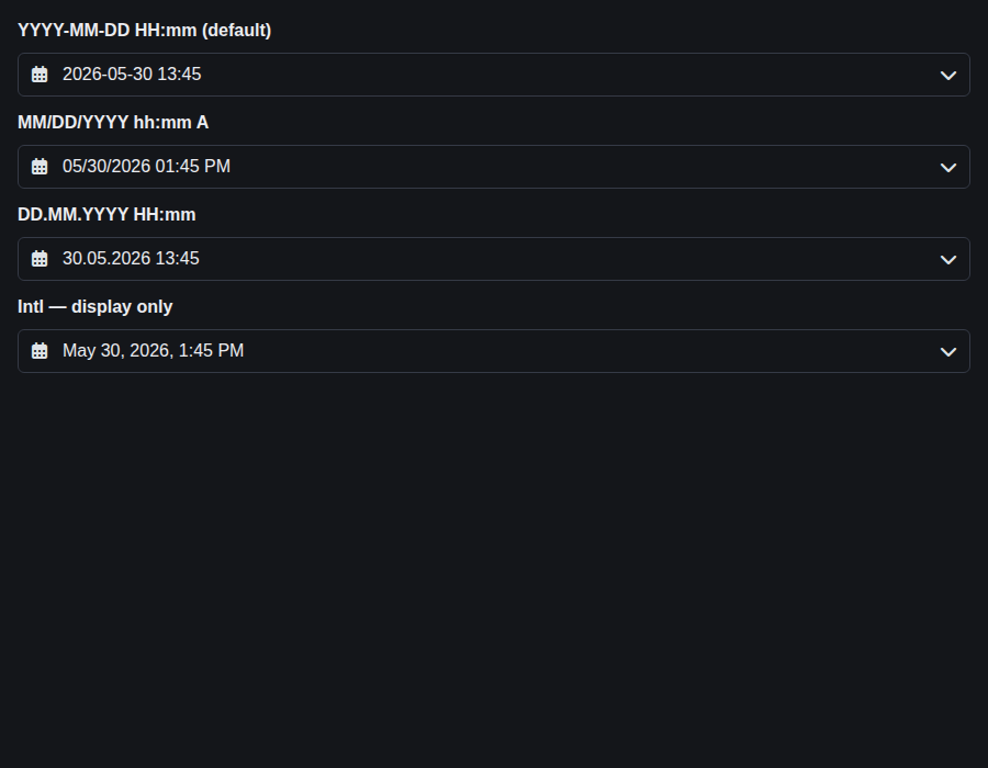 |
form-timeinput--default · Form/TimeInput · Default
| Light | Dark |
|---|---|
 |
 |
form-timeinput--controlled · Form/TimeInput · Controlled
| Light | Dark |
|---|---|
 |
 |
form-timeinput--sizes · Form/TimeInput · Sizes
| Light | Dark |
|---|---|
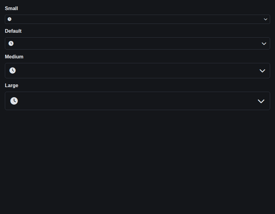
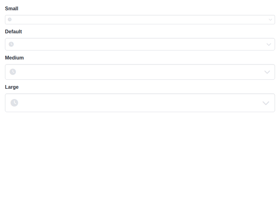 |
 |
form-timeinput--format-12-h · Form/TimeInput · Format 12 H
| Light | Dark |
|---|---|
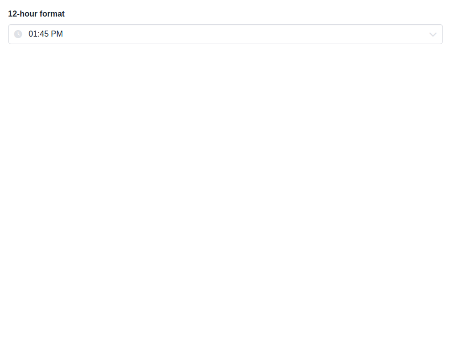 |
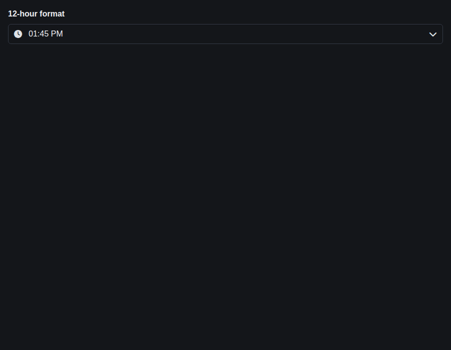 |
form-timeinput--with-seconds · Form/TimeInput · With Seconds
| Light | Dark |
|---|---|
 |
 |
form-timeinput--increment-steps · Form/TimeInput · Increment Steps
| Light | Dark |
|---|---|
 |
 |

Preview DeploymentPreview URL: https://d968649f.bestax.pages.dev |
|
🎉 This PR is included in version 5.19.0 🎉 The release is available on: Your semantic-release bot 📦🚀 |
|
🎉 This PR is included in version 1.14.0 🎉 The release is available on: Your semantic-release bot 📦🚀 |
|
🎉 This PR is included in version 2.25.0 🎉 The release is available on: Your semantic-release bot 📦🚀 |
|
🎉 This PR is included in version 4.2.13 🎉 The release is available on: Your semantic-release bot 📦🚀 |
1 participant

A follow-up to #832, with no issue of its own. #832 colored TimeInput's wheels and flagged the calendar's
is-<color>as dead. This makes it work, and wires up TimeInput's unread wheel variables.The calendar. DateInput and DateTimeInput both pass
colorto the calendar, which putsis-<color>on its root._dateinput.scsshad no rule for it, so the selected date, today's date and the focus rings stayedprimary, and a colored DateTimeInput got colored wheels next to a primary calendar. The calendar now gets the #832 treatment:.dateinput.is-<color>points the selection fill (with its-invert), today's tint and a new--bulma-dateinput-focus-ring-colorat the color.primarydoes by default. Yellow on white is low contrast forwarning, the same as Bulma's ownhas-text-warning.Focus rings and today's date. A ring that follows
coloris only as visible as the color, and on a white surface plaininfo,success,warninganddangerall fall below the 3:1 a focus indicator needs. Measured in Chromium by keyboard focus, light and dark, for every color:-on-schemevariant, which Bulma adjusts until it contrasts withscheme-main. The lowest is 5.83:1 on light and 5.65:1 on dark;warningwas 1.75:1 before.-invert, the selected value's own color. The lowest is 4.79:1 against the fill (link); it was 1.73:1 to 2.80:1 for four colors while it readscheme-main. The focused year is always the selected one.-invert, at least 4.79:1 against the band.Uncolored pickers look the same except in two keyboard-focus cases: the dark-mode selected-cell ring is now white on the fill (3.16:1 to 5.74:1), and a focused wheel now shows a ring at all. With a color set,
color="primary"is a shade off unset for today's date and the calendar ring, which thecolorTSDoc says. Bulma computes-on-schemewhen the CSS is built, so a runtimeThemechange to a color's lightness doesn't re-adjust it, as with Bulma's own help-text colors. The wheel hover fill sits under@media (hover: hover), so it can't stick on a touch screen.TimeInput's wheel variables.
--bulma-timeinput-wheel-bgis now painted on the wheel, and its default becomestransparent. The wheel sits on the popover, the inline frame or DateTimeInput's time card, each with its own background variable, and the oldscheme-maindefault would have covered whichever of those a theme had changed. Nothing read the variable before, so nothing that renders today changes.--bulma-timeinput-wheel-hover-bgis now a hover fill on non-selected items. It keeps its default, the calendar's cell hover, so both halves of a DateTimeInput respond the same way.--bulma-timeinput-wheel-item-heightstays registered and unread. The component sets item height inline, because the wheels position items from it in script. The API pages and the theming skill now say so. No Sass variable is removed.Default rendering. Static screenshots of each uncolored picker under the old and new stylesheets are pixel-identical in light and dark. The only differences without a color set are the two keyboard-focus cases above and the wheel hover fill.
Still primary: DateTimeInput's footer time pill and Done button, and TimeInput's mobile Done button. The panel doesn't carry the color class, so that needs a TSX change of its own. The TSDoc and docs say so.
Tests. A new
DateInput.styles.test.tsxcovers each color on DateInput and DateTimeInput, the defaults, the class prefix, every registered calendar variable being read, and no direct color reads.TimeInput.styles.test.tsxnow checks every registered variable is read, with item height as the one named exception.scripts/color-tuple-css.test.mjschecks the calendar the way it checks the wheels. Each new test fails against the unfixed SCSS.pnpm allpasses locally.