Repository navigation
feat(bulma-ui): add Bulma's position, overflow, radius and aspect-ratio helper props - #845
Conversation


…io helper props

Bulma v1 ships position, overflow, radius and aspect-ratio helpers that
bestax.css already carries, and the only way to reach most of them was a
raw className. They are helper props on every component now, next to the
ones that were there:

- `pos` takes `absolute`, `fixed`, `relative`, `static` and `sticky` and
  renders `is-position-<value>`. It is `pos` rather than `position`
  because several components already have a `position` prop of their own,
  and a consumer interface extending `BulmaClassesProps` with its own
  `position` would stop compiling. `relative` keeps rendering
  `is-relative`; when a valid `pos` is set it decides the position on its
  own, so the two can never emit conflicting classes.
- `overflow` keeps `clipped` (`is-clipped`) and adds the CSS keywords
  Bulma has helpers for, as `is-overflow-<value>`. `overflowX` and
  `overflowY` take the same keywords for one axis.
- `radius` keeps `radiusless` and adds `small`, `normal`, `large` and
  `rounded`, which render Bulma's `has-radius-<value>`.
- `aspectRatio` takes Bulma's ratios and renders
  `is-aspect-ratio-<value>`.

None of these families has responsive classes in Bulma, so there are no
per-viewport variants. The new tuples (`validPositions`,
`validAspectRatios`, `validAxisOverflows`) reach the package root and the
`./constants` subpath the way the others do, and existing tuples only
grow.

On `Theme`, the radius sizes add their class to the wrapper and write no
`--bulma-radius`. Their classes read the radius variables, so writing one
from `normal` would make the variable refer to itself and compute to 0,
and `rounded` would turn every control inside into a pill.
`radiusHelperVars` says so explicitly for each size.

The helper docs, the skills that list helper props, the modular-build
helper modules and the comparison matrix follow: the Affix row is now
reachable through `pos="sticky"` and the Aspect ratio row through
`aspectRatio` rather than only `Image`.

Part of #769.
…r props

`get_helper_props` guarantees that every prop in the reference table
belongs to exactly one group, so a prop outside the map is one a `group`
call can never surface. `pos`, `aspectRatio`, `overflowX` and `overflowY`
join the layout group with the sections that document them, and
`sticky`, `scroll` and `ratio` resolve to it.

Part of #769.
… props

The library exports tuples for its new helper props, so
`valid-helper-value` reports a value outside them the way it does for
every other helper: `<Box pos="center" />` and `<Box aspectRatio="16/9" />`
render nothing, and the second is answered with `16by9`.

`radius` leaves `REMOVES_ONLY`. Its one value used to remove the radius,
which is why `<Box radius />` got a message warning that the value does
the opposite of what the shorthand suggests. It also takes sizes that add
a radius now, so the ordinary remedy listing every value is the true one.

Part of #769.

|
Warning Review limit reachedYou've used all free OSS reviews for now. Wait for the free limit to reset to keep reviewing this public repository. Next included review available in 58 minutes. View limit detailsLimit details: You’ve used the included review currently available. Review configuration: ⚙️ Run configurationConfiguration used: Repository: allxsmith/bestax/.coderabbit.yaml Review profile: CHILL Plan: Advanced Run ID: 📒 Files selected for processing (38)
Thanks for using CodeRabbit! It's free for OSS, and your support helps us grow. If you like it, consider giving us a shout-out. Comment |

Preview DeploymentPreview URL: https://37cebafe.bestax.pages.dev |

AI triage — issues this PR may resolve
If this PR resolves one of these, add the line below to the PR description so the issue closes on merge: |
![claude[bot]](https://avatars.githubusercontent.com/in/1236702?s=60&v=4)

There was a problem hiding this comment.
Deep review — 2 blocking · 4 advisory
| # | Severity | Area | Finding | Location |
|---|---|---|---|---|
| 1 | 🟡 Minor | Correctness | overflow beside overflowX/overflowY is resolved by Bulma's stylesheet order (grouped by value, not by axis), so overflow="hidden" overflowY="auto" silently renders hidden on both axes — and the new unit tests assert exactly that combination |
bulma-ui/src/helpers/useOtherClasses.tsx:134-142 |
| 2 | 🟡 Minor | Correctness | The PASSTHROUGH why behind this sentence still reads "a Bulma helper with no bestax prop" for is-overflow-*, is-position-*, has-radius-*; the regenerated MCP index ships it and bulma_classes serves it to agents |
skills/bestax-migrate/references/bulma-classes/prop-map.md:210-211 |
| 3 | 🔵 Advisory | Robustness | <Theme isRoot radius="small"> is a documented silent no-op — no wrapper for the class, no variable written, and no dev warning, unlike the other non-helper radius routes on Theme |
bulma-ui/src/helpers/Theme.tsx:817-820 |
| 4 | 🔵 Advisory | API | Behaviour change on the record: an untyped <Theme radius="small"> used to write --bulma-radius: small (invalid, computed to 0) and warn; it now adds a class and warns about nothing. Strictly better, but a runtime change a JavaScript consumer can observe |
bulma-ui/src/helpers/Theme.tsx:635-644 |
| 5 | 🔵 Advisory | Accessibility | The new overflowY examples in the docs, the guides and the Storybook Overflow/Position stories create scrollable regions with no tabIndex={0}/role; keyboard-only users cannot scroll them in engines without keyboard-focusable scrollers |
docs/docs/guides/helpers/other.md:342-350 |
| 6 | 🔵 Advisory | Correctness | has-radius-* carries no !important where every sibling helper does, so a component rule above 0,1,0 — .input.is-rounded, .tags.has-addons .tag:not(:first-child) — beats it while radius="radiusless" always wins. An asymmetry inside one prop, inherited from Bulma |
bulma-ui/src/helpers/useOtherClasses.tsx:152-158 |
Overall: The change is sound and unusually well-evidenced — every class name, all fifteen ratios, the has-radius-normal → var(--bulma-radius) self-reference behind the Theme decision, and all six @use 'bulma/sass/helpers/…' module names in the optimize skill check out against bulma@1.0.4, and the pos/relative precedence guard is the right call. pnpm --filter @allxsmith/bestax-bulma test:coverage (4453 tests, useOtherClasses.tsx and useBulmaClasses.tsx at 100%), the eslint-plugin and bestax-mcp suites, typecheck:tests, lint, format:check, gen:catalog:check, gen:mcp:check and check:conformance all pass in this checkout — the single conformance failure, version-regression, is the shallow clone, not the PR. The riskiest part is what CSS does with the new class combinations, which jsdom cannot see: start with finding 1, since the library's own tests currently certify a combination a browser resolves the other way. Finding 2 is a one-string fix, but it ships in this PR's bestax-mcp release.
Residual risk:
overflow× the axis props — open, posted as finding 1. Confirmed againstbulma.csssource order:.is-overflow-x-auto(20074) precedes.is-overflow-hidden(20094), both!important, both0,1,0.pos×relative— refuted.useOtherClasses.tsx:178-182makes a validposexclusive, andposition.scssemits.is-relativebefore.is-position-*anyway, so even unguarded the order favourspos. Three tests cover it, including the invalid-posfallback.pos×overlay— open, not posted:%overlaysetsposition: absoluteplus all four offsets without!important(3270), sois-position-*(!important, 20134) takes the property and leaves the offsets behind. No shipped example combines them andoverlayis not documented as a position helper.radiussizes losing to component rules — refuted for everything this PR ships..has-radius-*lands at 14010–14022, after every componentborder-radius(the last at 8218), so<Button radius="small">and<Tag radius="rounded">do change. Only selectors above0,1,0beat it, which is advisory 6.- Prop-name collisions — refuted. No component declares
pos,overflowX,overflowYoraspectRatio; eleven declareposition, which is the rationale the TSDoc gives. No--bulma-*variable mints a collidingThemeprop (--bulma-body-overflow-xbecomesbodyOverflowX), so the #694 shape does not recur. radiusless/clippedregressions — refuted. Both branch toaddPrefixedClasswith the string they emitted before, asserted per value by theit.eachtables inuseOtherClasses.test.tsxunder the bare and thebestax-prefix.- Live docs examples — refuted.
Paragraph,Notification,Columns,Column,BlockandTagare all package-root exports and so in the react-live scope, andtypecheck:testscovers every story.
🏄 Four whole helper families hauled out of
classNamepurgatory and into real props, with the Bulma source cracked open to justify every call — clean set, dude. Just watch the overflow shorebreak: stack the shorthand on the axis props and the cascade decides who drops in, not you.
…erflow

`overflow` beside an axis prop emitted a both-axes class and an axis
class together. Bulma's overflow helpers are all `!important` at one
class of specificity and ordered by value rather than by axis, so which
one applied depended on where the two values sit in the stylesheet:
`overflow="hidden" overflowY="auto"`, the usual "clip sideways, scroll
down", rendered hidden on both axes, and the unit tests asserted that
combination as working.

Once an axis prop is set, both axes are now written per axis. The axis
prop wins its own, and `overflow` fills in the other, with `clipped`
counting as `hidden`, which is what `is-clipped` sets. Each axis gets
exactly one class, so the stylesheet's order no longer decides anything.
Checked in Chromium against the shipped bestax.css: every combination of
the three props now computes what the props say, where the old classes
got 84 of them wrong.

Two smaller things on the same props:

- The `radius` TSDoc and the helper docs say that the sizes are not
  `!important`, unlike `radiusless`, so an `isRounded` control stays a
  pill and a joined addon keeps its square inner corners.
- The scrolling examples in the helper docs and stories take
  `tabIndex={0}`, a `region` role and a name, so a keyboard can scroll
  them.

Part of #769.
The radius sizes add a class and write no variable, and a root Theme
renders no wrapper to carry the class, so `<Theme isRoot radius="small">`
did nothing and said nothing. Theme's other radius routes that do not do
what they look like warn in development, and this one now does too,
once, naming the two things that would work: the prop on the element
itself, or `--bulma-radius` through `bulmaVars`.

Part of #769.
… leaves alone

The bulma-classes table gave `is-position-*`, `is-overflow-*` and
`has-radius-*` the reason "a Bulma helper with no bestax prop", and
`is-aspect-ratio-*` the reason for an `.image` modifier. bestax-bulma now
has a helper prop for each, and the MCP server's `lookup_bulma_classes`
answers with these reasons, so an agent asking about one was told to keep
the class instead of reaching for `pos`, `overflow`, `radius` or
`aspectRatio`.

Each family now has its own reason, which says the codemod does not
convert it and names the prop that renders it. A test builds the classes
from bestax-bulma's own tuples, so a value the library adds is held to
the same rule.

Part of #769.

|
On the advisories:
The PR now has four scoped commits across bulma-ui, bestax-mcp, eslint-plugin and bestax-migrate, so it still wants a merge commit rather than a squash. |
Preview DeploymentPreview URL: https://40980038.bestax.pages.dev |
There was a problem hiding this comment.
Deep review — 0 blocking · 4 advisory
| # | Severity | Area | Finding | Location |
|---|---|---|---|---|
| 1 | 🔵 Advisory | Correctness | overflow="visible" beside a non-visible axis prop cannot render what the props say: CSS forces overflow-x: visible to compute as auto when the other axis is not visible, so overflow="visible" overflowY="hidden" shows a horizontal scrollbar. Identical to the inline-style equivalent, so nothing is wrong — but the doc sentence "an axis prop wins on its own axis and overflow sets the other" reads as if the filled-in axis is literally what you asked for |
bulma-ui/src/helpers/useOtherClasses.tsx:148-156 |
| 2 | 🔵 Advisory | Robustness | <Theme isRoot> drops every helper class and className, not only the radius sizes — the new warning covers the radius sizes alone, so <Theme isRoot m="4" pos="sticky" className="x"> stays exactly as silent as radius="small" was |
bulma-ui/src/helpers/Theme.tsx:901-911 |
| 3 | 🔵 Advisory | Correctness | pos × overlay: %overlay (mixins.scss:456) sets position: absolute plus all four offsets with no !important, and is-position-* is !important, so <Box overlay pos="sticky"> takes the position and keeps the four offsets. Carried over from the previous review residual-risk list; no shipped example combines them, and overlay is not documented as a position helper |
bulma-ui/src/helpers/useOtherClasses.tsx:178-182 |
| 4 | 🔵 Advisory | API | PR-body note for the maintainer: "The work is three scoped commits (bulma-ui, bestax-mcp, eslint-plugin)" is now stale — the branch carries six commits across four release scopes, fix(bestax-migrate) included, so a squash would strand bestax-migrate as well as the other two |
PR description |
Overall: The change is sound, and the two findings from the previous pass are genuinely fixed rather than papered over. The overflow rewrite is the right shape — once either axis prop is set the hook writes both axes per axis, so no element ever carries two competing overflow classes and the value-ordered !important rules in Bulma decide nothing; the exhaustive it.each over every overflow × overflowX × overflowY combination asserts exactly one class per axis, and overflow.scss in bulma@1.0.4 emits shorthand, x- and y- helpers for all five keywords, so every class the hook can now produce exists. The Theme warning is correct on its own terms (isRoot returns a fragment, so combinedClassName is discarded), keyed once like Theme:radius-variable, and gated by the fail-closed NODE_ENV read in warnOnce. The migrate why strings resolve as intended: no earlier PASSTHROUGH group matches is-position-*, is-overflow-*, has-radius-* or is-aspect-ratio-*, and is-aspect-ratio-* appears nowhere else in class-map.ts, so pulling it out of the .image group strands nothing. The riskiest part remains what CSS does with class combinations jsdom cannot see — advisory 1 is the one place where what the props say and what the browser computes still diverge, and it diverges the same way an inline style would.
Residual risk:
overflow× the axis props — refuted. Verified againstbulma-ui/node_modules/bulma/sass/helpers/overflow.scss: the loop emitsis-overflow-,is-overflow-x-andis-overflow-y-for each ofauto clip hidden scroll visible, so every axis class the hook can emit exists. Theit.each(combos)table inuseOtherClasses.test.tsxdrives every shorthand × axis pairing and asserts one class per axis;useOtherClasses.tsxreports 100% statements/branches/functions/lines in the coverage run.overflow="visible"beside a non-visible axis — open, advisory 1. Not posted as a blocker: this is the CSS visible-to-auto blockification rule, identical to an inlineoverflow-x: visiblealongsideoverflow-y: hidden, which is what the Chromium check in the commit message compared against.overflow="clipped"no longer emittingis-clippedbeside an axis prop — refuted as a regression.overflowXandoverflowYship in this same PR, so no released configuration changes class output;overflow="clipped"on its own still takes theaddPrefixedClassbranch foris-clipped, asserted bare and underbestax-.pos×relative— refuted. Thepos && validPositions.includes(pos)guard makes a validposexclusive, and the invalid-posfallback tois-relativeis covered.pos×overlay— open, advisory 3.- Silent no-ops left on
isRoot— open, advisory 2. The radius-size case is now warned; helper classes andclassNamein general are not. has-radius-*losing to component rules — refuted, and now documented rather than latent..input.is-roundedis0,2,0against the helper at0,1,0, which is exactly what the new TSDoc andother.mdsentence claim ("anisRoundedcontrol stays a pill, and a joined addon keeps its square inner corners").bestax-migratereason strings reaching the MCP server — refuted.passthroughReasonwalksPASSTHROUGHin order; each earlier group regex was checked against the four families and none matches. The newpassthrough.test.tsbuilds the class set from@allxsmith/bestax-bulma/constants, so a value added to a tuple later is held to the same rule.- Stale generated artefacts — refuted empirically. Re-ran
gen-mcp-index.mjs,gen-component-catalog.mjs,gen-eslint-meta.mjsandgen-skills-rosters.mjsin this checkout;git status --porcelaincame back empty. - Gates — all 8 turbo
testtasks pass (bulma-ui 4704 tests, bestax-migrate 2164);typecheck,typecheck:tests,lintandformat:checkclean (7 pre-existingreact-hooks/exhaustive-depswarnings inAutocomplete,SliderandTaginput, untouched here);check:conformancepasses every rule exceptversion-regression, which is this shallow clone rather than the PR. - Prop-name collisions — refuted. No component declares
pos,overflowX,overflowYoraspectRatio; the~aspectRatioand~pos="sticky"comparison cells resolve throughBESTAXaftercomponentComparison.js:457strips the~.
🏄 Both wipeouts from the last set got paddled back out and ridden clean — the overflow lineup is one class per axis now, so the cascade stopped dropping in on you, and the root-Theme radius finally says something instead of quietly eating the wave. Four families of helpers, a fixed codemod reason, and a green board across the whole break. Good to go.
|
On the fresh review's advisories, all on the record: 1 ( |
 allxsmith
added
the
needs-human-review
allxsmith
added
the
needs-human-review
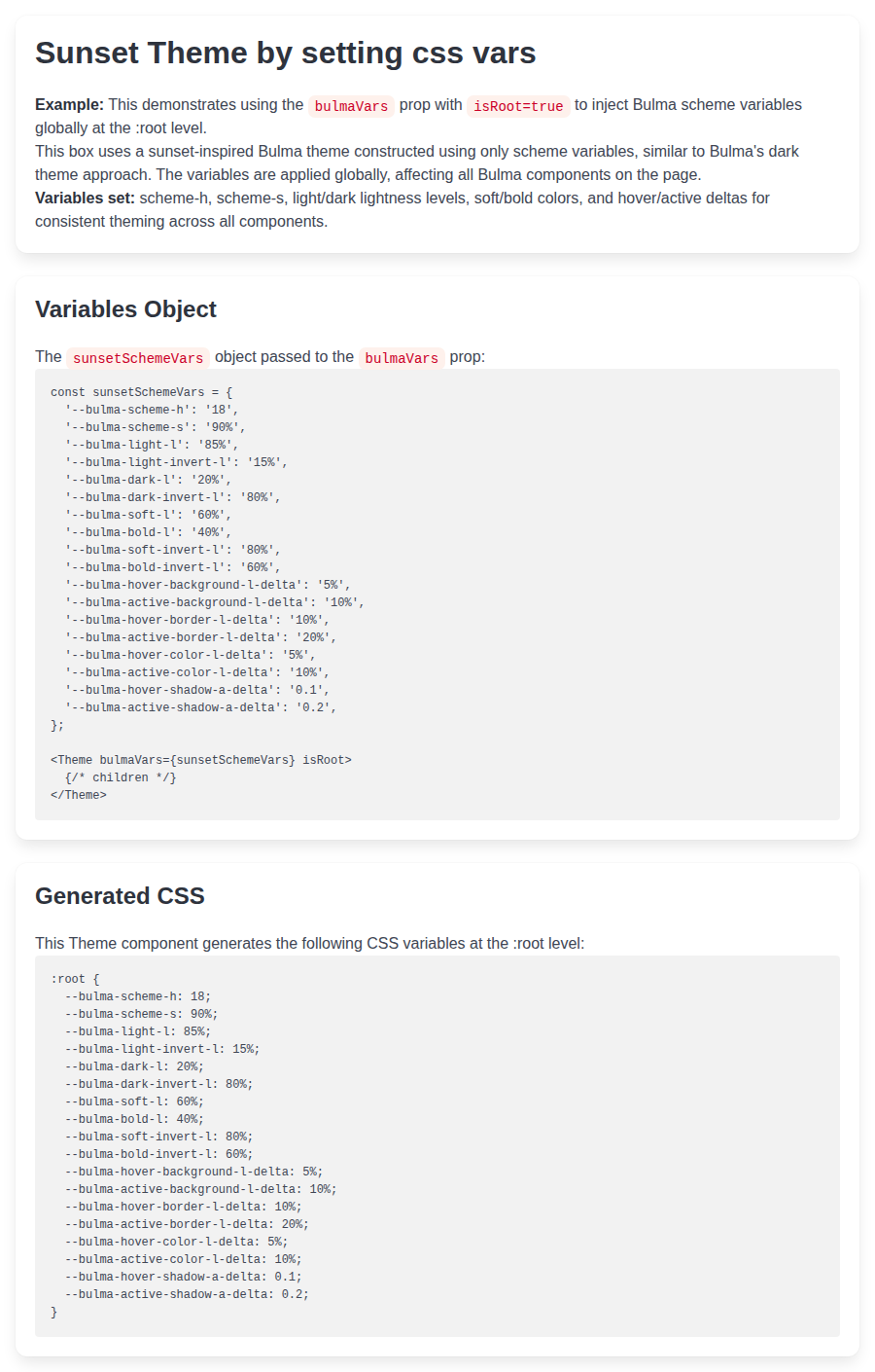
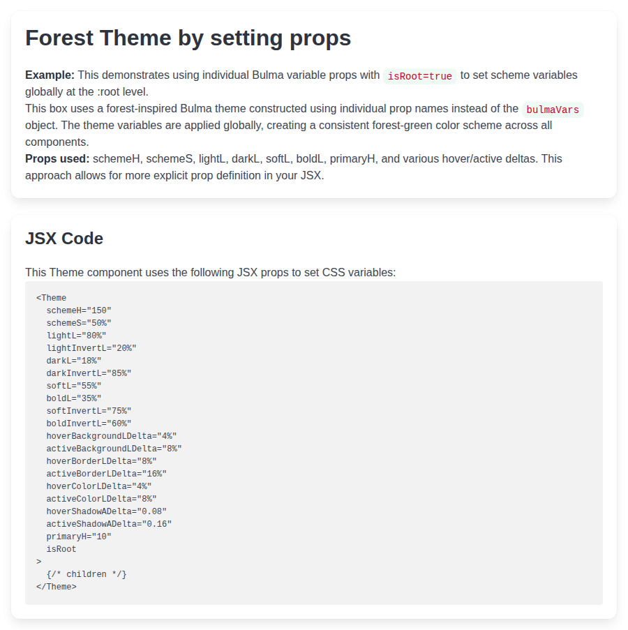
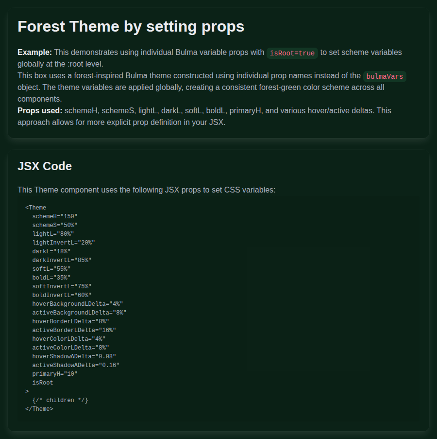
📸 Story screenshots at handoff —
|
| Light | Dark |
|---|---|
 |
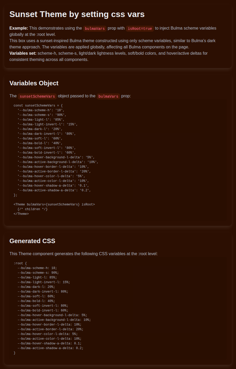 |
helpers-theme--forest-theme · Helpers/Theme · Forest Theme
| Light | Dark |
|---|---|
 |
 |
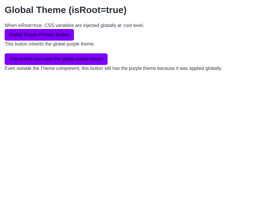
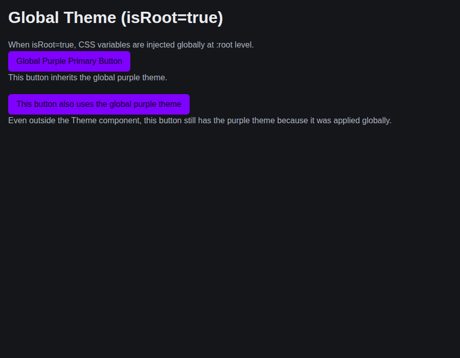
helpers-theme--global-theme · Helpers/Theme · Global Theme
| Light | Dark |
|---|---|
 |
 |
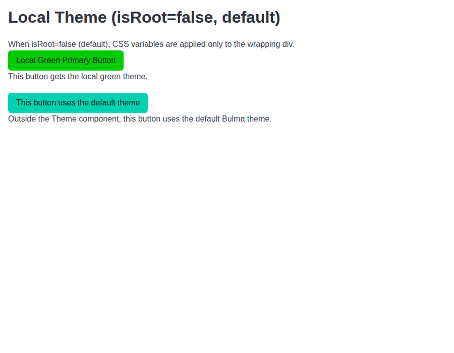
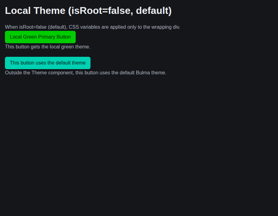
helpers-theme--local-theme · Helpers/Theme · Local Theme
| Light | Dark |
|---|---|
 |
 |
helpers-theme--theme-with-class-name · Helpers/Theme · Theme With Class Name
| Light | Dark |
|---|---|
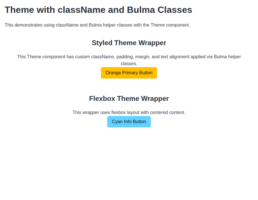 |
 |
helpers-theme--nested-themes · Helpers/Theme · Nested Themes
| Light | Dark |
|---|---|
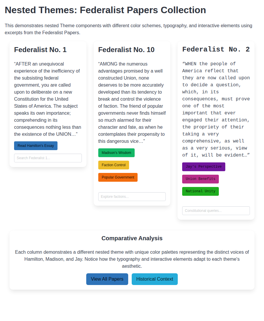 |
 |
helpers-usebulmaclasses--default · Helpers/useBulmaClasses · Default
| Light | Dark |
|---|---|
 |
 |
helpers-usebulmaclasses--custom-styles · Helpers/useBulmaClasses · Custom Styles
| Light | Dark |
|---|---|
 |
 |
helpers-usebulmaclasses--skeleton-button · Helpers/useBulmaClasses · Skeleton Button (Toggles)
| Light | Dark |
|---|---|
 |
 |
helpers-usebulmaclasses--skeleton-buttons · Helpers/useBulmaClasses · Skeleton Buttons Group (Toggles)
| Light | Dark |
|---|---|
 |
 |
helpers-usebulmaclasses--skeleton-icon · Helpers/useBulmaClasses · Skeleton Icon (Toggles)
| Light | Dark |
|---|---|
 |
 |
helpers-usebulmaclasses--skeleton-image · Helpers/useBulmaClasses · Skeleton Image (Toggles)
| Light | Dark |
|---|---|
 |
 |

Preview DeploymentPreview URL: https://b3af3544.bestax.pages.dev |
# Conflicts:
#	bestax-mcp/data/components/Valid value constants.json
#	docs/src/data/componentComparison.js
Preview DeploymentPreview URL: https://129716f9.bestax.pages.dev |
There was a problem hiding this comment.
Copilot review overview
🟡 Changes recommended
The new migration passthrough regexes overmatch unsupported values and produce incorrect guidance.
Review effort: Balanced
Findings: 1

Open (1)
What changed in this PR
Adds shared Bulma position, overflow, radius, and aspect-ratio helper props across the library and supporting tooling.
Changes:
- Implements helper props, constants, Theme behavior, stories, and tests.
- Updates ESLint, migration, MCP, documentation, and skills integrations.
- Refreshes generated metadata and comparison data.
| File | Description |
|---|---|
skills/bestax-theming/references/themeable-components.md |
Documents radius values. |
skills/bestax-optimize/SKILL.md |
Lists new helper props. |
skills/bestax-optimize/references/modular-build.md |
Corrects Sass helper modules. |
skills/bestax-migrate/references/bulma-classes/prop-map.md |
Updates passthrough guidance. |
skills/bestax-custom-component/references/api.md |
Documents helper API additions. |
scripts/conformance-baseline.json |
Updates story conformance baseline. |
eslint-plugin/src/rules/valid-helper-value.ts |
Generalizes shorthand handling. |
eslint-plugin/src/lib/values.ts |
Registers new helper values. |
eslint-plugin/src/__tests__/valid-helper-value.test.ts |
Tests new lint validation. |
eslint-plugin/README.md |
Updates radius guidance. |
docs/src/data/componentComparison.js |
Updates capability comparisons. |
docs/docs/guides/library/helpers.md |
Adds helper examples. |
docs/docs/guides/helpers/other.md |
Documents all new families. |
docs/docs/guides/getting-started/eslint-plugin.md |
Updates lint documentation. |
docs/docs/guides/features/css-variables.md |
Clarifies radius semantics. |
docs/docs/api/helpers/valid-values.md |
Lists new public tuples. |
docs/docs/api/helpers/usebulmaclasses.md |
Expands helper API reference. |
docs/docs/api/helpers/theme.md |
Documents Theme radius behavior. |
bulma-ui/src/helpers/useOtherClasses.tsx |
Implements helper class generation. |
bulma-ui/src/helpers/useBulmaClasses.tsx |
Consumes and exports new props. |
bulma-ui/src/helpers/useBulmaClasses.stories.tsx |
Adds stories and controls. |
bulma-ui/src/helpers/Theme.tsx |
Handles radius sizes safely. |
bulma-ui/src/helpers/Theme.stories.tsx |
Updates Theme radius story. |
bulma-ui/src/helpers/bulmaClassHelpers.ts |
Defines accepted value tuples. |
bulma-ui/src/helpers/__tests__/useOtherClasses.test.tsx |
Tests class generation. |
bulma-ui/src/helpers/__tests__/useBulmaClasses.test.tsx |
Tests shared prop consumption. |
bulma-ui/src/helpers/__tests__/useBulmaClasses.composition.test.tsx |
Tests hook composition. |
bulma-ui/src/helpers/__tests__/Theme.test.tsx |
Tests Theme radius behavior. |
bulma-ui/src/__tests__/index.test.ts |
Verifies public exports. |
bestax-migrate/src/sources/bulma-classes/class-map.ts |
Adds helper-specific passthrough reasons. |
bestax-migrate/src/sources/bulma-classes/__tests__/passthrough.test.ts |
Tests passthrough guidance. |
bestax-mcp/src/helper-props.ts |
Groups new layout helpers. |
bestax-mcp/data/skills.json |
Refreshes generated skill metadata. |
bestax-mcp/data/components/Valid value constants.json |
Refreshes constants documentation. |
bestax-mcp/data/components/Theme.json |
Refreshes Theme documentation. |
bestax-mcp/data/catalog.json |
Updates generated example count. |
bestax-mcp/data/bulma-classes.json |
Refreshes class passthrough data. |
💡 Add a code-review agent skill or configure MCP servers for context-aware, tailored reviews. Learn more in the docs.
| // names its prop, so a reader can make the change by hand. | ||
| { | ||
| why: 'a Bulma helper the codemod does not convert; the `pos` prop renders it', | ||
| match: /^is-position-.+$/, |

# [5.19.0](https://github.com/allxsmith/bestax/compare/@allxsmith/bestax-bulma@5.18.2...@allxsmith/bestax-bulma@5.19.0) (2026-10-01)

### Bug Fixes

* **bulma-ui:** announce polite notifications through a status region kept from mount ([#835](#835)) ([c93478d](c93478d))
* **bulma-ui:** color the calendar from the color prop and read TimeInput's wheel variables ([2251e67](2251e67)), closes [#832](#832)
* **bulma-ui:** draw the time wheel focus ring where the wheel's mask shows it ([e1d8c9f](e1d8c9f)), closes [#832](#832)
* **bulma-ui:** give the selected calendar cell a ring that shows on its fill ([b3eecc6](b3eecc6))
* **bulma-ui:** keep button defaults through a spread, and type the buttons that had none ([#853](#853)) ([0810482](0810482))
* **bulma-ui:** keep the picker focus rings visible in every color ([612aa09](612aa09))
* **bulma-ui:** read clicks and focus inside a shadow root ([474f2cc](474f2cc))
* **bulma-ui:** restore a portaled Modal's focus to an opener in a shadow root ([c564bd3](c564bd3))

### Features

* **bulma-ui:** add Bulma's position, overflow, radius and aspect-ratio helper props ([#845](#845)) ([64fb91c](64fb91c))
|
🎉 This PR is included in version 5.19.0 🎉 The release is available on: Your semantic-release bot 📦🚀 |
# [1.14.0](https://github.com/allxsmith/bestax/compare/bestax-mcp@1.13.0...bestax-mcp@1.14.0) (2026-10-03)

### Bug Fixes

* **bulma-ui:** announce polite notifications through a status region kept from mount ([#835](#835)) ([c93478d](c93478d))
* **bulma-ui:** answer the granularity review on native input and blur ([7a17486](7a17486))
* **bulma-ui:** color the calendar from the color prop and read TimeInput's wheel variables ([2251e67](2251e67)), closes [#832](#832)
* **bulma-ui:** draw the time wheel focus ring where the wheel's mask shows it ([e1d8c9f](e1d8c9f)), closes [#832](#832)
* **bulma-ui:** fall back when useFocusTrap's initialFocusRef can't take focus ([c191931](c191931))
* **bulma-ui:** give the selected calendar cell a ring that shows on its fill ([b3eecc6](b3eecc6))
* **bulma-ui:** hold Portal to looking a selector up on each render ([8fe02ce](8fe02ce))
* **bulma-ui:** judge image map areas by their image in useFocusTrap ([af7bc59](af7bc59))
* **bulma-ui:** keep button defaults through a spread, and type the buttons that had none ([#853](#853)) ([0810482](0810482))
* **bulma-ui:** keep button types and Avatar's accessible name through a spread ([#826](#826)) ([dc798d4](dc798d4))
* **bulma-ui:** keep the picker focus rings visible in every color ([612aa09](612aa09))
* **bulma-ui:** make useFocusTrap follow radio groups and initialFocusRef past the trap ([d6219d4](d6219d4))
* **bulma-ui:** place toasts and notifications at the position they were shown with ([#834](#834)) ([62feab9](62feab9))
* **bulma-ui:** read clicks and focus inside a shadow root ([474f2cc](474f2cc))
* **bulma-ui:** restore a portaled Modal's focus to an opener in a shadow root ([c564bd3](c564bd3))
* **bulma-ui:** settle Popover's deep review findings ([feadaf4](feadaf4))
* **bulma-ui:** stop Bulma's spinners under reduced motion in every stylesheet ([b234712](b234712)), closes [#770](#770)
* **bulma-ui:** stop TimeInput reopening on the focus its popover hands back ([1c87c15](1c87c15))

### Features

* **bestax-mcp:** publish to the official MCP Registry ([74efc7f](74efc7f))
* **bulma-ui:** add Bulma's position, overflow, radius and aspect-ratio helper props ([#845](#845)) ([64fb91c](64fb91c))
* **bulma-ui:** add Collapses, an accordion group for Collapse ([#849](#849)) ([a12c823](a12c823))
* **bulma-ui:** add Loader, Bulma's inline spinner ([c5e9eb0](c5e9eb0)), closes [#770](#770)
* **bulma-ui:** add month and year pickers to DateInput through granularity ([c4cfc2b](c4cfc2b)), closes [#773](#773)
* **bulma-ui:** add Popover ([2e17fac](2e17fac)), closes [#776](#776)
* **bulma-ui:** export ClientOnly and useIsHydrated ([2c0c1e6](2c0c1e6))
* **bulma-ui:** export Portal ([346d8c2](346d8c2))
* **bulma-ui:** export useFocusTrap, counting the stops the browser's Tab visits ([c304fef](c304fef)), closes [#772](#772)
|
🎉 This PR is included in version 1.14.0 🎉 The release is available on: Your semantic-release bot 📦🚀 |
# [1.2.0](https://github.com/allxsmith/bestax/compare/@allxsmith/eslint-plugin-bestax@1.1.9...@allxsmith/eslint-plugin-bestax@1.2.0) (2026-10-03)

### Bug Fixes

* **bulma-ui:** announce polite notifications through a status region kept from mount ([#835](#835)) ([c93478d](c93478d))
* **bulma-ui:** answer the granularity review on native input and blur ([7a17486](7a17486))
* **bulma-ui:** color the calendar from the color prop and read TimeInput's wheel variables ([2251e67](2251e67)), closes [#832](#832)
* **bulma-ui:** draw the time wheel focus ring where the wheel's mask shows it ([e1d8c9f](e1d8c9f)), closes [#832](#832)
* **bulma-ui:** fall back when useFocusTrap's initialFocusRef can't take focus ([c191931](c191931))
* **bulma-ui:** give the selected calendar cell a ring that shows on its fill ([b3eecc6](b3eecc6))
* **bulma-ui:** hold Portal to looking a selector up on each render ([8fe02ce](8fe02ce))
* **bulma-ui:** judge image map areas by their image in useFocusTrap ([af7bc59](af7bc59))
* **bulma-ui:** keep button defaults through a spread, and type the buttons that had none ([#853](#853)) ([0810482](0810482))
* **bulma-ui:** keep button types and Avatar's accessible name through a spread ([#826](#826)) ([dc798d4](dc798d4))
* **bulma-ui:** keep the picker focus rings visible in every color ([612aa09](612aa09))
* **bulma-ui:** make useFocusTrap follow radio groups and initialFocusRef past the trap ([d6219d4](d6219d4))
* **bulma-ui:** place toasts and notifications at the position they were shown with ([#834](#834)) ([62feab9](62feab9))
* **bulma-ui:** read clicks and focus inside a shadow root ([474f2cc](474f2cc))
* **bulma-ui:** restore a portaled Modal's focus to an opener in a shadow root ([c564bd3](c564bd3))
* **bulma-ui:** settle Popover's deep review findings ([feadaf4](feadaf4))
* **bulma-ui:** stop Bulma's spinners under reduced motion in every stylesheet ([b234712](b234712)), closes [#770](#770)
* **bulma-ui:** stop TimeInput reopening on the focus its popover hands back ([1c87c15](1c87c15))
* **eslint-plugin:** judge Columns' gap by its own steps, and lengths as lengths ([4786c8d](4786c8d))

### Features

* **bestax-mcp:** publish to the official MCP Registry ([74efc7f](74efc7f))
* **bulma-ui:** add Bulma's gap helper props to every component ([#877](#877)) ([1bd4abc](1bd4abc))
* **bulma-ui:** add Bulma's position, overflow, radius and aspect-ratio helper props ([#845](#845)) ([64fb91c](64fb91c))
* **bulma-ui:** add Collapses, an accordion group for Collapse ([#849](#849)) ([a12c823](a12c823))
* **bulma-ui:** add Loader, Bulma's inline spinner ([c5e9eb0](c5e9eb0)), closes [#770](#770)
* **bulma-ui:** add month and year pickers to DateInput through granularity ([c4cfc2b](c4cfc2b)), closes [#773](#773)
* **bulma-ui:** add Popover ([2e17fac](2e17fac)), closes [#776](#776)
* **bulma-ui:** export ClientOnly and useIsHydrated ([2c0c1e6](2c0c1e6))
* **bulma-ui:** export Portal ([346d8c2](346d8c2))
* **bulma-ui:** export useFocusTrap, counting the stops the browser's Tab visits ([c304fef](c304fef)), closes [#772](#772)
* **bulma-ui:** make columnGap the column gap helper on Theme ([eb2c611](eb2c611)), closes [#694](#694)
* **eslint-plugin:** check the gap helper props ([b53a749](b53a749))

# [2.25.0](https://github.com/allxsmith/bestax/compare/bestax-migrate@2.24.0...bestax-migrate@2.25.0) (2026-10-07)

### Bug Fixes

* **bulma-ui:** announce polite notifications through a status region kept from mount ([#835](#835)) ([c93478d](c93478d))
* **bulma-ui:** answer the granularity review on native input and blur ([7a17486](7a17486))
* **bulma-ui:** attach useFocusTrap to a container that mounts after it turns on ([17a944d](17a944d))
* **bulma-ui:** bring File and Taginput under the bare-Control Field rule ([cdaa6c2](cdaa6c2))
* **bulma-ui:** clear a picker's unused seed whenever its popover closes ([cbe86c5](cbe86c5))
* **bulma-ui:** color the calendar from the color prop and read TimeInput's wheel variables ([2251e67](2251e67)), closes [#832](#832)
* **bulma-ui:** commit nothing when a picker popover is dismissed ([0a46209](0a46209))
* **bulma-ui:** commit nothing when Enter confirms untouched picker text ([773e146](773e146))
* **bulma-ui:** commit nothing when focus leaves a picker untouched ([30b4849](30b4849))
* **bulma-ui:** draw the time wheel focus ring where the wheel's mask shows it ([e1d8c9f](e1d8c9f)), closes [#832](#832)
* **bulma-ui:** fall back when useFocusTrap's initialFocusRef can't take focus ([c191931](c191931))
* **bulma-ui:** fire the pickers' onOpen and onClose once under StrictMode ([#896](#896)) ([20b51ed](20b51ed))
* **bulma-ui:** give the selected calendar cell a ring that shows on its fill ([b3eecc6](b3eecc6))
* **bulma-ui:** hide a picker's launcher for a loading Control it sits in ([9a3888e](9a3888e))
* **bulma-ui:** hide a picker's launcher only for the spinner it draws ([7a28a0e](7a28a0e))
* **bulma-ui:** hold Portal to looking a selector up on each render ([8fe02ce](8fe02ce))
* **bulma-ui:** hold the year-1 floor under a max before it ([4f6eb18](4f6eb18))
* **bulma-ui:** judge image map areas by their image in useFocusTrap ([af7bc59](af7bc59))
* **bulma-ui:** keep a tab stop in the year list when the year falls outside it ([fe028c1](fe028c1))
* **bulma-ui:** keep an empty picker's seed while a portaled popover is open ([1e66528](1e66528))
* **bulma-ui:** keep an inline date picker's calendar on its released id ([c26da07](c26da07)), closes [#897](#897) [#897](#897)
* **bulma-ui:** keep button defaults through a spread, and type the buttons that had none ([#853](#853)) ([0810482](0810482))
* **bulma-ui:** keep button types and Avatar's accessible name through a spread ([#826](#826)) ([dc798d4](dc798d4))
* **bulma-ui:** keep the Field for horizontal and fieldClassName in a bare Control ([e4dc513](e4dc513))
* **bulma-ui:** keep the picker focus rings visible in every color ([612aa09](612aa09))
* **bulma-ui:** let focus follow the keys in an inline calendar, and skip disabled days for the tab stop ([#885](#885)) ([f55af27](f55af27))
* **bulma-ui:** let the picker bases give way to a loading Control too ([66e803a](66e803a))
* **bulma-ui:** let useFocusTrap go of a container that leaves while it is on ([8c56d7a](8c56d7a))
* **bulma-ui:** make auto leave room for an in-place picker panel's themed offset ([8c534bd](8c534bd)), closes [#904](#904)
* **bulma-ui:** make Theme colorMode switch the scheme under the prefixed builds ([#894](#894)) ([2bd6ec2](2bd6ec2))
* **bulma-ui:** make useFocusTrap follow radio groups and initialFocusRef past the trap ([d6219d4](d6219d4))
* **bulma-ui:** match a picker's opening focus only inside its calendar ([e3c22ed](e3c22ed))
* **bulma-ui:** place a portaled picker panel by its coordinates alone ([#886](#886)) ([040299b](040299b))
* **bulma-ui:** place toasts and notifications at the position they were shown with ([#834](#834)) ([62feab9](62feab9))
* **bulma-ui:** read clicks and focus inside a shadow root ([474f2cc](474f2cc))
* **bulma-ui:** read picker bounds and months in years 0 to 99 as written ([#890](#890)) ([02fb619](02fb619))
* **bulma-ui:** restore a portaled Modal's focus to an opener in a shadow root ([c564bd3](c564bd3))
* **bulma-ui:** return focus to the input when a date picker closes ([b741264](b741264))
* **bulma-ui:** settle Popover's deep review findings ([feadaf4](feadaf4))
* **bulma-ui:** start a date picker's focus on the focused cell ([#897](#897)) ([6a55714](6a55714))
* **bulma-ui:** stop Bulma's spinners under reduced motion in every stylesheet ([b234712](b234712)), closes [#770](#770)
* **bulma-ui:** stop form wrappers nesting a Field in a bare Control ([2c6d295](2c6d295))
* **bulma-ui:** stop the date pickers at year 1 ([853142a](853142a))
* **bulma-ui:** stop the indeterminate progress bar and skeleton pulse under reduced motion ([bcf5407](bcf5407))
* **bulma-ui:** stop the Rate pop and DateTimeInput scrim under reduced motion ([3a59129](3a59129))
* **bulma-ui:** stop TimeInput reopening on the focus its popover hands back ([1c87c15](1c87c15))
* **bulma-ui:** warn when a root Theme drops its className and helpers ([05c10e0](05c10e0))
* **eslint-plugin:** judge Columns' gap by its own steps, and lengths as lengths ([4786c8d](4786c8d))

### Features

* **bestax-mcp:** publish to the official MCP Registry ([74efc7f](74efc7f))
* **bestax-migrate:** convert the gap, position, overflow, radius and aspect-ratio helpers ([13dcf63](13dcf63))
* **bulma-ui:** add Bulma's gap helper props to every component ([#877](#877)) ([1bd4abc](1bd4abc))
* **bulma-ui:** add Bulma's position, overflow, radius and aspect-ratio helper props ([#845](#845)) ([64fb91c](64fb91c))
* **bulma-ui:** add Collapses, an accordion group for Collapse ([#849](#849)) ([a12c823](a12c823))
* **bulma-ui:** add Loader, Bulma's inline spinner ([c5e9eb0](c5e9eb0)), closes [#770](#770)
* **bulma-ui:** add month and year pickers to DateInput through granularity ([c4cfc2b](c4cfc2b)), closes [#773](#773)
* **bulma-ui:** add Popover ([2e17fac](2e17fac)), closes [#776](#776)
* **bulma-ui:** export ClientOnly and useIsHydrated ([2c0c1e6](2c0c1e6))
* **bulma-ui:** export Portal ([346d8c2](346d8c2))
* **bulma-ui:** export useFocusTrap, counting the stops the browser's Tab visits ([c304fef](c304fef)), closes [#772](#772)
* **bulma-ui:** make columnGap the column gap helper on Theme ([eb2c611](eb2c611)), closes [#694](#694)
* **eslint-plugin:** check the gap helper props ([b53a749](b53a749))
|
🎉 This PR is included in version 2.25.0 🎉 The release is available on: Your semantic-release bot 📦🚀 |
## [4.2.13](https://github.com/allxsmith/bestax/compare/create-bestax@4.2.12...create-bestax@4.2.13) (2026-10-08)

### Bug Fixes

* **bestax-mcp:** give .image's ratios their reason in the lookup ([3ea4d0c](3ea4d0c))
* **bestax-mcp:** say an .image converts around elements written out, not an expression ([49bb27b](49bb27b))
* **bestax-migrate:** convert an .image around its children only when they're elements ([ff99907](ff99907))
* **bestax-migrate:** flag react-bulma-components Pagination's delta={0} rather than renaming it ([e339ff1](e339ff1))
* **bestax-migrate:** keep a .menu-list around a bestax Menu.List as markup ([2119c3f](2119c3f))
* **bestax-migrate:** keep a Modal part as markup inside an existing bestax Modal ([cfd5f15](cfd5f15))
* **bestax-migrate:** keep a named anchor as markup instead of saying its name does nothing ([74dc360](74dc360)), closes [#fragment](https://github.com/allxsmith/bestax/issues/fragment)
* **bestax-migrate:** keep a page link as markup when its li is a component's only child ([0e72683](0e72683))
* **bestax-migrate:** know a bestax part imported under its flat export ([7a325ee](7a325ee))
* **bestax-migrate:** leave a wrapper tag alone when none of its classes would become a prop ([2397b9d](2397b9d))
* **bestax-migrate:** leave a wrapper tag with no helper class alone, TODOs and all ([1167a29](1167a29))
* **bestax-migrate:** map react-bulma-components Pagination onto the props it now renders from ([6cd4b51](6cd4b51))
* **bestax-migrate:** rename rbx innerRef to ref on a plain Navbar.Item too ([bb6ace0](bb6ace0)), closes [#734](#734)
* **bestax-migrate:** say why .image's ratios stay classes ([2fbfbd5](2fbfbd5))
* **bestax-migrate:** write a File text with a backslash as a string ([212831e](212831e))
* **bestax-migrate:** write a tabIndex string as a number on every root ([546bf8a](546bf8a)), closes [#814](#814)
* **bestax-migrate:** write isFullwidth from react-bulma-components too ([01da047](01da047))
* **bestax-migrate:** write isFullwidth rather than its deprecated alias from bloomer ([c2a1d22](c2a1d22)), closes [#680](#680)
* **bulma-ui:** announce polite notifications through a status region kept from mount ([#835](#835)) ([c93478d](c93478d))
* **bulma-ui:** answer the granularity review on native input and blur ([7a17486](7a17486))
* **bulma-ui:** apply textColor helper class on Navbar Menu, Start, End, and Burger ([#792](#792)) ([feb83c8](feb83c8))
* **bulma-ui:** attach useFocusTrap to a container that mounts after it turns on ([17a944d](17a944d))
* **bulma-ui:** avoid empty class attribute on several components ([#793](#793)) ([7c5c316](7c5c316))
* **bulma-ui:** bring File and Taginput under the bare-Control Field rule ([cdaa6c2](cdaa6c2))
* **bulma-ui:** clear a picker's unused seed whenever its popover closes ([cbe86c5](cbe86c5))
* **bulma-ui:** close a picker's popover on Alt+ArrowUp from inside it ([b6da4ef](b6da4ef))
* **bulma-ui:** color the calendar from the color prop and read TimeInput's wheel variables ([2251e67](2251e67)), closes [#832](#832)
* **bulma-ui:** color TimeInput's wheels from the color prop ([#832](#832)) ([ad370c9](ad370c9))
* **bulma-ui:** commit nothing when a picker popover is dismissed ([0a46209](0a46209))
* **bulma-ui:** commit nothing when Enter confirms untouched picker text ([773e146](773e146))
* **bulma-ui:** commit nothing when focus leaves a picker untouched ([30b4849](30b4849))
* **bulma-ui:** document the checkbox, radio and switch color and size tuples ([bd39ff3](bd39ff3))
* **bulma-ui:** draw the time wheel focus ring where the wheel's mask shows it ([e1d8c9f](e1d8c9f)), closes [#832](#832)
* **bulma-ui:** drop the openOnFocus TSDoc reason that only holds for segments ([efde0d9](efde0d9))
* **bulma-ui:** Dropdown items withhold attributes by tag and answer Enter and Space ([#827](#827)) ([f6aeb2d](f6aeb2d))
* **bulma-ui:** fall back when useFocusTrap's initialFocusRef can't take focus ([c191931](c191931))
* **bulma-ui:** fire the pickers' onOpen and onClose once under StrictMode ([#896](#896)) ([20b51ed](20b51ed))
* **bulma-ui:** give the calendar's day grid rows of a week ([971a196](971a196)), closes [#774](#774)
* **bulma-ui:** give the selected calendar cell a ring that shows on its fill ([b3eecc6](b3eecc6))
* **bulma-ui:** hide a picker's launcher for a loading Control it sits in ([9a3888e](9a3888e))
* **bulma-ui:** hide a picker's launcher only for the spinner it draws ([7a28a0e](7a28a0e))
* **bulma-ui:** hold Portal to looking a selector up on each render ([8fe02ce](8fe02ce))
* **bulma-ui:** hold the year-1 floor under a max before it ([4f6eb18](4f6eb18))
* **bulma-ui:** judge image map areas by their image in useFocusTrap ([af7bc59](af7bc59))
* **bulma-ui:** keep a range's end while the start's digits are coming ([8d1f862](8d1f862))
* **bulma-ui:** keep a read-only date or time picker closed on ArrowDown ([ba74bf7](ba74bf7))
* **bulma-ui:** keep a tab stop in the year list when the year falls outside it ([fe028c1](fe028c1))
* **bulma-ui:** keep an empty picker's seed while a portaled popover is open ([1e66528](1e66528))
* **bulma-ui:** keep an inline date picker's calendar on its released id ([c26da07](c26da07)), closes [#897](#897) [#897](#897)
* **bulma-ui:** keep button defaults through a spread, and type the buttons that had none ([#853](#853)) ([0810482](0810482))
* **bulma-ui:** keep button types and Avatar's accessible name through a spread ([#826](#826)) ([dc798d4](dc798d4))
* **bulma-ui:** keep menuitemcheckbox and menuitemradio items in Dropdown's arrow-key order ([#786](#786)) ([064155a](064155a))
* **bulma-ui:** keep Numberinput's buttons in a row inside Field > Control ([4dff84c](4dff84c))
* **bulma-ui:** keep Numberinput's Field examples in a row and labelled ([c937c88](c937c88))
* **bulma-ui:** keep radiusless zeroing the radius inside a Theme ([07db6a3](07db6a3)), closes [#829](#829) [#694](#694)
* **bulma-ui:** keep the calendar behind DateTimeInput's time wheels out of reach ([c7f674c](c7f674c))
* **bulma-ui:** keep the clock's seconds out of a picked date and time ([0af2e71](0af2e71))
* **bulma-ui:** keep the Field for horizontal and fieldClassName in a bare Control ([e4dc513](e4dc513))
* **bulma-ui:** keep the picker focus rings visible in every color ([612aa09](612aa09))
* **bulma-ui:** keep the range band under the pointer in the calendar ([c1f2008](c1f2008))
* **bulma-ui:** key the Avatar link warning on the element and attributes ([e628eba](e628eba)), closes [#733](#733) [#733](#733)
* **bulma-ui:** key the Control-level warning by its advice ([24cda3d](24cda3d))
* **bulma-ui:** leave keys on a control inside a tab to that control ([4a9f7b6](4a9f7b6))
* **bulma-ui:** leave rel out of the Avatar link attribute warning ([b059476](b059476)), closes [#733](#733) [#733](#733)
* **bulma-ui:** let Autocomplete's clear button give way to a loading spinner ([5c11fb2](5c11fb2))
* **bulma-ui:** let Escape in a popover's year dropdown go back to the grid ([a8b1dbf](a8b1dbf)), closes [#901](#901)
* **bulma-ui:** let File's picked-files count be reworded, and document its name in the label ([e86545c](e86545c))
* **bulma-ui:** let focus follow the keys in an inline calendar, and skip disabled days for the tab stop ([#885](#885)) ([f55af27](f55af27))
* **bulma-ui:** let several isRoot Themes share the :root style element ([04f399f](04f399f)), closes [#736](#736)
* **bulma-ui:** let the arrow keys move through the calendar's year dropdown ([6abc329](6abc329)), closes [#901](#901)
* **bulma-ui:** let the picker bases give way to a loading Control too ([66e803a](66e803a))
* **bulma-ui:** let useFocusTrap go of a container that leaves while it is on ([8c56d7a](8c56d7a))
* **bulma-ui:** let warnOnce decide when the Avatar link warning fires ([1a5965c](1a5965c)), closes [#733](#733)
* **bulma-ui:** make ArrowUp raise a time wheel's value ([c27c310](c27c310))
* **bulma-ui:** make auto leave room for an in-place picker panel's themed offset ([8c534bd](8c534bd)), closes [#904](#904)
* **bulma-ui:** make Tabs keyboard operable with the WAI-ARIA tabs pattern ([fe0e7ef](fe0e7ef))
* **bulma-ui:** make Theme colorMode switch the scheme under the prefixed builds ([#894](#894)) ([2bd6ec2](2bd6ec2))
* **bulma-ui:** make Theme's radius the helper it is typed as ([36c73d3](36c73d3)), closes [#694](#694)
* **bulma-ui:** make useFocusTrap follow radio groups and initialFocusRef past the trap ([d6219d4](d6219d4))
* **bulma-ui:** match a picker's opening focus only inside its calendar ([e3c22ed](e3c22ed))
* **bulma-ui:** merge className into Navbar.Divider instead of overwriting it ([#791](#791)) ([fcc0d51](fcc0d51))
* **bulma-ui:** move focus into DateTimeInput's time wheels as they open ([adfa9db](adfa9db))
* **bulma-ui:** move the year dropdown's tab stop with the arrow keys ([f56daf5](f56daf5))
* **bulma-ui:** name a picker's default icon when its icon size or column moves ([6f6de39](6f6de39))
* **bulma-ui:** name custom elements among the targets that get Avatar's target and rel ([a962259](a962259)), closes [#733](#733)
* **bulma-ui:** name DateRangeInput's default icon in its Control-level warning ([15cbbb8](15cbbb8)), closes [#952](#952)
* **bulma-ui:** name DateRangeInput's default icon in its Control-level warning ([9cbe7ca](9cbe7ca)), closes [#952](#952)
* **bulma-ui:** name Pagination's page links, and read a count that's no number as its default ([0a1cf06](0a1cf06))
* **bulma-ui:** open DateRangeInput's popover on Alt+ArrowDown, as the other pickers ([c0e22ec](c0e22ec))
* **bulma-ui:** open the date and time popovers on Alt+ArrowDown ([6db22cc](6db22cc))
* **bulma-ui:** order the Tabs fallback stop by index and style disabled tabs ([eefd283](eefd283))
* **bulma-ui:** pick a DateInput day at midnight by key as by click ([92c27ca](92c27ca))
* **bulma-ui:** place a portaled picker panel by its coordinates alone ([#886](#886)) ([040299b](040299b))
* **bulma-ui:** place toasts and notifications at the position they were shown with ([#834](#834)) ([62feab9](62feab9))
* **bulma-ui:** prefix the is-current and is-disabled classes on Pagination's parts ([c9a5fae](c9a5fae))
* **bulma-ui:** reach Taginput's delete buttons and Autocomplete's clear button ([21a064b](21a064b))
* **bulma-ui:** read a Pagination current page that's no number as the first ([68e963b](68e963b))
* **bulma-ui:** read clicks and focus inside a shadow root ([474f2cc](474f2cc))
* **bulma-ui:** read picker bounds and months in years 0 to 99 as written ([#890](#890)) ([02fb619](02fb619))
* **bulma-ui:** render the four burger spans Bulma v1 positions ([#785](#785)) ([8e4e1e6](8e4e1e6))
* **bulma-ui:** restore a portaled Modal's focus to an opener in a shadow root ([c564bd3](c564bd3))
* **bulma-ui:** return focus to the input when a date picker closes ([b741264](b741264))
* **bulma-ui:** say a picked DateTimeInput day keeps milliseconds and meets the bounds ([3536467](3536467))
* **bulma-ui:** say Tab reaches DateRangeInput's end input only when typing ([d2d3d1a](d2d3d1a))
* **bulma-ui:** say where Numberinput goes bare and test bare={false} in a Field ([0461631](0461631))
* **bulma-ui:** send a press on DateRangeInput's field to the nearer input ([f06b2b0](f06b2b0))
* **bulma-ui:** settle Popover's deep review findings ([feadaf4](feadaf4))
* **bulma-ui:** show the picked file with File's hasName and add a keyboard focus ring ([7881db4](7881db4))
* **bulma-ui:** show toasts, notifications and dialogs raised before their container mounts ([#828](#828)) ([2ab4493](2ab4493))
* **bulma-ui:** skip the Avatar target warning on elements with their own target ([27b58f4](27b58f4)), closes [#733](#733)
* **bulma-ui:** start a date picker's focus on the focused cell ([#897](#897)) ([6a55714](6a55714))
* **bulma-ui:** stop Bulma's spinners under reduced motion in every stylesheet ([b234712](b234712)), closes [#770](#770)
* **bulma-ui:** stop form wrappers nesting a Field in a bare Control ([2c6d295](2c6d295))
* **bulma-ui:** stop shipping test-only exports, and document notification() ([#781](#781)) ([5f95398](5f95398))
* **bulma-ui:** stop the date pickers at year 1 ([853142a](853142a))
* **bulma-ui:** stop the indeterminate progress bar and skeleton pulse under reduced motion ([bcf5407](bcf5407))
* **bulma-ui:** stop the Rate pop and DateTimeInput scrim under reduced motion ([3a59129](3a59129))
* **bulma-ui:** stop TimeInput reopening on the focus its popover hands back ([1c87c15](1c87c15))
* **bulma-ui:** strip the Avatar link warning from production builds ([a243fa5](a243fa5)), closes [#733](#733)
* **bulma-ui:** warn about a dropped Avatar href only for an as the caller wrote ([c93b27c](c93b27c)), closes [#733](#733)
* **bulma-ui:** warn in development when Avatar drops an href on a non-link as ([c76e632](c76e632)), closes [#733](#733)
* **bulma-ui:** warn when a root Theme drops its className and helpers ([05c10e0](05c10e0))
* **bulma-ui:** warn when a wrapper inside a Control drops its Control-level props ([cbf434b](cbf434b)), closes [#921](#921)
* **bulma-ui:** warn when an inline picker drops its Control-level props ([f0494bd](f0494bd)), closes [#921](#921)
* **bulma-ui:** warn when Avatar drops a target or rel on a non-link as ([50c385e](50c385e)), closes [#733](#733) [#733](#733)
* **create-bestax:** check the react ranges fit the library's peers, not equal them ([8ae5a0c](8ae5a0c)), closes [#950](#950)
* **create-bestax:** import the icon CSS for every Bulma flavor, not only complete ([a712b91](a712b91)), closes [#946](#946)
* **create-bestax:** install react and react-dom so Yarn 1 reports no unmet peers ([9c9814c](9c9814c)), closes [#644](#644) [#950](#950)
* **create-bestax:** name the files the overwrite prompt removes, and stop on a file path ([39b6232](39b6232)), closes [#945](#945)
* **create-bestax:** never empty a non-empty folder under -y, and validate flags first ([917f195](917f195)), closes [#950](#950) [#945](#945) [#950](#950)
* **create-bestax:** warn when the icon CSS import has nowhere to go ([f7f0b64](f7f0b64)), closes [#946](#946) [#946](#946)
* **eslint-plugin:** judge Columns' gap by its own steps, and lengths as lengths ([4786c8d](4786c8d))
* **eslint-plugin:** report .file as a class the codemod converts ([72a32c9](72a32c9))
* **eslint-plugin:** report .image with the message for a class the codemod converts ([d27c19b](d27c19b))
* **eslint-plugin:** report .menu, .menu-label and .menu-list with the converts message ([8ffaccc](8ffaccc))
* **eslint-plugin:** report .select and .breadcrumb as converted ([a9d8082](a9d8082))
* **eslint-plugin:** report Bulma form markup as classes the codemod converts ([128e832](128e832))
* **eslint-plugin:** report Bulma skeletons as converted ([04ca4ee](04ca4ee))
* **eslint-plugin:** report Modal's parts with the message for a class the codemod converts ([87f3c08](87f3c08))
* **eslint-plugin:** report Pagination's converting parts with the converts message ([6b94f14](6b94f14))
* **eslint-plugin:** report the pagination links and ellipsis as classes the codemod converts ([54ba0b3](54ba0b3))
* **eslint-plugin:** report Theme's deprecated radius route accurately ([5605816](5605816)), closes [#694](#694)
* **eslint-plugin:** suggest radiusless for a near miss on Theme ([21aa9a7](21aa9a7)), closes [#694](#694)

### Features

* **bestax-mcp:** look up .image as Image, with the props it takes from its <img> ([3e63230](3e63230))
* **bestax-mcp:** look up .menu and its label and list as Menu's parts ([f9fe7cd](f9fe7cd))
* **bestax-mcp:** look up Card's title and footer items on the tags their as takes ([ba8193e](ba8193e))
* **bestax-mcp:** look up Modal's parts as components ([b71583a](b71583a))
* **bestax-mcp:** look up Pagination, its list and its previous and next links as components ([f1298df](f1298df))
* **bestax-mcp:** look up the bestax component and props for a Bulma class string ([4a4b246](4a4b246)), closes [#744](#744)
* **bestax-mcp:** publish to the official MCP Registry ([74efc7f](74efc7f))
* **bestax-mcp:** say a Bulma field wraps its children only when horizontal ([929bc82](929bc82))
* **bestax-mcp:** say an .image converts around anything but a bare <img> ([60e9219](60e9219))
* **bestax-mcp:** say Menu.List renders .menu-list only at the top level ([dcce74f](dcce74f))
* **bestax-mcp:** say when a component renders the children from a count ([b60c295](b60c295))
* **bestax-mcp:** say when a component renders the element inside it ([4ced25c](4ced25c))
* **bestax-mcp:** say when a component renders the li around its element, or its own text ([8fd3faf](8fd3faf))
* **bestax-mcp:** say when a component renders the whole .file tree from props ([976d8a3](976d8a3))
* **bestax-migrate:** convert .file inside a Field, building its tree from props ([724dff5](724dff5)), closes [#809](#809)
* **bestax-migrate:** convert .icon-text, building its icons from props ([#823](#823)) ([933868f](933868f))
* **bestax-migrate:** convert .menu, its labels and its top-level lists ([02f4db6](02f4db6))
* **bestax-migrate:** convert .select and .breadcrumb with the element inside them ([d76c569](d76c569))
* **bestax-migrate:** convert .tabs and .icon around their children ([#815](#815)) ([3967a80](3967a80))
* **bestax-migrate:** convert a menu list's items to Menu.Item ([#816](#816)) ([b385687](b385687))
* **bestax-migrate:** convert an .image and its <img> to Image ([d4f3673](d4f3673)), closes [#793](#793)
* **bestax-migrate:** convert an .image around anything but a bare <img> ([0a31c5b](0a31c5b)), closes [#801](#801)
* **bestax-migrate:** convert Bulma cards built from their parts ([#752](#752)) ([1b08e17](1b08e17))
* **bestax-migrate:** convert Bulma form fields, controls, inputs and textareas ([3da788d](3da788d)), closes [#743](#743)
* **bestax-migrate:** convert Bulma grids and cells ([#760](#760)) ([22adc7c](22adc7c)), closes [#743](#743)
* **bestax-migrate:** convert Bulma navbars ([#754](#754)) ([02fdd72](02fdd72))
* **bestax-migrate:** convert Bulma skeletons ([2574ace](2574ace))
* **bestax-migrate:** convert Card's title and footer items on the tags their as takes ([20bc0c6](20bc0c6)), closes [#794](#794)
* **bestax-migrate:** convert conditional classes in clsx and classnames calls ([8948cce](8948cce))
* **bestax-migrate:** convert Modal's parts element by element ([4d41ad2](4d41ad2)), closes [#805](#805)
* **bestax-migrate:** convert navbar dividers with classes, and navbar text colors ([#796](#796)) ([c97c7e9](c97c7e9))
* **bestax-migrate:** convert Pagination, its list and its previous and next links ([d75bc70](d75bc70)), closes [#807](#807)
* **bestax-migrate:** convert Pagination's page links and ellipsis in their li's place ([ae720fa](ae720fa)), closes [#809](#809)
* **bestax-migrate:** convert Panel and its heading, tabs and blocks ([#811](#811)) ([0694e54](0694e54))
* **bestax-migrate:** convert the gap, position, overflow, radius and aspect-ratio helpers ([13dcf63](13dcf63))
* **bestax-migrate:** fold .table-container and .fixed-grid into the component inside ([#761](#761)) ([72504f5](72504f5)), closes [#743](#743)
* **bulma-ui:** add Bulma's gap helper props to every component ([#877](#877)) ([1bd4abc](1bd4abc))
* **bulma-ui:** add Bulma's position, overflow, radius and aspect-ratio helper props ([#845](#845)) ([64fb91c](64fb91c))
* **bulma-ui:** add Collapses, an accordion group for Collapse ([#849](#849)) ([a12c823](a12c823))
* **bulma-ui:** add DateRangeInput ([50fcba7](50fcba7)), closes [#774](#774)
* **bulma-ui:** add Loader, Bulma's inline spinner ([c5e9eb0](c5e9eb0)), closes [#770](#770)
* **bulma-ui:** add month and year pickers to DateInput through granularity ([c4cfc2b](c4cfc2b)), closes [#773](#773)
* **bulma-ui:** add Popover ([2e17fac](2e17fac)), closes [#776](#776)
* **bulma-ui:** export ClientOnly and useIsHydrated ([2c0c1e6](2c0c1e6))
* **bulma-ui:** export Portal ([346d8c2](346d8c2))
* **bulma-ui:** export useFocusTrap, counting the stops the browser's Tab visits ([c304fef](c304fef)), closes [#772](#772)
* **bulma-ui:** let Card.Header.Title and Card.FooterItem render Bulma's own tags ([#794](#794)) ([47ecdb6](47ecdb6))
* **bulma-ui:** make columnGap the column gap helper on Theme ([eb2c611](eb2c611)), closes [#694](#694)
* **bulma-ui:** render Pagination from total, current and onPageChange ([f7ddf04](f7ddf04)), closes [#813](#813)
* **eslint-plugin:** add an opt-in rule for plain elements styled with a Bulma component class ([#750](#750)) ([0bb4d80](0bb4d80))
* **eslint-plugin:** check the gap helper props ([b53a749](b53a749))
|
🎉 This PR is included in version 4.2.13 🎉 The release is available on: Your semantic-release bot 📦🚀 |


Part of #769.
This is the first of three parts: the helper props that don't involve gap. Gap and the "no gap helper" guidance are the next PR, and bestax-migrate's conversions are the third.
Bulma v1 ships position, overflow, radius and aspect-ratio helpers that
bestax.cssalready carries, and until now most of them were only reachable throughclassName. They're helper props on every component now:postakesabsolute,fixed,relative,staticandsticky(is-position-<value>). It'sposand notpositionbecause several components already have their ownpositionprop, and a consumer interface extendingBulmaClassesPropswith its ownpositionwould stop compiling.relativekeeps working as the shortcut it was. Whenposis set,poswins, so the two never emit conflicting classes.overflowkeepsclippedand addsauto,clip,hidden,scrollandvisible(is-overflow-<value>).overflowXandoverflowYdo the same for one axis.radiuskeepsradiuslessand addssmall,normal,largeandrounded(has-radius-<value>). OnThemethe sizes add their class and write no--bulma-radius:normalwould point the variable at itself and compute to 0, androundedwould turn every control inside into a pill.aspectRatiotakes Bulma's ratios (is-aspect-ratio-<value>).None of these families has responsive classes in Bulma, so there are no per-viewport variants. Existing unions only grow, and the new tuples (
validPositions,validAspectRatios,validAxisOverflows) reach the package root and./constantslike the others.Two things worth knowing, both in the TSDoc: the position helpers set
positionand nothing else, so a sticky element needs its owntop, and the radius class lands on the root element, so an inner<img>or<select>keeps its own radius.Also in here:
@allxsmith/eslint-plugin-bestaxchecks the new props, and<Box radius />gets the ordinary "give it a value" message now thatradiushas values that add a radius.layout.is-clippedin the wrong modules for Bulma 1.0.4, and is corrected.pos="sticky", and Aspect ratio is reached throughaspectRatiorather than onlyImage. Group and Stack wait for the gap PR.One behaviour change, on
Theme: an untyped<Theme radius="small">(ornormal,large,rounded) used to write that word into--bulma-radius, which is invalid and zeroed the radius inside, with a warning. It now adds the class only.Merge with a merge commit, not a squash. The commits carry four release scopes (
bulma-ui,bestax-mcp,eslint-plugin,bestax-migrate) so each package releases. A squash would release only bulma-ui, which is harmless but leaves the plugin, the MCP server and the codemod's corrected reasons behind until their next release.pnpm allpasses locally.