Repository navigation
fix(bulma-ui): keep button types and Avatar's accessible name through a spread - #826
Conversation


Avatar defaulted type="button" on an as="button" render by spreading the
default ahead of the forwarded props. React treats type={undefined} as
"remove the attribute", so a spread whose type was undefined erased the
default and the avatar went back to submitting any form it sat in.

The default now goes after the forwarded props and reads through them,
the way Dropdown.Item already does: an explicit type, submit included,
still wins, and other renders get no type from Avatar.

The as prop's TSDoc now states the default, the docs page says an
explicit type is used instead, and the comment in Dropdown.Item that
named Avatar as getting this wrong is corrected.

Closes #690
Menu.Item takes an open as, so as="button" renders a real button, but it
set no type. A button with no type submits the form around it, so a menu
item in a sidebar that sits inside a form posted the form on click.

Menu.Item now renders type="button" when as is "button". The default is
applied after the forwarded props and reads through them, as in
Dropdown.Item and Avatar, so a spread whose type is undefined cannot
erase it and an explicit type, submit included, still wins. Other
renders, the default anchor included, get no type from Menu.Item.

The as prop's TSDoc states the default, which the API page's props
table picks up, and the cross-references between the three components'
comments now agree.

Closes #691

Preview DeploymentPreview URL: https://2f0faaf1.bestax.pages.dev |

|
Navigate logical layers of code changes, visualize relationships, and explore their blast radius. Warning Review limit reachedNext included review available in 50 minutes. View limit detailsLimit details: You’ve used the included review currently available. You've used all free OSS reviews for now. Wait for the free limit to reset to keep reviewing this public repository. Review configuration: ⚙️ Run configurationConfiguration used: Repository: allxsmith/bestax/.coderabbit.yaml Review profile: CHILL Plan: Advanced Run ID: 📒 Files selected for processing (16)
No actionable comments were generated in the recent review. 🎉 ℹ️ Recent review info⚙️ Run configurationConfiguration used: Repository: allxsmith/bestax/.coderabbit.yaml Review profile: CHILL Plan: Advanced Run ID: 📒 Files selected for processing (16)
Included review availability: This review used your included allowance. Your plan provides up to 1 included review per hour; 0 remain after this review. WalkthroughThe change adds shared button type normalization and applies it to Avatar, CardFooterItem, Dropdown.Item, and Menu.Item. Avatar also preserves accessibility defaults when caller props are undefined. Component tests and documentation describe these behaviors. ChangesComponent button defaults
Priority: ➖ Normal Estimated code review effort: 3 (Moderate) | ~20 minutes Change: Bug fix · Severity of issue fixed: Medium Suggested reviewers: Merge Risk: ⚪ Minimal · up to The changes preserve explicit button types and Avatar accessibility defaults while preventing unintended form submission. No merge-blocking issue remains; merge after normal checks pass. 🚥 Pre-merge checks | ✅ 4 | ❌ 1❌ Failed checks (1 warning)
✅ Passed checks (4 passed)
Full details: Out of Scope Changes checkExplanation The PR also changes Avatar accessibility-default handling and changes invalid-type normalization in ✨ Finishing Touches 💡 1📝 Generate docstrings
🧪 Generate unit tests (beta)
🛠️ Fix failing CI checks 💡
Thanks for using CodeRabbit! It's free for OSS, and your support helps us grow. If you like it, consider giving us a shout-out. Comment |

![claude[bot]](https://avatars.githubusercontent.com/in/1236702?s=60&v=4)

There was a problem hiding this comment.
Deep review — 1 blocking · 3 advisory
| # | Severity | Area | Finding | Location |
|---|---|---|---|---|
| 1 | 🟠 Major | Accessibility | a11yProps is still spread before rest, so the very spread shape #690 describes erases aria-label / role="img" / the decorative aria-hidden — as="button" plus src plus a bag carrying aria-label: undefined renders a nameless button |
bulma-ui/src/components/Avatar.tsx:419-420 |
| 2 | 🔵 Advisory | Robustness | ?? 'button' guards null/undefined only. A loose caller passing an invalid value — a spread whose type is text/html — is forwarded verbatim, and HTML's invalid-value default for a button's type is submit, so the form still posts. Card.FooterItem already validates against the three native values for exactly this reason; Dropdown.Item, the model these two follow, does not |
bulma-ui/src/components/Menu.tsx:290, bulma-ui/src/components/Avatar.tsx:430 |
| 3 | 🔵 Advisory | Coverage | The behaviour change is covered by tests but by no story or docs example — no as="button" Menu.Item or Avatar appears in Menu.stories.tsx, Avatar.stories.tsx, menu.md or avatar.md. CI only checks that a story and a page exist, so nothing catches a regression visually |
bulma-ui/src/components/Menu.stories.tsx |
| 4 | 🔵 Advisory | API | avatar.md's Accessibility section gained the type sentence; menu.md's Accessibility section says nothing about it, so the only place a Menu reader learns the default is the generated as row |
docs/docs/api/components/menu.md:189 |
Overall: The fix itself is right and well evidenced. I confirmed both issue reports reproduce as described, that the mechanism is plain JSX-spread ordering — later spread wins, and React drops an attribute whose value is undefined — and that the new shape matches Dropdown.Item exactly: type: rest.type ?? 'button' and type: linkProps.type ?? 'button', both applied after the forwarded spread. useBulmaClasses types its rest as Omit<T, keyof BulmaClassesProps>, so the added type? on both *ImplProps makes the read type-safe rather than cast-through, and omitAttrs(forwarded, STRIP_FROM_NON_LINK) preserves type on the non-link-like path Menu's button takes. All 182 tests across Avatar/Menu/Dropdown pass, both new ternaries have both branches exercised (default, explicit submit, non-button), and the three components' cross-referencing comments now agree. The riskiest part is what the PR did not re-order: finding 1 is the identical erasure bug, one line above the line this PR moved, with a worse outcome than a stray form submit — start there.
Residual risk:
- Same erasure, a11y defaults — open, posted as finding 1.
a11yPropsbeforerestatAvatar.tsx:419-420.Dropdown.Itemfixed its analogousroledefault for precisely this reason;Avatar's three were left on the losing side. - Invalid
typevalue — open, advisory row 2.??cannot catch atypeoftext/html, which HTML resolves to submit. Only reachable from an untyped or loose caller, since forT = 'button'React narrowstypeto the three native values — i.e. the same caller class #690 is about.Card.FooterItemis the in-repo precedent for closing it. - Sibling components with the identical hole — open, outside the diff.
Navbar.ItemandNavbar.Linkboth take an openas, spreadrestand set notype, soas="button"there submits the enclosing form: #691 unchanged, one component over. Worth its own issue rather than scope creep here. className/style/hreferasure — refuted. All are destructured as own props on both components beforeuseBulmaClasses, so they cannot arrive insiderest/linkPropsand cannot win the spread.useBulmaClassesswallowingtype— refuted empirically: the new "explicit type wins" tests rendertype="submit"onto the DOM, so the helper neither consumes nor rewrites the key.- Menu's
hrefstrip interfering — refuted.Component === 'button'is not link-like, solinkPropsisomitAttrs(forwarded, STRIP_FROM_NON_LINK);omitAttrscopies every other enumerable own key withdefineProperty,typeincluded, which is why the undefined-typespread test reads backundefinedand falls through to the default. typeleaking onto the wrappingli— refuted.MenuItemhands thelian explicit prop list (className,data-testid,style,id,title,role,tabIndex), never a spread.- Generated-artefact drift — the three
bestax-mcp/datafiles move with the TSDoc and both props tables were regenerated; I could not rungen:mcp:check/gen:catalog:check/gen:eslint-meta:checkin this sandbox, so this one rests on CI's own steps, and Build and Test was still in progress at review time.
🏄 Clean little two-wave set here — both buttons stop hijacking the form, and reading the default through the spread instead of ahead of it is the right line to take. Only thing is the
aria-labelright next door is still paddling out in front ofrestand eats it on the exact same wipeout, so patch that one and this is good to go.
Avatar spread its accessibility defaults (the aria-label fallback,
role="img" for a picture, aria-hidden for a decorative avatar) ahead of
the forwarded props. That is the shape #690 fixed for the button type:
React treats an undefined attribute as "remove it", so a spread carrying
aria-label: undefined rendered a nameless button avatar, and role or
aria-hidden could be erased the same way.

Each default is now applied after the forwarded props and reads through
them, so it yields to a value the caller passed but not to one that is
merely present. An explicit aria-label, role or aria-hidden still wins,
and the decorative case stays decorative.
…m type

Avatar and Menu.Item defaulted a button's type with `?? 'button'`, which
only catches a missing value. HTML reads an invalid button type, such as
the anchor's type="text/html", as submit too, and a loose spread or an
untyped caller can still deliver one, so the item submitted its form.

Card.FooterItem already kept the caller's type only when it was button,
submit or reset. That check moves to a shared buttonType helper, which
Card.FooterItem, Avatar and Menu.Item now all use; Card's output does
not change.

The as prop's TSDoc on both components and the Avatar docs page now say
only submit or reset replaces the default. The Menu docs page gains the
Accessibility note the Avatar page already had.
Dropdown.Item defaulted a button's type with `?? 'button'`, the guard the
previous commit replaced in Avatar and Menu.Item, so an invalid type from
a loose spread or an untyped caller was forwarded and HTML read it as
submit.

It now uses the shared buttonType helper, so it treats an invalid value
the way Avatar, Menu.Item and Card.FooterItem do.

|
On the advisories:
|
Preview DeploymentPreview URL: https://0dc79495.bestax.pages.dev |
There was a problem hiding this comment.
Deep review (verify) — 1 resolved · 0 open
| # | Severity | Area | Finding | Location | Status |
|---|---|---|---|---|---|
| 1 | 🟠 Major | Accessibility | a11yProps was spread before the forwarded props, so a spread carrying aria-label: undefined erased the accessible name — role and aria-hidden went the same way |
bulma-ui/src/components/Avatar.tsx:442 |
✅ Verified fixed — resolved |
Overall: This pass settled the one thread the earlier deep review left open and reviewed no commits. Commit ab7cf83a moves Avatar's three accessibility defaults after the forwarded props and makes each read through them (rest[key] ?? fallback) — the same shape the button type default and Dropdown.Item's role already use, so a key present with no value falls back while an explicit value still wins. I ran the Avatar suite: 70/70 pass, with the new "Accessibility defaults and a spread carrying undefined" block covering all four erasure paths from my table plus four explicit-value-wins cases, including aria-hidden false staying false. Nothing from this review is left open for the human to arbitrate.
Residual risk:
- The carried-over risk — another default still sitting on the losing side of the props spread in the same JSX — is refuted for everything in scope:
linkPropsis present-only (an absent key rather than an explicitundefined) and yields to the caller by design, and the buttontypeplus the three a11y keys now all read through the forwarded props. - The commits after
ab7cf83a(e224ce8a,c5cc95bf) were not reviewed by this pass — a verify run settles threads only. A steer startingdeep-review: freshis what gets the current code reviewed.
🏄 Paddled back out for the one wave still breaking, and it had already been ridden clean — the a11y defaults are tucked in behind the spread where they belong and all 70 tests are upright. Thread's closed, water's glassy, this one's good to go.
|
deep-review: fresh The verify pass settled the a11y thread. Two commits it didn't review landed with it, both answering the first review's advisories: e224ce8, which moves |
There was a problem hiding this comment.
Deep review — 0 blocking · 4 advisory
| # | Severity | Area | Finding | Location |
|---|---|---|---|---|
| 1 | 🔵 Advisory | API | buttonType compares case-sensitively, but HTML's type is an ASCII case-insensitive enumerated attribute — a loose caller's type="SUBMIT" used to submit and now renders type="button". Safe direction, matches the documented contract, and Card.FooterItem has shipped exactly this comparison; on the record only |
bulma-ui/src/helpers/buttonType.ts:24 |
| 2 | 🔵 Advisory | API | c5cc95bf changed Dropdown.Item's observable behaviour (an invalid type is now replaced rather than forwarded), but its as TSDoc still reads "The element type to render." and dropdown.md says nothing about the button-type default — so Avatar and Menu now document a guarantee Dropdown gives and never states |
bulma-ui/src/components/Dropdown.tsx:421 |
| 3 | 🔵 Advisory | Coverage | Carried from the first review, still open: no story and no docs example renders as="button" for either Avatar or Menu.Item, so the new behaviour is exercised by tests alone |
bulma-ui/src/components/Menu.stories.tsx |
| 4 | 🔵 Advisory | API | For the maintainer, on the squash message: the PR body predates the last three commits. It says both components read type: rest.type ?? 'button' "the way Dropdown.Item already does" — no component does that now, all four go through buttonType — and it describes neither the a11y-spread fix (ab7cf83a) nor the invalid-type normalization (e224ce8a, c5cc95bf) |
PR body |
Overall: The change is sound and I found nothing blocking. I chased both issues to their source — #690's erasure reproduces exactly as reported (later spread wins; React drops an undefined attribute) and #691's Menu.Item genuinely defaulted nothing — and verified the fixes empirically rather than by reading: 342 tests across Avatar, Menu, Dropdown, Card and the new buttonType suite pass locally, including the three loose-spread type: "text/html" cases and the type: undefined spread cases that fail against main. The buttonType extraction is a literal lift of Card.FooterItem's three-way comparison, so Card's output is unchanged — its own type="text/html" test at Card.test.tsx:621 still passes untouched — and the new callers all sit after the forwarded spread, reading through it: rest.type in Avatar, linkProps.type in Menu, the cast forwarded type in Dropdown. The non-button paths are correctly untouched: Menu's pinned "anchor-only attributes on a non-link tag" test still asserts type survives on as="span", and Dropdown's as="div" never enters the branch. The riskiest thing here is not in the diff at all — see the first residual-risk bullet — so the human's time is best spent deciding whether that gets its own issue.
Residual risk:
- The identical erasure shape, one component over — open, outside the diff, so a summary bullet rather than a finding.
Modal.Close(Modal.tsx:330) renders a button witharia-label="close"andtype="button"written before its own props spread, andDelete(Delete.tsx:78) does the same immediately before its rest spread. Both are the exact #690 ordering: a props bag carryingtype: undefinedoraria-label: undefinederases the default, and the close button submits its form nameless. Worth its own issue rather than scope creep here. Navbar.Item/Navbar.Link— open, unchanged since the first review. Both take an openas, spreadrest, and set notype, soas="button"there still submits the enclosing form.typenormalization leaking onto non-buttons — refuted. Every call site guards on the rendered tag being the stringbutton, so a custom component passed toasandas="a"/as="div"/as="span"are all bypassed; Menu'sas="span"pin (Menu.test.tsx:417-437) assertstype="text/html"still reaches the element.Card.FooterItemoutput moving under the refactor — refuted.buttonTypeis a term-for-term lift of the three-way comparison it replaced, and Card's suite passes with no test edits anywhere in the diff.- A present-but-undefined
typereaching the DOM — refuted per component.buttonType(undefined)andbuttonType(null)both returnbutton, and each of Avatar, Menu and Dropdown has a spread test asserting the rendered attribute. - The a11y defaults regressing under the same reordering — refuted.
a11yPropsnow reads the forwarded value first and falls back only on nullish, for exactly the keysa11yDefaultscarries, none of which can be an explicitundefined; the eight-case block atAvatar.test.tsx:409+covers both directions, includingaria-hiddenfalse staying false. - Generated-artefact and gate drift — refuted by CI rather than by me: the
CIrun forc5cc95bf(id36566519047) concludedsuccess, which coversgen:mcp:check,gen:catalog:check,gen:eslint-meta:check,check:conformance, the 99% coverage bar and the React 18/19 matrix. Those scripts would not run in this sandbox, so this one rests on that run. - Skills sync — refuted. No file under
skills/documents a button-typedefault forAvatar,Menu.ItemorDropdown.Item, so nothing there went stale.
🏄 Whole set's cleaned up nice — one little
buttonTypehelper now paddles for all four boards, and the invalid-typesneaker wave that HTML quietly reads as submit is finally getting caught. Nothing blocking in the lineup; just knowModal.CloseandDeleteare still out there dropping in ahead of their own spread — same wipeout, different beach.
 allxsmith
changed the title
allxsmith
changed the title
Dropdown.Item renders type="button" on an as="button" item unless the
caller passes submit or reset, and replaces any other value with button,
but neither its as prop's TSDoc nor its docs page said so.

The as TSDoc and the docs page's Accessibility section now state it the
way Avatar and Menu.Item do, and the regenerated props table and MCP
index carry it.
|
On the fresh review's advisories: 2 is done in 4cb8f96, so |
Preview DeploymentPreview URL: https://d12417ab.bestax.pages.dev |
allxsmith
added
the
needs-human-review
📸 Story screenshots at handoff —
|
| Light | Dark |
|---|---|
 |
 |
components-avatar--broken-image-falls-back-to-initials · Components/Avatar · Broken Image Falls Back To Initials
| Light | Dark |
|---|---|
 |
 |
components-avatar--initials · Components/Avatar · Initials
| Light | Dark |
|---|---|
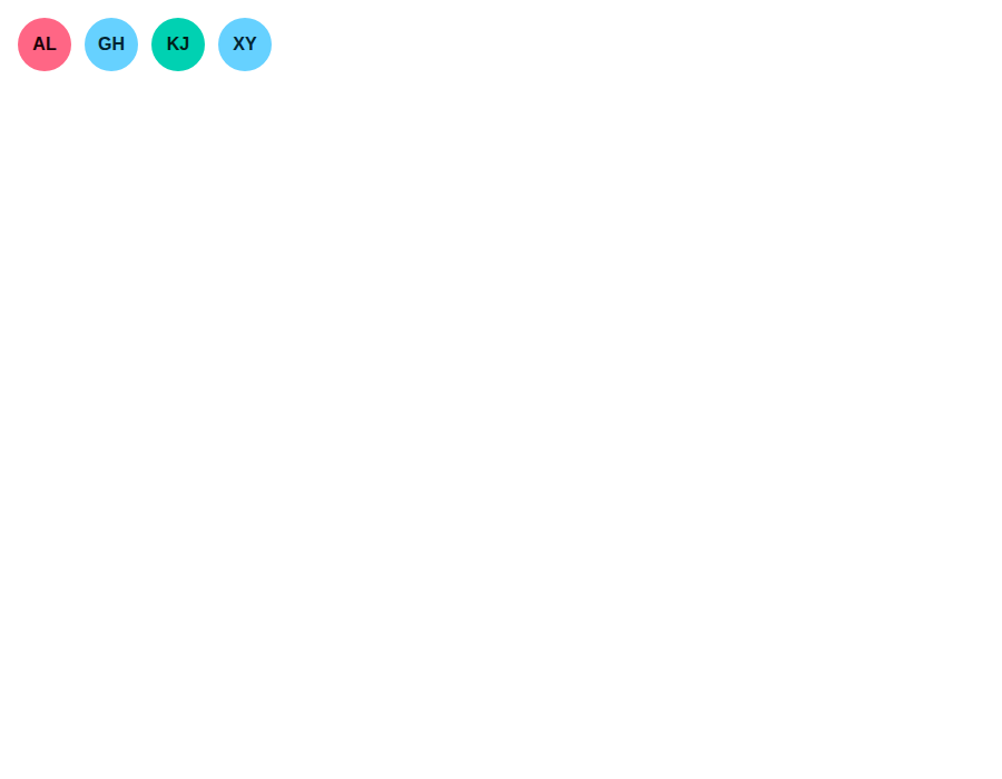 |
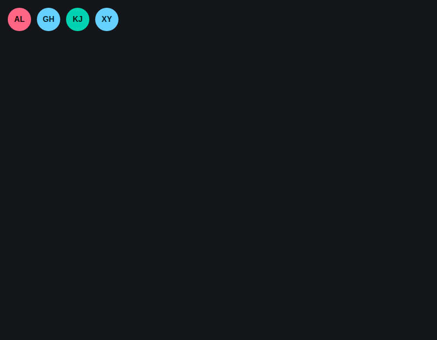 |
components-avatar--icon-fallback · Components/Avatar · Icon Fallback
| Light | Dark |
|---|---|
 |
 |
components-avatar--default-fallback · Components/Avatar · Default Fallback
| Light | Dark |
|---|---|
 |
 |
components-avatar--shapes · Components/Avatar · Shapes
| Light | Dark |
|---|---|
 |
 |
components-card--default · Components/Card · Default
| Light | Dark |
|---|---|
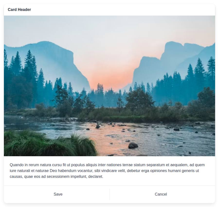 |
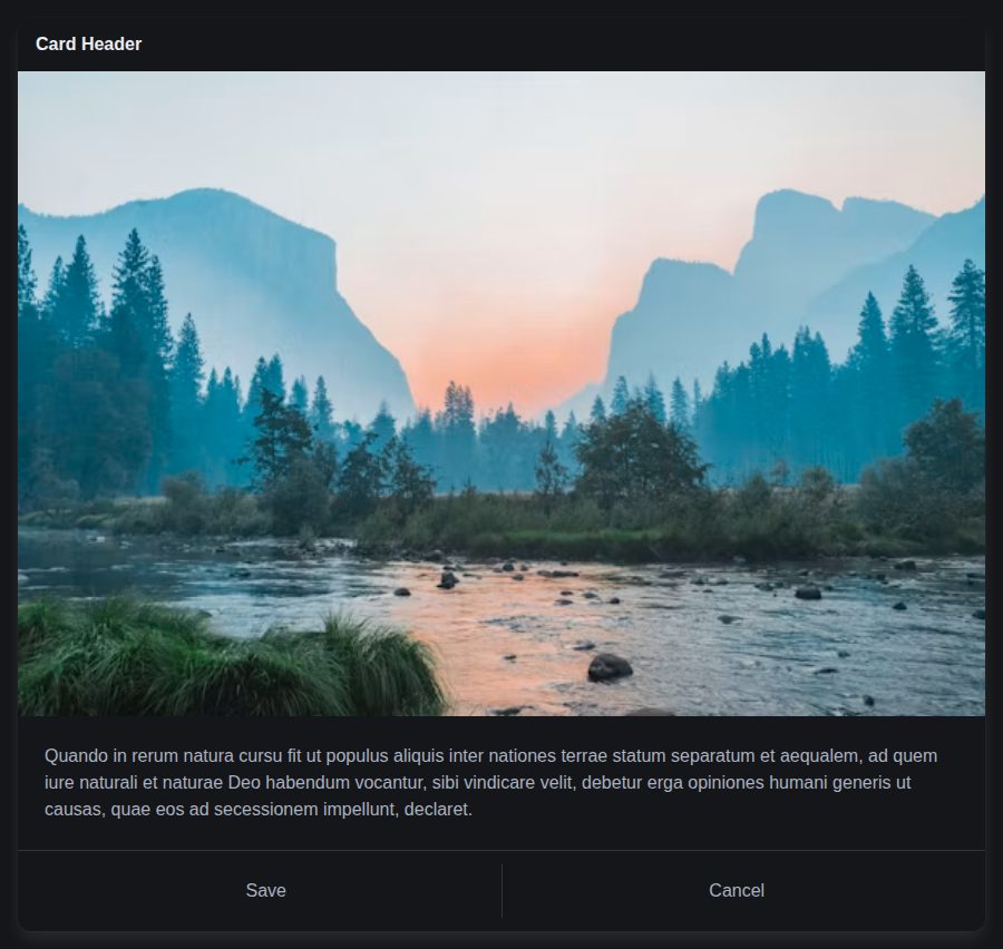 |
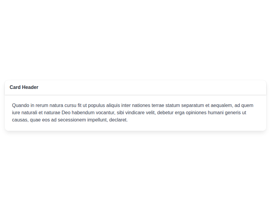
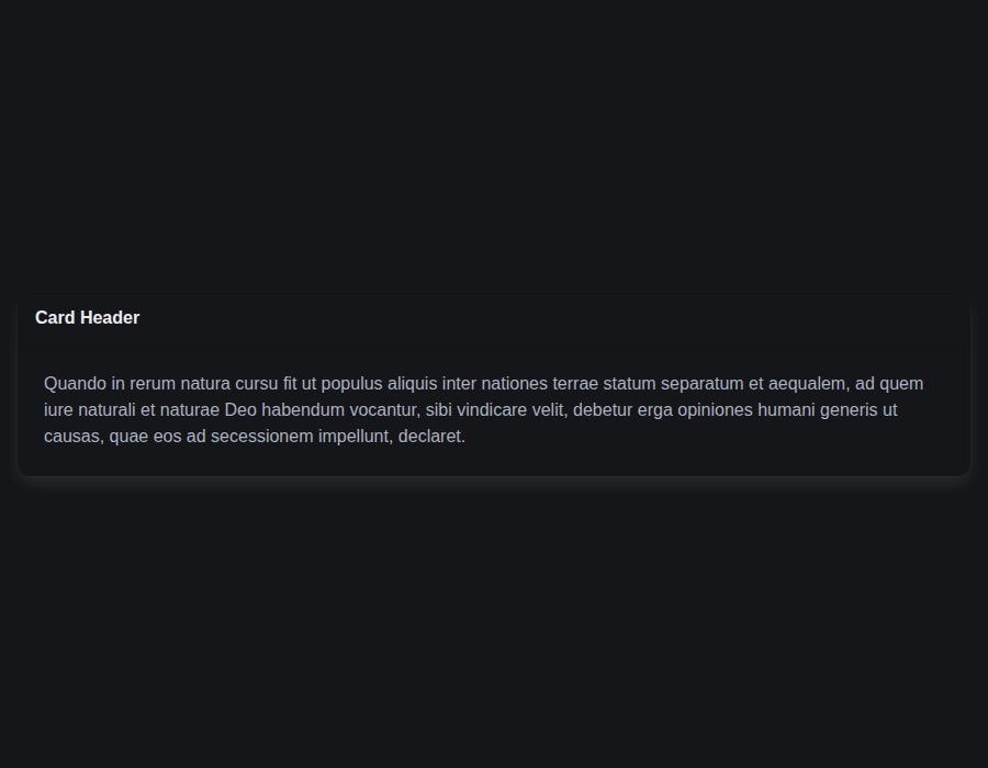
components-card--with-header · Components/Card · With Header
| Light | Dark |
|---|---|
 |
 |
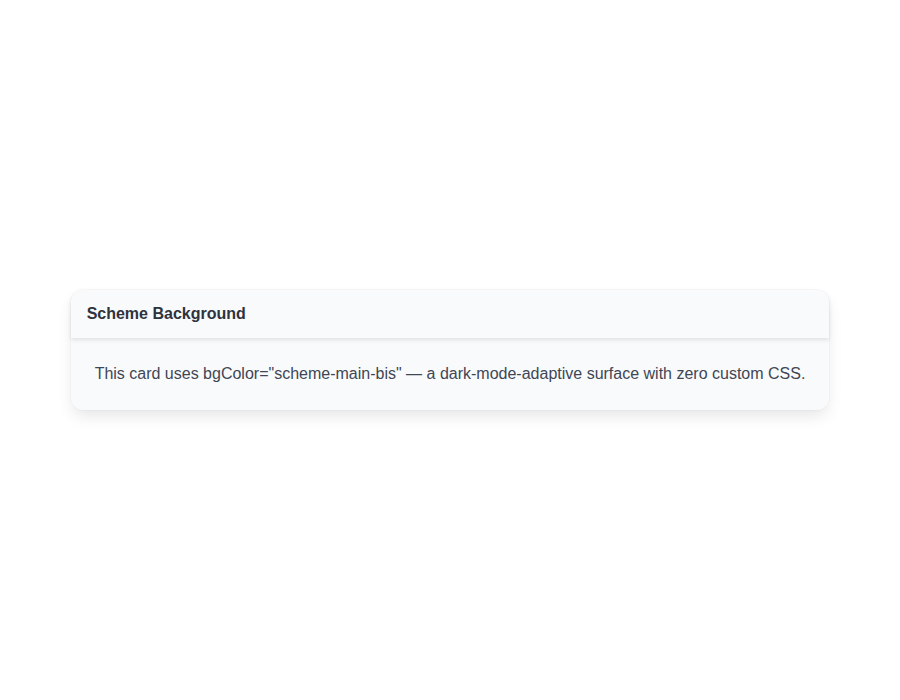
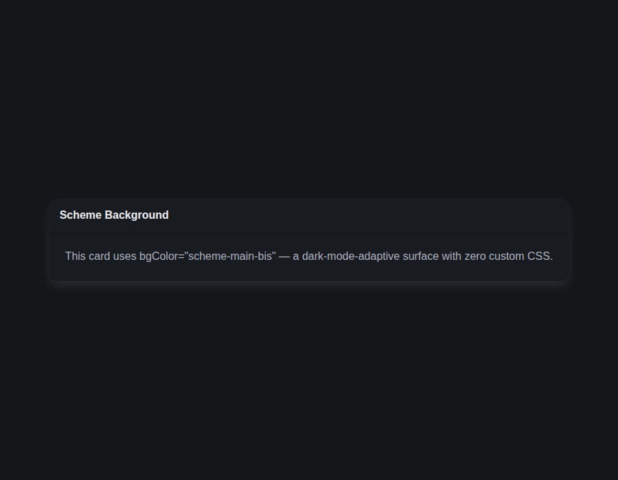
components-card--scheme-background · Components/Card · Scheme Background
| Light | Dark |
|---|---|
 |
 |
components-card--with-footer · Components/Card · With Footer
| Light | Dark |
|---|---|
 |
 |
components-card--with-image · Components/Card · With Image
| Light | Dark |
|---|---|
 |
 |
components-card--image-only · Components/Card · Image Only
| Light | Dark |
|---|---|
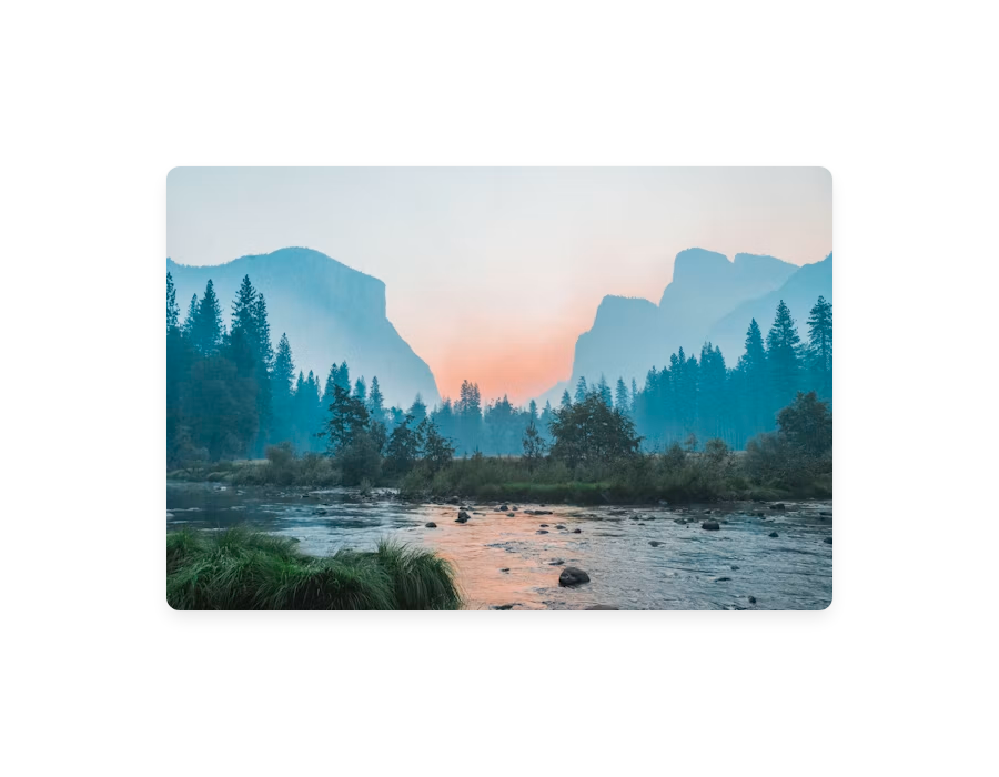 |
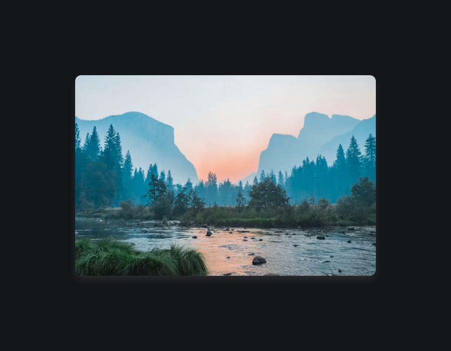 |
components-dropdown--default · Components/Dropdown · Default
| Light | Dark |
|---|---|
 |
 |
components-dropdown--custom-tags · Components/Dropdown · Custom Tags
| Light | Dark |
|---|---|
 |
 |
components-dropdown--hoverable-and-active · Components/Dropdown · Hoverable And Active
| Light | Dark |
|---|---|
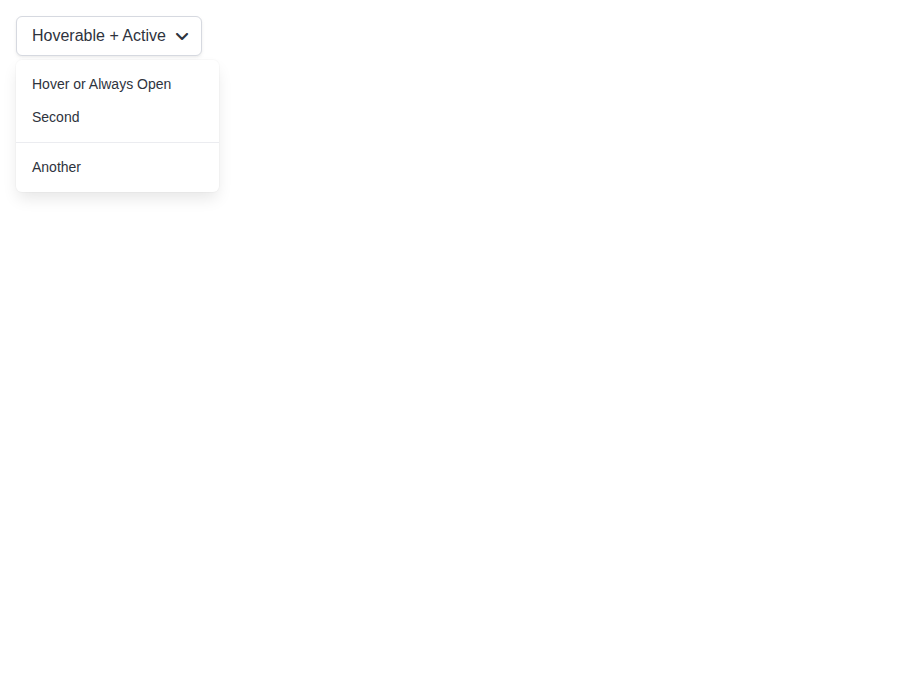 |
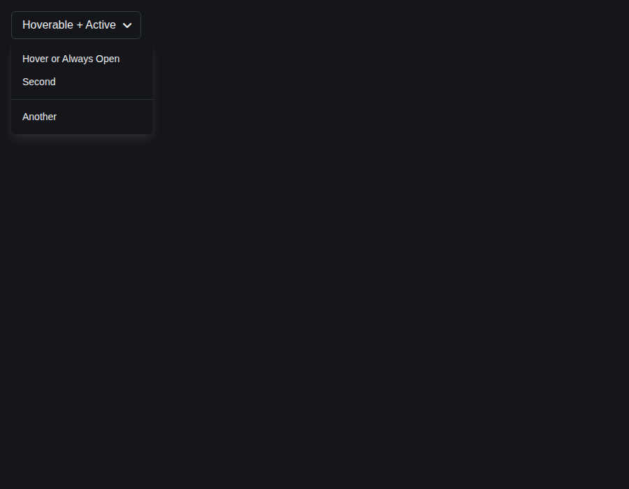 |
components-dropdown--right · Components/Dropdown · Right
| Light | Dark |
|---|---|
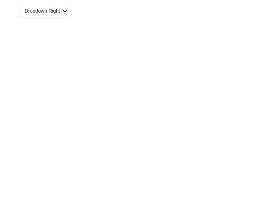 |
 |
components-dropdown--forwarded-ref · Components/Dropdown · Forwarded Ref
| Light | Dark |
|---|---|
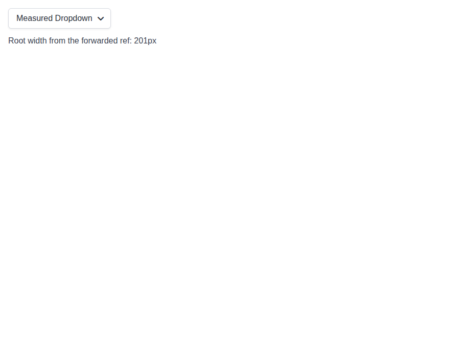 |
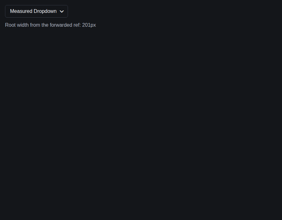 |
components-menu--basic · Components/Menu · Basic
| Light | Dark |
|---|---|
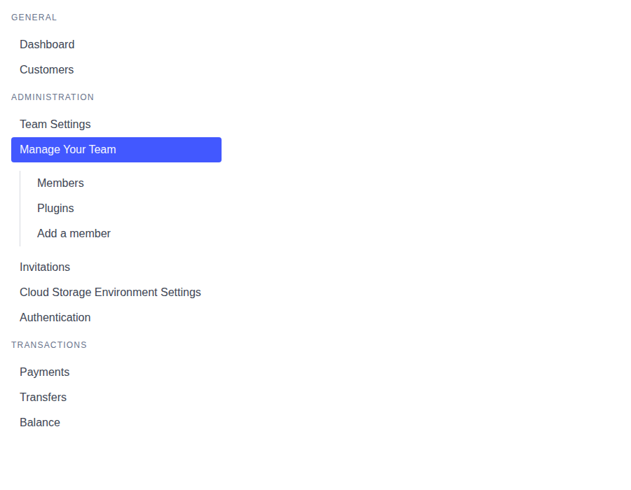 |
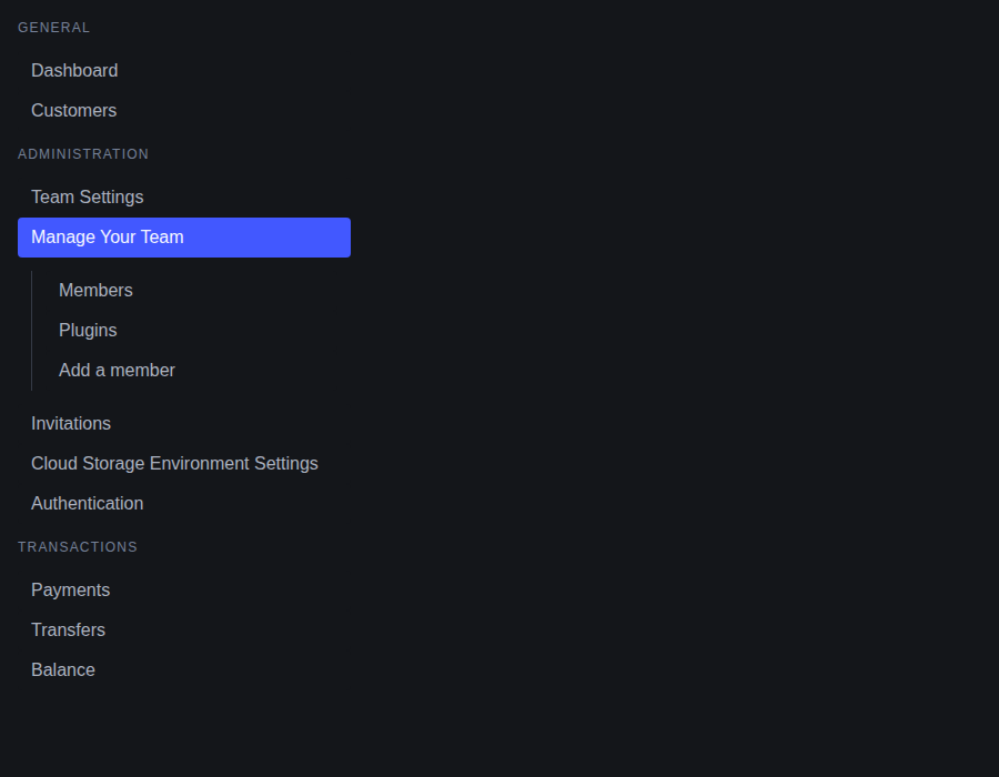 |
components-menu--compound-usage · Components/Menu · Compound Usage
| Light | Dark |
|---|---|
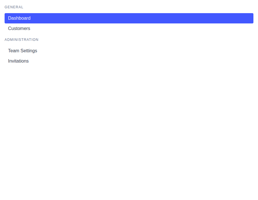 |
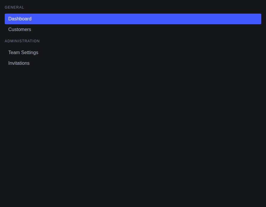 |
components-menu--forwarded-ref · Components/Menu · Forwarded ref (inner element, not the `<li>`)
| Light | Dark |
|---|---|
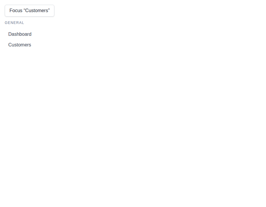 |
 |

# Conflicts:
#	bestax-mcp/data/components/Dropdown.json
#	docs/docs/api/components/avatar.md
Preview DeploymentPreview URL: https://c16b8700.bestax.pages.dev |
Preview DeploymentPreview URL: https://e53706b8.bestax.pages.dev |

## [5.18.2](https://github.com/allxsmith/bestax/compare/@allxsmith/bestax-bulma@5.18.1...@allxsmith/bestax-bulma@5.18.2) (2026-09-30)

### Bug Fixes

* **bulma-ui:** keep button types and Avatar's accessible name through a spread ([#826](#826)) ([dc798d4](dc798d4))
* **bulma-ui:** place toasts and notifications at the position they were shown with ([#834](#834)) ([62feab9](62feab9))
|
🎉 This PR is included in version 5.18.2 🎉 The release is available on: Your semantic-release bot 📦🚀 |
# [1.14.0](https://github.com/allxsmith/bestax/compare/bestax-mcp@1.13.0...bestax-mcp@1.14.0) (2026-10-03)

### Bug Fixes

* **bulma-ui:** announce polite notifications through a status region kept from mount ([#835](#835)) ([c93478d](c93478d))
* **bulma-ui:** answer the granularity review on native input and blur ([7a17486](7a17486))
* **bulma-ui:** color the calendar from the color prop and read TimeInput's wheel variables ([2251e67](2251e67)), closes [#832](#832)
* **bulma-ui:** draw the time wheel focus ring where the wheel's mask shows it ([e1d8c9f](e1d8c9f)), closes [#832](#832)
* **bulma-ui:** fall back when useFocusTrap's initialFocusRef can't take focus ([c191931](c191931))
* **bulma-ui:** give the selected calendar cell a ring that shows on its fill ([b3eecc6](b3eecc6))
* **bulma-ui:** hold Portal to looking a selector up on each render ([8fe02ce](8fe02ce))
* **bulma-ui:** judge image map areas by their image in useFocusTrap ([af7bc59](af7bc59))
* **bulma-ui:** keep button defaults through a spread, and type the buttons that had none ([#853](#853)) ([0810482](0810482))
* **bulma-ui:** keep button types and Avatar's accessible name through a spread ([#826](#826)) ([dc798d4](dc798d4))
* **bulma-ui:** keep the picker focus rings visible in every color ([612aa09](612aa09))
* **bulma-ui:** make useFocusTrap follow radio groups and initialFocusRef past the trap ([d6219d4](d6219d4))
* **bulma-ui:** place toasts and notifications at the position they were shown with ([#834](#834)) ([62feab9](62feab9))
* **bulma-ui:** read clicks and focus inside a shadow root ([474f2cc](474f2cc))
* **bulma-ui:** restore a portaled Modal's focus to an opener in a shadow root ([c564bd3](c564bd3))
* **bulma-ui:** settle Popover's deep review findings ([feadaf4](feadaf4))
* **bulma-ui:** stop Bulma's spinners under reduced motion in every stylesheet ([b234712](b234712)), closes [#770](#770)
* **bulma-ui:** stop TimeInput reopening on the focus its popover hands back ([1c87c15](1c87c15))

### Features

* **bestax-mcp:** publish to the official MCP Registry ([74efc7f](74efc7f))
* **bulma-ui:** add Bulma's position, overflow, radius and aspect-ratio helper props ([#845](#845)) ([64fb91c](64fb91c))
* **bulma-ui:** add Collapses, an accordion group for Collapse ([#849](#849)) ([a12c823](a12c823))
* **bulma-ui:** add Loader, Bulma's inline spinner ([c5e9eb0](c5e9eb0)), closes [#770](#770)
* **bulma-ui:** add month and year pickers to DateInput through granularity ([c4cfc2b](c4cfc2b)), closes [#773](#773)
* **bulma-ui:** add Popover ([2e17fac](2e17fac)), closes [#776](#776)
* **bulma-ui:** export ClientOnly and useIsHydrated ([2c0c1e6](2c0c1e6))
* **bulma-ui:** export Portal ([346d8c2](346d8c2))
* **bulma-ui:** export useFocusTrap, counting the stops the browser's Tab visits ([c304fef](c304fef)), closes [#772](#772)
|
🎉 This PR is included in version 1.14.0 🎉 The release is available on: Your semantic-release bot 📦🚀 |
# [1.2.0](https://github.com/allxsmith/bestax/compare/@allxsmith/eslint-plugin-bestax@1.1.9...@allxsmith/eslint-plugin-bestax@1.2.0) (2026-10-03)

### Bug Fixes

* **bulma-ui:** announce polite notifications through a status region kept from mount ([#835](#835)) ([c93478d](c93478d))
* **bulma-ui:** answer the granularity review on native input and blur ([7a17486](7a17486))
* **bulma-ui:** color the calendar from the color prop and read TimeInput's wheel variables ([2251e67](2251e67)), closes [#832](#832)
* **bulma-ui:** draw the time wheel focus ring where the wheel's mask shows it ([e1d8c9f](e1d8c9f)), closes [#832](#832)
* **bulma-ui:** fall back when useFocusTrap's initialFocusRef can't take focus ([c191931](c191931))
* **bulma-ui:** give the selected calendar cell a ring that shows on its fill ([b3eecc6](b3eecc6))
* **bulma-ui:** hold Portal to looking a selector up on each render ([8fe02ce](8fe02ce))
* **bulma-ui:** judge image map areas by their image in useFocusTrap ([af7bc59](af7bc59))
* **bulma-ui:** keep button defaults through a spread, and type the buttons that had none ([#853](#853)) ([0810482](0810482))
* **bulma-ui:** keep button types and Avatar's accessible name through a spread ([#826](#826)) ([dc798d4](dc798d4))
* **bulma-ui:** keep the picker focus rings visible in every color ([612aa09](612aa09))
* **bulma-ui:** make useFocusTrap follow radio groups and initialFocusRef past the trap ([d6219d4](d6219d4))
* **bulma-ui:** place toasts and notifications at the position they were shown with ([#834](#834)) ([62feab9](62feab9))
* **bulma-ui:** read clicks and focus inside a shadow root ([474f2cc](474f2cc))
* **bulma-ui:** restore a portaled Modal's focus to an opener in a shadow root ([c564bd3](c564bd3))
* **bulma-ui:** settle Popover's deep review findings ([feadaf4](feadaf4))
* **bulma-ui:** stop Bulma's spinners under reduced motion in every stylesheet ([b234712](b234712)), closes [#770](#770)
* **bulma-ui:** stop TimeInput reopening on the focus its popover hands back ([1c87c15](1c87c15))
* **eslint-plugin:** judge Columns' gap by its own steps, and lengths as lengths ([4786c8d](4786c8d))

### Features

* **bestax-mcp:** publish to the official MCP Registry ([74efc7f](74efc7f))
* **bulma-ui:** add Bulma's gap helper props to every component ([#877](#877)) ([1bd4abc](1bd4abc))
* **bulma-ui:** add Bulma's position, overflow, radius and aspect-ratio helper props ([#845](#845)) ([64fb91c](64fb91c))
* **bulma-ui:** add Collapses, an accordion group for Collapse ([#849](#849)) ([a12c823](a12c823))
* **bulma-ui:** add Loader, Bulma's inline spinner ([c5e9eb0](c5e9eb0)), closes [#770](#770)
* **bulma-ui:** add month and year pickers to DateInput through granularity ([c4cfc2b](c4cfc2b)), closes [#773](#773)
* **bulma-ui:** add Popover ([2e17fac](2e17fac)), closes [#776](#776)
* **bulma-ui:** export ClientOnly and useIsHydrated ([2c0c1e6](2c0c1e6))
* **bulma-ui:** export Portal ([346d8c2](346d8c2))
* **bulma-ui:** export useFocusTrap, counting the stops the browser's Tab visits ([c304fef](c304fef)), closes [#772](#772)
* **bulma-ui:** make columnGap the column gap helper on Theme ([eb2c611](eb2c611)), closes [#694](#694)
* **eslint-plugin:** check the gap helper props ([b53a749](b53a749))
# [2.25.0](https://github.com/allxsmith/bestax/compare/bestax-migrate@2.24.0...bestax-migrate@2.25.0) (2026-10-07)

### Bug Fixes

* **bulma-ui:** announce polite notifications through a status region kept from mount ([#835](#835)) ([c93478d](c93478d))
* **bulma-ui:** answer the granularity review on native input and blur ([7a17486](7a17486))
* **bulma-ui:** attach useFocusTrap to a container that mounts after it turns on ([17a944d](17a944d))
* **bulma-ui:** bring File and Taginput under the bare-Control Field rule ([cdaa6c2](cdaa6c2))
* **bulma-ui:** clear a picker's unused seed whenever its popover closes ([cbe86c5](cbe86c5))
* **bulma-ui:** color the calendar from the color prop and read TimeInput's wheel variables ([2251e67](2251e67)), closes [#832](#832)
* **bulma-ui:** commit nothing when a picker popover is dismissed ([0a46209](0a46209))
* **bulma-ui:** commit nothing when Enter confirms untouched picker text ([773e146](773e146))
* **bulma-ui:** commit nothing when focus leaves a picker untouched ([30b4849](30b4849))
* **bulma-ui:** draw the time wheel focus ring where the wheel's mask shows it ([e1d8c9f](e1d8c9f)), closes [#832](#832)
* **bulma-ui:** fall back when useFocusTrap's initialFocusRef can't take focus ([c191931](c191931))
* **bulma-ui:** fire the pickers' onOpen and onClose once under StrictMode ([#896](#896)) ([20b51ed](20b51ed))
* **bulma-ui:** give the selected calendar cell a ring that shows on its fill ([b3eecc6](b3eecc6))
* **bulma-ui:** hide a picker's launcher for a loading Control it sits in ([9a3888e](9a3888e))
* **bulma-ui:** hide a picker's launcher only for the spinner it draws ([7a28a0e](7a28a0e))
* **bulma-ui:** hold Portal to looking a selector up on each render ([8fe02ce](8fe02ce))
* **bulma-ui:** hold the year-1 floor under a max before it ([4f6eb18](4f6eb18))
* **bulma-ui:** judge image map areas by their image in useFocusTrap ([af7bc59](af7bc59))
* **bulma-ui:** keep a tab stop in the year list when the year falls outside it ([fe028c1](fe028c1))
* **bulma-ui:** keep an empty picker's seed while a portaled popover is open ([1e66528](1e66528))
* **bulma-ui:** keep an inline date picker's calendar on its released id ([c26da07](c26da07)), closes [#897](#897) [#897](#897)
* **bulma-ui:** keep button defaults through a spread, and type the buttons that had none ([#853](#853)) ([0810482](0810482))
* **bulma-ui:** keep button types and Avatar's accessible name through a spread ([#826](#826)) ([dc798d4](dc798d4))
* **bulma-ui:** keep the Field for horizontal and fieldClassName in a bare Control ([e4dc513](e4dc513))
* **bulma-ui:** keep the picker focus rings visible in every color ([612aa09](612aa09))
* **bulma-ui:** let focus follow the keys in an inline calendar, and skip disabled days for the tab stop ([#885](#885)) ([f55af27](f55af27))
* **bulma-ui:** let the picker bases give way to a loading Control too ([66e803a](66e803a))
* **bulma-ui:** let useFocusTrap go of a container that leaves while it is on ([8c56d7a](8c56d7a))
* **bulma-ui:** make auto leave room for an in-place picker panel's themed offset ([8c534bd](8c534bd)), closes [#904](#904)
* **bulma-ui:** make Theme colorMode switch the scheme under the prefixed builds ([#894](#894)) ([2bd6ec2](2bd6ec2))
* **bulma-ui:** make useFocusTrap follow radio groups and initialFocusRef past the trap ([d6219d4](d6219d4))
* **bulma-ui:** match a picker's opening focus only inside its calendar ([e3c22ed](e3c22ed))
* **bulma-ui:** place a portaled picker panel by its coordinates alone ([#886](#886)) ([040299b](040299b))
* **bulma-ui:** place toasts and notifications at the position they were shown with ([#834](#834)) ([62feab9](62feab9))
* **bulma-ui:** read clicks and focus inside a shadow root ([474f2cc](474f2cc))
* **bulma-ui:** read picker bounds and months in years 0 to 99 as written ([#890](#890)) ([02fb619](02fb619))
* **bulma-ui:** restore a portaled Modal's focus to an opener in a shadow root ([c564bd3](c564bd3))
* **bulma-ui:** return focus to the input when a date picker closes ([b741264](b741264))
* **bulma-ui:** settle Popover's deep review findings ([feadaf4](feadaf4))
* **bulma-ui:** start a date picker's focus on the focused cell ([#897](#897)) ([6a55714](6a55714))
* **bulma-ui:** stop Bulma's spinners under reduced motion in every stylesheet ([b234712](b234712)), closes [#770](#770)
* **bulma-ui:** stop form wrappers nesting a Field in a bare Control ([2c6d295](2c6d295))
* **bulma-ui:** stop the date pickers at year 1 ([853142a](853142a))
* **bulma-ui:** stop the indeterminate progress bar and skeleton pulse under reduced motion ([bcf5407](bcf5407))
* **bulma-ui:** stop the Rate pop and DateTimeInput scrim under reduced motion ([3a59129](3a59129))
* **bulma-ui:** stop TimeInput reopening on the focus its popover hands back ([1c87c15](1c87c15))
* **bulma-ui:** warn when a root Theme drops its className and helpers ([05c10e0](05c10e0))
* **eslint-plugin:** judge Columns' gap by its own steps, and lengths as lengths ([4786c8d](4786c8d))

### Features

* **bestax-mcp:** publish to the official MCP Registry ([74efc7f](74efc7f))
* **bestax-migrate:** convert the gap, position, overflow, radius and aspect-ratio helpers ([13dcf63](13dcf63))
* **bulma-ui:** add Bulma's gap helper props to every component ([#877](#877)) ([1bd4abc](1bd4abc))
* **bulma-ui:** add Bulma's position, overflow, radius and aspect-ratio helper props ([#845](#845)) ([64fb91c](64fb91c))
* **bulma-ui:** add Collapses, an accordion group for Collapse ([#849](#849)) ([a12c823](a12c823))
* **bulma-ui:** add Loader, Bulma's inline spinner ([c5e9eb0](c5e9eb0)), closes [#770](#770)
* **bulma-ui:** add month and year pickers to DateInput through granularity ([c4cfc2b](c4cfc2b)), closes [#773](#773)
* **bulma-ui:** add Popover ([2e17fac](2e17fac)), closes [#776](#776)
* **bulma-ui:** export ClientOnly and useIsHydrated ([2c0c1e6](2c0c1e6))
* **bulma-ui:** export Portal ([346d8c2](346d8c2))
* **bulma-ui:** export useFocusTrap, counting the stops the browser's Tab visits ([c304fef](c304fef)), closes [#772](#772)
* **bulma-ui:** make columnGap the column gap helper on Theme ([eb2c611](eb2c611)), closes [#694](#694)
* **eslint-plugin:** check the gap helper props ([b53a749](b53a749))
|
🎉 This PR is included in version 2.25.0 🎉 The release is available on: Your semantic-release bot 📦🚀 |
## [4.2.13](https://github.com/allxsmith/bestax/compare/create-bestax@4.2.12...create-bestax@4.2.13) (2026-10-08)

### Bug Fixes

* **bestax-mcp:** give .image's ratios their reason in the lookup ([3ea4d0c](3ea4d0c))
* **bestax-mcp:** say an .image converts around elements written out, not an expression ([49bb27b](49bb27b))
* **bestax-migrate:** convert an .image around its children only when they're elements ([ff99907](ff99907))
* **bestax-migrate:** flag react-bulma-components Pagination's delta={0} rather than renaming it ([e339ff1](e339ff1))
* **bestax-migrate:** keep a .menu-list around a bestax Menu.List as markup ([2119c3f](2119c3f))
* **bestax-migrate:** keep a Modal part as markup inside an existing bestax Modal ([cfd5f15](cfd5f15))
* **bestax-migrate:** keep a named anchor as markup instead of saying its name does nothing ([74dc360](74dc360)), closes [#fragment](https://github.com/allxsmith/bestax/issues/fragment)
* **bestax-migrate:** keep a page link as markup when its li is a component's only child ([0e72683](0e72683))
* **bestax-migrate:** know a bestax part imported under its flat export ([7a325ee](7a325ee))
* **bestax-migrate:** leave a wrapper tag alone when none of its classes would become a prop ([2397b9d](2397b9d))
* **bestax-migrate:** leave a wrapper tag with no helper class alone, TODOs and all ([1167a29](1167a29))
* **bestax-migrate:** map react-bulma-components Pagination onto the props it now renders from ([6cd4b51](6cd4b51))
* **bestax-migrate:** rename rbx innerRef to ref on a plain Navbar.Item too ([bb6ace0](bb6ace0)), closes [#734](#734)
* **bestax-migrate:** say why .image's ratios stay classes ([2fbfbd5](2fbfbd5))
* **bestax-migrate:** write a File text with a backslash as a string ([212831e](212831e))
* **bestax-migrate:** write a tabIndex string as a number on every root ([546bf8a](546bf8a)), closes [#814](#814)
* **bestax-migrate:** write isFullwidth from react-bulma-components too ([01da047](01da047))
* **bestax-migrate:** write isFullwidth rather than its deprecated alias from bloomer ([c2a1d22](c2a1d22)), closes [#680](#680)
* **bulma-ui:** announce polite notifications through a status region kept from mount ([#835](#835)) ([c93478d](c93478d))
* **bulma-ui:** answer the granularity review on native input and blur ([7a17486](7a17486))
* **bulma-ui:** apply textColor helper class on Navbar Menu, Start, End, and Burger ([#792](#792)) ([feb83c8](feb83c8))
* **bulma-ui:** attach useFocusTrap to a container that mounts after it turns on ([17a944d](17a944d))
* **bulma-ui:** avoid empty class attribute on several components ([#793](#793)) ([7c5c316](7c5c316))
* **bulma-ui:** bring File and Taginput under the bare-Control Field rule ([cdaa6c2](cdaa6c2))
* **bulma-ui:** clear a picker's unused seed whenever its popover closes ([cbe86c5](cbe86c5))
* **bulma-ui:** close a picker's popover on Alt+ArrowUp from inside it ([b6da4ef](b6da4ef))
* **bulma-ui:** color the calendar from the color prop and read TimeInput's wheel variables ([2251e67](2251e67)), closes [#832](#832)
* **bulma-ui:** color TimeInput's wheels from the color prop ([#832](#832)) ([ad370c9](ad370c9))
* **bulma-ui:** commit nothing when a picker popover is dismissed ([0a46209](0a46209))
* **bulma-ui:** commit nothing when Enter confirms untouched picker text ([773e146](773e146))
* **bulma-ui:** commit nothing when focus leaves a picker untouched ([30b4849](30b4849))
* **bulma-ui:** document the checkbox, radio and switch color and size tuples ([bd39ff3](bd39ff3))
* **bulma-ui:** draw the time wheel focus ring where the wheel's mask shows it ([e1d8c9f](e1d8c9f)), closes [#832](#832)
* **bulma-ui:** drop the openOnFocus TSDoc reason that only holds for segments ([efde0d9](efde0d9))
* **bulma-ui:** Dropdown items withhold attributes by tag and answer Enter and Space ([#827](#827)) ([f6aeb2d](f6aeb2d))
* **bulma-ui:** fall back when useFocusTrap's initialFocusRef can't take focus ([c191931](c191931))
* **bulma-ui:** fire the pickers' onOpen and onClose once under StrictMode ([#896](#896)) ([20b51ed](20b51ed))
* **bulma-ui:** give the calendar's day grid rows of a week ([971a196](971a196)), closes [#774](#774)
* **bulma-ui:** give the selected calendar cell a ring that shows on its fill ([b3eecc6](b3eecc6))
* **bulma-ui:** hide a picker's launcher for a loading Control it sits in ([9a3888e](9a3888e))
* **bulma-ui:** hide a picker's launcher only for the spinner it draws ([7a28a0e](7a28a0e))
* **bulma-ui:** hold Portal to looking a selector up on each render ([8fe02ce](8fe02ce))
* **bulma-ui:** hold the year-1 floor under a max before it ([4f6eb18](4f6eb18))
* **bulma-ui:** judge image map areas by their image in useFocusTrap ([af7bc59](af7bc59))
* **bulma-ui:** keep a range's end while the start's digits are coming ([8d1f862](8d1f862))
* **bulma-ui:** keep a read-only date or time picker closed on ArrowDown ([ba74bf7](ba74bf7))
* **bulma-ui:** keep a tab stop in the year list when the year falls outside it ([fe028c1](fe028c1))
* **bulma-ui:** keep an empty picker's seed while a portaled popover is open ([1e66528](1e66528))
* **bulma-ui:** keep an inline date picker's calendar on its released id ([c26da07](c26da07)), closes [#897](#897) [#897](#897)
* **bulma-ui:** keep button defaults through a spread, and type the buttons that had none ([#853](#853)) ([0810482](0810482))
* **bulma-ui:** keep button types and Avatar's accessible name through a spread ([#826](#826)) ([dc798d4](dc798d4))
* **bulma-ui:** keep menuitemcheckbox and menuitemradio items in Dropdown's arrow-key order ([#786](#786)) ([064155a](064155a))
* **bulma-ui:** keep Numberinput's buttons in a row inside Field > Control ([4dff84c](4dff84c))
* **bulma-ui:** keep Numberinput's Field examples in a row and labelled ([c937c88](c937c88))
* **bulma-ui:** keep radiusless zeroing the radius inside a Theme ([07db6a3](07db6a3)), closes [#829](#829) [#694](#694)
* **bulma-ui:** keep the calendar behind DateTimeInput's time wheels out of reach ([c7f674c](c7f674c))
* **bulma-ui:** keep the clock's seconds out of a picked date and time ([0af2e71](0af2e71))
* **bulma-ui:** keep the Field for horizontal and fieldClassName in a bare Control ([e4dc513](e4dc513))
* **bulma-ui:** keep the picker focus rings visible in every color ([612aa09](612aa09))
* **bulma-ui:** keep the range band under the pointer in the calendar ([c1f2008](c1f2008))
* **bulma-ui:** key the Avatar link warning on the element and attributes ([e628eba](e628eba)), closes [#733](#733) [#733](#733)
* **bulma-ui:** key the Control-level warning by its advice ([24cda3d](24cda3d))
* **bulma-ui:** leave keys on a control inside a tab to that control ([4a9f7b6](4a9f7b6))
* **bulma-ui:** leave rel out of the Avatar link attribute warning ([b059476](b059476)), closes [#733](#733) [#733](#733)
* **bulma-ui:** let Autocomplete's clear button give way to a loading spinner ([5c11fb2](5c11fb2))
* **bulma-ui:** let Escape in a popover's year dropdown go back to the grid ([a8b1dbf](a8b1dbf)), closes [#901](#901)
* **bulma-ui:** let File's picked-files count be reworded, and document its name in the label ([e86545c](e86545c))
* **bulma-ui:** let focus follow the keys in an inline calendar, and skip disabled days for the tab stop ([#885](#885)) ([f55af27](f55af27))
* **bulma-ui:** let several isRoot Themes share the :root style element ([04f399f](04f399f)), closes [#736](#736)
* **bulma-ui:** let the arrow keys move through the calendar's year dropdown ([6abc329](6abc329)), closes [#901](#901)
* **bulma-ui:** let the picker bases give way to a loading Control too ([66e803a](66e803a))
* **bulma-ui:** let useFocusTrap go of a container that leaves while it is on ([8c56d7a](8c56d7a))
* **bulma-ui:** let warnOnce decide when the Avatar link warning fires ([1a5965c](1a5965c)), closes [#733](#733)
* **bulma-ui:** make ArrowUp raise a time wheel's value ([c27c310](c27c310))
* **bulma-ui:** make auto leave room for an in-place picker panel's themed offset ([8c534bd](8c534bd)), closes [#904](#904)
* **bulma-ui:** make Tabs keyboard operable with the WAI-ARIA tabs pattern ([fe0e7ef](fe0e7ef))
* **bulma-ui:** make Theme colorMode switch the scheme under the prefixed builds ([#894](#894)) ([2bd6ec2](2bd6ec2))
* **bulma-ui:** make Theme's radius the helper it is typed as ([36c73d3](36c73d3)), closes [#694](#694)
* **bulma-ui:** make useFocusTrap follow radio groups and initialFocusRef past the trap ([d6219d4](d6219d4))
* **bulma-ui:** match a picker's opening focus only inside its calendar ([e3c22ed](e3c22ed))
* **bulma-ui:** merge className into Navbar.Divider instead of overwriting it ([#791](#791)) ([fcc0d51](fcc0d51))
* **bulma-ui:** move focus into DateTimeInput's time wheels as they open ([adfa9db](adfa9db))
* **bulma-ui:** move the year dropdown's tab stop with the arrow keys ([f56daf5](f56daf5))
* **bulma-ui:** name a picker's default icon when its icon size or column moves ([6f6de39](6f6de39))
* **bulma-ui:** name custom elements among the targets that get Avatar's target and rel ([a962259](a962259)), closes [#733](#733)
* **bulma-ui:** name DateRangeInput's default icon in its Control-level warning ([15cbbb8](15cbbb8)), closes [#952](#952)
* **bulma-ui:** name DateRangeInput's default icon in its Control-level warning ([9cbe7ca](9cbe7ca)), closes [#952](#952)
* **bulma-ui:** name Pagination's page links, and read a count that's no number as its default ([0a1cf06](0a1cf06))
* **bulma-ui:** open DateRangeInput's popover on Alt+ArrowDown, as the other pickers ([c0e22ec](c0e22ec))
* **bulma-ui:** open the date and time popovers on Alt+ArrowDown ([6db22cc](6db22cc))
* **bulma-ui:** order the Tabs fallback stop by index and style disabled tabs ([eefd283](eefd283))
* **bulma-ui:** pick a DateInput day at midnight by key as by click ([92c27ca](92c27ca))
* **bulma-ui:** place a portaled picker panel by its coordinates alone ([#886](#886)) ([040299b](040299b))
* **bulma-ui:** place toasts and notifications at the position they were shown with ([#834](#834)) ([62feab9](62feab9))
* **bulma-ui:** prefix the is-current and is-disabled classes on Pagination's parts ([c9a5fae](c9a5fae))
* **bulma-ui:** reach Taginput's delete buttons and Autocomplete's clear button ([21a064b](21a064b))
* **bulma-ui:** read a Pagination current page that's no number as the first ([68e963b](68e963b))
* **bulma-ui:** read clicks and focus inside a shadow root ([474f2cc](474f2cc))
* **bulma-ui:** read picker bounds and months in years 0 to 99 as written ([#890](#890)) ([02fb619](02fb619))
* **bulma-ui:** render the four burger spans Bulma v1 positions ([#785](#785)) ([8e4e1e6](8e4e1e6))
* **bulma-ui:** restore a portaled Modal's focus to an opener in a shadow root ([c564bd3](c564bd3))
* **bulma-ui:** return focus to the input when a date picker closes ([b741264](b741264))
* **bulma-ui:** say a picked DateTimeInput day keeps milliseconds and meets the bounds ([3536467](3536467))
* **bulma-ui:** say Tab reaches DateRangeInput's end input only when typing ([d2d3d1a](d2d3d1a))
* **bulma-ui:** say where Numberinput goes bare and test bare={false} in a Field ([0461631](0461631))
* **bulma-ui:** send a press on DateRangeInput's field to the nearer input ([f06b2b0](f06b2b0))
* **bulma-ui:** settle Popover's deep review findings ([feadaf4](feadaf4))
* **bulma-ui:** show the picked file with File's hasName and add a keyboard focus ring ([7881db4](7881db4))
* **bulma-ui:** show toasts, notifications and dialogs raised before their container mounts ([#828](#828)) ([2ab4493](2ab4493))
* **bulma-ui:** skip the Avatar target warning on elements with their own target ([27b58f4](27b58f4)), closes [#733](#733)
* **bulma-ui:** start a date picker's focus on the focused cell ([#897](#897)) ([6a55714](6a55714))
* **bulma-ui:** stop Bulma's spinners under reduced motion in every stylesheet ([b234712](b234712)), closes [#770](#770)
* **bulma-ui:** stop form wrappers nesting a Field in a bare Control ([2c6d295](2c6d295))
* **bulma-ui:** stop shipping test-only exports, and document notification() ([#781](#781)) ([5f95398](5f95398))
* **bulma-ui:** stop the date pickers at year 1 ([853142a](853142a))
* **bulma-ui:** stop the indeterminate progress bar and skeleton pulse under reduced motion ([bcf5407](bcf5407))
* **bulma-ui:** stop the Rate pop and DateTimeInput scrim under reduced motion ([3a59129](3a59129))
* **bulma-ui:** stop TimeInput reopening on the focus its popover hands back ([1c87c15](1c87c15))
* **bulma-ui:** strip the Avatar link warning from production builds ([a243fa5](a243fa5)), closes [#733](#733)
* **bulma-ui:** warn about a dropped Avatar href only for an as the caller wrote ([c93b27c](c93b27c)), closes [#733](#733)
* **bulma-ui:** warn in development when Avatar drops an href on a non-link as ([c76e632](c76e632)), closes [#733](#733)
* **bulma-ui:** warn when a root Theme drops its className and helpers ([05c10e0](05c10e0))
* **bulma-ui:** warn when a wrapper inside a Control drops its Control-level props ([cbf434b](cbf434b)), closes [#921](#921)
* **bulma-ui:** warn when an inline picker drops its Control-level props ([f0494bd](f0494bd)), closes [#921](#921)
* **bulma-ui:** warn when Avatar drops a target or rel on a non-link as ([50c385e](50c385e)), closes [#733](#733) [#733](#733)
* **create-bestax:** check the react ranges fit the library's peers, not equal them ([8ae5a0c](8ae5a0c)), closes [#950](#950)
* **create-bestax:** import the icon CSS for every Bulma flavor, not only complete ([a712b91](a712b91)), closes [#946](#946)
* **create-bestax:** install react and react-dom so Yarn 1 reports no unmet peers ([9c9814c](9c9814c)), closes [#644](#644) [#950](#950)
* **create-bestax:** name the files the overwrite prompt removes, and stop on a file path ([39b6232](39b6232)), closes [#945](#945)
* **create-bestax:** never empty a non-empty folder under -y, and validate flags first ([917f195](917f195)), closes [#950](#950) [#945](#945) [#950](#950)
* **create-bestax:** warn when the icon CSS import has nowhere to go ([f7f0b64](f7f0b64)), closes [#946](#946) [#946](#946)
* **eslint-plugin:** judge Columns' gap by its own steps, and lengths as lengths ([4786c8d](4786c8d))
* **eslint-plugin:** report .file as a class the codemod converts ([72a32c9](72a32c9))
* **eslint-plugin:** report .image with the message for a class the codemod converts ([d27c19b](d27c19b))
* **eslint-plugin:** report .menu, .menu-label and .menu-list with the converts message ([8ffaccc](8ffaccc))
* **eslint-plugin:** report .select and .breadcrumb as converted ([a9d8082](a9d8082))
* **eslint-plugin:** report Bulma form markup as classes the codemod converts ([128e832](128e832))
* **eslint-plugin:** report Bulma skeletons as converted ([04ca4ee](04ca4ee))
* **eslint-plugin:** report Modal's parts with the message for a class the codemod converts ([87f3c08](87f3c08))
* **eslint-plugin:** report Pagination's converting parts with the converts message ([6b94f14](6b94f14))
* **eslint-plugin:** report the pagination links and ellipsis as classes the codemod converts ([54ba0b3](54ba0b3))
* **eslint-plugin:** report Theme's deprecated radius route accurately ([5605816](5605816)), closes [#694](#694)
* **eslint-plugin:** suggest radiusless for a near miss on Theme ([21aa9a7](21aa9a7)), closes [#694](#694)

### Features

* **bestax-mcp:** look up .image as Image, with the props it takes from its <img> ([3e63230](3e63230))
* **bestax-mcp:** look up .menu and its label and list as Menu's parts ([f9fe7cd](f9fe7cd))
* **bestax-mcp:** look up Card's title and footer items on the tags their as takes ([ba8193e](ba8193e))
* **bestax-mcp:** look up Modal's parts as components ([b71583a](b71583a))
* **bestax-mcp:** look up Pagination, its list and its previous and next links as components ([f1298df](f1298df))
* **bestax-mcp:** look up the bestax component and props for a Bulma class string ([4a4b246](4a4b246)), closes [#744](#744)
* **bestax-mcp:** publish to the official MCP Registry ([74efc7f](74efc7f))
* **bestax-mcp:** say a Bulma field wraps its children only when horizontal ([929bc82](929bc82))
* **bestax-mcp:** say an .image converts around anything but a bare <img> ([60e9219](60e9219))
* **bestax-mcp:** say Menu.List renders .menu-list only at the top level ([dcce74f](dcce74f))
* **bestax-mcp:** say when a component renders the children from a count ([b60c295](b60c295))
* **bestax-mcp:** say when a component renders the element inside it ([4ced25c](4ced25c))
* **bestax-mcp:** say when a component renders the li around its element, or its own text ([8fd3faf](8fd3faf))
* **bestax-mcp:** say when a component renders the whole .file tree from props ([976d8a3](976d8a3))
* **bestax-migrate:** convert .file inside a Field, building its tree from props ([724dff5](724dff5)), closes [#809](#809)
* **bestax-migrate:** convert .icon-text, building its icons from props ([#823](#823)) ([933868f](933868f))
* **bestax-migrate:** convert .menu, its labels and its top-level lists ([02f4db6](02f4db6))
* **bestax-migrate:** convert .select and .breadcrumb with the element inside them ([d76c569](d76c569))
* **bestax-migrate:** convert .tabs and .icon around their children ([#815](#815)) ([3967a80](3967a80))
* **bestax-migrate:** convert a menu list's items to Menu.Item ([#816](#816)) ([b385687](b385687))
* **bestax-migrate:** convert an .image and its <img> to Image ([d4f3673](d4f3673)), closes [#793](#793)
* **bestax-migrate:** convert an .image around anything but a bare <img> ([0a31c5b](0a31c5b)), closes [#801](#801)
* **bestax-migrate:** convert Bulma cards built from their parts ([#752](#752)) ([1b08e17](1b08e17))
* **bestax-migrate:** convert Bulma form fields, controls, inputs and textareas ([3da788d](3da788d)), closes [#743](#743)
* **bestax-migrate:** convert Bulma grids and cells ([#760](#760)) ([22adc7c](22adc7c)), closes [#743](#743)
* **bestax-migrate:** convert Bulma navbars ([#754](#754)) ([02fdd72](02fdd72))
* **bestax-migrate:** convert Bulma skeletons ([2574ace](2574ace))
* **bestax-migrate:** convert Card's title and footer items on the tags their as takes ([20bc0c6](20bc0c6)), closes [#794](#794)
* **bestax-migrate:** convert conditional classes in clsx and classnames calls ([8948cce](8948cce))
* **bestax-migrate:** convert Modal's parts element by element ([4d41ad2](4d41ad2)), closes [#805](#805)
* **bestax-migrate:** convert navbar dividers with classes, and navbar text colors ([#796](#796)) ([c97c7e9](c97c7e9))
* **bestax-migrate:** convert Pagination, its list and its previous and next links ([d75bc70](d75bc70)), closes [#807](#807)
* **bestax-migrate:** convert Pagination's page links and ellipsis in their li's place ([ae720fa](ae720fa)), closes [#809](#809)
* **bestax-migrate:** convert Panel and its heading, tabs and blocks ([#811](#811)) ([0694e54](0694e54))
* **bestax-migrate:** convert the gap, position, overflow, radius and aspect-ratio helpers ([13dcf63](13dcf63))
* **bestax-migrate:** fold .table-container and .fixed-grid into the component inside ([#761](#761)) ([72504f5](72504f5)), closes [#743](#743)
* **bulma-ui:** add Bulma's gap helper props to every component ([#877](#877)) ([1bd4abc](1bd4abc))
* **bulma-ui:** add Bulma's position, overflow, radius and aspect-ratio helper props ([#845](#845)) ([64fb91c](64fb91c))
* **bulma-ui:** add Collapses, an accordion group for Collapse ([#849](#849)) ([a12c823](a12c823))
* **bulma-ui:** add DateRangeInput ([50fcba7](50fcba7)), closes [#774](#774)
* **bulma-ui:** add Loader, Bulma's inline spinner ([c5e9eb0](c5e9eb0)), closes [#770](#770)
* **bulma-ui:** add month and year pickers to DateInput through granularity ([c4cfc2b](c4cfc2b)), closes [#773](#773)
* **bulma-ui:** add Popover ([2e17fac](2e17fac)), closes [#776](#776)
* **bulma-ui:** export ClientOnly and useIsHydrated ([2c0c1e6](2c0c1e6))
* **bulma-ui:** export Portal ([346d8c2](346d8c2))
* **bulma-ui:** export useFocusTrap, counting the stops the browser's Tab visits ([c304fef](c304fef)), closes [#772](#772)
* **bulma-ui:** let Card.Header.Title and Card.FooterItem render Bulma's own tags ([#794](#794)) ([47ecdb6](47ecdb6))
* **bulma-ui:** make columnGap the column gap helper on Theme ([eb2c611](eb2c611)), closes [#694](#694)
* **bulma-ui:** render Pagination from total, current and onPageChange ([f7ddf04](f7ddf04)), closes [#813](#813)
* **eslint-plugin:** add an opt-in rule for plain elements styled with a Bulma component class ([#750](#750)) ([0bb4d80](0bb4d80))
* **eslint-plugin:** check the gap helper props ([b53a749](b53a749))
|
🎉 This PR is included in version 4.2.13 🎉 The release is available on: Your semantic-release bot 📦🚀 |
1 participant

Closes #690, closes #691. Components that render a
<button>and could submit the form around it, or lose their accessible name, through a props spread.type="button"foras="button"by spreading the default before the forwarded props. React readstype={undefined}as "remove the attribute", so a spread carrying that key erased the default.as="button"set no type at all.Both now apply the default after the forwarded props and read through them. An explicit
type,submitorreset, still wins. A render that isn't a<button>gets no type from the component.After the first review:
aria-labelfallback,role="img", the decorativearia-hidden) were also spread before the forwarded props, so{ 'aria-label': undefined }could leave a nameless button. They now go afterrestand read through it: an explicit value still wins, and a key present with no value falls back.typeis normalized. HTML treats an invalid buttontypeas submit, so a loose spread carryingtype: 'text/html'still posted the form.Card.FooterItemalready guarded this inline. That check is now an internalbuttonTypehelper, which keepsbutton,submitorresetand rendersbuttonfor anything else. Avatar, Menu.Item and Dropdown.Item use it, and Card's output doesn't change.asprop's TSDoc states the default, and so do the Avatar, Menu and Dropdown pages.Tests cover the default, a spread with
type: undefined, an explicitsubmit, an invalidtype, non-button renders, and each a11y default erased by an undefined spread. Each of those spread cases fails against main's source.Seen by the review, outside this PR, for a follow-up once this lands:
Modal.CloseandDeletealso write their defaults before their spread.Navbar.ItemandNavbar.Linkasas="button"set no type.pnpm allpasses locally.Summary by CodeRabbit
type="button", preventing unintended form submissions. Explicitsubmitandresettypes are preserved.undefined, while explicit accessibility values continue to take precedence.