Repository navigation
feat(bulma-ui): add Collapses, an accordion group for Collapse - #849
Conversation


Collapses renders the .collapses and .is-seamless styles that
_collapse.scss already shipped, and decides which of its Collapse
children are open, by index, with the Tabs names: value, defaultValue
and onChange, controlled or not. The value is an index or null by
default and an array of indexes with multiple, and the props are a
union on multiple so the types follow it. A child that sets its own
open is left alone.

Collapse gains onOpenChange, which reports the state its trigger asks
for in every mode. A controlled Collapse's trigger used to do nothing
and report nothing. onOpen and onClose still fire only when the
Collapse holds its own state, and the inherited DOM onToggle is
untouched.

The group read --bulma-collapse-group-gap, which only its items
declare, so the gap never applied and the items' margins did the
spacing. The group now reads it with a 0.5rem fallback and declares no
value of its own, so a value on the group, on :root or on any other
ancestor still reaches it. Group items drop their bottom margin, and
the group rules reach direct children only. A slide-animated Collapse
that mounts open through open or a group starts at full height rather
than 0.

|
Navigate logical layers of code changes, visualize relationships, and explore their blast radius. 🧰 Additional context used📚 Code guidelines (6)No actionable comments were generated in the recent review. 🎉 ℹ️ Recent review info⚙️ Run configurationConfiguration used: Repository: allxsmith/bestax/.coderabbit.yaml Review profile: CHILL Plan: Advanced Run ID: 📒 Files selected for processing (28)
Included review availability: This review used your included allowance. Your plan provides up to 1 included review per hour; 0 remain after this review. WalkthroughThis pull request adds ChangesCollapses component
Priority: ➖ Normal Estimated code review effort: 4 (Complex) | ~60 minutes Change: Feature Sequence Diagram(s)sequenceDiagram
participant User
participant Collapse
participant Collapses
participant ParentState
User->>Collapse: Activate item trigger
Collapse->>Collapses: Request open state through item context
Collapses->>ParentState: Report indexed value through onChange
ParentState-->>Collapses: Supply updated value
Collapses-->>Collapse: Provide indexed open state
Suggested reviewers: Merge Risk: ⚪ Minimal · up to The accordion state, callback, accessibility, and styling changes have no established merge-blocking defect. The duplicate example headings are cosmetic; merge after normal checks. Security Architecture ReviewSecurity architecture risk: 🔵 Low · up to The inspected changes coordinate client-side accordion state while preserving explicitly controlled items and isolating nested collapses. No security vulnerability was established. Effects supplied by consuming applications and unusual interrupted or overlapping transitions remain incompletely assessed. Retained concerns Security review detailsSecurity Blast Radius
Trust Boundaries and Controls
🚥 Pre-merge checks | ✅ 4 | ❌ 1❌ Failed checks (1 warning)
✅ Passed checks (4 passed)
Full details: Docstring CoverageExplanation Docstring coverage is 62.50% which is insufficient. The required threshold is 80.00%. Docstring coverage is scoped to functions touched by this diff. Analyzed 8 functions across 16 files. (12 skipped: 12 unsupported.)
✨ Finishing Touches 💡 1📝 Generate docstrings 💡
🧪 Generate unit tests (beta)
Thanks for using CodeRabbit! It's free for OSS, and your support helps us grow. If you like it, consider giving us a shout-out. Comment |


Preview DeploymentPreview URL: https://77bc82b5.bestax.pages.dev |
![claude[bot]](https://avatars.githubusercontent.com/in/1236702?s=60&v=4)

There was a problem hiding this comment.
Deep review — 0 blocking · 6 advisory
| # | Severity | Area | Finding | Location |
|---|---|---|---|---|
| 1 | 🔵 Advisory | API | Item identity is positional, so conditionally rendering or reordering children shifts every later index and the open item silently moves to a different panel. Tabs — the API this deliberately mirrors — takes an explicit index per tab and is immune. Nothing on the page warns. |
bulma-ui/src/components/Collapses.tsx:159 |
| 2 | 🔵 Advisory | API | Two public Collapse props become silent no-ops inside a group (defaultOpen ignored, onOpen/onClose never fire) with no dev warning, even though helpers/devWarnings.ts's warnOnce exists for exactly this shape (Theme's radius). Documented in the TSDoc, the docs note and the Props table — so it's a design call, not a defect. |
bulma-ui/src/components/Collapse.tsx:167 |
| 3 | 🔵 Advisory | API | multiple mode reports indexes in click order, not index order ([...others, index]), so the Controlled story's open.join(', ') renders 2, 0. Neither the TSDoc nor the page promises an order either way. |
bulma-ui/src/components/Collapses.tsx:145 |
| 4 | 🔵 Advisory | Accessibility | Closed panels are aria-hidden while their links and inputs stay in the tab order — under the default fade (and slide) the panel is height:0;overflow:hidden, not display:none. An accordion makes that the normal state for N−1 panels rather than an occasional one. Pre-existing in Collapse; the PR body scopes it out. |
bulma-ui/src/components/Collapse.tsx:225 |
| 5 | 🔵 Advisory | Accessibility | No heading wrapper around triggers and no role="region"/aria-labelledby on panels, both of which the APG accordion pattern the page links under Additional Resources specifies. The section is candid about arrow keys but silent on these two. |
docs/docs/api/components/collapses.md:396 |
| 6 | 🔵 Advisory | Robustness | SCSS_SOURCES.Collapses = [] suppresses the generated CSS & Sass Variables section on a page whose component does read a variable — the #464 shape, here covered by the hand-written Spacing section and the cross-link from collapse.md. Defensible (the variable is registered on .collapse), worth being deliberate about. |
scripts/lib/api-sources.mjs:95 |
Overall: Sound, and unusually well evidenced for its size — the state-ownership chain in Collapse (open → group → own) is explicit, the .collapses gap fix is the right shape (read with a fallback, declare nothing, so ancestor overrides survive any stylesheet order), and Collapses.styles.test.tsx actually compiles the partial and checks the cascade rather than asserting class names. I verified empirically: 4436/4436 bulma-ui tests pass, Collapses.tsx/collapsesContext.ts at 100% on every metric, typecheck:tests clean (the @ts-expect-error union cases are live), eslint and prettier clean, check:conformance green on all 21 rules bar version-regression (a shallow-clone artefact of this checkout, not the PR), all three generator staleness checks green, and the docs site builds with collapses in llms.txt. The riskiest part is not the code but the positional item identity (row 1): it is the one thing a consumer can get wrong with no signal, and Tabs already established the explicit-index alternative in this library — that is where a human should spend attention first, together with row 2's two silently inert props.
Residual risk:
- Wrong item opens after a child list changes — open.
defaultValue={1}with a{show && <Collapse/>}middle child leaves index 1 pointing at the third item onceshowflips false, so it renders open without the user opening it; likewise amapover a reordered array, since state is an index and not a key. Confirmed by readingopenIndexes.includes(itemIndex)against the positional counter atCollapses.tsx:160-179. Row 1. - Fragment/array flattening — refuted.
Children.toArrayflattens arrays beforeflattenChildrensees them, and the fragment branch re-keys with the fragment's own key as prefix, so auto keys (.N) can never collide with prefixed ones (.N.M); covered by the fragment test and thesections.mapstories. - Key warnings from unkeyed text siblings — refuted. Non-elements are pushed bare while items are keyed; React only warns for unkeyed elements in an array, and the test asserts
console.errorstays silent. - Default spacing regression from the gap change — refuted. Before,
.collapses { gap: var(--bulma-collapse-group-gap) }had no fallback and nothing at or above.collapsesdeclares it (the registration sits on.collapse, a descendant), so the declaration was invalid at computed-value time and item margins did all the spacing. After:gap: 0.5rem, margins zeroed. Identical either way, and the styles test pins both halves. - A themer who spaced group items via
--bulma-collapse-margin-bottom— open but narrow.> .collapse { margin-bottom: 0 }now overrides it inside a group; only reachable for someone who overrode that variable and hand-wrote.collapsesmarkup, since no component rendered it before this PR. seamlesscorner rounding — open, cosmetic. The outer radii hang off> .collapse:first-child/:last-child, so a non-Collapseelement at either end of a group (which the group now renders in place) leaves that end square. Text nodes are unaffected.- Gap variable unreachable for a nested group — accepted and documented. Because
.collapsestill declares--bulma-collapse-group-gap, aCollapsesinside an item's content reads that0.5remand ignores:root. Stated in the Spacing section, incollapse.mdunder the cssvars table, and in the theming skill; moving the registration to.collapseswould shadow ancestor overrides, which is the bug being fixed. - Existing
onOpen/onClose/controlled-trigger behaviour outside a group — refuted.handleTogglenow branches onisOpen, which equalsinternalOpenfor a standalone uncontrolled Collapse andcontrolledOpenfor a controlled one, andCollapseresets the item context tonullfor its own subtree — so no pre-group usage changes. The three newonOpenChangetests plus the two SSR height tests pin it. - React 18/19 — refuted locally on 19.2.7; only
useId/useContext/Children.toArray/cloneElementare used, all stable on both, and the CI matrix covers 18.
🏄 Clean set, this one — those
.collapsesstyles have been sitting in the wax all along and somebody finally paddled out on 'em. The gap fix reads the variable instead of stomping it, the tests actually compile the Sass, and the docs stopped hand-rolling the accordion. Only thing bobbing out back is that indexes count positions and not items, so a conditional child can hand the open slot to its neighbour. Good to go.
Under the fade and slide animations a closed panel is only squeezed to
height 0, so it was aria-hidden while its links and fields still took
tab stops, and an accordion makes that the normal state of every panel
but one. A closed panel is now inert as well, which removes its
contents from focus and pointer use until it opens and leaves the
animations alone.

React 19 knows inert as a boolean attribute and React 18 passes it
through only as a string, and each warns on the other's spelling and
drops it, so an internal helper picks the spelling for the React in
use. The server markup carries it too.
…ps a group ignores

With multiple, onChange now reports the open indexes in ascending
order rather than the order they were opened in, so a value reads and
compares the same way however the user got there.

Inside a group an item's defaultOpen does nothing and its onOpen and
onClose never fire, since the group owns its state. Development builds
now say so once per combination of props, and name what to use
instead: the group's defaultValue, the item's onOpenChange or the
group's onChange.

The value, defaultValue and onChange TSDoc now says an index is a
position among the children, so rendering an item conditionally or
reordering them moves the open state onto a neighbour.
… accordion pattern

The Collapses page now has a section on indexing: an index is a
position, so an item rendered conditionally or reordered hands its open
state to a neighbour, with a live example of hiding an item with
visibility="hidden" instead. The Spacing section carries the variable
table the generated section would have shown, and the Accessibility
section says which parts of the WAI-ARIA accordion pattern are built
in (the button, aria-expanded, aria-controls, inert closed panels),
which are not (the heading around each trigger), and how to add a
region by hand. The layout-scaffold skill says the same about hiding
items.

Preview DeploymentPreview URL: https://2cfd5f85.bestax.pages.dev |
There was a problem hiding this comment.
Deep review — 0 blocking · 6 advisory
| # | Severity | Area | Finding | Location |
|---|---|---|---|---|
| 1 | 🔵 Advisory | API | The item context wraps the whole child subtree, so one child element that renders two Collapses (a layout <div>, or a component of your own that emits a pair) hands both the same index — they open and close together, silently. Conversely a non-Collapse element among the children still consumes an index, so mapping to <Fragment><Collapse/><Divider/></Fragment> yields items at 0, 2, 4. Both follow from the documented "each child element is one item"; neither is called out. |
bulma-ui/src/components/Collapses.tsx:173 |
| 2 | 🔵 Advisory | Accessibility | The tab-order fix rests entirely on inert, which has no fallback: on a browser that does not implement it the closed panel's links and fields stay tabbable — the pre-PR state. Graceful, and aria-hidden still applies, but the gain is browser-conditional where the docs state it flatly. |
bulma-ui/src/components/Collapse.tsx:296 |
| 3 | 🔵 Advisory | Robustness | Number(React.version.split('.')[0]) is 0 for an experimental build (0.0.0-experimental-…), which takes the React-18 string spelling; React 19 canary then warns and treats inert="" as false, so the panel is not inert. Named majors and RCs (19.0.0-rc.1) resolve correctly, so this is only the unversioned channel. |
bulma-ui/src/helpers/inertProps.ts:5 |
| 4 | 🔵 Advisory | API | The ignored-prop warning is gated on groupItem, which is null for an item that sets its own open. Such an item's onOpen/onClose are equally dead (a controlled Collapse never calls them), yet it draws no warning — and the test covering it is named stays quiet where the props still work, which is the one case in that test where they don't. Pre-existing Collapse semantics, deliberately outside the warning's scope. |
bulma-ui/src/components/Collapse.tsx:114 |
| 5 | 🔵 Advisory | Correctness | seamless's corner and border rules key off :first-child/:last-child, which still match an item hidden with visibility="hidden" — the technique the new "How Items Are Indexed" section recommends. Hiding the last item of a seamless group of bordered items leaves the visually-last one with border-bottom: none and square bottom corners. Cosmetic, and no example combines the two. |
bulma-ui/src/scss/components/_collapse.scss:120 |
| 6 | 🔵 Advisory | API | The layout-scaffold skill's "never {cond && …}" claims more than the mechanism delivers: a trailing conditional child, or a value the caller keeps in step, is fine, and the API page says so. |
skills/bestax-layout-scaffold/SKILL.md:53 |
Overall: Sound, and the three follow-up commits land what the earlier pass flagged. The per-major inert spelling is not defensive over-engineering: react-dom 19.2.8's setProp has an explicit case "inert" that warns Received an empty string for a boolean attribute and then falls through to the boolean branch, which removes the attribute — so both branches are load-bearing. The ascending sort never mutates a caller's array, because others is always a fresh filter result. And the warning follows Avatar.tsx's established warnOnce shape down to the accepted cost of building the message in production. Verified empirically on this checkout: 4451/4451 bulma-ui tests pass with the 99% thresholds met, Collapses.tsx/collapsesContext.ts/inertProps.ts at 100% on every metric, typecheck and typecheck:tests clean, eslint clean, check:conformance green on every rule bar version-regression (a shallow-clone artefact of this checkout, not the PR), all four generators re-run with zero drift, and the docs site builds. The riskiest thing is still positional item identity, but it has moved from "no signal at all" to documented, warned about and demonstrated — so what a human should look at first is row 1, the one shape of it the docs don't cover: a single child that renders two panels.
Residual risk:
- Closed-panel content still tabbable — open where
inertis unimplemented (row 2); refuted everywhere else. The DOM tests coveranimationoffade,slideandfalse, the SSR test covers the server markup, and both assert the attribute present withconsole.errorsilent; the CI matrix exercises the React-18 branch. - Wrong
inertspelling for the React in use — refuted at the source rather than by inference, quoted above. The React-18 branch is a plain custom-attributesetAttribute('inert',''), which jsdom and the browser both keep. Only the experimental channel misroutes (row 3). - Focus trapped inside a panel that closes — refuted. A focused element that becomes inert is blurred, and the trigger sits outside the inert subtree in both
positionorders, so focus lands somewhere reachable. - Portalled content under a closed panel — open, narrow.
inertcovers DOM descendants only, so aModal/Toastportalled out of a closed panel's children is unaffected. Reachable only by opening an overlay from a panel you then collapse, and the same blind spotaria-hiddenalready had. onChangemutating a controlledvalue— refuted by readingCollapses.tsx:142-152: the in-place.sort()only ever runs on a freshopenIndexes.filter(...)or a fresh literal. Pinned bysorts a controlled value it reports on, however it was passed(value={[2,0]}plus one click reports[0,1,2]) and byreports open indexes in ascending order, not the order opened.- Duplicate indexes in a controlled
value— refuted.filter(i => i !== index)drops every copy, so[0,0]cannot be reported back. - Two toggles in one React batch losing one — open in theory, unreachable in practice.
setInternalOpen(next)takes a value rather than an updater, so a secondsetOpenin the same batch would overwrite the first; each trigger activation is its own event and React re-renders between them. - One warning hiding another component's — accepted by design and tested: the
warnOncekey is the prop combination, so two items sharing a combination warn once, and production is silent (is silent in production). - First TypeScript annotations inside a
tsx livefence on this site (useState<number | null>(0),useState<number[]>([])) — refuted.react-live@4.1.8defaultsenableTypeScript = trueand sucrase strips them before eval, the shadowedCodeBlockspreads the whole library into the live scope soCollapsesresolves, and the docs build succeeds. - Gap variable unreachable for a nested group — accepted and documented, unchanged from the earlier pass:
.collapsestill registers--bulma-collapse-group-gap, so aCollapsesinside an item's content reads that0.5rem. Stated in the Spacing section, incollapse.mdbelow the cssvars table, and in the theming skill.
🏄 Three clean follow-up sets on an already-tidy ride — closed panels quit hogging tab stops, the index array comes back in page order instead of click order, and dev builds now holler when you hand a panel props the group already owns. Only small stuff still bobbing out back. Good to go.
|
Fresh review converged with nothing blocking. Advisories on the record for follow-ups: 1 (one child rendering two Collapses shares an index, and a non-Collapse child still takes one), 2 (the tab-order fix relies on |
 allxsmith
added
the
needs-human-review
allxsmith
added
the
needs-human-review
📸 Story screenshots at handoff —
|
| Light | Dark |
|---|---|
 |
 |
components-collapse--default-open · Components/Collapse · Default Open
| Light | Dark |
|---|---|
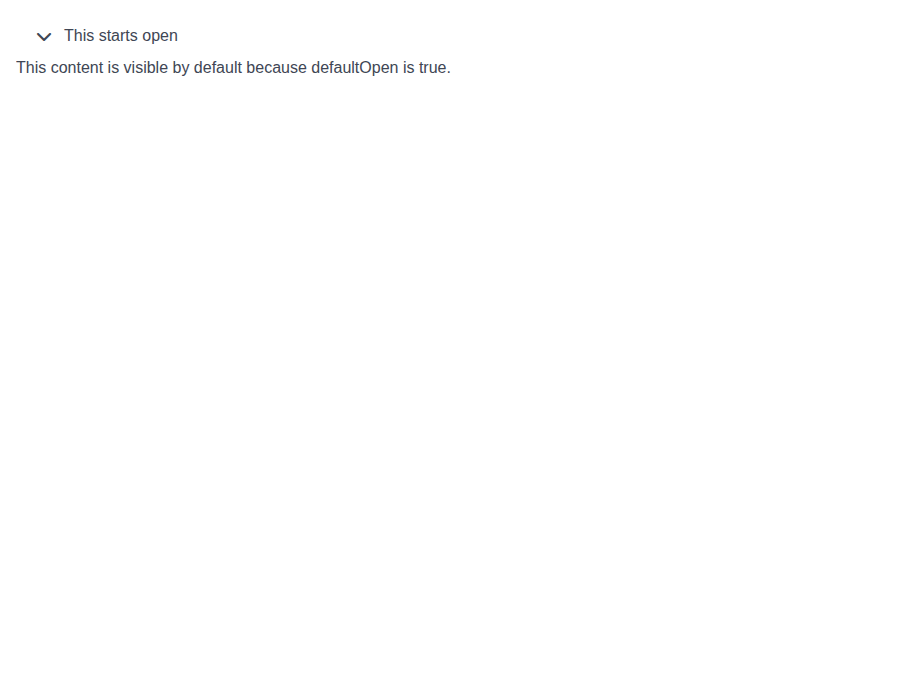 |
 |
components-collapse--slide-animation · Components/Collapse · Slide Animation
| Light | Dark |
|---|---|
 |
 |
components-collapse--no-animation · Components/Collapse · No Animation
| Light | Dark |
|---|---|
 |
 |
components-collapse--trigger-bottom · Components/Collapse · Trigger Bottom
| Light | Dark |
|---|---|
 |
 |
components-collapse--controlled · Components/Collapse · Controlled
| Light | Dark |
|---|---|
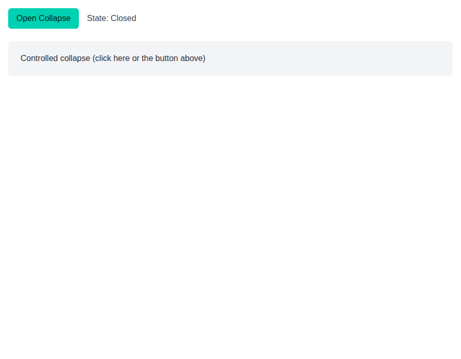 |
 |
components-collapses--default · Components/Collapses · Default
| Light | Dark |
|---|---|
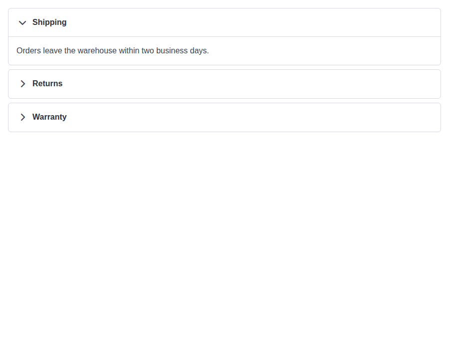 |
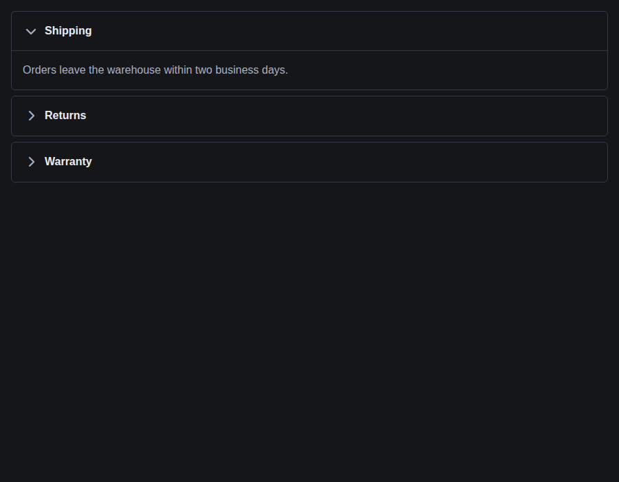 |
components-collapses--multiple · Components/Collapses · Multiple
| Light | Dark |
|---|---|
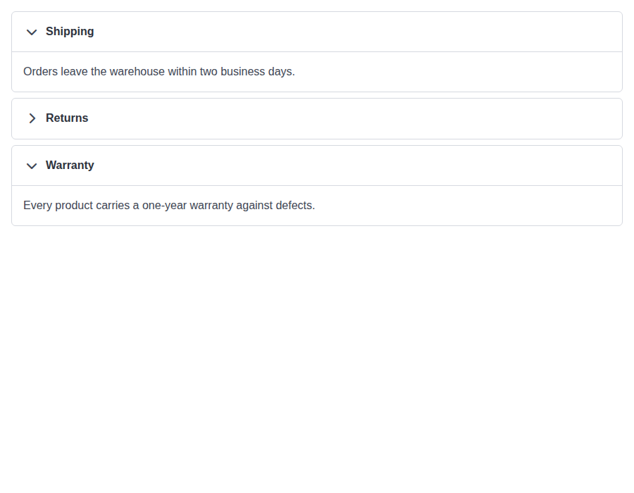 |
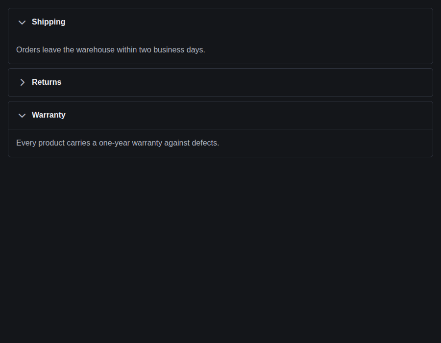 |
components-collapses--seamless · Components/Collapses · Seamless
| Light | Dark |
|---|---|
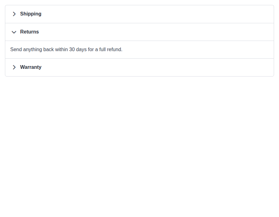 |
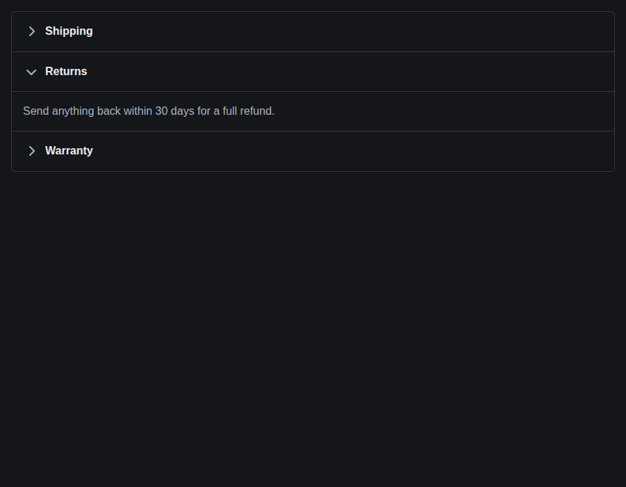 |
components-collapses--controlled · Components/Collapses · Controlled
| Light | Dark |
|---|---|
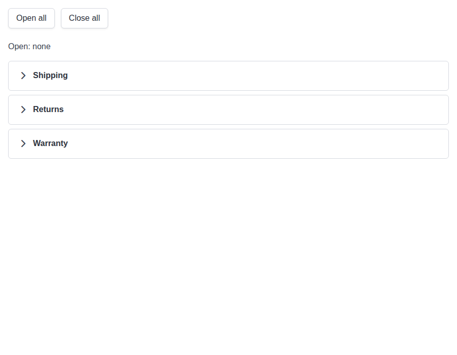 |
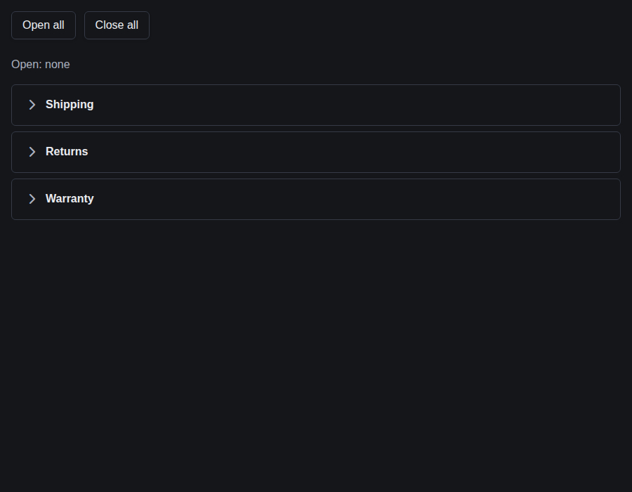 |
components-collapses--item-with-its-own-state · Components/Collapses · Item With Its Own State
| Light | Dark |
|---|---|
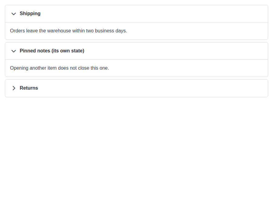 |
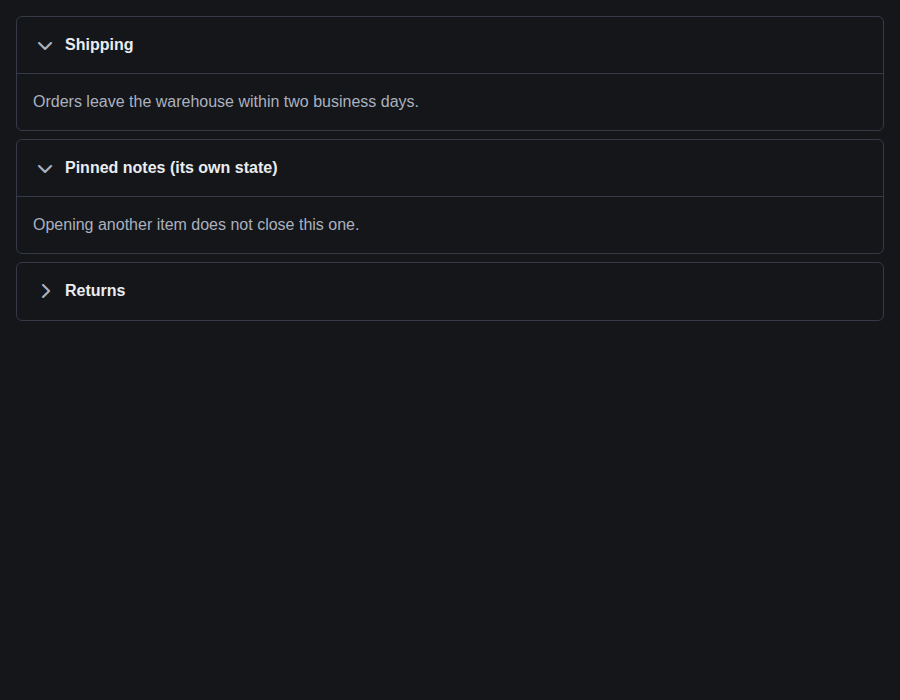 |
components-collapses--compound-usage · Components/Collapses · Compound Usage
| Light | Dark |
|---|---|
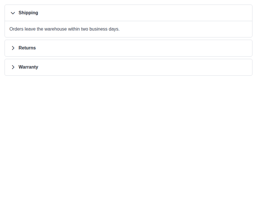 |
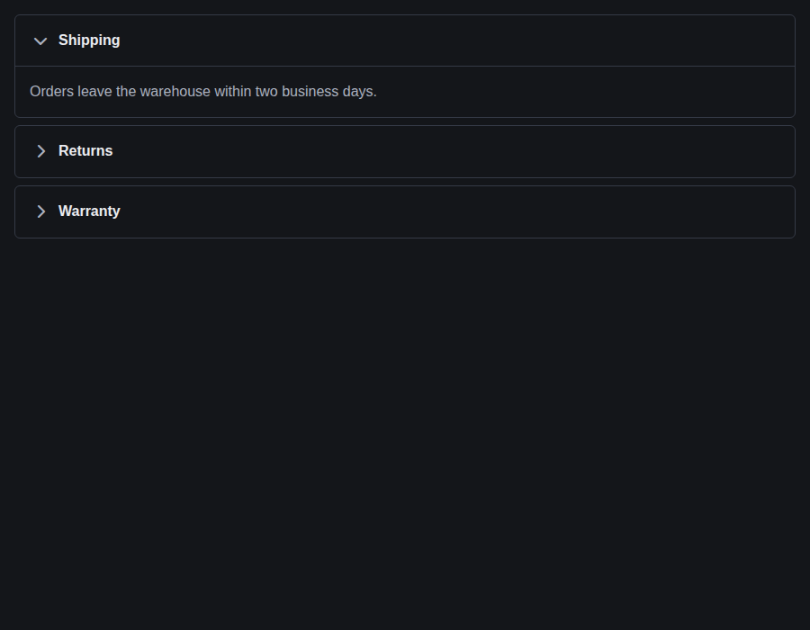 |

Preview DeploymentPreview URL: https://5c2af852.bestax.pages.dev |
# Conflicts:
#	bestax-mcp/data/skills.json
Preview DeploymentPreview URL: https://247750e6.bestax.pages.dev |
There was a problem hiding this comment.
Copilot review overview
🟡 Changes recommended
Seamless groups render malformed outer joins when a documented hidden edge item remains mounted.
Review effort: Balanced
Findings: 1


Open (2)
What changed in this PR
Adds Collapses, a controlled/uncontrolled accordion group for Collapse, with styling, accessibility improvements, documentation, and generated metadata.
Changes:
- Adds single/multiple accordion state management and
Collapse.onOpenChange. - Fixes group spacing, slide initialization, and closed-panel focus behavior.
- Adds comprehensive stories, tests, docs, skills guidance, and MCP data.
| File | Description |
|---|---|
skills/bestax-theming/references/css-variables.md |
Documents group gap theming. |
skills/bestax-layout-scaffold/SKILL.md |
Adds accordion state guidance. |
skills/bestax-custom-component/references/component-catalog.md |
Catalogs Collapses. |
scripts/lib/api-sources.mjs |
Registers documentation sources and imports. |
scripts/check-conformance.mjs |
Exempts the plural container from homepage cards. |
docs/src/data/componentComparison.js |
Marks grouped accordions supported. |
docs/docs/guides/library/index.md |
Lists the new component. |
docs/docs/guides/library/components.md |
Adds a usage example. |
docs/docs/api/components/collapses.md |
Adds the complete API page. |
docs/docs/api/components/collapse.md |
Documents grouping and onOpenChange. |
bulma-ui/src/scss/components/_collapse.scss |
Updates group spacing and seamless joins. |
bulma-ui/src/index.ts |
Exports Collapses. |
bulma-ui/src/helpers/inertProps.ts |
Adds React-version-aware inert props. |
bulma-ui/src/helpers/__tests__/inertProps.test.tsx |
Tests inert rendering. |
bulma-ui/src/components/collapsesContext.ts |
Defines internal group-item context. |
bulma-ui/src/components/Collapses.tsx |
Implements the accordion group. |
bulma-ui/src/components/Collapses.stories.tsx |
Adds component stories. |
bulma-ui/src/components/Collapse.tsx |
Integrates group state and accessibility changes. |
bulma-ui/src/components/Collapse.stories.tsx |
Updates controlled and accordion examples. |
bulma-ui/src/components/__tests__/Collapses.test.tsx |
Tests group behavior and API. |
bulma-ui/src/components/__tests__/Collapses.styles.test.tsx |
Tests spacing and seamless styles. |
bulma-ui/src/components/__tests__/Collapse.test.tsx |
Tests callbacks, inert panels, and SSR height. |
bulma-ui/src/__tests__/prefix-sweep.test.tsx |
Covers prefixed group classes. |
bulma-ui/src/__tests__/index.test.ts |
Verifies the public export. |
bestax-mcp/data/skills.json |
Refreshes skill metadata. |
bestax-mcp/data/components/Collapses.json |
Adds generated MCP component data. |
bestax-mcp/data/components/Collapse.json |
Refreshes Collapse MCP data. |
bestax-mcp/data/catalog.json |
Adds Collapses to the MCP catalog. |
💡 Add a code-review agent skill or configure MCP servers for context-aware, tailored reviews. Learn more in the docs.
|
|
||
| .#{iv.$class-prefix}collapse { | ||
| margin-bottom: 0; | ||
| > .#{iv.$class-prefix}collapse { |
| describe('types', () => { | ||
| it('ties the shape of value and onChange to multiple', () => { | ||
| const single = (value: number | null) => value; | ||
| const many = (value: number[]) => value; | ||
| render( |

# [5.21.0](https://github.com/allxsmith/bestax/compare/@allxsmith/bestax-bulma@5.20.0...@allxsmith/bestax-bulma@5.21.0) (2026-10-01)

### Features

* **bulma-ui:** add Collapses, an accordion group for Collapse ([#849](#849)) ([a12c823](a12c823))
# [1.14.0](https://github.com/allxsmith/bestax/compare/bestax-mcp@1.13.0...bestax-mcp@1.14.0) (2026-10-03)

### Bug Fixes

* **bulma-ui:** announce polite notifications through a status region kept from mount ([#835](#835)) ([c93478d](c93478d))
* **bulma-ui:** answer the granularity review on native input and blur ([7a17486](7a17486))
* **bulma-ui:** color the calendar from the color prop and read TimeInput's wheel variables ([2251e67](2251e67)), closes [#832](#832)
* **bulma-ui:** draw the time wheel focus ring where the wheel's mask shows it ([e1d8c9f](e1d8c9f)), closes [#832](#832)
* **bulma-ui:** fall back when useFocusTrap's initialFocusRef can't take focus ([c191931](c191931))
* **bulma-ui:** give the selected calendar cell a ring that shows on its fill ([b3eecc6](b3eecc6))
* **bulma-ui:** hold Portal to looking a selector up on each render ([8fe02ce](8fe02ce))
* **bulma-ui:** judge image map areas by their image in useFocusTrap ([af7bc59](af7bc59))
* **bulma-ui:** keep button defaults through a spread, and type the buttons that had none ([#853](#853)) ([0810482](0810482))
* **bulma-ui:** keep button types and Avatar's accessible name through a spread ([#826](#826)) ([dc798d4](dc798d4))
* **bulma-ui:** keep the picker focus rings visible in every color ([612aa09](612aa09))
* **bulma-ui:** make useFocusTrap follow radio groups and initialFocusRef past the trap ([d6219d4](d6219d4))
* **bulma-ui:** place toasts and notifications at the position they were shown with ([#834](#834)) ([62feab9](62feab9))
* **bulma-ui:** read clicks and focus inside a shadow root ([474f2cc](474f2cc))
* **bulma-ui:** restore a portaled Modal's focus to an opener in a shadow root ([c564bd3](c564bd3))
* **bulma-ui:** settle Popover's deep review findings ([feadaf4](feadaf4))
* **bulma-ui:** stop Bulma's spinners under reduced motion in every stylesheet ([b234712](b234712)), closes [#770](#770)
* **bulma-ui:** stop TimeInput reopening on the focus its popover hands back ([1c87c15](1c87c15))

### Features

* **bestax-mcp:** publish to the official MCP Registry ([74efc7f](74efc7f))
* **bulma-ui:** add Bulma's position, overflow, radius and aspect-ratio helper props ([#845](#845)) ([64fb91c](64fb91c))
* **bulma-ui:** add Collapses, an accordion group for Collapse ([#849](#849)) ([a12c823](a12c823))
* **bulma-ui:** add Loader, Bulma's inline spinner ([c5e9eb0](c5e9eb0)), closes [#770](#770)
* **bulma-ui:** add month and year pickers to DateInput through granularity ([c4cfc2b](c4cfc2b)), closes [#773](#773)
* **bulma-ui:** add Popover ([2e17fac](2e17fac)), closes [#776](#776)
* **bulma-ui:** export ClientOnly and useIsHydrated ([2c0c1e6](2c0c1e6))
* **bulma-ui:** export Portal ([346d8c2](346d8c2))
* **bulma-ui:** export useFocusTrap, counting the stops the browser's Tab visits ([c304fef](c304fef)), closes [#772](#772)
|
🎉 This PR is included in version 1.14.0 🎉 The release is available on: Your semantic-release bot 📦🚀 |
# [1.2.0](https://github.com/allxsmith/bestax/compare/@allxsmith/eslint-plugin-bestax@1.1.9...@allxsmith/eslint-plugin-bestax@1.2.0) (2026-10-03)

### Bug Fixes

* **bulma-ui:** announce polite notifications through a status region kept from mount ([#835](#835)) ([c93478d](c93478d))
* **bulma-ui:** answer the granularity review on native input and blur ([7a17486](7a17486))
* **bulma-ui:** color the calendar from the color prop and read TimeInput's wheel variables ([2251e67](2251e67)), closes [#832](#832)
* **bulma-ui:** draw the time wheel focus ring where the wheel's mask shows it ([e1d8c9f](e1d8c9f)), closes [#832](#832)
* **bulma-ui:** fall back when useFocusTrap's initialFocusRef can't take focus ([c191931](c191931))
* **bulma-ui:** give the selected calendar cell a ring that shows on its fill ([b3eecc6](b3eecc6))
* **bulma-ui:** hold Portal to looking a selector up on each render ([8fe02ce](8fe02ce))
* **bulma-ui:** judge image map areas by their image in useFocusTrap ([af7bc59](af7bc59))
* **bulma-ui:** keep button defaults through a spread, and type the buttons that had none ([#853](#853)) ([0810482](0810482))
* **bulma-ui:** keep button types and Avatar's accessible name through a spread ([#826](#826)) ([dc798d4](dc798d4))
* **bulma-ui:** keep the picker focus rings visible in every color ([612aa09](612aa09))
* **bulma-ui:** make useFocusTrap follow radio groups and initialFocusRef past the trap ([d6219d4](d6219d4))
* **bulma-ui:** place toasts and notifications at the position they were shown with ([#834](#834)) ([62feab9](62feab9))
* **bulma-ui:** read clicks and focus inside a shadow root ([474f2cc](474f2cc))
* **bulma-ui:** restore a portaled Modal's focus to an opener in a shadow root ([c564bd3](c564bd3))
* **bulma-ui:** settle Popover's deep review findings ([feadaf4](feadaf4))
* **bulma-ui:** stop Bulma's spinners under reduced motion in every stylesheet ([b234712](b234712)), closes [#770](#770)
* **bulma-ui:** stop TimeInput reopening on the focus its popover hands back ([1c87c15](1c87c15))
* **eslint-plugin:** judge Columns' gap by its own steps, and lengths as lengths ([4786c8d](4786c8d))

### Features

* **bestax-mcp:** publish to the official MCP Registry ([74efc7f](74efc7f))
* **bulma-ui:** add Bulma's gap helper props to every component ([#877](#877)) ([1bd4abc](1bd4abc))
* **bulma-ui:** add Bulma's position, overflow, radius and aspect-ratio helper props ([#845](#845)) ([64fb91c](64fb91c))
* **bulma-ui:** add Collapses, an accordion group for Collapse ([#849](#849)) ([a12c823](a12c823))
* **bulma-ui:** add Loader, Bulma's inline spinner ([c5e9eb0](c5e9eb0)), closes [#770](#770)
* **bulma-ui:** add month and year pickers to DateInput through granularity ([c4cfc2b](c4cfc2b)), closes [#773](#773)
* **bulma-ui:** add Popover ([2e17fac](2e17fac)), closes [#776](#776)
* **bulma-ui:** export ClientOnly and useIsHydrated ([2c0c1e6](2c0c1e6))
* **bulma-ui:** export Portal ([346d8c2](346d8c2))
* **bulma-ui:** export useFocusTrap, counting the stops the browser's Tab visits ([c304fef](c304fef)), closes [#772](#772)
* **bulma-ui:** make columnGap the column gap helper on Theme ([eb2c611](eb2c611)), closes [#694](#694)
* **eslint-plugin:** check the gap helper props ([b53a749](b53a749))
# [2.25.0](https://github.com/allxsmith/bestax/compare/bestax-migrate@2.24.0...bestax-migrate@2.25.0) (2026-10-07)

### Bug Fixes

* **bulma-ui:** announce polite notifications through a status region kept from mount ([#835](#835)) ([c93478d](c93478d))
* **bulma-ui:** answer the granularity review on native input and blur ([7a17486](7a17486))
* **bulma-ui:** attach useFocusTrap to a container that mounts after it turns on ([17a944d](17a944d))
* **bulma-ui:** bring File and Taginput under the bare-Control Field rule ([cdaa6c2](cdaa6c2))
* **bulma-ui:** clear a picker's unused seed whenever its popover closes ([cbe86c5](cbe86c5))
* **bulma-ui:** color the calendar from the color prop and read TimeInput's wheel variables ([2251e67](2251e67)), closes [#832](#832)
* **bulma-ui:** commit nothing when a picker popover is dismissed ([0a46209](0a46209))
* **bulma-ui:** commit nothing when Enter confirms untouched picker text ([773e146](773e146))
* **bulma-ui:** commit nothing when focus leaves a picker untouched ([30b4849](30b4849))
* **bulma-ui:** draw the time wheel focus ring where the wheel's mask shows it ([e1d8c9f](e1d8c9f)), closes [#832](#832)
* **bulma-ui:** fall back when useFocusTrap's initialFocusRef can't take focus ([c191931](c191931))
* **bulma-ui:** fire the pickers' onOpen and onClose once under StrictMode ([#896](#896)) ([20b51ed](20b51ed))
* **bulma-ui:** give the selected calendar cell a ring that shows on its fill ([b3eecc6](b3eecc6))
* **bulma-ui:** hide a picker's launcher for a loading Control it sits in ([9a3888e](9a3888e))
* **bulma-ui:** hide a picker's launcher only for the spinner it draws ([7a28a0e](7a28a0e))
* **bulma-ui:** hold Portal to looking a selector up on each render ([8fe02ce](8fe02ce))
* **bulma-ui:** hold the year-1 floor under a max before it ([4f6eb18](4f6eb18))
* **bulma-ui:** judge image map areas by their image in useFocusTrap ([af7bc59](af7bc59))
* **bulma-ui:** keep a tab stop in the year list when the year falls outside it ([fe028c1](fe028c1))
* **bulma-ui:** keep an empty picker's seed while a portaled popover is open ([1e66528](1e66528))
* **bulma-ui:** keep an inline date picker's calendar on its released id ([c26da07](c26da07)), closes [#897](#897) [#897](#897)
* **bulma-ui:** keep button defaults through a spread, and type the buttons that had none ([#853](#853)) ([0810482](0810482))
* **bulma-ui:** keep button types and Avatar's accessible name through a spread ([#826](#826)) ([dc798d4](dc798d4))
* **bulma-ui:** keep the Field for horizontal and fieldClassName in a bare Control ([e4dc513](e4dc513))
* **bulma-ui:** keep the picker focus rings visible in every color ([612aa09](612aa09))
* **bulma-ui:** let focus follow the keys in an inline calendar, and skip disabled days for the tab stop ([#885](#885)) ([f55af27](f55af27))
* **bulma-ui:** let the picker bases give way to a loading Control too ([66e803a](66e803a))
* **bulma-ui:** let useFocusTrap go of a container that leaves while it is on ([8c56d7a](8c56d7a))
* **bulma-ui:** make auto leave room for an in-place picker panel's themed offset ([8c534bd](8c534bd)), closes [#904](#904)
* **bulma-ui:** make Theme colorMode switch the scheme under the prefixed builds ([#894](#894)) ([2bd6ec2](2bd6ec2))
* **bulma-ui:** make useFocusTrap follow radio groups and initialFocusRef past the trap ([d6219d4](d6219d4))
* **bulma-ui:** match a picker's opening focus only inside its calendar ([e3c22ed](e3c22ed))
* **bulma-ui:** place a portaled picker panel by its coordinates alone ([#886](#886)) ([040299b](040299b))
* **bulma-ui:** place toasts and notifications at the position they were shown with ([#834](#834)) ([62feab9](62feab9))
* **bulma-ui:** read clicks and focus inside a shadow root ([474f2cc](474f2cc))
* **bulma-ui:** read picker bounds and months in years 0 to 99 as written ([#890](#890)) ([02fb619](02fb619))
* **bulma-ui:** restore a portaled Modal's focus to an opener in a shadow root ([c564bd3](c564bd3))
* **bulma-ui:** return focus to the input when a date picker closes ([b741264](b741264))
* **bulma-ui:** settle Popover's deep review findings ([feadaf4](feadaf4))
* **bulma-ui:** start a date picker's focus on the focused cell ([#897](#897)) ([6a55714](6a55714))
* **bulma-ui:** stop Bulma's spinners under reduced motion in every stylesheet ([b234712](b234712)), closes [#770](#770)
* **bulma-ui:** stop form wrappers nesting a Field in a bare Control ([2c6d295](2c6d295))
* **bulma-ui:** stop the date pickers at year 1 ([853142a](853142a))
* **bulma-ui:** stop the indeterminate progress bar and skeleton pulse under reduced motion ([bcf5407](bcf5407))
* **bulma-ui:** stop the Rate pop and DateTimeInput scrim under reduced motion ([3a59129](3a59129))
* **bulma-ui:** stop TimeInput reopening on the focus its popover hands back ([1c87c15](1c87c15))
* **bulma-ui:** warn when a root Theme drops its className and helpers ([05c10e0](05c10e0))
* **eslint-plugin:** judge Columns' gap by its own steps, and lengths as lengths ([4786c8d](4786c8d))

### Features

* **bestax-mcp:** publish to the official MCP Registry ([74efc7f](74efc7f))
* **bestax-migrate:** convert the gap, position, overflow, radius and aspect-ratio helpers ([13dcf63](13dcf63))
* **bulma-ui:** add Bulma's gap helper props to every component ([#877](#877)) ([1bd4abc](1bd4abc))
* **bulma-ui:** add Bulma's position, overflow, radius and aspect-ratio helper props ([#845](#845)) ([64fb91c](64fb91c))
* **bulma-ui:** add Collapses, an accordion group for Collapse ([#849](#849)) ([a12c823](a12c823))
* **bulma-ui:** add Loader, Bulma's inline spinner ([c5e9eb0](c5e9eb0)), closes [#770](#770)
* **bulma-ui:** add month and year pickers to DateInput through granularity ([c4cfc2b](c4cfc2b)), closes [#773](#773)
* **bulma-ui:** add Popover ([2e17fac](2e17fac)), closes [#776](#776)
* **bulma-ui:** export ClientOnly and useIsHydrated ([2c0c1e6](2c0c1e6))
* **bulma-ui:** export Portal ([346d8c2](346d8c2))
* **bulma-ui:** export useFocusTrap, counting the stops the browser's Tab visits ([c304fef](c304fef)), closes [#772](#772)
* **bulma-ui:** make columnGap the column gap helper on Theme ([eb2c611](eb2c611)), closes [#694](#694)
* **eslint-plugin:** check the gap helper props ([b53a749](b53a749))
|
🎉 This PR is included in version 2.25.0 🎉 The release is available on: Your semantic-release bot 📦🚀 |
## [4.2.13](https://github.com/allxsmith/bestax/compare/create-bestax@4.2.12...create-bestax@4.2.13) (2026-10-08)

### Bug Fixes

* **bestax-mcp:** give .image's ratios their reason in the lookup ([3ea4d0c](3ea4d0c))
* **bestax-mcp:** say an .image converts around elements written out, not an expression ([49bb27b](49bb27b))
* **bestax-migrate:** convert an .image around its children only when they're elements ([ff99907](ff99907))
* **bestax-migrate:** flag react-bulma-components Pagination's delta={0} rather than renaming it ([e339ff1](e339ff1))
* **bestax-migrate:** keep a .menu-list around a bestax Menu.List as markup ([2119c3f](2119c3f))
* **bestax-migrate:** keep a Modal part as markup inside an existing bestax Modal ([cfd5f15](cfd5f15))
* **bestax-migrate:** keep a named anchor as markup instead of saying its name does nothing ([74dc360](74dc360)), closes [#fragment](https://github.com/allxsmith/bestax/issues/fragment)
* **bestax-migrate:** keep a page link as markup when its li is a component's only child ([0e72683](0e72683))
* **bestax-migrate:** know a bestax part imported under its flat export ([7a325ee](7a325ee))
* **bestax-migrate:** leave a wrapper tag alone when none of its classes would become a prop ([2397b9d](2397b9d))
* **bestax-migrate:** leave a wrapper tag with no helper class alone, TODOs and all ([1167a29](1167a29))
* **bestax-migrate:** map react-bulma-components Pagination onto the props it now renders from ([6cd4b51](6cd4b51))
* **bestax-migrate:** rename rbx innerRef to ref on a plain Navbar.Item too ([bb6ace0](bb6ace0)), closes [#734](#734)
* **bestax-migrate:** say why .image's ratios stay classes ([2fbfbd5](2fbfbd5))
* **bestax-migrate:** write a File text with a backslash as a string ([212831e](212831e))
* **bestax-migrate:** write a tabIndex string as a number on every root ([546bf8a](546bf8a)), closes [#814](#814)
* **bestax-migrate:** write isFullwidth from react-bulma-components too ([01da047](01da047))
* **bestax-migrate:** write isFullwidth rather than its deprecated alias from bloomer ([c2a1d22](c2a1d22)), closes [#680](#680)
* **bulma-ui:** announce polite notifications through a status region kept from mount ([#835](#835)) ([c93478d](c93478d))
* **bulma-ui:** answer the granularity review on native input and blur ([7a17486](7a17486))
* **bulma-ui:** apply textColor helper class on Navbar Menu, Start, End, and Burger ([#792](#792)) ([feb83c8](feb83c8))
* **bulma-ui:** attach useFocusTrap to a container that mounts after it turns on ([17a944d](17a944d))
* **bulma-ui:** avoid empty class attribute on several components ([#793](#793)) ([7c5c316](7c5c316))
* **bulma-ui:** bring File and Taginput under the bare-Control Field rule ([cdaa6c2](cdaa6c2))
* **bulma-ui:** clear a picker's unused seed whenever its popover closes ([cbe86c5](cbe86c5))
* **bulma-ui:** close a picker's popover on Alt+ArrowUp from inside it ([b6da4ef](b6da4ef))
* **bulma-ui:** color the calendar from the color prop and read TimeInput's wheel variables ([2251e67](2251e67)), closes [#832](#832)
* **bulma-ui:** color TimeInput's wheels from the color prop ([#832](#832)) ([ad370c9](ad370c9))
* **bulma-ui:** commit nothing when a picker popover is dismissed ([0a46209](0a46209))
* **bulma-ui:** commit nothing when Enter confirms untouched picker text ([773e146](773e146))
* **bulma-ui:** commit nothing when focus leaves a picker untouched ([30b4849](30b4849))
* **bulma-ui:** document the checkbox, radio and switch color and size tuples ([bd39ff3](bd39ff3))
* **bulma-ui:** draw the time wheel focus ring where the wheel's mask shows it ([e1d8c9f](e1d8c9f)), closes [#832](#832)
* **bulma-ui:** drop the openOnFocus TSDoc reason that only holds for segments ([efde0d9](efde0d9))
* **bulma-ui:** Dropdown items withhold attributes by tag and answer Enter and Space ([#827](#827)) ([f6aeb2d](f6aeb2d))
* **bulma-ui:** fall back when useFocusTrap's initialFocusRef can't take focus ([c191931](c191931))
* **bulma-ui:** fire the pickers' onOpen and onClose once under StrictMode ([#896](#896)) ([20b51ed](20b51ed))
* **bulma-ui:** give the calendar's day grid rows of a week ([971a196](971a196)), closes [#774](#774)
* **bulma-ui:** give the selected calendar cell a ring that shows on its fill ([b3eecc6](b3eecc6))
* **bulma-ui:** hide a picker's launcher for a loading Control it sits in ([9a3888e](9a3888e))
* **bulma-ui:** hide a picker's launcher only for the spinner it draws ([7a28a0e](7a28a0e))
* **bulma-ui:** hold Portal to looking a selector up on each render ([8fe02ce](8fe02ce))
* **bulma-ui:** hold the year-1 floor under a max before it ([4f6eb18](4f6eb18))
* **bulma-ui:** judge image map areas by their image in useFocusTrap ([af7bc59](af7bc59))
* **bulma-ui:** keep a range's end while the start's digits are coming ([8d1f862](8d1f862))
* **bulma-ui:** keep a read-only date or time picker closed on ArrowDown ([ba74bf7](ba74bf7))
* **bulma-ui:** keep a tab stop in the year list when the year falls outside it ([fe028c1](fe028c1))
* **bulma-ui:** keep an empty picker's seed while a portaled popover is open ([1e66528](1e66528))
* **bulma-ui:** keep an inline date picker's calendar on its released id ([c26da07](c26da07)), closes [#897](#897) [#897](#897)
* **bulma-ui:** keep button defaults through a spread, and type the buttons that had none ([#853](#853)) ([0810482](0810482))
* **bulma-ui:** keep button types and Avatar's accessible name through a spread ([#826](#826)) ([dc798d4](dc798d4))
* **bulma-ui:** keep menuitemcheckbox and menuitemradio items in Dropdown's arrow-key order ([#786](#786)) ([064155a](064155a))
* **bulma-ui:** keep Numberinput's buttons in a row inside Field > Control ([4dff84c](4dff84c))
* **bulma-ui:** keep Numberinput's Field examples in a row and labelled ([c937c88](c937c88))
* **bulma-ui:** keep radiusless zeroing the radius inside a Theme ([07db6a3](07db6a3)), closes [#829](#829) [#694](#694)
* **bulma-ui:** keep the calendar behind DateTimeInput's time wheels out of reach ([c7f674c](c7f674c))
* **bulma-ui:** keep the clock's seconds out of a picked date and time ([0af2e71](0af2e71))
* **bulma-ui:** keep the Field for horizontal and fieldClassName in a bare Control ([e4dc513](e4dc513))
* **bulma-ui:** keep the picker focus rings visible in every color ([612aa09](612aa09))
* **bulma-ui:** keep the range band under the pointer in the calendar ([c1f2008](c1f2008))
* **bulma-ui:** key the Avatar link warning on the element and attributes ([e628eba](e628eba)), closes [#733](#733) [#733](#733)
* **bulma-ui:** key the Control-level warning by its advice ([24cda3d](24cda3d))
* **bulma-ui:** leave keys on a control inside a tab to that control ([4a9f7b6](4a9f7b6))
* **bulma-ui:** leave rel out of the Avatar link attribute warning ([b059476](b059476)), closes [#733](#733) [#733](#733)
* **bulma-ui:** let Autocomplete's clear button give way to a loading spinner ([5c11fb2](5c11fb2))
* **bulma-ui:** let Escape in a popover's year dropdown go back to the grid ([a8b1dbf](a8b1dbf)), closes [#901](#901)
* **bulma-ui:** let File's picked-files count be reworded, and document its name in the label ([e86545c](e86545c))
* **bulma-ui:** let focus follow the keys in an inline calendar, and skip disabled days for the tab stop ([#885](#885)) ([f55af27](f55af27))
* **bulma-ui:** let several isRoot Themes share the :root style element ([04f399f](04f399f)), closes [#736](#736)
* **bulma-ui:** let the arrow keys move through the calendar's year dropdown ([6abc329](6abc329)), closes [#901](#901)
* **bulma-ui:** let the picker bases give way to a loading Control too ([66e803a](66e803a))
* **bulma-ui:** let useFocusTrap go of a container that leaves while it is on ([8c56d7a](8c56d7a))
* **bulma-ui:** let warnOnce decide when the Avatar link warning fires ([1a5965c](1a5965c)), closes [#733](#733)
* **bulma-ui:** make ArrowUp raise a time wheel's value ([c27c310](c27c310))
* **bulma-ui:** make auto leave room for an in-place picker panel's themed offset ([8c534bd](8c534bd)), closes [#904](#904)
* **bulma-ui:** make Tabs keyboard operable with the WAI-ARIA tabs pattern ([fe0e7ef](fe0e7ef))
* **bulma-ui:** make Theme colorMode switch the scheme under the prefixed builds ([#894](#894)) ([2bd6ec2](2bd6ec2))
* **bulma-ui:** make Theme's radius the helper it is typed as ([36c73d3](36c73d3)), closes [#694](#694)
* **bulma-ui:** make useFocusTrap follow radio groups and initialFocusRef past the trap ([d6219d4](d6219d4))
* **bulma-ui:** match a picker's opening focus only inside its calendar ([e3c22ed](e3c22ed))
* **bulma-ui:** merge className into Navbar.Divider instead of overwriting it ([#791](#791)) ([fcc0d51](fcc0d51))
* **bulma-ui:** move focus into DateTimeInput's time wheels as they open ([adfa9db](adfa9db))
* **bulma-ui:** move the year dropdown's tab stop with the arrow keys ([f56daf5](f56daf5))
* **bulma-ui:** name a picker's default icon when its icon size or column moves ([6f6de39](6f6de39))
* **bulma-ui:** name custom elements among the targets that get Avatar's target and rel ([a962259](a962259)), closes [#733](#733)
* **bulma-ui:** name DateRangeInput's default icon in its Control-level warning ([15cbbb8](15cbbb8)), closes [#952](#952)
* **bulma-ui:** name DateRangeInput's default icon in its Control-level warning ([9cbe7ca](9cbe7ca)), closes [#952](#952)
* **bulma-ui:** name Pagination's page links, and read a count that's no number as its default ([0a1cf06](0a1cf06))
* **bulma-ui:** open DateRangeInput's popover on Alt+ArrowDown, as the other pickers ([c0e22ec](c0e22ec))
* **bulma-ui:** open the date and time popovers on Alt+ArrowDown ([6db22cc](6db22cc))
* **bulma-ui:** order the Tabs fallback stop by index and style disabled tabs ([eefd283](eefd283))
* **bulma-ui:** pick a DateInput day at midnight by key as by click ([92c27ca](92c27ca))
* **bulma-ui:** place a portaled picker panel by its coordinates alone ([#886](#886)) ([040299b](040299b))
* **bulma-ui:** place toasts and notifications at the position they were shown with ([#834](#834)) ([62feab9](62feab9))
* **bulma-ui:** prefix the is-current and is-disabled classes on Pagination's parts ([c9a5fae](c9a5fae))
* **bulma-ui:** reach Taginput's delete buttons and Autocomplete's clear button ([21a064b](21a064b))
* **bulma-ui:** read a Pagination current page that's no number as the first ([68e963b](68e963b))
* **bulma-ui:** read clicks and focus inside a shadow root ([474f2cc](474f2cc))
* **bulma-ui:** read picker bounds and months in years 0 to 99 as written ([#890](#890)) ([02fb619](02fb619))
* **bulma-ui:** render the four burger spans Bulma v1 positions ([#785](#785)) ([8e4e1e6](8e4e1e6))
* **bulma-ui:** restore a portaled Modal's focus to an opener in a shadow root ([c564bd3](c564bd3))
* **bulma-ui:** return focus to the input when a date picker closes ([b741264](b741264))
* **bulma-ui:** say a picked DateTimeInput day keeps milliseconds and meets the bounds ([3536467](3536467))
* **bulma-ui:** say Tab reaches DateRangeInput's end input only when typing ([d2d3d1a](d2d3d1a))
* **bulma-ui:** say where Numberinput goes bare and test bare={false} in a Field ([0461631](0461631))
* **bulma-ui:** send a press on DateRangeInput's field to the nearer input ([f06b2b0](f06b2b0))
* **bulma-ui:** settle Popover's deep review findings ([feadaf4](feadaf4))
* **bulma-ui:** show the picked file with File's hasName and add a keyboard focus ring ([7881db4](7881db4))
* **bulma-ui:** show toasts, notifications and dialogs raised before their container mounts ([#828](#828)) ([2ab4493](2ab4493))
* **bulma-ui:** skip the Avatar target warning on elements with their own target ([27b58f4](27b58f4)), closes [#733](#733)
* **bulma-ui:** start a date picker's focus on the focused cell ([#897](#897)) ([6a55714](6a55714))
* **bulma-ui:** stop Bulma's spinners under reduced motion in every stylesheet ([b234712](b234712)), closes [#770](#770)
* **bulma-ui:** stop form wrappers nesting a Field in a bare Control ([2c6d295](2c6d295))
* **bulma-ui:** stop shipping test-only exports, and document notification() ([#781](#781)) ([5f95398](5f95398))
* **bulma-ui:** stop the date pickers at year 1 ([853142a](853142a))
* **bulma-ui:** stop the indeterminate progress bar and skeleton pulse under reduced motion ([bcf5407](bcf5407))
* **bulma-ui:** stop the Rate pop and DateTimeInput scrim under reduced motion ([3a59129](3a59129))
* **bulma-ui:** stop TimeInput reopening on the focus its popover hands back ([1c87c15](1c87c15))
* **bulma-ui:** strip the Avatar link warning from production builds ([a243fa5](a243fa5)), closes [#733](#733)
* **bulma-ui:** warn about a dropped Avatar href only for an as the caller wrote ([c93b27c](c93b27c)), closes [#733](#733)
* **bulma-ui:** warn in development when Avatar drops an href on a non-link as ([c76e632](c76e632)), closes [#733](#733)
* **bulma-ui:** warn when a root Theme drops its className and helpers ([05c10e0](05c10e0))
* **bulma-ui:** warn when a wrapper inside a Control drops its Control-level props ([cbf434b](cbf434b)), closes [#921](#921)
* **bulma-ui:** warn when an inline picker drops its Control-level props ([f0494bd](f0494bd)), closes [#921](#921)
* **bulma-ui:** warn when Avatar drops a target or rel on a non-link as ([50c385e](50c385e)), closes [#733](#733) [#733](#733)
* **create-bestax:** check the react ranges fit the library's peers, not equal them ([8ae5a0c](8ae5a0c)), closes [#950](#950)
* **create-bestax:** import the icon CSS for every Bulma flavor, not only complete ([a712b91](a712b91)), closes [#946](#946)
* **create-bestax:** install react and react-dom so Yarn 1 reports no unmet peers ([9c9814c](9c9814c)), closes [#644](#644) [#950](#950)
* **create-bestax:** name the files the overwrite prompt removes, and stop on a file path ([39b6232](39b6232)), closes [#945](#945)
* **create-bestax:** never empty a non-empty folder under -y, and validate flags first ([917f195](917f195)), closes [#950](#950) [#945](#945) [#950](#950)
* **create-bestax:** warn when the icon CSS import has nowhere to go ([f7f0b64](f7f0b64)), closes [#946](#946) [#946](#946)
* **eslint-plugin:** judge Columns' gap by its own steps, and lengths as lengths ([4786c8d](4786c8d))
* **eslint-plugin:** report .file as a class the codemod converts ([72a32c9](72a32c9))
* **eslint-plugin:** report .image with the message for a class the codemod converts ([d27c19b](d27c19b))
* **eslint-plugin:** report .menu, .menu-label and .menu-list with the converts message ([8ffaccc](8ffaccc))
* **eslint-plugin:** report .select and .breadcrumb as converted ([a9d8082](a9d8082))
* **eslint-plugin:** report Bulma form markup as classes the codemod converts ([128e832](128e832))
* **eslint-plugin:** report Bulma skeletons as converted ([04ca4ee](04ca4ee))
* **eslint-plugin:** report Modal's parts with the message for a class the codemod converts ([87f3c08](87f3c08))
* **eslint-plugin:** report Pagination's converting parts with the converts message ([6b94f14](6b94f14))
* **eslint-plugin:** report the pagination links and ellipsis as classes the codemod converts ([54ba0b3](54ba0b3))
* **eslint-plugin:** report Theme's deprecated radius route accurately ([5605816](5605816)), closes [#694](#694)
* **eslint-plugin:** suggest radiusless for a near miss on Theme ([21aa9a7](21aa9a7)), closes [#694](#694)

### Features

* **bestax-mcp:** look up .image as Image, with the props it takes from its <img> ([3e63230](3e63230))
* **bestax-mcp:** look up .menu and its label and list as Menu's parts ([f9fe7cd](f9fe7cd))
* **bestax-mcp:** look up Card's title and footer items on the tags their as takes ([ba8193e](ba8193e))
* **bestax-mcp:** look up Modal's parts as components ([b71583a](b71583a))
* **bestax-mcp:** look up Pagination, its list and its previous and next links as components ([f1298df](f1298df))
* **bestax-mcp:** look up the bestax component and props for a Bulma class string ([4a4b246](4a4b246)), closes [#744](#744)
* **bestax-mcp:** publish to the official MCP Registry ([74efc7f](74efc7f))
* **bestax-mcp:** say a Bulma field wraps its children only when horizontal ([929bc82](929bc82))
* **bestax-mcp:** say an .image converts around anything but a bare <img> ([60e9219](60e9219))
* **bestax-mcp:** say Menu.List renders .menu-list only at the top level ([dcce74f](dcce74f))
* **bestax-mcp:** say when a component renders the children from a count ([b60c295](b60c295))
* **bestax-mcp:** say when a component renders the element inside it ([4ced25c](4ced25c))
* **bestax-mcp:** say when a component renders the li around its element, or its own text ([8fd3faf](8fd3faf))
* **bestax-mcp:** say when a component renders the whole .file tree from props ([976d8a3](976d8a3))
* **bestax-migrate:** convert .file inside a Field, building its tree from props ([724dff5](724dff5)), closes [#809](#809)
* **bestax-migrate:** convert .icon-text, building its icons from props ([#823](#823)) ([933868f](933868f))
* **bestax-migrate:** convert .menu, its labels and its top-level lists ([02f4db6](02f4db6))
* **bestax-migrate:** convert .select and .breadcrumb with the element inside them ([d76c569](d76c569))
* **bestax-migrate:** convert .tabs and .icon around their children ([#815](#815)) ([3967a80](3967a80))
* **bestax-migrate:** convert a menu list's items to Menu.Item ([#816](#816)) ([b385687](b385687))
* **bestax-migrate:** convert an .image and its <img> to Image ([d4f3673](d4f3673)), closes [#793](#793)
* **bestax-migrate:** convert an .image around anything but a bare <img> ([0a31c5b](0a31c5b)), closes [#801](#801)
* **bestax-migrate:** convert Bulma cards built from their parts ([#752](#752)) ([1b08e17](1b08e17))
* **bestax-migrate:** convert Bulma form fields, controls, inputs and textareas ([3da788d](3da788d)), closes [#743](#743)
* **bestax-migrate:** convert Bulma grids and cells ([#760](#760)) ([22adc7c](22adc7c)), closes [#743](#743)
* **bestax-migrate:** convert Bulma navbars ([#754](#754)) ([02fdd72](02fdd72))
* **bestax-migrate:** convert Bulma skeletons ([2574ace](2574ace))
* **bestax-migrate:** convert Card's title and footer items on the tags their as takes ([20bc0c6](20bc0c6)), closes [#794](#794)
* **bestax-migrate:** convert conditional classes in clsx and classnames calls ([8948cce](8948cce))
* **bestax-migrate:** convert Modal's parts element by element ([4d41ad2](4d41ad2)), closes [#805](#805)
* **bestax-migrate:** convert navbar dividers with classes, and navbar text colors ([#796](#796)) ([c97c7e9](c97c7e9))
* **bestax-migrate:** convert Pagination, its list and its previous and next links ([d75bc70](d75bc70)), closes [#807](#807)
* **bestax-migrate:** convert Pagination's page links and ellipsis in their li's place ([ae720fa](ae720fa)), closes [#809](#809)
* **bestax-migrate:** convert Panel and its heading, tabs and blocks ([#811](#811)) ([0694e54](0694e54))
* **bestax-migrate:** convert the gap, position, overflow, radius and aspect-ratio helpers ([13dcf63](13dcf63))
* **bestax-migrate:** fold .table-container and .fixed-grid into the component inside ([#761](#761)) ([72504f5](72504f5)), closes [#743](#743)
* **bulma-ui:** add Bulma's gap helper props to every component ([#877](#877)) ([1bd4abc](1bd4abc))
* **bulma-ui:** add Bulma's position, overflow, radius and aspect-ratio helper props ([#845](#845)) ([64fb91c](64fb91c))
* **bulma-ui:** add Collapses, an accordion group for Collapse ([#849](#849)) ([a12c823](a12c823))
* **bulma-ui:** add DateRangeInput ([50fcba7](50fcba7)), closes [#774](#774)
* **bulma-ui:** add Loader, Bulma's inline spinner ([c5e9eb0](c5e9eb0)), closes [#770](#770)
* **bulma-ui:** add month and year pickers to DateInput through granularity ([c4cfc2b](c4cfc2b)), closes [#773](#773)
* **bulma-ui:** add Popover ([2e17fac](2e17fac)), closes [#776](#776)
* **bulma-ui:** export ClientOnly and useIsHydrated ([2c0c1e6](2c0c1e6))
* **bulma-ui:** export Portal ([346d8c2](346d8c2))
* **bulma-ui:** export useFocusTrap, counting the stops the browser's Tab visits ([c304fef](c304fef)), closes [#772](#772)
* **bulma-ui:** let Card.Header.Title and Card.FooterItem render Bulma's own tags ([#794](#794)) ([47ecdb6](47ecdb6))
* **bulma-ui:** make columnGap the column gap helper on Theme ([eb2c611](eb2c611)), closes [#694](#694)
* **bulma-ui:** render Pagination from total, current and onPageChange ([f7ddf04](f7ddf04)), closes [#813](#813)
* **eslint-plugin:** add an opt-in rule for plain elements styled with a Bulma component class ([#750](#750)) ([0bb4d80](0bb4d80))
* **eslint-plugin:** check the gap helper props ([b53a749](b53a749))
|
🎉 This PR is included in version 4.2.13 🎉 The release is available on: Your semantic-release bot 📦🚀 |

Closes #771.
_collapse.scsshas shipped.collapsesand.collapses.is-seamlessfor a while, and nothing rendered them, so the Collapse docs built their accordion by hand. This addsCollapses, a sibling export likeAvatars,TagsandButtons.Collapsesrenders.collapses(andis-seamlessfromseamless) around plainCollapsechildren and decides which are open, by index, with the Tabs names:value,defaultValue,onChange, controlled or not. Withoutmultiplethe value isnumber | nulland opening one item closes the others; withmultipleit'snumber[]. The props are a union onmultiple, as Slider's are onrange, so the types follow it.Collapseworks. A child that sets its ownopenkeeps it: the group neither overrides it nor closes it when another item opens. Inside the group an item'sdefaultOpenis ignored and itsonOpen/onClosedon't fire, since the group owns its state. The TSDoc says all of this.onOpenChangeonCollapse,(open: boolean) => void, fires from the trigger (click, Enter, Space) in every mode. A controlled Collapse's trigger used to do nothing and report nothing, which is why the old demo put a clickable Block inside the trigger.onOpen/onClosestill fire only when the Collapse holds its own state. It'sonOpenChangerather thanonToggleso thatCollapsePropsis otherwise unchanged: the inherited DOMonToggleis still there, and code that typed a handler for it still compiles..collapsesread--bulma-collapse-group-gap, which only its items declare, so the gap never applied and the items' own margins did the spacing. The group now reads it with a 0.5rem fallback and declares no value itself, so a value on the group, on:rootor on any other ancestor reaches it, whatever order the stylesheets load in. Group items drop their bottom margin, and the group and seamless rules reach direct children only, so a Collapse nested in an item's content keeps its own borders. The default spacing is unchanged, checked in Chromium alongside each kind of override.openor a group starts at full height. It used to start at 0 unlessdefaultOpenwas set, which also hid an open panel in the server markup.Collapses/onOpenChange, and the comparison matrix's Accordion row flipped with its link. The layout-scaffold skill's state-API line namesonOpenChangeandCollapses, and the theming reference says where the gap variable can be set.Review follow-ups. A closed
Collapsepanel is nowinertas well asaria-hidden, so underfadeandslideits links and fields leave the tab order until it opens. It's spelled per React major, since 18 and 19 each warn on the other's form and drop it, and was checked with the real keyboard on both. Withmultiple,onChangereports indexes in ascending order. Development builds warn, once per combination, when an item inside a group getsdefaultOpen,onOpenoronClose, and name what to use instead. The TSDoc and a new API-page section say that an index is a position, so an item rendered conditionally or reordered hands its open state to a neighbour: hide items withvisibility="hidden", or controlvalue. The Accessibility section now says which parts of the WAI-ARIA accordion pattern are built in and which aren't (the heading around each trigger), and the Spacing section carries the gap variable's table.Worth a look.
CollapsesjoinsHOME_EXEMPT, following the #257 call for plural group containers. The gap variable stays registered on.collapse, where it has always been, so a group nested inside a Collapse picks up that Collapse's default rather than an outer value. That matches main, and the Spacing section says so.Not in this PR.
is-card, which no stylesheet defines.index, likeTabs.Tabtakes. It's cheap and additive later; the open question is what happens when explicit and positional indexes mix in one group.Card.Header.Iconbutton inside the trigger.pnpm allpasses locally.Summary by CodeRabbit
Collapsesfor grouping collapsible sections in single-open accordion or multiple-open modes, with controlled and uncontrolled state.onOpenChangeto report requested state changes for individual collapses.