General UX Thread #2984
Comments
|
Many icons are repeated for different purposes, like the Start Chat and the icon below the number of users |
|
Many icons do not have hints when the mouse is over them |
|
When previewing an image I expect that the preview closes after clicking on the dark area |
|
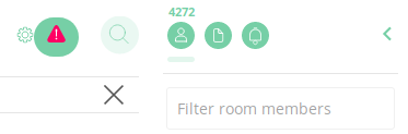
It could be better to have an arrow to collapse the right sidebar instead of clicking on the person icon, to be consistent with the left sidebar |
|
Having hitlists like this are really useful (although some of these are duplicates of other issues in the enormous bugtracker) - thanks. please keep them coming :) It may be worth including checkboxes on the issues so they can be checked off when resolved, e.g.:
=>
|
|
Thanks, I was thinking it might be helpful as a way to separate out UX issues from the whole pool of everything else that's in motion. Some redundancy is probably unavoidable, but the goal is to have a big bucket that's easy to find.
|
|
yay! for finding existing ui/ux bugs in github, you'd look & search within labels; specifically: https://github.com/vector-im/riot-web/labels/cosmetic and https://github.com/vector-im/riot-web/labels/ui%2fux. However, there are a few hundred at least, so in practice I'd suggest just jotting down quick wins as you see them here, and I can worry about reconciling them with the main bugtracker. It's better to have dups than none! |
|
agree -- I did a quick search before creating the issue, will look through those labels as well |
https://matrix.to/#/!blHeuKmYNNfIqDlWGO:matrix.org/$14847994894067xhrhG:atauno.com |
|
Implement Sticker Packs #2950 |
Submitted from designUX |
|
I find the bot messages to be difficult to read if I have some distance between my head and the screen as the screen is bright and Riot is light and I am supposed to read gray text against white background which might be doable when there isn't so much text, but when all room activity is bots (RSS) integration it gets difficult. I think this might also be an accessibility issue and I hope the dark theme will fix it. |
|
We should have a stronger contrast on color pallette, like level 700 in material design guidelines. The lines in the icons should be also bolder. Sender text should be bold and optionally colored, not grayed out. The margin between messages is too big, and we should use some line/color elements to make it smaller. |
|
The default light color scheme is uncomfortable to use on my laptop with a TN screen. The contrast between the colors in the color scheme is low enough that the bad viewing angles of the TN panel makes the colors sort of vary uncomfortably when looking at the screen from slightly different angles (vertically). Now it is of course known that TN panels are crap (and I'm waiting for my IPS panel to arrive in the mail) but I still think it's important for the UI to feel nice to use even on a low-quality screen 😃 |
|
Most IRC clients can be operated solely with the keyboard, most web-based chat systems can be operated largely with the keyboard. It would be nice if Riot supported some baseline keyboard behaviour here too:
|
|
Determine which general features should be made available for E2E chat, which should be optional, and which should be banned. Currently unavailable features:
Searching and listing uploaded files is being worked on by doing it client-side. Bots and bridges could be done in theory, but may not be a good idea depending on your level of paranoia. |
|
|
Better user interface for screen readers and keyboard navigation #2946 |
|
Thanks for the dark theme on develop ... it's already quite usable and was able to build the electron version locally after building in |
|
Make it easier to get people chatting: import data files #3076 |
|
If checklists work in gists, maybe this list could be externally managed there? @tessgadwa |
|
Gists look really good, but is there a way to tie them to a specific
repository?
…On Jan 27, 2017 12:51 AM, "martin f. krafft" ***@***.***> wrote:
If checklists work in gists, maybe this list could be externally managed
there? @tessgadwa <https://github.com/tessgadwa>
—
You are receiving this because you were mentioned.
Reply to this email directly, view it on GitHub
<#2984 (comment)>,
or mute the thread
<https://github.com/notifications/unsubscribe-auth/AGLNGxUPaQEskqzWQelFg9LRTMyO8ytPks5rWbAigaJpZM4LnMQr>
.
|
|
@madduck checklists do work on gists, for future ref |
|
Can you add: Adapt better to narrow screens #1633: Riot's UI reconfigures poorly when the window is made small. |
|
@tessgadwa just wanted to say thanks again for curating this epic bug; it's really useful to have so much stuff gathered in one place like this when trying to get perspective on our UX problems. |
|
You are most welcome! |
|
In the Linux chatroom, I noticed that the timestamp was behind my avatar: Riot stable, Chromium Version 60.0.3112.78 (Developer Build) (64-bit) |

|
@benrob0329 have you tried to force reload the page, or clear your cache? |
|
@benrob0329: that's #2284 |
|
Some comments from the discussion with gutigen at around https://matrix.to/#/!DgvjtOljKujDBrxyHk:matrix.org/$15079470492091056AtPEp:matrix.org:
|
"More"? you got me intrigued now.. are there already some Vim keybinds in Riot? |
|
Improve the UX for messages that cannot be decrypted #5642 |
|
Expose metadata about a homeserver, useful for server discovery and general experience matrix-org/matrix-spec#1258 |
|
|
@croulibri These suggestions makes a lot of sense. |
|
Thanks @MightyCreak ! Another issue...
|
|
I hope this is the right place to post this:
|

|
Would you add an option to list users and rooms not in this (current) way... ...but in this way: ...so that all PEOPLE and ROOMS listed in more than one horizontal line so that the user is not forced to scroll horizontally? Thx! Edit: moved to element-hq/riot-android#1800 (comment) - thx @uhoreg |
|
@saljut7 you should post comments about the Android app in https://github.com/vector-im/riot-android/issues, rather than here. This repository is only for the web/desktop versions. Your comment could added either be a new issue in that repository, or a comment on element-hq/riot-android#1800. |
|
The small avatars on the right that show who read a message don't do anything when clicked, apart from lighting up. Maybe it should show their profile like what happens when you click someone's avatar? |
|
@mission712 yes, that issue is tracked in #5784 (It actually does to something already: it shows all the read receipts if there are more than 5 on a certain message.) |
|
Would you consider to merge PEOPLE and ROOMS as well as "Start chat" and "Create room"? People totally understand the "everything is a room" idea. There is no need to separate something that is technically the same. Idea:
Thx for Matrix and Riot! |
|
Should be able to turn off the 'encryption lock icon' on mobile (Android), such as it is in the web client. |
|
This general UX issue is not actively monitored and doesn't really match our current way of working. I would suggest opening a new issue for each thing. I would recommend focusing the issue on describing your use case so we can understand your perspective, instead of proposing a specific solution. |
|
I had to google and come to this page in order to find the link https://riot.im/app/#/login |
This issue thread has been created for collecting / catalog general UX issues and enhancements -- things that aren't necessarily broken but could work a bit better.
Here is a somewhat comprehensive list of issues added to date. Updated 11/19/2017.
Untracked issues:
Tracked issues:
The text was updated successfully, but these errors were encountered: