Add Progress SPEC #24418
Add Progress SPEC #24418
Conversation
📊 Bundle size reportUnchanged fixtures
|
|
This pull request is automatically built and testable in CodeSandbox. To see build info of the built libraries, click here or the icon next to each commit SHA. Latest deployment of this branch, based on commit 9a2153f:
|
Asset size changesSize Auditor did not detect a change in bundle size for any component! Baseline commit: b0b7f99bbbb05b0bd136432983a74fea252c7163 (build) |
| ## Prior Art | ||
|
|
||
| _Include background research done for this component_ | ||
| ### Open UI |
There was a problem hiding this comment.
I don't see a reference there to OpenUI, is the title correct?
There was a problem hiding this comment.
@tomi-msft you can add a link to Open UI if there is a page about Progress there. If a page for progress does not exist feel free to rename this section to something like "Comparison between other libraries".
| | Library | Component Name | Spec Link | Notes | | ||
| | ---------- | -------------- | ------------------------------------------------------------------ | ----------------------------------------------------------------------- | | ||
| | Ant Design | Progress | [Progress](https://ant.design/components/progress/) | Specifies the type, a combined progress component | | ||
| | Bootstrap | Progress | [Progress](https://getbootstrap.com/docs/4.3/components/progress/) | Allows for multiple different animation styles on the same Progress bar | |
There was a problem hiding this comment.
I am surprised with such small list of prior art as this component is quite popular:
- https://react.semantic-ui.com/modules/progress/
- https://react-spectrum.adobe.com/react-spectrum/ProgressBar.html
- https://vuetifyjs.com/en/components/progress-linear/
- https://mui.com/material-ui/react-progress/
Did you consider other libraries in a research?
|
|
||
| ### Props | ||
|
|
||
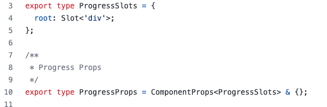
| See API at [Progress.types.tsx](./src/components/Progress/Progress.types.ts). |
There was a problem hiding this comment.
FYI: it's currently empty:
It would be great to include currently implemented props from #24023 to the spec.
| ### Slots | ||
|
|
||
| - `root` - The root element of the Progress. The html element is a `div` | ||
| - `indicator` - The div element that gets animated into a Progress. The html element is `span` |
There was a problem hiding this comment.
I know that we call this part indicator in few other places, but few other libraries call this part bar. Curiosity: what is a motivation to call it indicator? 🐱 Taking into account that there is a prop called barThickness in #24023.
| ```html | ||
| <div class="fui-Progress"> | ||
| <!-- Label for Progress --> | ||
| <label className="fui-Progress__label">Loading...</label> | ||
| <span className="fui-Progress__indicator" role="progressbar"> | ||
| <!-- div that receives the animation. Classnames are used for animation --> | ||
| <div className="fui-Progress__Container"> | ||
| <div className="fui-Progress__Track" /> | ||
| <div className="fui-Progress__Tail" /> | ||
| </div> | ||
| </span> | ||
| <!-- Label for Progress description --> | ||
| <label className="fui-Progress__description">Loading Text</label> | ||
| </div> | ||
| ``` |
There was a problem hiding this comment.
From markup I see that we will not allow to pass children. Is it correct? If so, I would mention this somewhere in the spec.
| ## API | ||
|
|
||
| _List the **Props** and **Slots** proposed for the component. Ideally this would just be a link to the component's `.types.ts` file_ | ||
| ### Slots |
There was a problem hiding this comment.
It would be great to include there an image with a component's anatomy so it would be clearer which slots correspond to what area.
| - **Display** - The Progress will use the following priority: | ||
|
|
||
| ## Accessibility | ||
| - Adding `appearance={inverted}` will alter the way that the Progress is displayed. |
There was a problem hiding this comment.
This says that appearance={inverted} will alter the way Progress is displayed but doesn't say how. Can we add that?
Co-authored-by: Makoto Morimoto <[email protected]>
Co-authored-by: Oleksandr Fediashov <[email protected]>
 github-actions
bot
modified the milestones:
July Project Cycle Q3 2022,
September Project Cycle Q1 2022
github-actions
bot
modified the milestones:
July Project Cycle Q3 2022,
September Project Cycle Q1 2022
| ## Prior Art | ||
|
|
||
| _Include background research done for this component_ | ||
| ### Open UI |
There was a problem hiding this comment.
@tomi-msft you can add a link to Open UI if there is a page about Progress there. If a page for progress does not exist feel free to rename this section to something like "Comparison between other libraries".
|
|
||
| ### Props | ||
|
|
||
| See API at [Progress.types.tsx](./src/components/Progress/Progress.types.ts). |
There was a problem hiding this comment.
I wonder if we should make the props align with the HTML <progress> element:
- Use
valueinstead ofpercentComplete - Add a
maxprop that defaults to 1.0 - Remove the
indeterminateprop, and just use thevalueprop: the progress bar is indeterminate if value is undefined.
| ## API | ||
|
|
||
| _List the **Props** and **Slots** proposed for the component. Ideally this would just be a link to the component's `.types.ts` file_ | ||
| ### Slots |
There was a problem hiding this comment.
We might want to use Field to add support for the label and description. It also looks like the visual spec includes support for error and success states, which the Field component already supports.
That would mean:
- The
Progresscontrol only has two slots:root(which would be the track)bar(child of root)
- There's a new
ProgresFieldcontrol that wrapsProgressand adds the features of Field: label, helperText, validationState, etc.
That would follow the pattern of our other form controls, which (mostly) don't include labels built-in. And it would also benefit from sharing all of the features of Field.
There was a problem hiding this comment.
I agree with this but I think we discussed maybe making those changes to both spec and implementation in a separate PR.
github-actions
bot
modified the milestones:
September Project Cycle Q1 2022,
October Project Cycle Q4 2022
|
The initial SPEC has been reviewed and approved, so I will merge this PR, and take the comments left by @behowell and make a separate PR with those changes |
* master: (62 commits)
  chore(migrate-converged): add functionality to execute various v9 package file restructuring tasks (microsoft#24458)
  chore(react-dialog): updates stories (microsoft#25070)
  refactor Progress to remove label and description slots (microsoft#25067)
  fix(SplitButton): Remove borders from hover and pressed state in primary split buttons (microsoft#25059)
  chore(react-persona): Add vr, conformance, and unit tests (microsoft#25007)
  (docs): update Icon docs with examples (microsoft#24768)
  Split button/primary hc fix (microsoft#25066)
  chore(react-utilities): restricts trigger API types (microsoft#25044)
  Add utilities export @fluentui/style-utilities v8 (microsoft#25065)
  chore: migrate whole repo to webpack 5 (microsoft#24542)
  applying package updates
  BREAKING: refactor `useTable` to be composable (microsoft#24947)
  Added shims to shim packages (microsoft#25048)
  Add Progress SPEC (microsoft#24418)
  applying package updates
  chore(react-persona): Add bundle-size command for bundle-size fixtures (microsoft#25055)
  fix(Button): Remove margin added to buttons by Safari (microsoft#25052)
  fix: Menu triggers no longer take focus when they are mounted (microsoft#25016)
  chore: deletes react-trigger package (microsoft#25042)
  Fixed a minor typo: immmediately => immediately (microsoft#25036)
  ...
* Add Progress SPEC

* Apply suggestions from code review

Co-authored-by: Makoto Morimoto <[email protected]>
Co-authored-by: Oleksandr Fediashov <[email protected]>

* Update spec

* Update SPEC

Co-authored-by: Makoto Morimoto <[email protected]>
Co-authored-by: Oleksandr Fediashov <[email protected]>
5 participants
This PR is to add the initial
ProgressSPEC to thereact-progresspackage. There might be some style changes or prop additions after a design review, and this initial SPEC will get updated to reflect that.Fixes #24388