Experimental Chiclet Component#4678
Conversation
| }); | ||
| } | ||
|
|
||
| switch (size) { |
There was a problem hiding this comment.
Each case returns the same DOM as far as I can tell. Intentional as an area of extensibility later?
There was a problem hiding this comment.
In general, we should not add extra prototype code that we know will need to change eventually. Let's just add to this when we get there. Maybe add a @todo comment to mention what you intend to do.
| protected _selectedElement: HTMLDivElement; | ||
| private SuggestionsItemOfProperType: new (props: ISuggestionItemProps<T>) => SuggestionsItem<T> = | ||
| SuggestionsItem as new (props: ISuggestionItemProps<T>) => SuggestionsItem<T>; | ||
| SuggestionsItem as new (props: ISuggestionItemProps<T>) => SuggestionsItem<T>; |
There was a problem hiding this comment.
Intentional format change?
There was a problem hiding this comment.
Looks like it was some auto-indentation formatting done by Visual Studio Code. Probably a good change for readability, though
| height={ imageHeight } | ||
| src={ TestImages.documentPreview } | ||
| role='presentation' | ||
| alt='' |
There was a problem hiding this comment.
We should try to parse and provide alt text for any images used in this component at some point for users with accessibility needs. Otherwise a person with vision problems using assistive technology won't know what this image is of. It looks like OG offers og:image:alt for this reason.
https://webaim.org/techniques/alttext/#intro
FYI - I use to help find common a11y issues if you find it helpful, http://wave.webaim.org/extension/
| /** | ||
| * Chiclet size to render | ||
| */ | ||
| size?: string; |
There was a problem hiding this comment.
Can we leverage the enum ChicletType here for type-safety? I know TS is a bit odd with key/value for enums, but it should be do-able.
| private _classNames: IChicletStyles = {}; | ||
|
|
||
| public render() { | ||
| const { styles: customStyles, chicletCardProps, size, actions, theme } = this.props; |
There was a problem hiding this comment.
Can probably add { ... onClick = _onClick ... } = this.props; and remove it from the manual DOM assignment below. I think we do it across the lib for functions that can be supplied via props including event handlers (tho this link isn't an event handler example): https://github.com/OfficeDev/office-ui-fabric-react/blob/fee79fb9e115dd282a4337418ac77ed4f1c6cad7/packages/office-ui-fabric-react/src/components/TextField/TextField.tsx#L150
| imageSecureUrl?: string; | ||
| imageWidth?: string; | ||
| imageHeight?: string; | ||
| imageType?: string; |
There was a problem hiding this comment.
As mentioned below I'd add imageAlt to this list
There was a problem hiding this comment.
Might even consider extracting image related meta fields to its own enum, but that might be over-engineering right now.
| } | ||
|
|
||
| export enum ChicletType { | ||
| /** |
There was a problem hiding this comment.
You likely don't need to supply values for this enum in its current usage. You may need it if you use the values later as part of assigning the sizes to the props for the node. I left a comment elsewhere about that potential enhancement.
| } | ||
|
|
||
| private _onKeyDown = (ev: React.KeyboardEvent<HTMLElement>): void => { | ||
| if (ev.which === KeyCodes.enter || ev.which === KeyCodes.space) { |
There was a problem hiding this comment.
FYI because I fixed a bug elsewhere about this. If the node could potentially be a <button/> then this will fire twice. Once for _onClick and again for _onKeyDown which will in turn invoke _onAction twice. Native onclick fires for SPACE is why this occurs.
There was a problem hiding this comment.
Good to know, thanks!
| onClick(ev); | ||
| } else if (!onClick && onClickHref) { | ||
| // If no onClick Function was provided and we do have an onClickHref, redirect to the onClickHref | ||
| window.location.href = onClickHref; |
There was a problem hiding this comment.
If I hold CTRL or CMD and click does it open the link in a new tab? That would be expected browser behavior so I'd check that scenario.
There was a problem hiding this comment.
Good point! I'll have to change that. For now though, I'm going to wait to see what exactly we're expecting from onClick for Chiclets before implementing further. I'll keep this as a placeholder for now.
There was a problem hiding this comment.
I'd say let's keep things simple and remove the onClickHref till we need to...
| /** | ||
| * Function to call when the card is clicked or keyboard Enter/Space is pushed. | ||
| */ | ||
| onClick?: (ev?: React.SyntheticEvent<HTMLElement>) => void; |
There was a problem hiding this comment.
Might be better to use the type React.MouseEvent which extends SyntheticEvent.
| public render() { | ||
| const { url, size, actions } = this.props; | ||
|
|
||
| let chicletCardProps = this.extractMetaTags(url); |
There was a problem hiding this comment.
I'm curious to see what others think here being relatively new to React. Do we want to be fetching these attributes on render? And if so is XMLHttpRequest preferred? Leaving a comment so I can follow-up for my own learning.
There was a problem hiding this comment.
If we need to fetch, perhaps componentDidMount is better? Honestly need to defer to the rest of the team here.
There was a problem hiding this comment.
Good point. I'm also interested to hear what other people think!
There was a problem hiding this comment.
+1.Let's add it to componentWillReceiveProps and put the results in state, so we get to recompute if and only if the input url changes
| let chicletCardProps = this.extractMetaTags(url); | ||
|
|
||
| return ( | ||
| <Chiclet chicletCardProps={ chicletCardProps } size={ size ? size : "medium" } actions={ actions } /> |
There was a problem hiding this comment.
As mentioned elsewhere can prob use Enum value here for type safety
|
Hope you don't mind the comments. Mostly went thru so I can learn what's all involved in adding a new component 😄 |
| /** | ||
| * Function to call when the action is clicked. | ||
| */ | ||
| onClick?: (ev?: any) => void; |
| * OpenGraph props. | ||
| */ | ||
| title?: string; | ||
| ogType?: string; |
There was a problem hiding this comment.
remove the OG reference here. ChicletCard should not be aware of the source of the inputs.
| /** | ||
| * Action icon buttons to render. | ||
| */ | ||
| actions?: string[]; |
There was a problem hiding this comment.
I still think the type of actions should be IChicletAction all the way up. We'd need to send in the onClick too, right?
| import { IChicletCardProps } from './ChicletCard.types'; | ||
|
|
||
| export class OpenGraphUtilities { | ||
| public static extractMetaTags(url: string) { |
There was a problem hiding this comment.
- Add the return type.
- I'd call this getOpenGraphChicletProps or something similar
| xmlHttp.send(null); | ||
|
|
||
| var metaElements = document.getElementsByTagName("meta"); | ||
| let openGraphObject = this._getOpenGraphValues(metaElements, attributes); |
There was a problem hiding this comment.
Why do you want to pass in attributes? Can't we just construct it in _getOpenGraphValues and return?
| @@ -0,0 +1,112 @@ | |||
| import { IChicletCardProps } from './ChicletCard.types'; | |||
|
|
|||
| export class OpenGraphUtilities { | |||
There was a problem hiding this comment.
I would prefer to export the one static function instead of adding the class wrapper...
| const getClassNames = classNamesFunction<IBaseChicletStyleProps, IBaseChicletStyles>(); | ||
|
|
||
| @customizable('BaseChicletBase', ['theme']) | ||
| export class BaseChicletBase extends BaseComponent<IBaseChicletProps, any> { |
There was a problem hiding this comment.
how about we rename
- BaseChiclet to Chiclet (I like this because it's the top order Chiclet component exported from Fabric)
- Chiclet to SizedChiclet (this is a mid-tier layer, so don't care as much about its name)
| <div | ||
| className={ mergeStyles(this._classNames.title) } | ||
| > | ||
| { title ? title : "Placeholder" } |
There was a problem hiding this comment.
Do we really want hardcoded english text as the default? if title is an optional prop, we should be able to render a ChicletCard without one.
| /** | ||
| * Medium Chiclet | ||
| */ | ||
| medium = 2, |
There was a problem hiding this comment.
Most enums in the fabric codebase seem to be lowerCamelCased... let's go with consistency now, and if we want to change the convention, do it all in one go?
 JasonGore
left a comment
JasonGore
left a comment
JasonGore
left a comment
There was a problem hiding this comment.
Sorry I didn't notice this earlier, but I don't see any tests.. can we add snapshot tests with various configurations? They should ideally give you confidence that someone won't break all of your hard work. 😃
| /** | ||
| * Description to render for the component. | ||
| */ | ||
| description?: React.ReactElement<any> |
There was a problem hiding this comment.
most fabric components default to strings for description. is there a specific need for using any element? Makes it a bit less predictable.
There was a problem hiding this comment.
Good question! For now, the description here serves as a kind of "location" for the chiclet, so the idea is to be able to use either a url string or a Breadcrumb, which is why I've made it more generic. One example I have with the Breadcrumb is in Chiclet.Breadcrumb.Example.tsx and one with the basic url string is in Chiclet.Basic.Example.tsx.
In the future, depending on who is using the chiclet, users may want to be able to pass in their own "description" here. Perhaps they'll just want text, or maybe something a little richer like the breadcrumb, or maybe something of their own.
@aditima may be able to speak a little more to this idea.
|
Just realized this was in experiments :D Be sure to add that in the description. We'll be a bit more 'flexible' on the code in that case. I see you did say 'prototype', but I went and made it more obvious. |
|
Sorry, I didn't notice it was experimental either. |
|
Please include screenshots in the description when new components are added :) |
|
|
Make sure to run Also install the |
| backgroundColor: palette.white, | ||
| borderRadius: '2px', | ||
| boxShadow: '0 1px 3px 0 rgba(0, 0, 0, 0.3)', | ||
| width: '600px', |
There was a problem hiding this comment.
numerical pixel values in styling can be represented as numbers rather than strings. :)
* master: (67 commits)
  Applying package updates.
  Revert ChoiceGroup change in 5.0 to minimize potential partner impact. (microsoft#4962)
  Applying package updates.
  ChoiceGroup: getStyles conversion (microsoft#4852)
  Export SASS variables and mixins (microsoft#4959)
  Variants: update algorithm (microsoft#4949)
  Allow for customization of keycodes that cause the focus rect to appear (microsoft#4948)
  Mergestyles facepile (microsoft#4950)
  Fixing circular dependency and non-AMD references in ContextualMenu (microsoft#4946)
  Clean up semantic slots (microsoft#4932)
  Added missing merge-styles background-size typing (microsoft#4935)
  Applying package updates.
  Split menu button styles (microsoft#4922)
  Experimental Chiclet Component (microsoft#4678)
  Remove hover and pressed background colors (microsoft#4908)
  Remove @cschleiden as Rating code owner (microsoft#4929)
  Addressing Issue microsoft#3691 - SplitButton: In Safari, the SplitButton has mismatched heights (microsoft#4797)
  Applying package updates.
  Adding option for focus on tags in disabled picker (microsoft#4833)
  Jest merge-styles serialization fix for animation-name (microsoft#4927)
  ...
7 participants
Pull request checklist
$ npm run changeDescription of changes
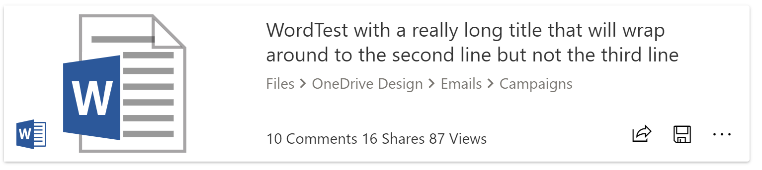
Basic prototype of the medium-sized ChicletCard.
Basic Medium-Sized Chiclet Example
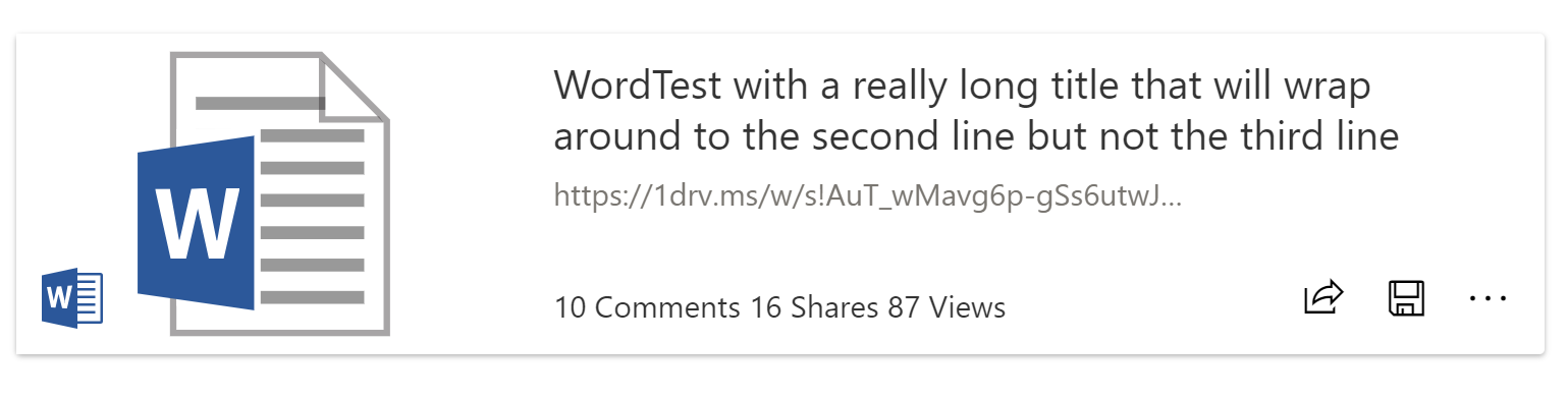
Basic Medium-Sized Chiclet with Breadcrumb Example