Ensure visual gap in dark panel mode between header and content#7465
Ensure visual gap in dark panel mode between header and content#7465spacegaier wants to merge 2 commits intohome-assistant:devfrom
Conversation
|
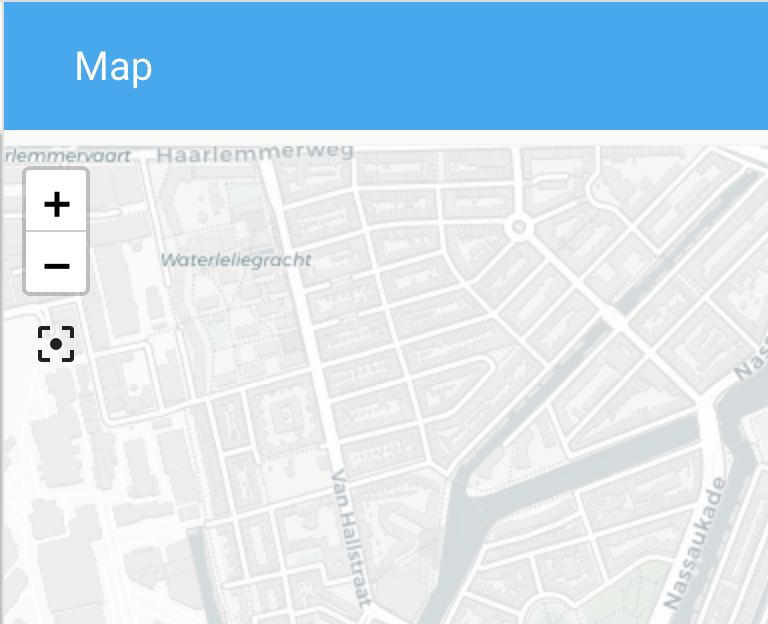
We should not do this. The panel is not always a card, what if it is an iframe or a map? |
How would that affect it? Wouldn't we then still want a clear visual separation for clarity? |
|
If the panel is not the same color (with an iframe and map) it just looks weird to have a gap between the header and the panel.
|
|
You could maybe give the card a different background color in panel mode?
|
I don't know. Purposefully introducing this inconsistency feels weird to me. I also I personally don't mind that gap in your map screenshot, since it is still consistent as all other tabs in a dashboard have it (although I have to admit that for the map it looks nice if it goes up directly to the menu). However, my changes do break using a map in panel mode apparently, although I am unclear currently why. But until we have a consensus if and how we move forward with this topic, I will not try to fix that yet 😄 . |
|
Have to agree with bram here. This would target panel views in light and dark mode and kind of goes against what panel mode is, especially when using iframes. Panel mode should fill the view. I think the a better fix here would be either changing the header color or card background color while in dark mode. |
|
The current dark theme has a gray border for the sidebar. Would it be an option to use the some for the header bar (both in and out of panel mode)? Then we would also have a consistent slight visual separation without switching around the background colors in different modes? I just tested in the browser dev tools. Regular view: Panel mode: |

|
That may look pretty odd depending, as a drop shadow is added to the bottom of the header when scrolling. I still think the best and easiest solution is just to change dark mode's default header or card background color. In light mode they are different colors, why not in dark mode? It would only be changing a single default theme color value, rather than anything more drastic, and in dark mode it would really only need to be a small change in the shade of the color. |
|
Okay, you and Bram have different ideas:
|
|
I didn't mean for us to change the card color for the panel mode, as that is not something we should do. More that the user could theme it if he wanted to. But would not really be a good solution anyway. |
|
For the color of the header/sidebar/cards, check material guidelines: https://material.io/design/color/dark-theme.html#usage |
Okay, gotcha. But would you be fine with changing the color of the header/sidebar (of coursed adhering to MatDesign) or would you say we do not do anything here in general and leave it all up to themeing instead? That would potentially mean every panel view user would require a custom theme if they want a separation between header and content as the light theme provides. |
|
I'm fine with changing the header or card color a bit, as long as it all looks good. |
|
I think just adjusting the header color is the way to go. Check out "Accessibility and contrast" in the "Properties" section of the material design link above. Essentially modify the Home Assistant brand's blue color to fit the dark theme on the header. |
|
Using their formula there, the header color would end up being #111e24 (even a slightly lighter version might be alright). |
|
Keep in mind that we have to make that work for every primary color, as a user can pick that. |
|
Closing in favor of #7514. |
4 participants
Breaking change
Proposed change
In dark mode the background color of the header and for a card are the same (medium dark gray). As there was no gap/space between header and content in panel mode, there was no visual bottom of the header. In the light theme, that missing gap is not an issue since header is blue, but card background is white.
I now added the same 8px gap that we have in non panel views.
Before:
After:
Comparison to non panel mode:
Type of change
Example configuration
Additional information
Checklist
If user exposed functionality or configuration variables are added/changed: