Repository navigation
fix(bulma-ui): warn when a wrapper inside a Control drops its Control-level props - #928
Conversation


…-level props

Inside a caller's Control, the convenience form wrappers render no Control of their own, so the
props they would have handed it, such as isLoading, the icon props and controlSize, did nothing
without a word. rendersOwnControl now makes that decision beside rendersOwnField and, in
development, warns once per set of props, naming them and saying to set them on the enclosing
Control. Only truthy props the caller passed count, so the pickers' default left icon never
warns, and an inline picker, which renders no Control anywhere, stays quiet. Rendered output is
unchanged, and production stays silent.

The pickers take their props whole so the check reads the caller's iconLeftName before the
default fills it in. A recording Control in bare-control.test.tsx traces each Control-level prop
to the Control prop it reaches, so a wrapper that hands its Control something new fails there
until the prop joins ControlLevelProps and the wrapper passes it to the helper.

Fixes #921

|
Warning Review limit reachedYou've used all free OSS reviews for now. Wait for the free limit to reset to keep reviewing this public repository. Next included review available in 9 minutes. View limit detailsLimit details: You’ve used the included review currently available. Review configuration: ⚙️ Run configuration
📒 Files selected for processing (26)
No actionable comments were generated in the recent review. 🎉 ℹ️ Recent review info⚙️ Run configuration
📒 Files selected for processing (26)
Included review availability: This review used your included allowance. Your plan provides up to 1 included review per hour; 0 remain after this review. WalkthroughForm wrappers now use a shared helper to determine whether they render a ChangesForm Control prop handling
Priority: ➖ Normal Estimated code review effort: 3 (Moderate) | ~25 minutes Change: Feature · Severity of issue fixed: Medium Merge Risk: ⚪ Minimal · up to No actionable issue remains in the supplied review evidence; the PR is mergeable after normal checks. 🚥 Pre-merge checks | ✅ 5✅ Passed checks (5 passed)
✨ Finishing Touches📝 Generate docstrings
🧪 Generate unit tests (beta)
Thanks for using CodeRabbit! It's free for OSS, and your support helps us grow. If you like it, consider giving us a shout-out. Comment |


Preview DeploymentPreview URL: https://6cd955ac.bestax.pages.dev |
![claude[bot]](https://avatars.githubusercontent.com/in/1236702?s=60&v=4)

There was a problem hiding this comment.
Deep review — 0 blocking · 1 advisory
| # | Severity | Area | Finding | Location |
|---|---|---|---|---|
| 1 | 🔵 Advisory | Robustness | An inline picker inside a Control still drops its Control-level props silently, and the added "warns in development" clause in the pickers' isLoading TSDoc does not hold there |
bulma-ui/src/form/DateInput.tsx:150 |
Overall: The change is sound and verified end-to-end. rendersOwnControl is a faithful sibling of #920's rendersOwnField: every one of the ten wrappers that skips its own Control now routes the decision through it, and the two rewritten conditions (!insideControl → ownControl, and !insideControl && !inline → !inline && rendersOwnControl(…)) are logically identical to what they replaced, so "rendered output is unchanged" holds by construction as well as by test. The riskiest part is the hand-maintained ON_CONTROL map, and that is exactly where the test design is strongest — Required<ControlLevelProps> forces a value for every new member, Record<keyof ControlLevelProps, string> forces a mapping, and warns inside a Control for exactly the props that reach its own derives the expected mapping from the real Control prop names rather than restating it, so a drifted entry fails rather than lying. A human should focus on whether scoping inline out of the warning is the call they want; everything else is mechanical.
What I verified empirically
| Check | Result |
|---|---|
jest src/form/__tests__/bare-control.test.tsx |
195 passed |
jest src/form |
40 suites, 2368 passed |
jest src/ grepped for renders no <Control> of its own |
0 — the new warning fires nowhere in the existing suite, so no current usage trips it |
pnpm --filter @allxsmith/bestax-bulma run test:coverage |
159 suites, 6368 passed, exit 0, so the 99% gate holds |
typecheck:tests |
clean — everyControlProp satisfies Required<ControlLevelProps> compiles |
check-conformance.mjs |
all 20 checks pass |
re-ran gen-api-docs, gen-mcp-index, gen-component-catalog, gen-eslint-meta |
git status clean — no stale generated artefact |
Build and Test, React 18 + React 19 matrix on 5f5cbe0e |
success |
Claim by claim against the diff: Select's isLoading is excluded from the check and still reaches SelectBase → .select.is-loading (SelectBase.tsx:96); Input's isLoading is destructured away and never reaches InputBase, so it is genuinely inert inside a Control; the pickers read props.iconLeftName before = 'calendar'/'clock'/'calendar-alt' applies, and iconLeftName="" — the documented way to hide it, DateInputBase.tsx:229 — is falsy so it correctly stays quiet; every ON_CONTROL target really exists on Control (iconLeftName/iconRightName at Control.tsx:62,66, plus size and className); Slider, Rate, Checkboxes and Radios hand their Control nothing but children. The ten wrappers that render a <Control> are exactly the ten that now call the helper — File and Taginput read insideControl but render none, and Autocomplete/Numberinput neither read it nor declare a Control-level prop.
Residual risk:
inlinepickers — posted as finding 1. The only executable path in the diff where a Control-level prop is still dropped without a word.- A new Control-level prop added to a wrapper — refuted. Two independent gates:
hands its Control only props that come from a Control-level propfails on any value handed to aControlthat is not one of the traced sentinels (an unlisted prop arrives asundefined, which is not intracedProp), andwarns inside a Control for exactly the props that reach its ownfails when a prop reaches theControlbut is not named in the warning. I traced both by hand againstDateInput's derivedhasIconsLeft={hasIconsLeft || !!iconLeftName}, the one non-pass-through value, and it still resolves to a traced sentinel. - Our own docs and stories tripping the new warning — refuted. Grepped every
.stories.tsx, API page and guide for a convenience wrapper carrying a Control-level prop inside a<Control>; the only two hits aredocs/docs/api/form/field.md:384(<Control isLoading><Select isLoading>, deliberately exempt and still working) anddocs/docs/api/form/datetime/timeinput.md:761(controlSizeon a standaloneTimeInput, noControlin sight). The whole-suite grep above corroborates it. - A falsy prop warning spuriously — refuted. The filter is a plain truthiness test and
Controlitself keys every class off truthiness (Control.tsx:187-191), so the two agree;ignores falsy Control-level props, which a Control ignores toocoversfalse,nulland''. - Production noise, or one mistake warning twice — refuted.
warnOncefails closed throughisDev()(devWarnings.ts:17-23) and adds towarnedKeysonly after that gate, so production neither logs nor accumulates keys;is silent in production, and renders the sameasserts byte-identical markup. The Field-level and Control-level keys are namespaced apart (:Field-in-bare-Control:vs:Control-props-in-Control:), so one mistake of each kind yields one warning each. - Nothing in the diff is behind a flag, a network call, or a browser-only CSS rule, so there is no path I could only read rather than run. One inherited property, unchanged here: the
warnOnceregistry is module-global, so an SSR process logs each key once for its whole lifetime rather than once per request.
🏄 Clean little set, dude. #920 paddled out and this one just rides the same wave one reef over — zero markup change, the warning only speaks up when you have actually dropped something, and the test harness basically dares a future prop to sneak past it. Only ripple is the
inlinepickers quietly eating their props, and that reads more like a known sandbar than a wipeout. Good to go. 🤙
An inline date or time picker renders no Control inside a Control or outside one, so its
Control-level props do nothing in either place. The pickers skipped rendersOwnControl in inline
mode, so <Control><DateInput inline isLoading /></Control>, the shape #921 is about, stayed
silent while the isLoading TSDoc said it warns.

The pickers now pass inline to the helper, which warns in development once per set of props in
both places with its own message: the props do nothing in inline mode, so leave them out. It
does not point at the enclosing Control, whose icons would sit over the calendar. The default
left icon still never warns, and rendered output is unchanged.

|
deep-review: verify Every open thread has a reply: fixed, with the commit, or refuted with a reason. This settles them on f0494bd. |
Preview DeploymentPreview URL: https://2c48d1b6.bestax.pages.dev |
There was a problem hiding this comment.
Deep review (verify) — 1 resolved · 0 open
| # | Severity | Area | Thread | Outcome |
|---|---|---|---|---|
| 1 | 🔵 Advisory | Robustness | An inline picker inside a Control still drops its Control-level props silently |
✅ Verified fixed — resolved |
Overall: This pass settled threads and reviewed no commits. The one open thread — the inline carve-out that skipped the new diagnostic, plus the isLoading TSDoc that over-claimed because of it — is genuinely fixed in f0494bdc, and fixed at the right level: rendersOwnControl now owns the inline case (FormContext.tsx:174) instead of each picker short-circuiting past it, so the helper stays the single place the Control decision and its warning live. The broadened scope (an inline picker now warns outside a Control too) is a strict superset of what the thread asked for, rendered output is unchanged on both inline paths, and the class TSDoc, the three API pages and skills/bestax-form were updated in the same commit. Nothing is left for a human to arbitrate here.
What this pass checked
FormContext.tsx:174—if (!options.inline && !options.insideControl) return true;is the only early return, so aninlinepicker falls through to theheldfilter from either position. The twowarnOncekeys differ (Control-props-inlinevsControl-props-in-Control), so neither dedupes the other away.DateInput.tsx:151-153,TimeInput.tsx:143-145,DateTimeInput.tsx:145-147— all three passinline: baseProps.inline, and all three still readiconLeftName: props.iconLeftNamepre-default, so the component's own default glyph never counts as a prop the caller set.ownControlresolves tofalseon both inline paths, exactly as the old!baseProps.inline &&chain did, so the fix adds a warning without touching markup — pinned by the new test'swithoutIds(container.innerHTML)equality assertion.DateInput.tsx:64-71— theisLoadingTSDoc's "draws nothing and warns in development" is now true in inline mode too, which was the second half of the finding.pnpm --filter @allxsmith/bestax-bulma exec jest src/form→ 40 suites, 2371 tests, all passing.
Residual risk: none identified for the settled finding. rendersOwnControl's inline option is optional, so the non-picker wrappers that omit it keep their prior behaviour unchanged, and bare-control.test.tsx still holds ON_CONTROL to what each wrapper hands its own Control, so a new Control-level prop fails there until it is wired through both paths. A verify pass raises no new findings by design — a fresh review is what reviews the commits since.
🏄 Called the break, and the author paddled out and caught a bigger wave than the one I pointed at — inline pickers now speak up whether they're tucked into a Control or riding solo. Thread closed out clean, zero open, totally good to go.
 github-actions
Bot
added
the
review-converged
github-actions
Bot
added
the
review-converged
 allxsmith
added
the
needs-human-review
github-actions
Bot
removed
the
review-converged
allxsmith
added
the
needs-human-review
github-actions
Bot
removed
the
review-converged
📸 Story screenshots at handoff —
|
| Light | Dark |
|---|---|
 |
 |
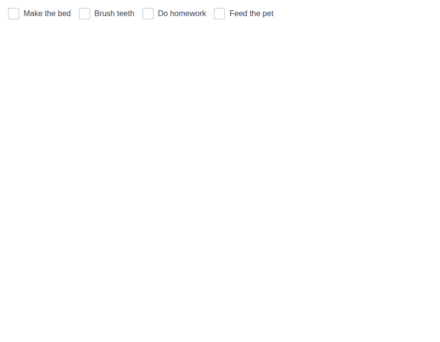
form-checkboxes--with-colors · Form/Checkboxes · With Colors
| Light | Dark |
|---|---|
 |
 |
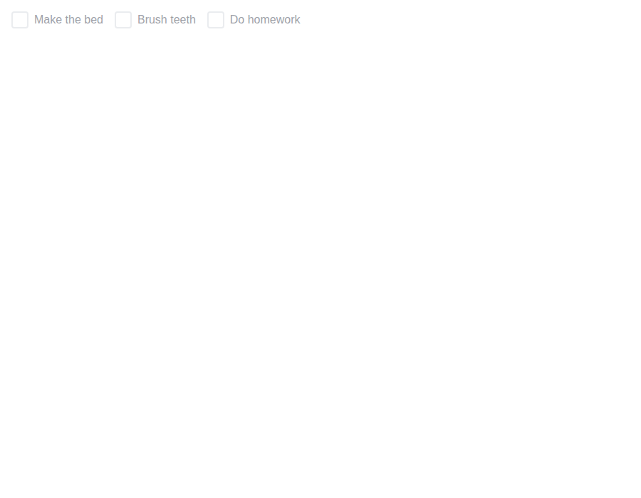
form-checkboxes--disabled-group · Form/Checkboxes · Disabled Group
| Light | Dark |
|---|---|
 |
 |
form-checkboxes--with-label · Form/Checkboxes · With Label
| Light | Dark |
|---|---|
 |
 |
form-checkboxes--with-field-wrapper · Form/Checkboxes · With Field Wrapper
| Light | Dark |
|---|---|
 |
 |
form-checkboxes--with-field-control-wrapper · Form/Checkboxes · With Field Control Wrapper
| Light | Dark |
|---|---|
 |
 |
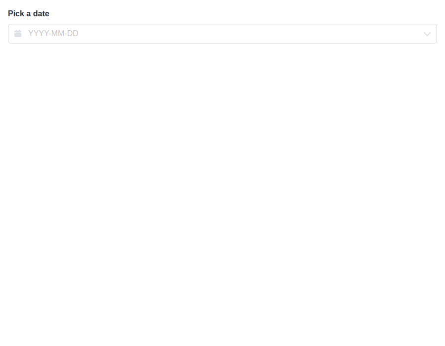
form-dateinput--default · Form/DateInput · Default
| Light | Dark |
|---|---|
 |
 |
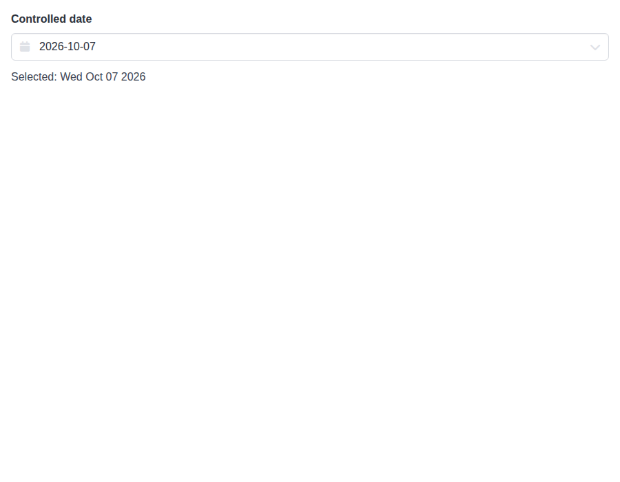
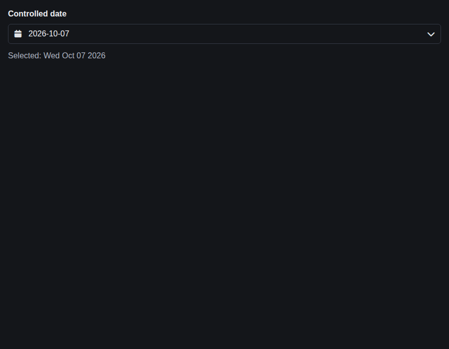
form-dateinput--controlled · Form/DateInput · Controlled
| Light | Dark |
|---|---|
 |
 |
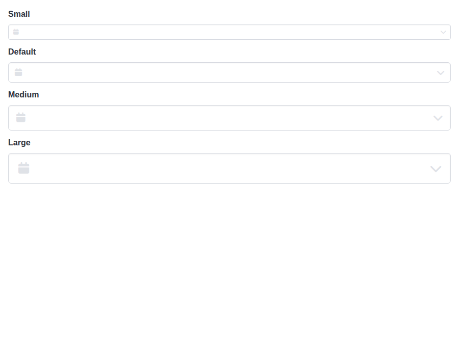
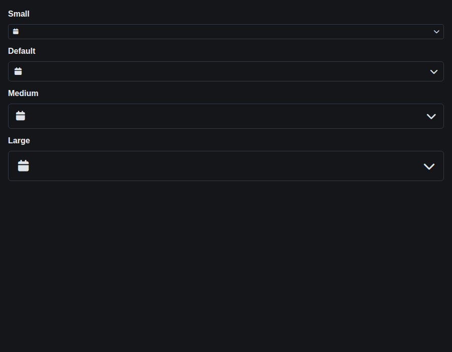
form-dateinput--sizes · Form/DateInput · Sizes
| Light | Dark |
|---|---|
 |
 |
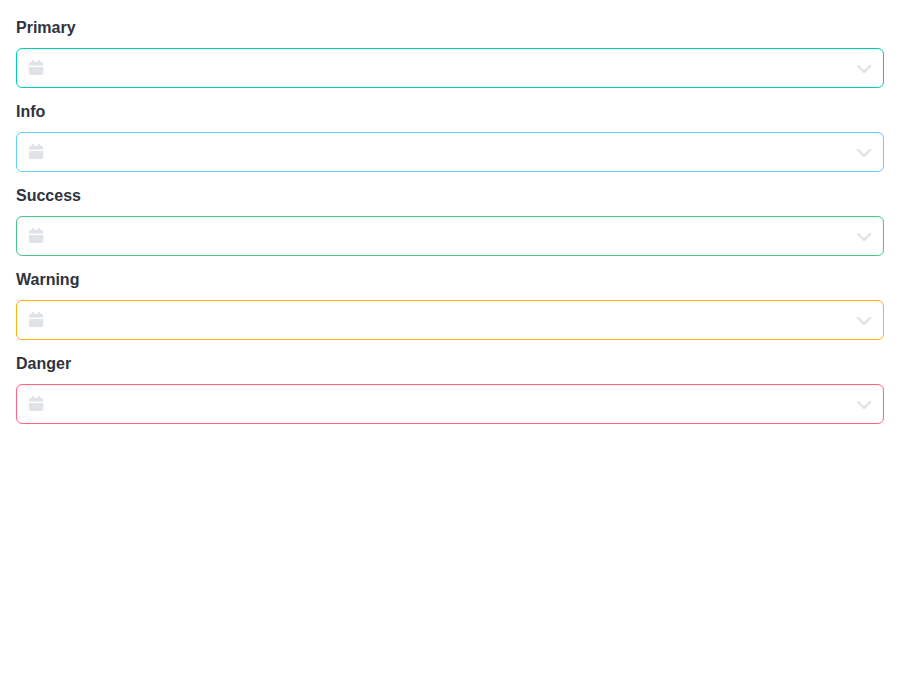
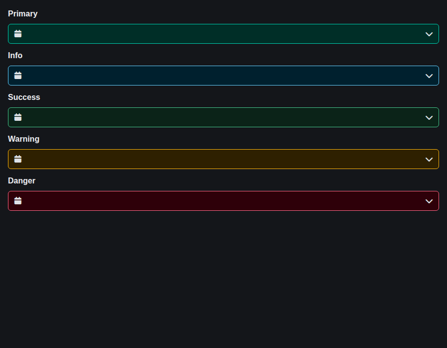
form-dateinput--colors · Form/DateInput · Colors
| Light | Dark |
|---|---|
 |
 |
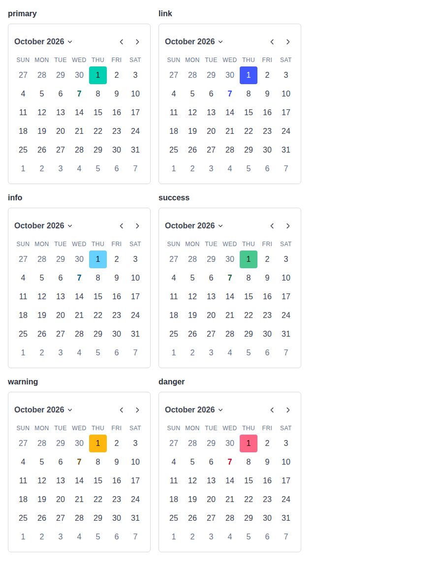
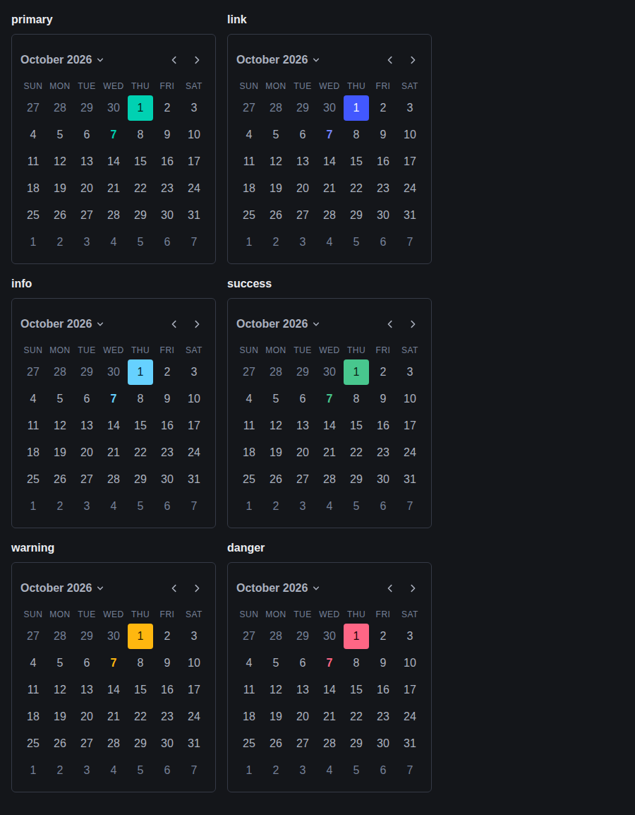
form-dateinput--inline-colors · Form/DateInput · Inline Colors
| Light | Dark |
|---|---|
 |
 |
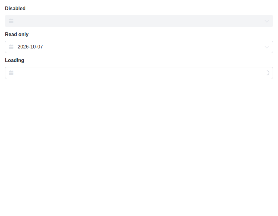
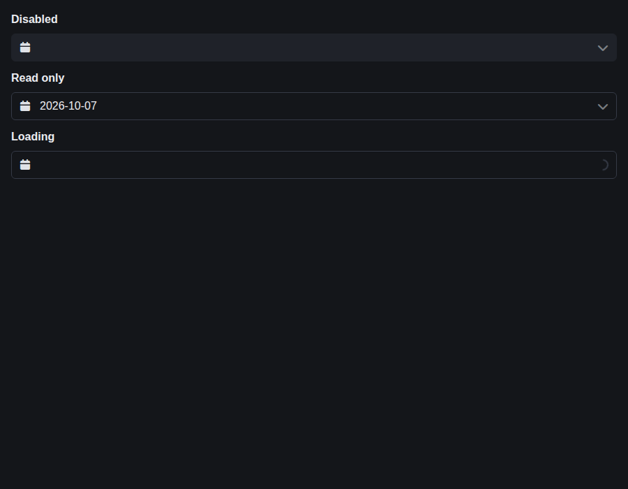
form-dateinput--states · Form/DateInput · States
| Light | Dark |
|---|---|
 |
 |
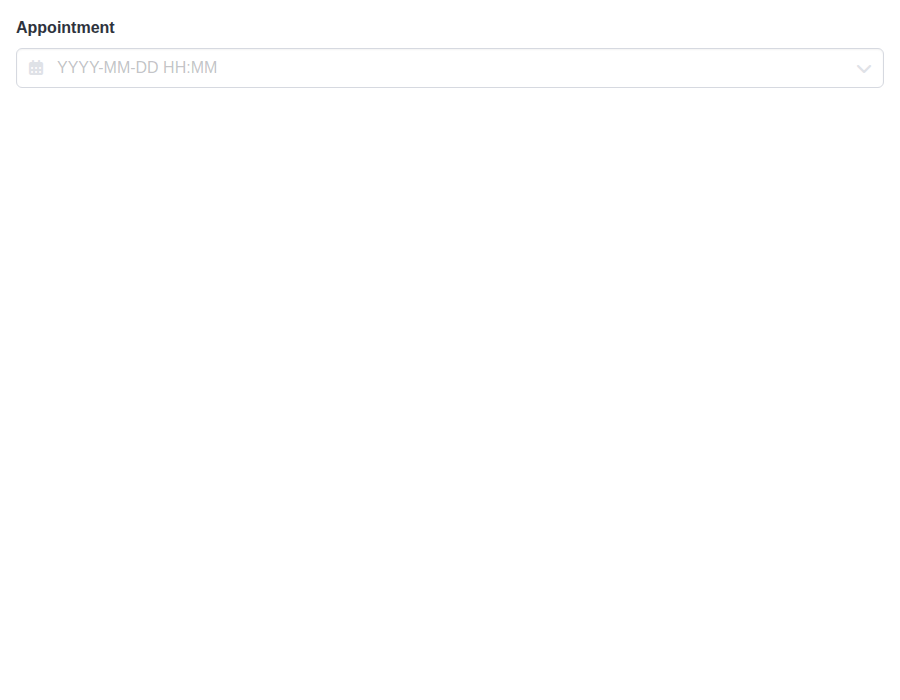
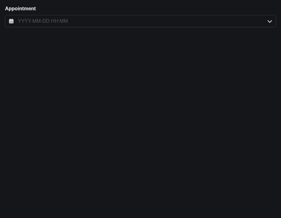
form-datetimeinput--default · Form/DateTimeInput · Default
| Light | Dark |
|---|---|
 |
 |
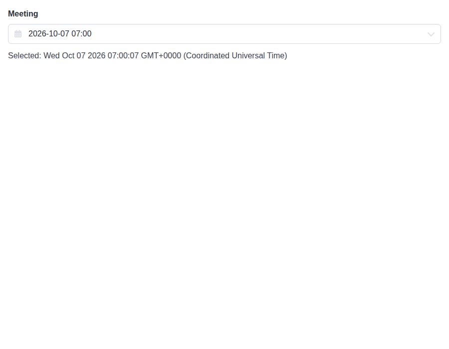
form-datetimeinput--controlled · Form/DateTimeInput · Controlled
| Light | Dark |
|---|---|
 |
 |
form-datetimeinput--format-12-h · Form/DateTimeInput · Format 12 H
| Light | Dark |
|---|---|
 |
 |
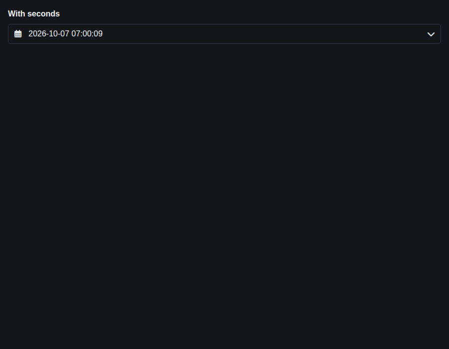
form-datetimeinput--with-seconds · Form/DateTimeInput · With Seconds
| Light | Dark |
|---|---|
 |
 |
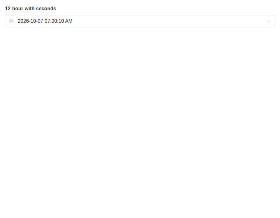
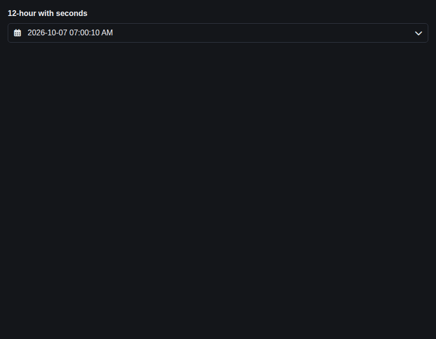
form-datetimeinput--format-12-h-with-seconds · Form/DateTimeInput · 12-hour with seconds
| Light | Dark |
|---|---|
 |
 |
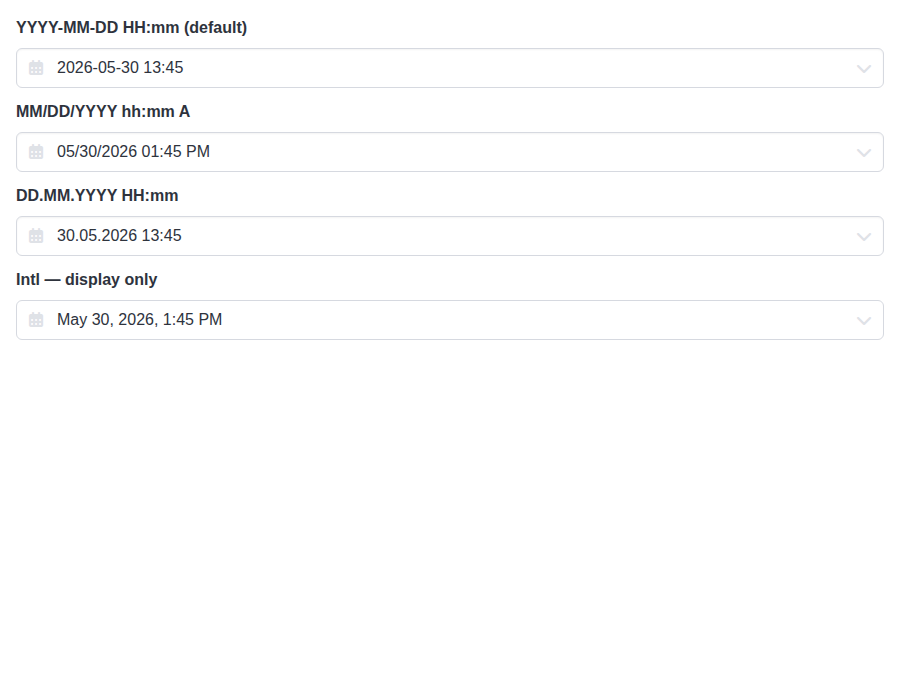
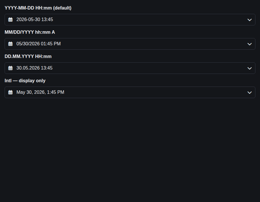
form-datetimeinput--formats · Form/DateTimeInput · Formats (compare)
| Light | Dark |
|---|---|
 |
 |
form-input--default · Form/Input · Default
| Light | Dark |
|---|---|
 |
 |
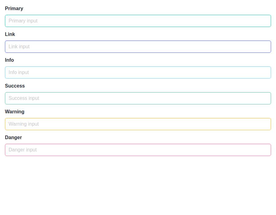
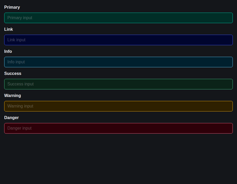
form-input--colors · Form/Input · Colors
| Light | Dark |
|---|---|
 |
 |
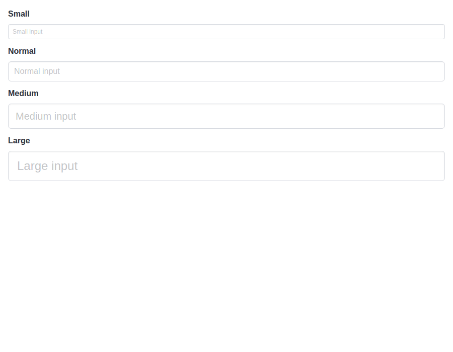
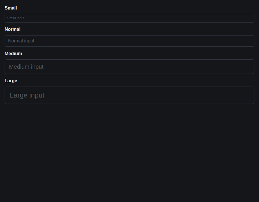
form-input--sizes · Form/Input · Sizes
| Light | Dark |
|---|---|
 |
 |
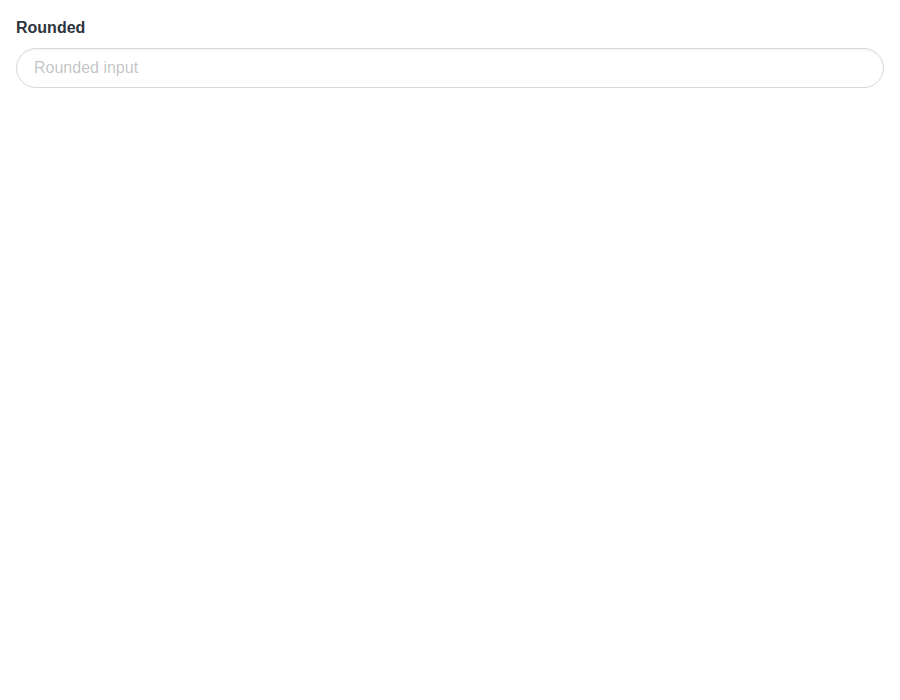
form-input--rounded · Form/Input · Rounded
| Light | Dark |
|---|---|
 |
 |
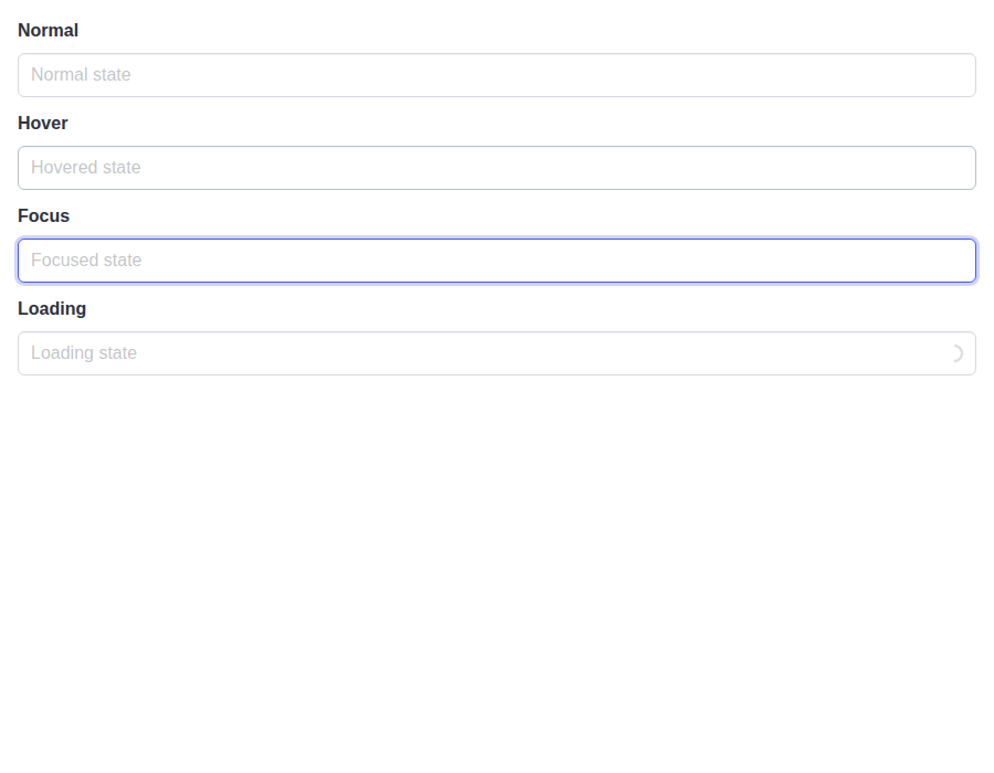
form-input--states · Form/Input · States
| Light | Dark |
|---|---|
 |
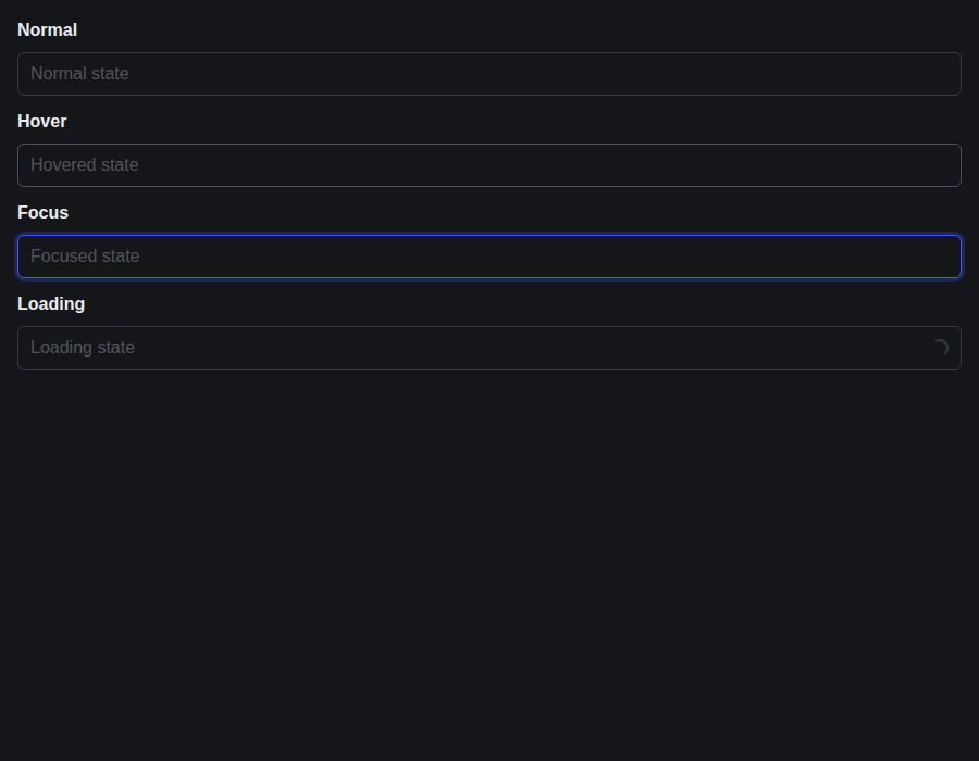 |
form-input--loading-sizes · Form/Input · Loading Sizes
| Light | Dark |
|---|---|
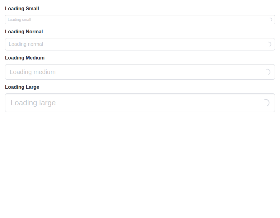 |
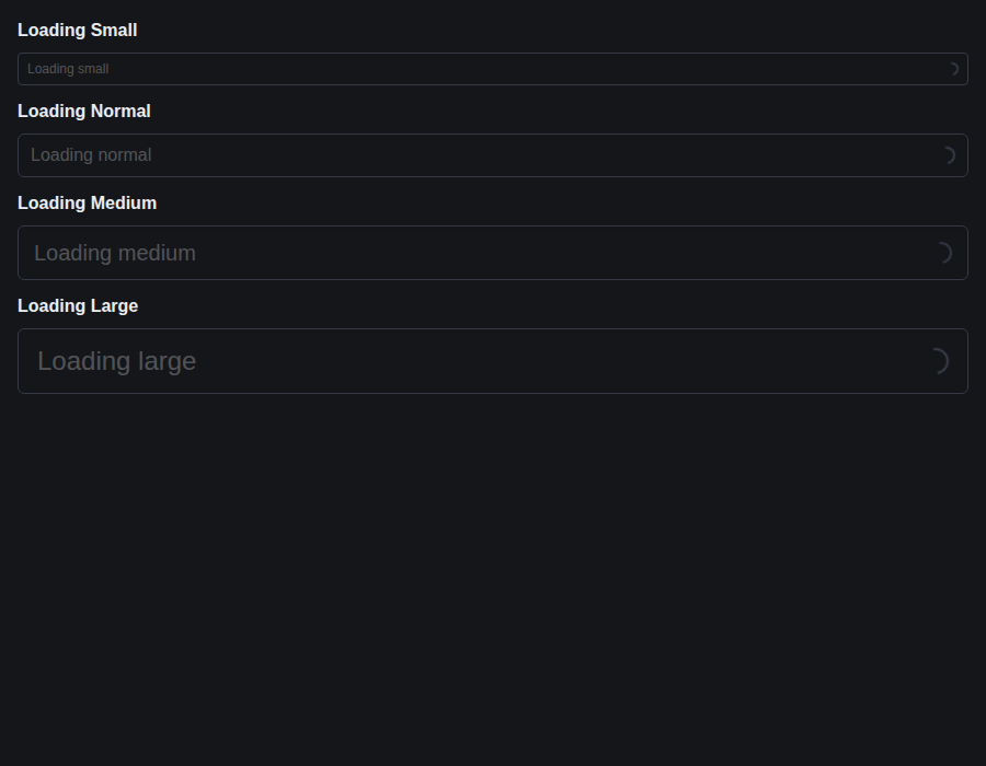 |
github-actions
Bot
added
the
review-converged
…props-warning

# Conflicts:
#	bestax-mcp/data/skills.json
github-actions
Bot
removed
the
review-converged
Preview DeploymentPreview URL: https://28c8ee95.bestax.pages.dev |
There was a problem hiding this comment.
Deep review — 0 blocking · 1 advisory
| # | Severity | Area | Finding | Location |
|---|---|---|---|---|
| 1 | 🔵 Advisory | Robustness | A picker's iconLeftSize/hasIconsLeft warning says "set it on that Control", but the deliberately-excluded default iconLeftName means doing so renders nothing |
bulma-ui/src/form/DateInput.tsx:156 |
Overall: The change is sound. rendersOwnControl reduces to exactly the old predicate (!inline && !insideControl) on every path, so rendered output is provably unchanged, and bare-control.test.tsx is a real guard rather than a restatement — I traced both failure directions by hand (a wrapper that hands its Control a new prop lands an untraced undefined in handedToControl, and a mismatch between the props passed to the helper and the props that reach the Control breaks named/toSet), and both fail the suite. 198 tests in that file and 2388 across src/form pass locally, FormContext.tsx is at 100% on all four metrics, both tsc programs are clean, and "Build and Test" is green on f2afc2f4. The riskiest part is that ON_CONTROL, the per-wrapper argument lists, and Select's deliberate isLoading omission are three hand-maintained lists that must agree; the test holds all three together, so the human's attention is better spent on whether the inline picker's "leave it out" message is the guidance you want for controlSize/isExpanded/controlClassName inside a Control, where the icon-collision reason behind it does not apply.
Residual risk:
- A wrapper missed entirely. Refuted:
useInsideControlhas exactly ten callers that skip aControl(Input, Select, TextArea, the three pickers, Slider, Rate, Checkboxes, Radios) and all ten now route throughrendersOwnControl.FileandTaginputread it only forrendersOwnFieldand render noControl(File'siconLeft/iconRightsit inside its own.file-label);Autocompletehasloading, notisLoading, andNumberinputrenders its own.controlwithis-loadingunconditionally (Numberinput.tsx:286-288), so neither drops anything. - A prop accepted but never handed to any
Control(dropped everywhere, so never warned). Refuted: the suite asserts all 12ControlLevelPropsreachInput's and each picker's ownControl;Selecthands 7 and routesisLoadingtoSelectBase;TextAreahands its 3; Slider/Rate/Checkboxes/Radios declare none. - A false positive — warning for a prop that still works. Refuted:
Input.isLoadingis destructured away fromInputBase(whose.input.is-loadingdraws nothing by Bulma's rules, per its own TSDoc), and the pickers'triggerIconreadsuseControlLoading()rather than theirisLoadingprop, sorenders the same inside a Control with or without those propspassing for every wrapper is the real evidence. - A future default silently warning. Refuted:
renders no Field in a bare Controlandnever warns for $name's own default iconboth assert zero warnings for a props-free render inside aControl, so any new wrapper-supplied default fails the suite. - New console noise in our own examples. Refuted: swept every story and
docs/docslive block — all Control-level props sit on theControlitself, noinlinepicker is given one, and the<Control isLoading><Select isLoading>example infield.md:382is the case the implementation deliberately excludes. - Open: the inline picker's message does not point at the enclosing
ControlforcontrolSize,controlClassName,isExpandedorisLoading, which have no icon collision with the panel. Left open rather than raised — it is the reason the earlier inline thread was resolved on, and narrowing it would re-litigate that. - Open (prior design, out of scope): a Field-level prop inside an outer
Fieldis still dropped in silence (rendersOwnFieldreturns early oninsideFieldwith no warning, andbare-control.test.tsx:289-302asserts that), and the pickers' prop-levelisLoadingTSDoc is the only one updated —Input/Select/TextAreacarry the disclosure in the interface-level block comment, which reaches neither the generated prop tables nor the MCP index.
🏄 Clean little swell, this one — no new waves, just a lifeguard finally blowing the whistle when your
isLoadingwipes out inside someone else'sControl. The test harness is the real board here: it'll catch the next wrapper that tries to paddle out with an undeclared prop. Good to go.
|
🎉 This PR is included in version 5.26.5 🎉 The release is available on: Your semantic-release bot 📦🚀 |
|
deep-review: verify Every open thread has a reply: fixed, with the commit, or refuted with a reason. This settles them on 2b09e88. |
|
🎉 This PR is included in version 4.2.13 🎉 The release is available on: Your semantic-release bot 📦🚀 |
|
🎉 This PR is included in version 2.25.1 🎉 The release is available on: Your semantic-release bot 📦🚀 |
|
🎉 This PR is included in version 1.14.1 🎉 The release is available on: Your semantic-release bot 📦🚀 |
1 participant

Inside a Control you wrap around it, a convenience form wrapper renders no Control of its own. The props it would have handed that Control, such as
isLoading, the icon props,isExpanded,controlSizeandcontrolClassName, then did nothing, and nothing said so.<Field><Control><Input isLoading /></Control></Field>showed no spinner and logged nothing.Each wrapper that skips its Control inside one now decides that with
rendersOwnControl, which sits beside #920'srendersOwnFieldinFormContext.tsx. In development it warns once per set of props, naming the ones that were dropped and saying to set them on the enclosing Control, with the Control's own name where it differs (sizeforcontrolSize,classNameforcontrolClassName). Only truthy props the caller passed count. The date and time pickers readiconLeftNamebefore their default glyph fills it in, so that default never warns. A picker's ownisLoadinginside a loading Control still draws nothing, so it warns too. Rendered output is unchanged everywhere, and production stays silent.bare-control.test.tsxrecords every Control the wrappers render and traces each Control-level prop to the Control prop it reaches, so a wrapper that hands its Control a new prop fails the suite until that prop joinsControlLevelPropsand the wrapper passes it to the helper. The table covers every wrapper that skips its Control inside one.Some cases stay quiet on purpose. Select's
isLoadingis drawn on the select itself and still works inside a Control. Slider, Rate, Checkboxes and Radios hand their Control no props at all. An inline picker renders no Control inside a Control or outside one, so its Control-level props do nothing in either place; it warns about them in both, with its own message saying to leave them out rather than pointing at the enclosing Control. File and Taginput never render a Control.TSDoc, the API pages for the affected wrappers, the form guide and the bestax-form skill now mention the warning.
pnpm allpasses locally.Fixes #921
Summary by CodeRabbit
Bug Fixes
isLoadingbehavior remains available when nested inside a Control.Documentation