Repository navigation
fix(bulma-ui): let Autocomplete's clear button give way to a loading spinner - #927
Conversation


…spinner

The clear button sat under the spinner of a `<Control isLoading>` around the Autocomplete,
which also caught clicks on the middle of it. It sat under the Autocomplete's own `loading`
spinner as well, whose icon box covers it entirely, so it could not be clicked at all while
loading. It now reads the enclosing Control's loading state through the internal hook the
pickers use, and hides while either spinner shows, the way it already hides while the input
is empty or disabled.

Numberinput's buttons and stepper also sit under a loading Control's spinner, but they are the
component itself rather than chrome that can step aside. Its own `isLoading` keeps the spinner
inside the input, clear of them, and its TSDoc and the form skill now point there. Taginput's
only right-edge element is its own loader, drawn only for an explicit `loading`, with nothing
under it to click.

|
Warning Review limit reachedYou've used all free OSS reviews for now. Wait for the free limit to reset to keep reviewing this public repository. Next included review available in 51 minutes. View limit detailsLimit details: You’ve used the included review currently available. Review configuration: ⚙️ Run configuration
📒 Files selected for processing (13)
Thanks for using CodeRabbit! It's free for OSS, and your support helps us grow. If you like it, consider giving us a shout-out. Comment |

Preview DeploymentPreview URL: https://17a3f7b2.bestax.pages.dev |
![claude[bot]](https://avatars.githubusercontent.com/in/1236702?s=60&v=4)

There was a problem hiding this comment.
Deep review — 0 blocking · 2 advisory
| # | Severity | Area | Finding | Location |
|---|---|---|---|---|
| 1 | 🔵 Advisory | Correctness | Taginput is audited clean against its own loader, but the element that blocks clicks is the ::after of the wrapping Control, and closable tags put delete buttons at that same right edge |
bestax-mcp/data/components/Autocomplete.json:146 (no line of its own — PR body) |
| 2 | 🔵 Advisory | Accessibility | The clear button this diff gates is a span with role="button", no tab stop and no key handler, so it is unreachable by keyboard at any time (pre-existing) |
bulma-ui/src/form/Autocomplete.tsx:478 |
Overall: The change is sound and narrow, and every empirical claim in the PR body that I could chase held up. I confirmed the failure mechanism from the compiled rules rather than taking it on trust: the clear icon and the loader both render as .icon.is-right inside the same .control.has-icons-right, Bulma stacks them in one identical 2.5em box, and _autocomplete.scss re-enables pointer-events: auto on that selector — so the later-painted loader intercepted every click, and the clear button really was dead while loading was set rather than merely obscured. The one-line showClear gate is the same shape #917 gave the picker launchers, the new test covers Field-plus-Control, bare Control, idle and own-loading, and jest src/form (2301 tests) plus typecheck:tests pass locally. The riskiest part is not the code but the audit scope: #923 named three components and two of them are answered with prose, so the human should look first at finding 1 and decide whether Taginput really is clean before closing it.
Residual risk:
- Own-
loadingspinner. Refuted as remaining:showClearexcludesloading, and a test asserts the button is absent forclearable loadingwith a value. - A loading Control whose spinner is nowhere near the Autocomplete (several children in one
.control, or an addons group where the loading Control is not the one wrapping the Autocomplete) still hides the clear button — the context reports the presence of a loading ancestor Control, not proximity. Open but accepted: the identical trade-off to #917, and one input per.controlis the convention Bulma itself follows. - Numberinput, declined on purpose. Refuted that the decision leaves bad advice behind:
expandedControlClassesalways carriesis-loadingfrom the prop on the component itself and is rendered unconditionally (Numberinput.tsx:286-289,332-353) with nouseInsideControlgate — so unlike the wrappers listed in #921, its ownisLoadingstill draws inside a Control supplied by the caller, which is exactly what the new TSDoc tells people to do. The stepper is a flex sibling rather than an overlay (_numberinput.scss:89-99), so that spinner does not collide with the arrows either. - The Numberinput guidance does not hold for
controlsPosition="left", where no button sits at the right edge and a wrapping loading Control is harmless. Named here rather than posted: imprecise rather than false, and following the advice is still safe. - A hand-rolled
div.control.is-loading, and theiconRighton Control itself — out of scope per #923, unchanged here. - Without the SCSS that bestax ships (the package ships
src/scssfor consumers to compile), stock Bulma gives every.control .iconpointer-events: none, so the clear button was never clickable in that configuration either. Pre-existing and untouched. - Taginput — posted as finding 1. I could not refute it, only bound it to the geometry quoted in that comment; no browser was available in this session, so it is reasoned from the compiled rules rather than observed.
- Generated artefacts. The
Build and Testjob was still running when this was written, sogen:mcp:checkandcheck:conformanceare unconfirmed. The one derived value I could check by hand, thereferences/api.mdbyte count recorded inskills.json, matches the file at 10328 bytes.
🏄 Mellow little one-liner with a long paddle-out behind it — the author went and read the compiled CSS before touching any JSX, and it shows. Only thing still bobbing past the break is whether Taginput really got looked at, so give that a squint and then send it.
…ar button

A loading Control around a Taginput draws its spinner over the first row of tags. At some
widths that lands on the delete button of the last tag in the row, and the spinner caught the
clicks meant for it. The spinner now lets clicks through when it wraps a Taginput, the way the
Taginput's own loader already does.

Autocomplete's clear button was a span with a button role, so Tab never reached it and no key
could press it. It is now a native button with the same name and classes, which Bulma's button
reset already draws exactly like the span, so Tab reaches it and Enter or Space clears the
input.

|
deep-review: verify Every open thread has a reply: fixed, with the commit, or refuted with a reason. This settles them on 21a064b. |
Preview DeploymentPreview URL: https://5b6572d8.bestax.pages.dev |
There was a problem hiding this comment.
Deep review (verify) — 2 resolved · 0 open
| # | Severity | Area | Finding | Location |
|---|---|---|---|---|
| 1 | 🔵 Advisory | Correctness | Taginput delete buttons at the right edge sat under a loading Control spinner — fixed, resolved | bulma-ui/src/scss/form/_taginput.scss:358 |
| 2 | 🔵 Advisory | Accessibility | The clear button that showClear gates was not keyboard-reachable — fixed, resolved |
bulma-ui/src/form/Autocomplete.tsx:479 |
Overall: This pass settled the two threads the earlier deep review left open and reviewed no commits. Both were fixed in 21a064b2 and both fixes hold up: the new SCSS rule carries three classes, so it outranks the two-class .control.is-loading::after Bulma ships (which declares no pointer-events of its own), and Taginput.styles.test.tsx pins the compiled rule against the real rendered markup in two wrapper shapes, a non-Taginput control, and a bestax--prefixed build. The clear affordance is now a native <button type="button"> with an aria-hidden svg, and handleClear ends in inputRef.current?.focus(), so focus lands back in the input rather than stranding on the unmounted button; the new test tabs there and activates with both Enter and Space through userEvent. All 211 tests across the three Autocomplete/Taginput suites pass.
Residual risk: Nothing new was hunted — a verify pass raises no findings. The one residual noted while confirming the Taginput fix is that the spinner still draws over the last tag delete button (clicks pass through, but the target is visually obscured), which the PR body states plainly as the deliberate trade-off against reserving padding that would make tags jump rows. A reader who wants the current code reviewed afresh should ask for one with a deep-review: fresh steer.
🏄 Both advisories came back from the author fully patched — the spinner lets clicks slide right on through, and the clear button finally catches a Tab. Clean set, no wipeouts, good to go.
 github-actions
Bot
added
the
review-converged
github-actions
Bot
added
the
review-converged
 allxsmith
added
the
needs-human-review
github-actions
Bot
removed
the
review-converged
allxsmith
added
the
needs-human-review
github-actions
Bot
removed
the
review-converged
📸 Story screenshots at handoff —
|
| Light | Dark |
|---|---|
 |
 |
form-autocomplete--object-data · Form/Autocomplete · Object Data
| Light | Dark |
|---|---|
 |
 |
form-autocomplete--clearable · Form/Autocomplete · Clearable
| Light | Dark |
|---|---|
 |
 |
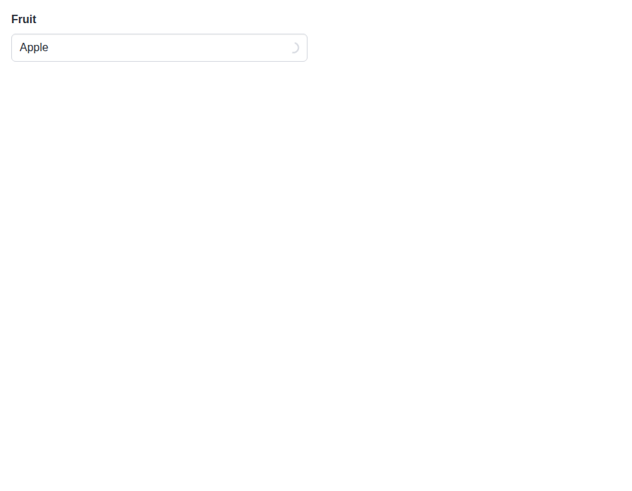
form-autocomplete--clear-in-loading-control · Form/Autocomplete · Clear button in a loading Control
| Light | Dark |
|---|---|
 |
 |
form-autocomplete--open-on-focus · Form/Autocomplete · Open On Focus
| Light | Dark |
|---|---|
 |
 |
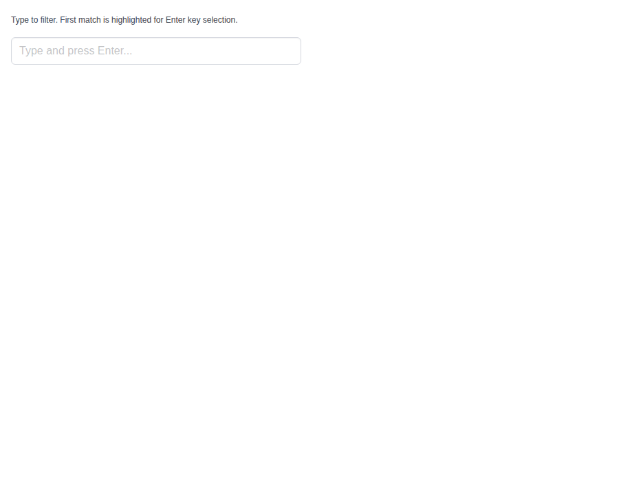
form-autocomplete--keep-first · Form/Autocomplete · Keep First
| Light | Dark |
|---|---|
 |
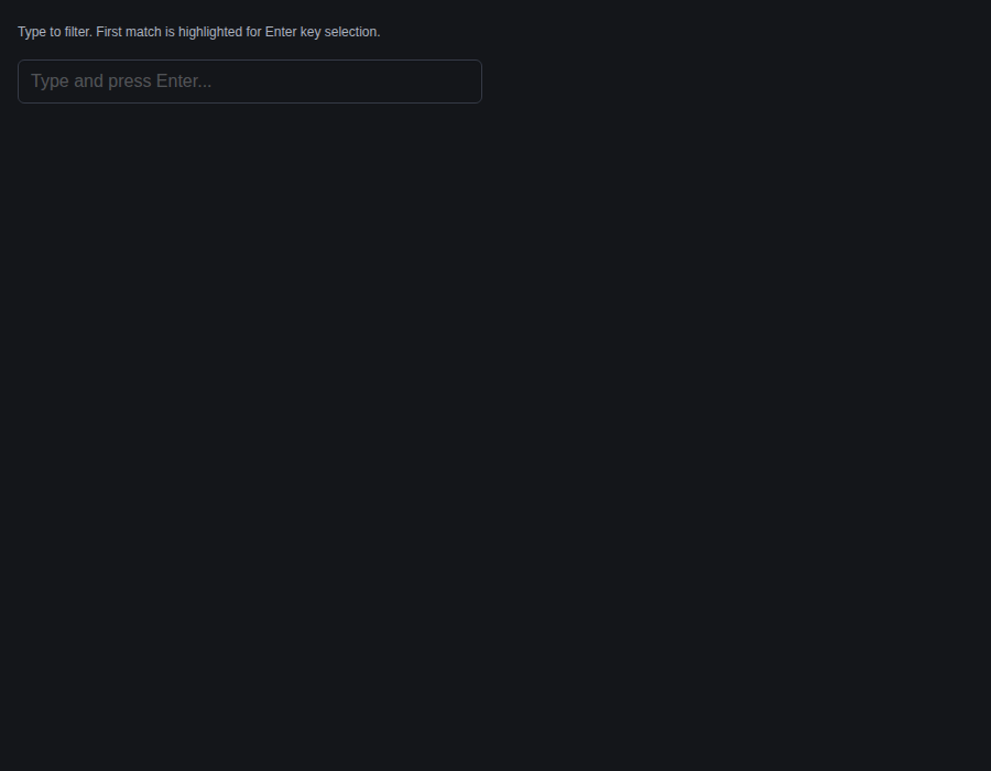 |
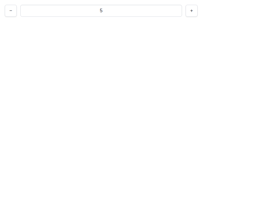
form-numberinput--default · Form/Numberinput · Default
| Light | Dark |
|---|---|
 |
 |
form-numberinput--rounded · Form/Numberinput · Rounded
| Light | Dark |
|---|---|
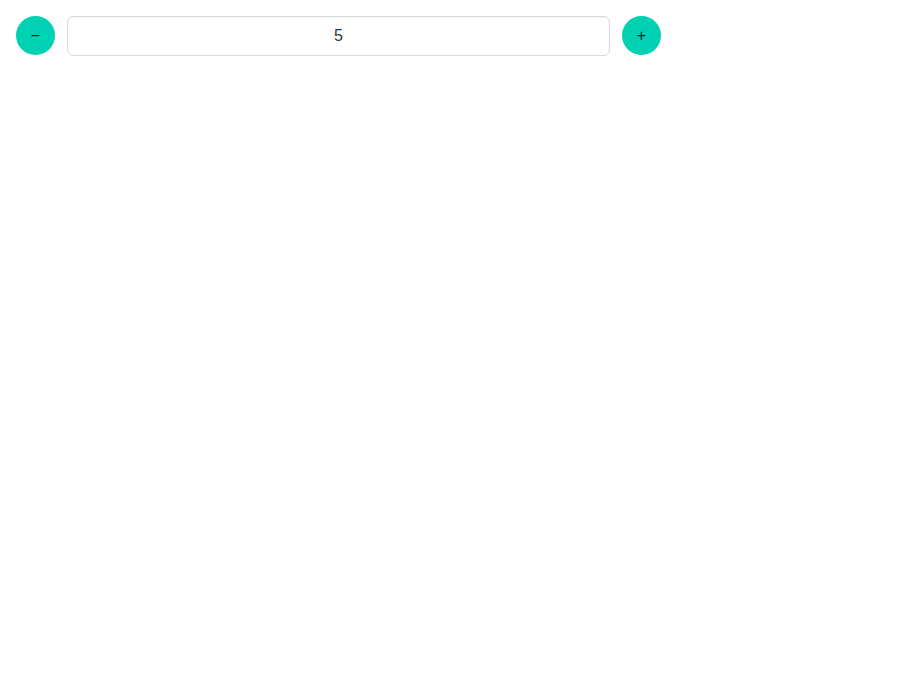 |
 |
form-numberinput--compact · Form/Numberinput · Compact
| Light | Dark |
|---|---|
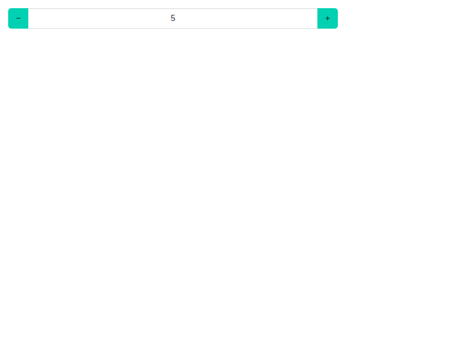 |
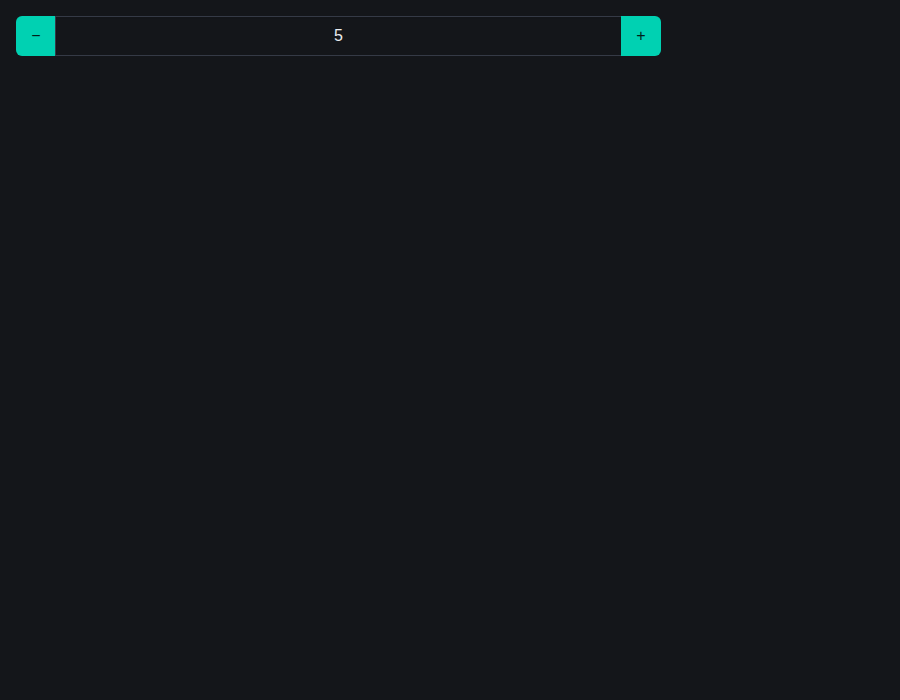 |
form-numberinput--compact-rounded · Form/Numberinput · Compact Rounded
| Light | Dark |
|---|---|
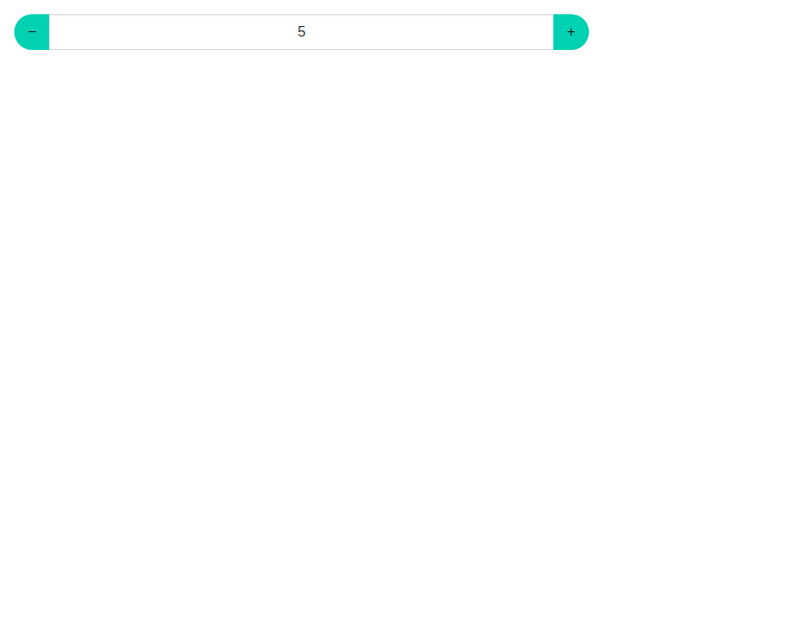 |
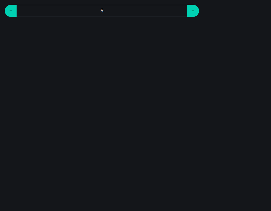 |
form-numberinput--compact-rounded-right · Form/Numberinput · Compact Rounded Right
| Light | Dark |
|---|---|
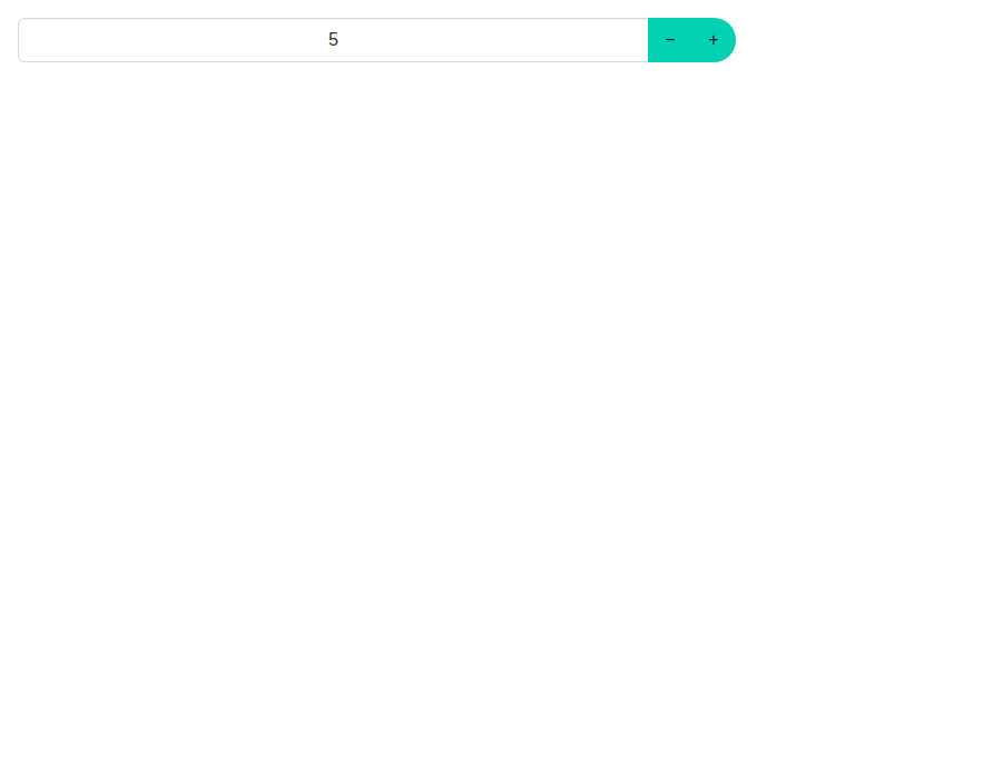 |
 |
form-numberinput--controls-left · Form/Numberinput · Controls Left
| Light | Dark |
|---|---|
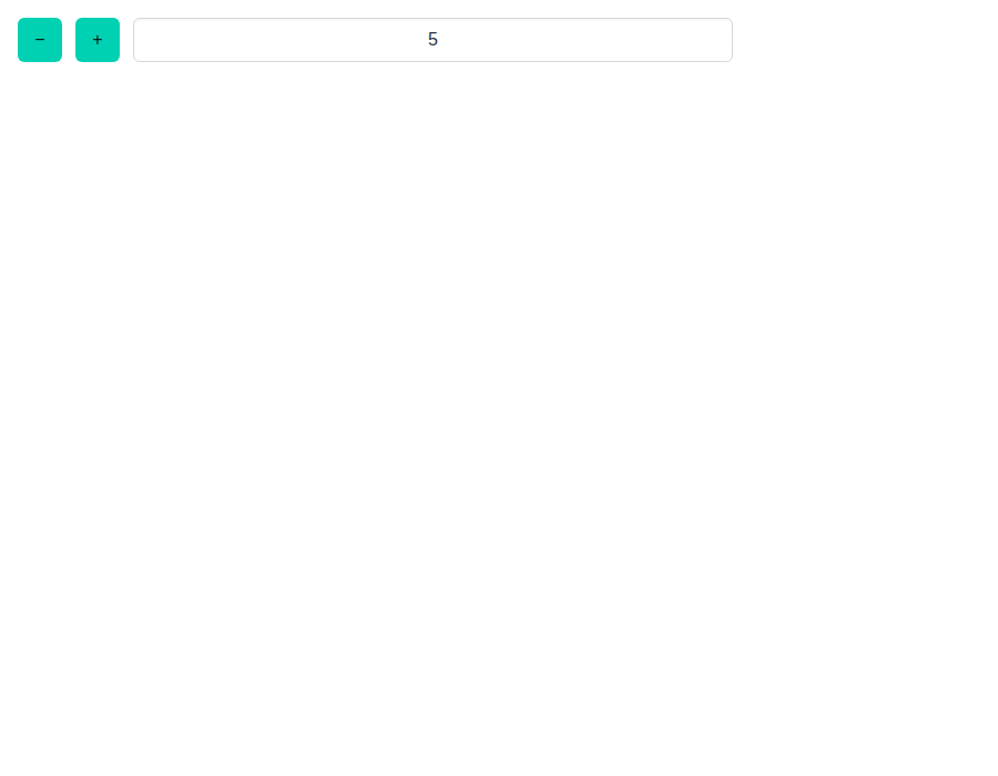 |
 |
form-taginput--default · Form/Taginput · Default
| Light | Dark |
|---|---|
 |
 |
form-taginput--with-icon · Form/Taginput · With Icon
| Light | Dark |
|---|---|
 |
 |
form-taginput--with-autocomplete · Form/Taginput · With Autocomplete
| Light | Dark |
|---|---|
 |
 |
form-taginput--restrict-to-list · Form/Taginput · Restrict To List
| Light | Dark |
|---|---|
 |
 |
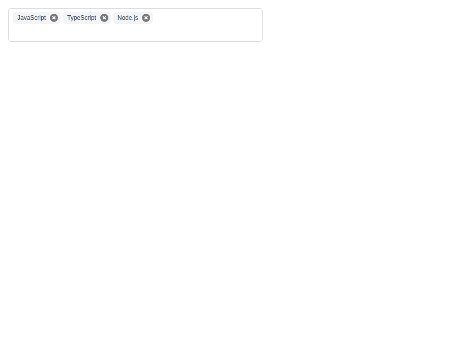
form-taginput--default-tags · Form/Taginput · Default Tags
| Light | Dark |
|---|---|
 |
 |
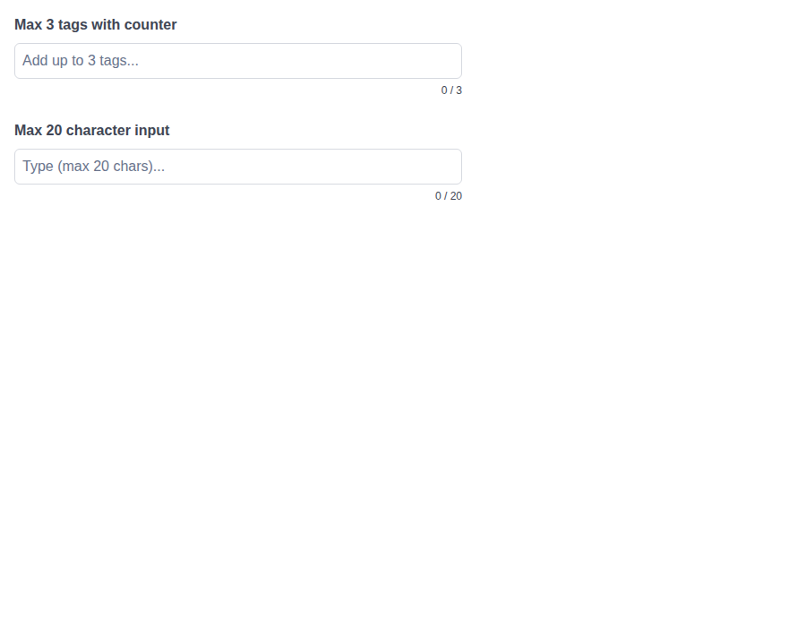
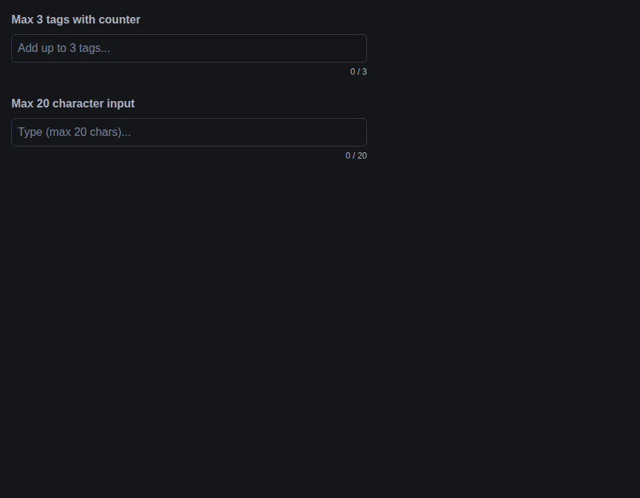
form-taginput--limits · Form/Taginput · Limits
| Light | Dark |
|---|---|
 |
 |
 github-actions
Bot
added
the
review-converged
github-actions
Bot
added
the
review-converged
|
🎉 This PR is included in version 5.26.5 🎉 The release is available on: Your semantic-release bot 📦🚀 |
|
🎉 This PR is included in version 4.2.13 🎉 The release is available on: Your semantic-release bot 📦🚀 |
|
🎉 This PR is included in version 2.25.1 🎉 The release is available on: Your semantic-release bot 📦🚀 |
|
🎉 This PR is included in version 1.14.1 🎉 The release is available on: Your semantic-release bot 📦🚀 |
1 participant

Inside a
<Control isLoading>, Autocomplete's clear button sat directly under the Control's spinner. The spinner is drawn on top and caught clicks on the middle of the button. Checked in Chromium against the compiled CSS, the clear button also sits under Autocomplete's ownloadingspinner rather than beside it: both are right-edge icon boxes of the same size in the same spot, and the loader comes later with pointer events on, so the clear button couldn't be clicked at all while loading.Autocomplete now reads the enclosing Control's loading state through the internal hook the picker inputs use. The clear button hides while that Control is loading or while the Autocomplete's own
loadingis set, as it already did while the input is empty or disabled. There's no override for an explicit prop here:clearableis the only way the button appears at all, so letting it win would leave the bug in place. Tests cover a loading and an idle Control, with and without a Field around it, and the Autocomplete's ownloading. TheclearableTSDoc, the API page, a new story and the form skill describe the behavior.Numberinput's buttons also sit under a loading Control's spinner when they're laid out in a row: the spinner covers the increment button and catches clicks on it, and in the stepper variant it straddles both arrows. Giving way would mean hiding the buttons, which are the component rather than optional chrome. Numberinput's own
isLoadingalready draws the spinner inside the input's own control, clear of the buttons, so its TSDoc and the form skill now say to use that instead. Its behavior doesn't change.Taginput's tags wrap across its full width, so inside a loading Control the spinner can land on the delete button of the last tag in the first row. Measured in Chromium across a range of widths, it did at some of them, and it caught the clicks meant for that button. Hiding the delete buttons would hide part of the component, so the spinner now lets clicks through when it wraps a Taginput, the way Taginput's own loader already does. It still draws over the button. A styles test checks the compiled rule against the markup Taginput renders, with and without a class prefix.
Autocomplete's clear button was a span with a button role, so it wasn't in the tab order and no key could press it. It's now a native button with the same name and classes, which Bulma's button reset draws exactly like the span, so Tab from the input reaches it and Enter or Space clears the input. The API page's accessibility list says so.
As the issue says, a hand-rolled loading control and Control's own
iconRightare out of scope. Nothing new is exported, anduseInsideControl()still only reports presence.pnpm allpasses locally.Fixes #923