Repository navigation
fix(bulma-ui): wire Taginput's suggestions as a combobox - #1084
Conversation


With `data`, Taginput's input is now a `role="combobox"` with `aria-autocomplete="list"` and
`aria-haspopup="listbox"`, the wiring Autocomplete got in #942, #998 and #1066. `aria-expanded`
is true only while the list shows suggestions, `aria-controls` points at the list only while
it's there, and `aria-activedescendant` follows the highlighted suggestion.

The list gets an id and a name from the label that names the input, through the same label hook
Autocomplete uses, or "Suggestions" when nothing names it. Each suggestion gets an id, and
`aria-selected` stays on the highlighted one, the way Autocomplete has it.

Without `data` there's never a list, so the input stays a plain text field and its label gets no
id. Keyboard behavior, tag creation and the markup around the list don't change.

Fixes #1082

|
deep-review: fresh This fixes #1082. Taginput's suggestion list is now wired as a combobox, copying Autocomplete's pattern. The input gets The wiring applies only when Review it in full. Above all, check:
Post every finding, advisory included, as its own thread. |

|
Warning Review limit reachedYou've used all free OSS reviews for now. Wait for the free limit to reset to keep reviewing this public repository. Next included review available in 3 minutes. View limit details
Thanks for using CodeRabbit! It's free for OSS, and your support helps us grow. If you like it, consider giving us a shout-out. Comment |

Preview DeploymentPreview URL: https://823f5541.bestax.pages.dev |
![claude[bot]](https://avatars.githubusercontent.com/in/1236702?s=60&v=4)

There was a problem hiding this comment.
Deep review — 0 blocking · 3 advisory
| # | Severity | Area | Finding | Location |
|---|---|---|---|---|
| 1 | 🔵 Advisory | Accessibility | Field's and useAutoLabelId's TSDoc still name only Autocomplete as naming a suggestion list from the Field label; field.md and the MCP index are generated from it |
bulma-ui/src/form/Taginput.tsx:307 (subject: Field.tsx:35,39, useAutoLabelId.ts:28) |
| 2 | 🔵 Advisory | Accessibility | At maxTags the input unmounts while the listbox stays on screen — orphan named listbox, aria-selected options that do nothing, focus dropped to <body> (pre-existing) |
bulma-ui/src/form/Taginput.tsx:733 |
| 3 | 🔵 Advisory | Accessibility | activeOptionId/aria-selected guard on index-in-range while Enter guards on truthiness, so an empty-string suggestion announces as selected but cannot be chosen |
bulma-ui/src/form/Taginput.tsx:644 |
Overall: The change is sound and lands the fix the issue asked for. I traced every IDREF through useAutoLabelId by hand — own label, outer Field (plain, grouped, hasAddons), hand-wired labelProps.htmlFor with and without an id, maxTags, and the open-to-closed transition — and found no path that leaves aria-controls, aria-activedescendant or aria-labelledby pointing at nothing: aria-controls and aria-activedescendant are gated on the same listOpen that renders the list in the same commit, and at maxTags labelled goes false so the list falls back to aria-label="Suggestions" rather than dangling. The wiring mirrors Autocomplete.tsx:498-640 closely, which is the right call for a component Combobox will replace. Tests (156 across Taginput.test.tsx and shadow-root.test.tsx) pass, tsc --noEmit is clean, prettier is clean, and Taginput.tsx holds 100% statements/lines/functions with 98.93% branches — the only misses are the pre-existing object-tag paths at lines 353-355, matching the PR body's claim. The data-set rule checks out: data = dataProp ?? [] keeps caller identity when set, and only data.length reaches the useCallback dep arrays, so the fresh [] on the undefined path memoizes nothing away. The riskiest part is the consumer-facing role flip — a data-bearing Taginput is no longer getByRole('textbox') — but that is the fix itself, it matches the fix(bulma-ui) precedent set by the Autocomplete work in #942/#998/#1066, and the first line of the squash message states it. Look at finding 3 first; it is the only one with a code change behind it.
Residual risk:
- Dangling IDREFs as the list opens and closes — refuted.
listOpengates the listbox element,aria-controlsandaria-activedescendantin one render, so they commit together; the newdanglingIdRefshelper checks all four attributes (aria-labelledby,aria-controls,aria-activedescendant,for) across no-match, click-outside and all three label setups. I separately traced the two cases the tests do not cover —maxTagsreached with the list open, and agrouped/hasAddonsField — and both resolve tolistLabelId === undefined, i.e. the "Suggestions" fallback, not a dangling reference. - Stale
highlightedIndexafter the match set shrinks — refuted.activeOptionId's upper bound andhandleKeyDown'sfilteredData[highlightedIndex]drop out together for an out-of-range index, and the suite covers it ("drops aria-activedescendant when filtering leaves the highlight behind"). The one place the two guards diverge is an empty-string suggestion, posted as finding 3. - Collision between two Taginputs' generated ids — refuted.
listboxIdcomes from auseId()distinct fromuseAutoLabelId's, and the test "gives each Taginput its own listbox and option ids" asserts set-uniqueness acrossframeworks.length * 2option ids plus per-instancearia-controls/aria-activedescendant. - Other surfaces still claiming the old semantics — refuted. A grep for "ARIA listbox" across
docs/,skills/,bestax-mcp/data/andbulma-ui/srcreturns nothing after the change; the only remaining stale prose is theField/useAutoLabelIdTSDoc in finding 1. Noskills/page documents Taginput's accessibility, and the eslint-plugin metadata carries deprecations only, so droppingdata's destructured default does not stale it. - Open, by design: nothing announces the arrival or count of matches, and going from matches to no matches collapses the list silently —
aria-expandedflipping is the only signal. The PR declines a status region with a reason (Autocomplete's exists to speak itsemptytext, which Taginput has no equivalent of), so Taginput sits at parity with anAutocompletethat has noempty. Recorded rather than raised. - Open, not reachable from this diff:
autoComplete="off"is on Autocomplete's input and not Taginput's, so a browser autofill popup can still overlay the suggestion list. Unchanged by this PR and deliberately deferred to Combobox.
🏄 Clean little a11y set, brah — paddled right into Autocomplete's wake and caught the same wave, no wipeouts on the id refs. Three mellow advisories floating out back, nothing that'll hold up the lineup. Good to go.
…n list

Taginput's list now takes its name from the label that names its input, the way Autocomplete's
does, but Field's TSDoc, its docs page, the two label hooks' notes and the form skill still named
Autocomplete alone. A reader wiring a label by hand for a Taginput had no reason to give it an id.
Each of those places names Taginput beside Autocomplete now.
…n become a tag

A suggestion that's blank once trimmed, like an empty string in `data`, can be highlighted, but
Enter and a click both add nothing for it. The combobox still pointed `aria-activedescendant` at
it and marked it `aria-selected`, so a screen reader announced a nameless option as the current
choice and then nothing happened.

The combobox now skips such a suggestion, and `aria-selected` marks the option it points at, the
same rule as before for every other suggestion. The highlight on screen and the keys are unchanged.
|
deep-review: verify Every open thread has a reply: fixed, with the commit, or refuted with a reason. This settles them on 490ff1a. |
Preview DeploymentPreview URL: https://ee396819.bestax.pages.dev |
There was a problem hiding this comment.
Deep review (verify) — 3 resolved · 0 open
| # | Severity | Area | Thread | Outcome |
|---|---|---|---|---|
| 1 | 🔵 Advisory | Accessibility | Field docs named Autocomplete alone as naming a suggestion list |
Fixed — resolved |
| 2 | 🔵 Advisory | Accessibility | At maxTags the listbox outlives its combobox |
Accepted (deliberate, tracked in #1087) — resolved |
| 3 | 🔵 Advisory | Accessibility | aria-activedescendant looser than the Enter guard |
Fixed — resolved |
What I checked
1 — Field docs. Field.tsx:35 now names "An Autocomplete or a Taginput" as naming the open suggestion list after the label, Field.tsx:39 names both in the aria-labelledby sentence and again in the labelProps.id sentence that the third labelSources case of this PR depends on, and useAutoLabelId.ts:30 names both suggestion lists with #998 and #1082. The change went further than the finding asked: FieldLabel TSDoc, FormContext.tsx:276, the two hand-written Field page lines, and the form skill SKILL.md, references/api.md and references/patterns.md. I ran pnpm run gen:mcp:check and pnpm run gen:catalog:check — both clean — so docs/docs/api/form/field.md (7 Taginput mentions) and bestax-mcp/data/components/Field.json carry it.
2 — orphaned listbox. The reason holds. The behaviour predates the PR, the fix changes what every user sees (the list would close as the last allowed tag goes in), it flips Taginput.test.tsx:216, and it forces a decision about the now-unreachable maxTags check inside addTag. #1087 is open and carries the repro, the one-line gate and that follow-on question, so this is a tracked deliberate deferral rather than a bare out-of-scope.
3 — activedescendant guard. activeOptionId at Taginput.tsx:648-651 is now gated on listOpen plus an optional-chained .trim() of the highlighted entry of filteredData. The optional chaining covers a highlighted index of -1 and any out-of-range index, so dropping the explicit upper-bound comparison loses nothing, and data is typed as an array of strings, which makes the .trim() always safe. The aria-selected on each option at :754 is now derived from the same activeOptionId, so the announced option and the pointed-at option can no longer diverge. The new it.each over an empty-string entry and a whitespace-only entry asserts the blank row keeps is-active, reports aria-selected="false", draws no aria-activedescendant, swallows Enter, and that the next ArrowDown points at Vue. Full Taginput.test.tsx plus Field.test.tsx run: 371 passed.
Overall: This pass settled the three threads the earlier deep review left open and reviewed no commits — two verified fixed against the current code, one accepted as a reasoned deferral with a tracking issue. Nothing of mine is left open; a reader who wants 1a7e6daf, 8f02a403 and 490ff1ae themselves reviewed should ask for a fresh pass.
Residual risk: not assessed — a verify pass settles threads and does not hunt for new failure modes.
🏄 Three threads paddled in clean, dude — two patched tighter than asked and one parked in its own issue with a proper note. Board is waxed, no open sets on the horizon.
 github-actions
Bot
added
the
review-converged
github-actions
Bot
added
the
review-converged
 allxsmith
added
the
needs-human-review
github-actions
Bot
removed
the
review-converged
allxsmith
added
the
needs-human-review
github-actions
Bot
removed
the
review-converged
📸 Story screenshots at handoff —
|
| Light | Dark |
|---|---|
 |
 |
form-field--with-help-text · Form/Field · With Help Text
| Light | Dark |
|---|---|
 |
 |
form-field--labels-custom-controls · Form/Field · Labels Custom Controls
| Light | Dark |
|---|---|
 |
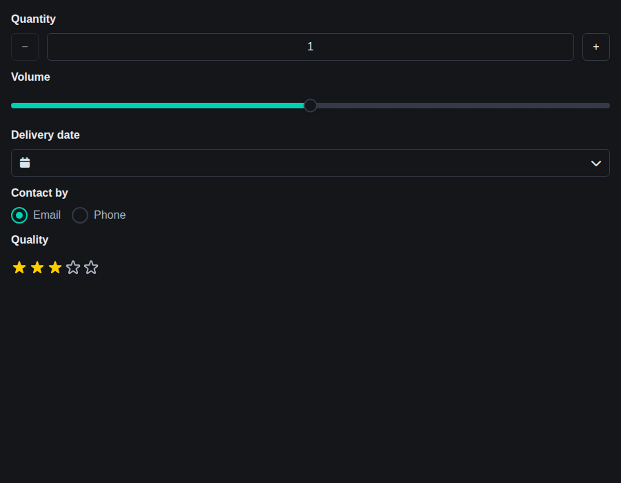 |
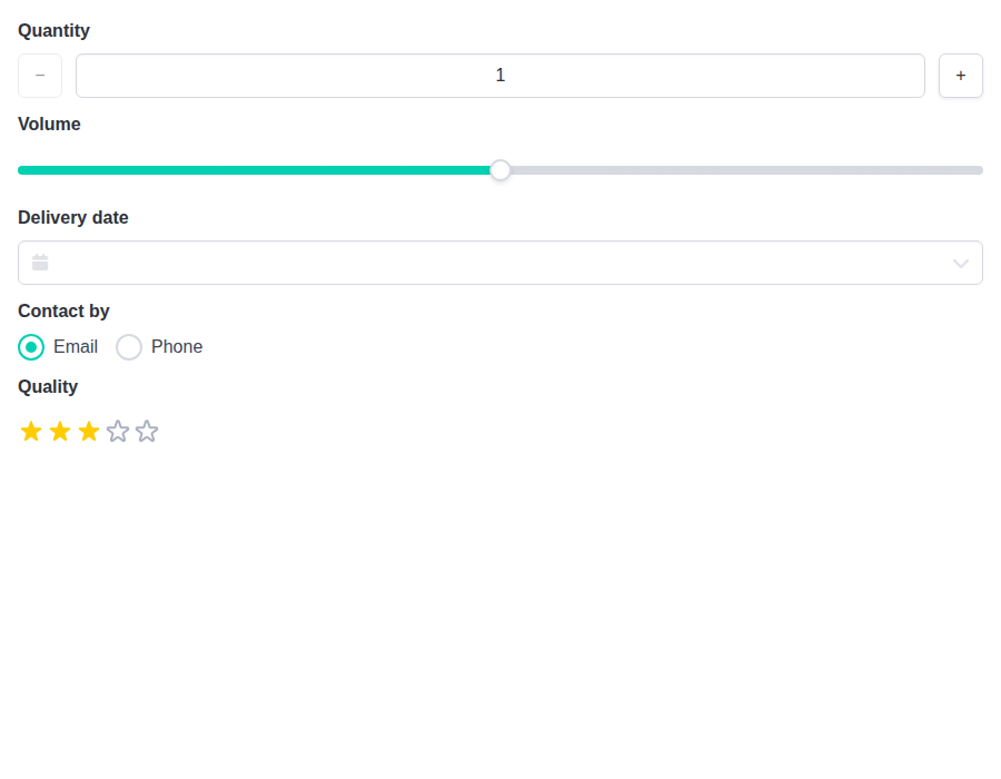
form-field--labels-composed-pickers · Form/Field · Labels Composed Pickers
| Light | Dark |
|---|---|
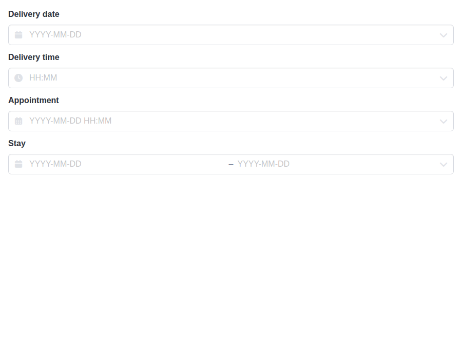 |
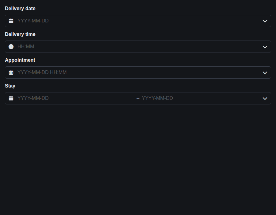 |
form-field--validation-states · Form/Field · Validation States
| Light | Dark |
|---|---|
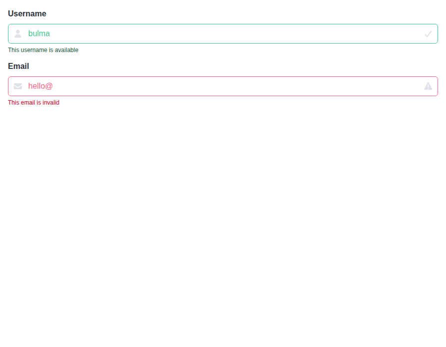 |
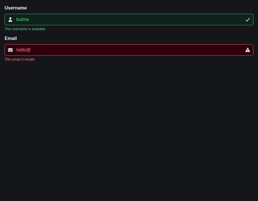 |
form-field--label-sizes · Form/Field · Label Sizes
| Light | Dark |
|---|---|
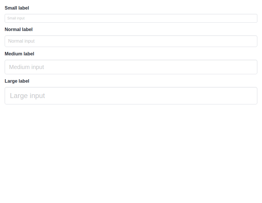 |
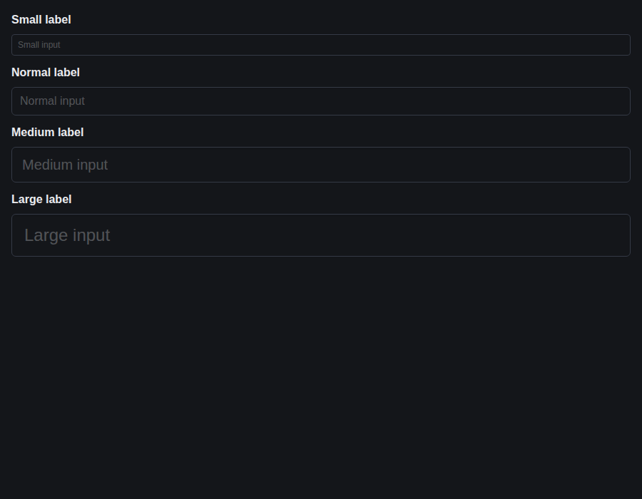 |
form-taginput--default · Form/Taginput · Default
| Light | Dark |
|---|---|
 |
 |
form-taginput--with-icon · Form/Taginput · With Icon
| Light | Dark |
|---|---|
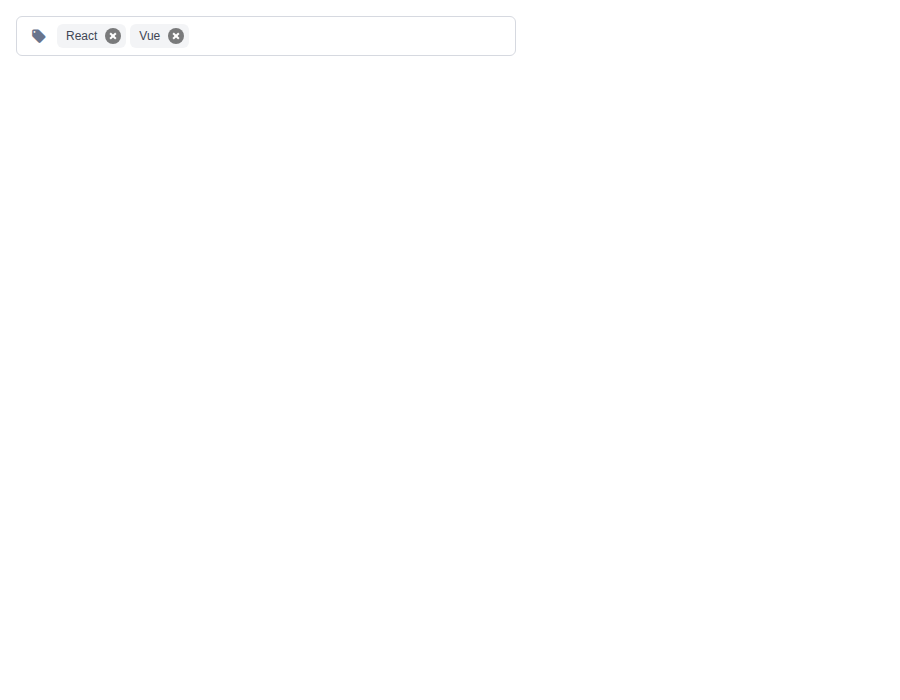 |
 |
form-taginput--with-autocomplete · Form/Taginput · With Autocomplete
| Light | Dark |
|---|---|
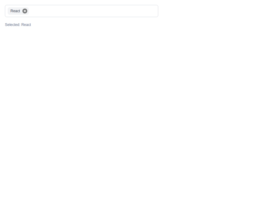 |
 |
form-taginput--restrict-to-list · Form/Taginput · Restrict To List
| Light | Dark |
|---|---|
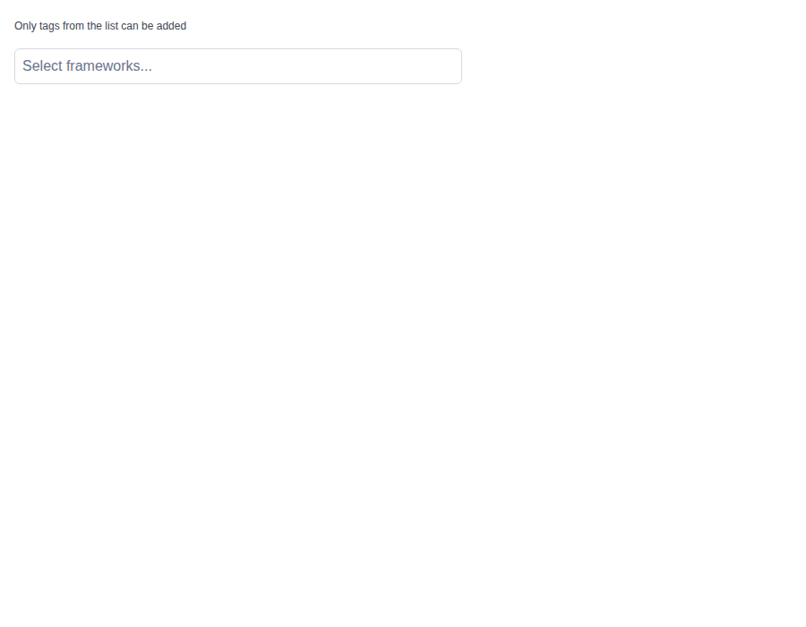 |
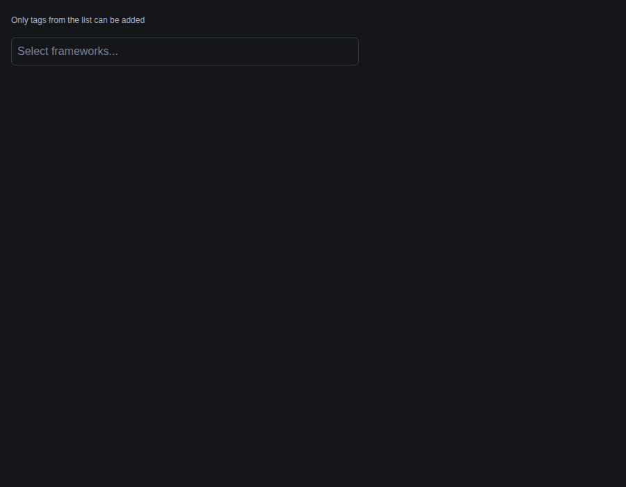 |
form-taginput--default-tags · Form/Taginput · Default Tags
| Light | Dark |
|---|---|
 |
 |
form-taginput--limits · Form/Taginput · Limits
| Light | Dark |
|---|---|
 |
 |
github-actions
Bot
added
the
review-converged

## [5.34.1](https://github.com/allxsmith/bestax/compare/@allxsmith/bestax-bulma@5.34.0...@allxsmith/bestax-bulma@5.34.1) (2026-10-16)

### Bug Fixes

* **bestax-migrate:** keep a title's heading level when its size carries over ([#1071](#1071)) ([7549699](7549699))
* **bulma-ui:** wire Taginput's suggestions as a combobox ([#1084](#1084)) ([e30c33a](e30c33a)), closes [#942](#942) [#998](#998) [#1082](#1082)
* **docs:** pin react-scripts in CodeSandbox sandboxes and keep the sandbox notes in step ([#1074](#1074)) ([3ac8a65](3ac8a65))

### Features

* **docs:** open live examples in StackBlitz and CodeSandbox ([#1073](#1073)) ([730db1e](730db1e))
|
🎉 This PR is included in version 5.34.1 🎉 The release is available on: Your semantic-release bot 📦🚀 |
## [2.25.4](https://github.com/allxsmith/bestax/compare/bestax-migrate@2.25.3...bestax-migrate@2.25.4) (2026-10-16)

### Bug Fixes

* **bestax-mcp:** leave the query behind when a component's own rows answered it ([ec8a2f1](ec8a2f1))
* **bestax-mcp:** say "matching" in the pointer answer only when there is a query ([2d28530](2d28530))
* **bestax-mcp:** say Button's variables style it for the colors and modifiers it accepts ([2b94042](2b94042))
* **bestax-migrate:** keep a title's heading level when its size carries over ([#1071](#1071)) ([7549699](7549699))
* **bulma-ui:** announce Autocomplete's empty content, and keep its listbox to options ([98cfaac](98cfaac)), closes [#1066](#1066)
* **bulma-ui:** describe a Tooltip's trigger with its text for screen readers ([5a7eb99](5a7eb99)), closes [#1031](#1031)
* **bulma-ui:** drop a key's fill in forced colors, so only its border draws it ([466ad38](466ad38)), closes [#1063](#1063)
* **bulma-ui:** hide a Tooltip with its stylesheet alone, without aria-hidden ([d4cbee4](d4cbee4))
* **bulma-ui:** hold Autocomplete's empty announcement while results load ([75d8fdf](75d8fdf))
* **bulma-ui:** keep a loading ToggleButton from toggling ([cf9f6e8](cf9f6e8))
* **bulma-ui:** keep EmptyState's left room only for an indicator, and follow py ([9a615d6](9a615d6)), closes [#1065](#1065)
* **bulma-ui:** keep SegmentedControl's fallback tab stop on the first segment after a reorder ([b32df32](b32df32))
* **bulma-ui:** key each key in Kbd.Group by its own React key ([b51c5c8](b51c5c8)), closes [#1063](#1063)
* **bulma-ui:** leave the keys alone on a SegmentedControl segment outside its row ([f477666](f477666))
* **bulma-ui:** mark a loading ToggleButton aria-disabled as well as aria-busy ([f87425f](f87425f))
* **bulma-ui:** open Fragments in Kbd.Group before placing its separators ([c595de2](c595de2)), closes [#1063](#1063)
* **bulma-ui:** stop the keys a SegmentedControl takes from reaching listeners above it ([6b9e797](6b9e797))
* **bulma-ui:** warn when Tab can't reach a Tooltip trigger that carries the link ([cfd21c7](cfd21c7))
* **bulma-ui:** wire Taginput's suggestions as a combobox ([#1084](#1084)) ([e30c33a](e30c33a)), closes [#942](#942) [#998](#998) [#1082](#1082)
* **docs:** address the deep review of the sandbox builders ([b7338d9](b7338d9))
* **docs:** close the CodeSandbox tab when its launch fails ([d1e6d1d](d1e6d1d))
* **docs:** compare the icon link as a string in the sandbox test ([9ac4737](9ac4737))
* **docs:** darken the live preview surface and follow the library stylesheet import ([363badf](363badf))
* **docs:** draw the CodeSandbox button icon as the cube mark ([8389e18](8389e18))
* **docs:** give both sandboxes the example window's dark page and padding ([33dfb4a](33dfb4a))
* **docs:** keep the live preview's spacing outside its dark surface ([7a158e1](7a158e1))
* **docs:** keep the live-preview margin off the homepage previews ([f18eed3](f18eed3))
* **docs:** load the CodeSandbox stylesheet from the CDN and darken example windows ([253f057](253f057))
* **docs:** match the preview's color scheme and keep the copy button on narrow screens ([c4d6d25](c4d6d25))
* **docs:** open CodeSandbox through its JSON define API ([6a65276](6a65276))
* **docs:** open the CodeSandbox tab on the click, and skip the sandbox when popups are blocked ([bcc0634](bcc0634))
* **docs:** pin react-scripts in CodeSandbox sandboxes and keep the sandbox notes in step ([#1074](#1074)) ([3ac8a65](3ac8a65))
* **docs:** restore the homepage preview margin, and reject a CodeSandbox reply without an id ([9e0991f](9e0991f))
* **docs:** send the copy and sandbox buttons the code the reader typed ([019edf0](019edf0))

### Features

* **bestax-mcp:** name the other component's call in get_component's theming hint ([cbedd5f](cbedd5f))
* **bestax-mcp:** point get_css_variables at the component whose element a component renders ([d4be1a8](d4be1a8))
* **bulma-ui:** add Buttons.ToggleButton ([0c8fb10](0c8fb10))
* **bulma-ui:** add EmptyState, the block a list shows when it has nothing in it ([c5929d2](c5929d2)), closes [#1065](#1065)
* **bulma-ui:** add Kbd, a key drawn as a keycap, and Kbd.Group for combinations ([98d1578](98d1578)), closes [#1063](#1063)
* **bulma-ui:** add SegmentedControl, a row of buttons where only one can be on ([b1be0e8](b1be0e8)), closes [#1040](#1040)
* **bulma-ui:** give Dropdown typeahead ([1bb35bf](1bb35bf)), closes [#1035](#1035)
* **docs:** open live examples in StackBlitz and CodeSandbox ([654b16c](654b16c))
* **docs:** open live examples in StackBlitz and CodeSandbox ([#1073](#1073)) ([730db1e](730db1e))
|
🎉 This PR is included in version 2.25.4 🎉 The release is available on: Your semantic-release bot 📦🚀 |
## [1.15.4](https://github.com/allxsmith/bestax/compare/bestax-mcp@1.15.3...bestax-mcp@1.15.4) (2026-10-16)

### Bug Fixes

* **bestax-migrate:** keep a title's heading level when its size carries over ([#1071](#1071)) ([7549699](7549699))
* **bulma-ui:** wire Taginput's suggestions as a combobox ([#1084](#1084)) ([e30c33a](e30c33a)), closes [#942](#942) [#998](#998) [#1082](#1082)
* **docs:** pin react-scripts in CodeSandbox sandboxes and keep the sandbox notes in step ([#1074](#1074)) ([3ac8a65](3ac8a65))

### Features

* **docs:** open live examples in StackBlitz and CodeSandbox ([#1073](#1073)) ([730db1e](730db1e))
|
🎉 This PR is included in version 1.15.4 🎉 The release is available on: Your semantic-release bot 📦🚀 |

## [4.2.17](https://github.com/allxsmith/bestax/compare/create-bestax@4.2.16...create-bestax@4.2.17) (2026-10-17)

### Bug Fixes

* **bestax-mcp:** leave the query behind when a component's own rows answered it ([ec8a2f1](ec8a2f1))
* **bestax-mcp:** release with every bulma-ui release so the published index keeps up ([#1027](#1027)) ([618e483](618e483))
* **bestax-mcp:** say "matching" in the pointer answer only when there is a query ([2d28530](2d28530))
* **bestax-mcp:** say Button's variables style it for the colors and modifiers it accepts ([2b94042](2b94042))
* **bestax-migrate:** carry size to Buttons, Tags and Message ([#1038](#1038)) ([7549264](7549264))
* **bestax-migrate:** keep a title's heading level when its size carries over ([#1071](#1071)) ([7549699](7549699))
* **bulma-ui:** announce Autocomplete's empty content, and keep its listbox to options ([98cfaac](98cfaac)), closes [#1066](#1066)
* **bulma-ui:** deprecate Autocomplete's unread selected and dropdown props ([#1091](#1091)) ([5a90eba](5a90eba)), closes [#1080](#1080)
* **bulma-ui:** describe a Tooltip's trigger with its text for screen readers ([5a7eb99](5a7eb99)), closes [#1031](#1031)
* **bulma-ui:** drop a Field label's for when nothing it holds takes it ([#1020](#1020)) ([3604c14](3604c14))
* **bulma-ui:** drop a key's fill in forced colors, so only its border draws it ([466ad38](466ad38)), closes [#1063](#1063)
* **bulma-ui:** give TimeInput's AM/PM column a real name for screen readers ([2b1122f](2b1122f))
* **bulma-ui:** hide a Tooltip with its stylesheet alone, without aria-hidden ([d4cbee4](d4cbee4))
* **bulma-ui:** hold Autocomplete's empty announcement while results load ([75d8fdf](75d8fdf))
* **bulma-ui:** keep a loading ToggleButton from toggling ([cf9f6e8](cf9f6e8))
* **bulma-ui:** keep a Notification's text clear of its close button ([#1017](#1017)) ([91ebb63](91ebb63))
* **bulma-ui:** keep a picker label's default when its override is undefined ([aa88e50](aa88e50))
* **bulma-ui:** keep EmptyState's left room only for an indicator, and follow py ([9a615d6](9a615d6)), closes [#1065](#1065)
* **bulma-ui:** keep SegmentedControl's fallback tab stop on the first segment after a reorder ([b32df32](b32df32))
* **bulma-ui:** keep Theme's component-variable check out of production ([537d90d](537d90d))
* **bulma-ui:** key each key in Kbd.Group by its own React key ([b51c5c8](b51c5c8)), closes [#1063](#1063)
* **bulma-ui:** leave the keys alone on a SegmentedControl segment outside its row ([f477666](f477666))
* **bulma-ui:** let Autocomplete's Enter submit, keep focus on a click, and open on a highlight ([#1090](#1090)) ([81f5982](81f5982)), closes [#1078](#1078) [#1089](#1089) [#1079](#1079) [#1081](#1081) [#1081](#1081)
* **bulma-ui:** mark a loading ToggleButton aria-disabled as well as aria-busy ([f87425f](f87425f))
* **bulma-ui:** name a composed DateRangeInputBase's group from a Field label ([75aa6cb](75aa6cb))
* **bulma-ui:** name a range Slider's thumbs from a hand-wired Field label's id ([355065b](355065b))
* **bulma-ui:** name Autocomplete's list from a hand-wired Field label's id ([ad46c06](ad46c06))
* **bulma-ui:** name Autocomplete's suggestion list from a surrounding Field's label ([190183f](190183f)), closes [#998](#998)
* **bulma-ui:** one Escape closes one layer inside a Modal or Sidebar ([#1086](#1086)) ([3ea7ac8](3ea7ac8)), closes [#1077](#1077) [#1077](#1077)
* **bulma-ui:** open Fragments in Kbd.Group before placing its separators ([c595de2](c595de2)), closes [#1063](#1063)
* **bulma-ui:** say a label placed in Field.Label reaches no thumbs or list ([07c2a99](07c2a99))
* **bulma-ui:** say the label prop needs wiring to reach thumbs or list in an inner Field ([9b33d8d](9b33d8d))
* **bulma-ui:** say which controls a hand-wired Field label's id reaches ([514127f](514127f))
* **bulma-ui:** stop the keys a SegmentedControl takes from reaching listeners above it ([6b9e797](6b9e797))
* **bulma-ui:** warn when Tab can't reach a Tooltip trigger that carries the link ([cfd21c7](cfd21c7))
* **bulma-ui:** warn when Theme is given a variable Bulma sets on the component ([bb8f9b8](bb8f9b8)), closes [#1021](#1021)
* **bulma-ui:** wire Taginput's suggestions as a combobox ([#1084](#1084)) ([e30c33a](e30c33a)), closes [#942](#942) [#998](#998) [#1082](#1082)
* **create-bestax:** bring the vite-ts tsconfigs up to create-vite 9 ([#1076](#1076)) ([dc6995c](dc6995c)), closes [#1049](#1049)
* **docs:** address the deep review of the sandbox builders ([b7338d9](b7338d9))
* **docs:** close the CodeSandbox tab when its launch fails ([d1e6d1d](d1e6d1d))
* **docs:** compare the icon link as a string in the sandbox test ([9ac4737](9ac4737))
* **docs:** darken the live preview surface and follow the library stylesheet import ([363badf](363badf))
* **docs:** draw the CodeSandbox button icon as the cube mark ([8389e18](8389e18))
* **docs:** give both sandboxes the example window's dark page and padding ([33dfb4a](33dfb4a))
* **docs:** give the mixin note the modifier caveat its lead carries ([1427f08](1427f08))
* **docs:** keep the live preview's spacing outside its dark surface ([7a158e1](7a158e1))
* **docs:** keep the live-preview margin off the homepage previews ([f18eed3](f18eed3))
* **docs:** keep the modifier caveat for mixin variables in the MCP index ([e227663](e227663))
* **docs:** load the CodeSandbox stylesheet from the CDN and darken example windows ([253f057](253f057))
* **docs:** match the preview's color scheme and keep the copy button on narrow screens ([c4d6d25](c4d6d25))
* **docs:** name the one edge of the rule for which variables Theme reaches ([b33ebfa](b33ebfa))
* **docs:** open CodeSandbox through its JSON define API ([6a65276](6a65276))
* **docs:** open the CodeSandbox tab on the click, and skip the sandbox when popups are blocked ([bcc0634](bcc0634))
* **docs:** pin react-scripts in CodeSandbox sandboxes and keep the sandbox notes in step ([#1074](#1074)) ([3ac8a65](3ac8a65))
* **docs:** qualify the guide and the theming skill on what Theme reaches ([9c2347b](9c2347b))
* **docs:** read only a component's own mixin as its home ([f40cd2c](f40cd2c))
* **docs:** refuse a CSS-variable scope the page cannot fully word ([c815602](c815602))
* **docs:** restore the homepage preview margin, and reject a CodeSandbox reply without an id ([9e0991f](9e0991f))
* **docs:** say where component-scoped Bulma variables have to be set ([771d5bd](771d5bd)), closes [#1021](#1021)
* **docs:** send the copy and sandbox buttons the code the reader typed ([019edf0](019edf0))

### Features

* **bestax-mcp:** name the other component's call in get_component's theming hint ([cbedd5f](cbedd5f))
* **bestax-mcp:** point get_css_variables at the component whose element a component renders ([d4be1a8](d4be1a8))
* **bulma-ui:** add Buttons.ToggleButton ([0c8fb10](0c8fb10))
* **bulma-ui:** add ContextMenu, a menu that opens on right-click or long press ([#1036](#1036)) ([85a3e77](85a3e77))
* **bulma-ui:** add EmptyState, the block a list shows when it has nothing in it ([c5929d2](c5929d2)), closes [#1065](#1065)
* **bulma-ui:** add HoverCard, a card that opens on hover or keyboard focus ([#1030](#1030)) ([0eb41df](0eb41df))
* **bulma-ui:** add Kbd, a key drawn as a keycap, and Kbd.Group for combinations ([98d1578](98d1578)), closes [#1063](#1063)
* **bulma-ui:** add SegmentedControl, a row of buttons where only one can be on ([b1be0e8](b1be0e8)), closes [#1040](#1040)
* **bulma-ui:** add ToggleButton, a button that stays pressed ([#1041](#1041)) ([582aff0](582aff0))
* **bulma-ui:** give Dropdown typeahead ([1bb35bf](1bb35bf)), closes [#1035](#1035)
* **bulma-ui:** let a Tooltip be hovered, dismissed with Escape, and opened by a tap ([#1033](#1033)) ([52aeeda](52aeeda))
* **bulma-ui:** let ConfigProvider set where portaled content goes ([#1032](#1032)) ([5e928ae](5e928ae))
* **docs:** open live examples in StackBlitz and CodeSandbox ([654b16c](654b16c))
* **docs:** open live examples in StackBlitz and CodeSandbox ([#1073](#1073)) ([730db1e](730db1e))
|
🎉 This PR is included in version 4.2.17 🎉 The release is available on: Your semantic-release bot 📦🚀 |
1 participant

What was wrong
With
data, Taginput shows suggestions under its field. The arrow keys move a highlight through them and Enter adds the highlighted one, but none of that reached a screen reader. The input had no combobox role, nothing said a list was open, and nothing pointed at the highlighted suggestion. Therole="listbox"had no id and no name, and its options had no ids, so nothing could have pointed at them anyway. A screen reader user typed, pressed Down Arrow, heard nothing, pressed Enter, and a tag appeared. Meanwhile the docs said the dropdown "follows ARIA listbox pattern".What changes
With
data, the input is a combobox. It gets the wiring Autocomplete got in #942, #998 and #1066, copied over and adapted to Taginput's markup:role="combobox",aria-autocomplete="list"andaria-haspopup="listbox".aria-expandedis true only while the list is on screen with suggestions in it. When nothing matches, Taginput renders no dropdown at all, so it's false.aria-controlspoints at the list only while the list is in the page, so it never dangles.aria-activedescendantpoints at the highlighted suggestion as the arrow keys or the mouse move it. It's dropped when nothing is highlighted: before the first arrow press, after Enter adds the highlighted suggestion and the list stays open, and when typing filters the list down past the highlight. It's dropped too while the highlight sits on a suggestion that's blank once trimmed, like an empty string indata, since that one can't become a tag.Field's, or thearia-label="Add tag"fallback.The list gets an id and a name. The existing
.dropdown-contentdiv already hadrole="listbox", so it stays the listbox and gains an id and a name. The name comes from the label that names the input, througharia-labelledby, using the sameneedsLabelIdoption ofuseAutoLabelIdthat names Autocomplete's list (#998). When no label names the input, or the one that does has no id to point at (aFieldlabel wired by hand with noidin itslabelProps), the list falls back toaria-label="Suggestions".Each suggestion gets an id. The ids are
${listboxId}-${index}, from oneuseIdper Taginput, so two Taginputs on a page never share one.aria-selectedmarks the optionaria-activedescendantpoints at, which is the rule Autocomplete uses today, where that's always the highlighted one. Here it's the highlighted one too, except a blank suggestion, which is marked neither. Combobox can settle the library-wide rule later.Without
data, nothing changes. A Taginput with nodatanever shows a list, so a combobox role would announce a popup that can't open. It stays a plain text field with none of these attributes, and its label gets no id. "Withdata" means the prop is set, even to an empty array, so an app that loads suggestions as the user types keeps one role, not one that flips between textbox and combobox as results come and go. To tell the two apart,datalost its destructured[]default (the component readsdataProp ?? []), so the props table now shows no default for it.What I left alone
emptyprop, and when nothing matches it renders no dropdown, so nothing non-option ever sat inside the list. Autocomplete's status region exists to announce itsemptytext, so it doesn't fall out of reusing the pattern here, and I didn't add one.autoComplete="off". Autocomplete sets it and Taginput doesn't. Adding it would change how the browser's own suggestions behave, which isn't ARIA wiring, so it's left for Combobox.maxTags. As onmain, the list stays open after the last allowed tag unmounts the input. Closing it changes what renders, so it's left for [Bug] bulma-ui: Taginput's suggestion list stays open after the tag limit removes its input #1087.Worth knowing
datais now found bygetByRole('combobox'), notgetByRole('textbox'). That's the fix itself, but it breaks a consumer test that queries it the old way. This PR's own suites needed that change in 30 existing tests. A Taginput withoutdatais still a textbox. It's worth a line in the release notes, the way fix(bulma-ui): announce Autocomplete's empty content, and keep its listbox to options #1068's markup note was.dataputs anidon its label, a generated one unlesslabelProps.idsets it, so the list has something to point at.Tests
In
Taginput.test.tsx, a newTaginput suggestions as a combobox (#1082)block:data: a plain text field with no combobox attributes, and its label gets no iddata: a collapsed combobox named "Add tag", witharia-autocomplete="list",aria-haspopup="listbox",aria-expanded="false"and noaria-controlsoraria-activedescendantdata={[]}: still a combobox, and it stays collapsed since no list opensopenOnFocusopens the list:aria-expanded="true"andaria-controlspointing at the listbox's idaria-activedescendantfollows the highlight through Down, Down, Up and a mouse hover, witharia-selected="true"on that option only, and the option ids hold still while it moveskeepFirstpoints it at the first optionrole="option"children, each with an idaria-activedescendantstays its ownField's label, and a horizontalField's label wired by hand into an innerField, through a generated id or alabelProps.idof your ownFieldlabel wired by hand with no idThe existing tests that render a Taginput with
datanow find its input as acombobox, 28 inTaginput.test.tsxand two inshadow-root.test.tsx. Nothing else in them changed.Coverage for
Taginput.tsx: lines, statements and functions stay at 100%, and the only branches missed are the same two as onmain, the object-tag paths inaddTag, which only strings reach.Fail on the old behavior
With
main'sTaginput.tsxput back over this branch's tests, every new test fails except the two for a Taginput withoutdata, which is the behavior that shouldn't change. The existing tests that now query acomboboxfail too.Most of the new ones fail at the role query, so I ran them again with
main's file plus nothing butrole="combobox"on the input. They all still fail, on the missingaria-*attributes, ids and list name, so they're testing the wiring and not just the role.Visual check
The markup around the list doesn't change: the same elements, classes and nesting. What changes is attributes: the combobox ones on the input, an id and a name on the listbox div that was already there, ids on the options, and an id on the label. Neither Bulma's CSS nor bestax's SCSS selects on
role,aria-*oridfor anything in a Taginput, so I didn't take screenshots.Docs and generated output
datasays it makes the input a combobox, and the TSDoc onlabelandlabelPropssays how the list gets its name.Field's TSDoc and its page, the label hooks' notes and the form skill name Taginput beside Autocomplete where a label'sidnames a suggestion list, so a label wired by hand gets anidfor a Taginput too.chore: regeneratecommits. No listing in the distribution guide is affected.Fixes #1082