Repository navigation
fix(bulma-ui): keep a Notification's text clear of its close button - #1017
Conversation


Bulma v1 pads a notification 1.5em at each end and puts its close button 1rem in from the end,
1.25rem square, so the button reaches further in than the padding and on a narrow column the end
of the first line runs under it. Bulma 0.9 padded the end wider, and v1 doesn't.

- A new _notification.scss pads the end of a notification with a close button by
  --bulma-notification-delete-padding-inline-end, 3rem by default: Bulma's inset and size for
  the button, plus the gap 0.9 left. A notification without one keeps Bulma's padding.
- Notification adds has-delete with hasDelete, and the rule keys on it, so it holds in browsers
  without :has(). A second rule on .notification:has(> .delete) covers a Delete passed in as a
  child where :has() is supported.
- The rules outrank Bulma's .notification padding, so it doesn't matter which stylesheet comes
  first, and they aren't !important, so a spacing helper still sets the padding.
- A story shows a dismissible notification in a narrow column.
The Notification page's dismiss section says why the end padding widens with hasDelete and which
variable sets it. The Delete page says a Delete passed into a Notification gets that room where
:has() is supported, and that hasDelete doesn't depend on it. The theming skill names the new
variable.

|
Warning Review limit reachedYou've used all free OSS reviews for now. Wait for the free limit to reset to keep reviewing this public repository. Next included review available in 51 minutes. View limit details
Thanks for using CodeRabbit! It's free for OSS, and your support helps us grow. If you like it, consider giving us a shout-out. Comment |

Preview DeploymentPreview URL: https://87d5115d.bestax.pages.dev |
![claude[bot]](https://avatars.githubusercontent.com/in/1236702?s=60&v=4)

There was a problem hiding this comment.
Deep review — 0 blocking · 3 advisory
| # | Severity | Area | Finding | Location |
|---|---|---|---|---|
| 1 | 🔵 Advisory | Robustness | 3rem default doesn't track --bulma-delete-dimensions; a large Delete leaves a 0 gap, a themed one re-overlaps |
bulma-ui/src/scss/elements/_notification.scss:15 |
| 2 | 🔵 Advisory | Robustness | The modular SCSS install route has no way to discover elements/notification |
bulma-ui/src/scss/elements/_index.scss:7 |
| 3 | 🔵 Advisory | Robustness | The Bulma-upgrade guard compiles from the root's bulma and asserts against bulma-ui's |
bulma-ui/src/elements/__tests__/Notification.styles.test.tsx:20 |
Overall: Sound, and unusually well evidenced — every number in the SCSS comment checks out against the shipped CSS (Bulma v1: padding: 1.375em 1.5em, .notification > .delete at inset-inline-end: 1rem with --bulma-delete-dimensions: 1.25rem; Bulma 0.9: padding-right: 2.5rem with the button at right: 0.5rem, 1.25rem square — exactly the 0.75rem gap that 3rem = 1 + 1.25 + 0.75 reconstructs). The cascade claim holds where it matters: both new rules are 0-2-0 against Bulma's 0-1-0 .notification, so stylesheet order is genuinely irrelevant, and Bulma's spacing helpers are !important, so p="3" still wins. The riskiest part is the hand-rolled cascade resolver in the new test file — it is the only thing standing behind the central claim — but it is written to throw rather than drop out on anything it cannot rank (an @media/@supports-nested padding rule, an unknown functional pseudo-class, a non-rem length), which is the right failure polarity, and its negative cases (no close button, a Delete nested one level in, :has() unsupported) are real discriminators. A human should start with finding 1 — whether a fixed 3rem or a calc tracking the button's size is the intended contract — then decide whether the modular-docs route in finding 2 is worth closing.
What I ran
pnpm --filter @allxsmith/bestax-bulma run test— 168 suites, 7038 tests, all green, so the newhas-deleteclass broke no existing exact-markup assertion.pnpm --filter @allxsmith/bestax-bulma run typecheck:tests— clean (the new file'srequire.resolveandCSSGroupingRulecasts typecheck).pnpm run check:conformance— every check passes exceptversion-regression, which fails only because this checkout is shallow (no tag reachable from HEAD).scss-conformancepassing is the one that matters here: the new partial is claimed byNotification'sSCSS_SOURCESentry, so the API page's CSS & Sass Variables section is not silently suppressed (#464).inline-stylepasses, so the new story is helper-prop-only.pnpm run gen:api-docs:check,gen:mcp:check,gen:eslint-meta:check— all clean, no stale artefact.- Compiled
versions/bestax-prefixed.scsswith real sass: the emitted selectors are.bestax-notification.bestax-has-deleteand.bestax-notification:has(> .bestax-delete), with--bulma-notification-delete-padding-inline-end: 3remregistered on.bestax-notification— i.e. the class prefix reaches the selectors and not the variable, matching every other extras partial. - Read #1000 and confirmed the failure shape against the shipped CSS rather than against the issue text.
Residual risk — ways a notification's text could still meet its close button:
- A themed or
is-largeclose button. Posted as finding 1.1rem + 2rem = 3remfor.delete.is-large, so a<Delete size="large">child gets exactly zero gap, andTheme'sbulmaVarsaccepts--bulma-delete-dimensions, so a value above2rembrings the overlap back. The new default-padding guard reads only the bare.deletedimension, so it stays green through both. - An app that loads Bulma's CSS and not bestax's. Refuted as a documented gap rather than a silent one: every install route in
installation.md,variations.mdandmodular.mdpulls eitherbestax.cssorextras.css,create-bestax's templates importbestax.css(templates/vite/src/main.jsx), and thehasDeleteTSDoc says outright that the rule ships in bestax's stylesheets. The one route that can miss it is the hand-picked modular SCSS list — finding 2. - A browser without
:has(), with aDeletepassed as a child rather thanhasDelete. Open by design, and the right call: the two rules are deliberately separate declarations rather than one selector list, which is what keeps.notification.has-deletealive when the:has()rule is dropped — thehas: falsetest exercises exactly that. - A padding helper on the notification.
<Notification hasDelete p="2">re-creates the overlap, because Bulma's spacing helpers are!important. Deliberate, stated in the partial's comment, and tested (lets a spacing helper set the padding). - A consumer's own single-class
.notification { padding: … }override. Now loses on the inline-end side, since the new rules are 0-2-0. Inherent to winning the cascade without!important; the API page's "override them there" guidance still resolves it. em/remasymmetry. Refuted as a non-overlap: Bulma's1.5emstart padding scales with font size while the new end padding is a fixed3rem, so<Notification hasDelete textSize="1">(.is-size-1→font-size: 3rem !important) ends up with a 4.5rem start and a 3rem end. Cosmetically uneven, but the button is rem-sized, so clearance is never lost — and rem is the correct unit for that reason.- Sibling components with the same markup. Refuted:
Toasthas its own.toasttree and no.delete, and Bulma lays.message-header .deleteout in a flex row, so neither carries this bug. - Vertical writing modes / RTL. Refuted:
padding-inline-endis the logical counterpart of Bulma's owninset-inline-end, so the padding follows the button onto whichever axis the inline direction lands. - Post-merge screenshot churn. Not a risk to this change —
visual-regression.ymlruns on PRs only undercreate-bestax/**, plus a nightly schedule, and its scaffolded apps install the library from the registry, so03-notification-visible.pngmoves after the release rather than at merge. The PR body already flags it.
🏄 Dialed, dude. Bulma v1 dropped the elbow room its own close button needs, and this one paddles it right back — logical property, two classes deep so stylesheet order can't wipe you out, and a test that actually resolves the cascade instead of trusting jsdom. Three advisories to kick around on the beach, nothing holding the set. Send it. 🤙
…y're checked with

The styles test compiled the partial against Bulma's Sass from the monorepo root's node_modules,
which holds Bulma only because the root lists it for scripts/, and read Bulma's CSS through
bulma-ui's own dependency. The two were the same install by coincidence. Both now come from one
require.resolve of bulma/package.json, so a Bulma upgrade moves the compile and the CSS it is
checked against together.
The end padding cleared Bulma's default close button, 1.25rem square, but a Delete passed in
with size="large" is 2rem, so its edge met the text, and size="medium" left half the gap.

- A notification whose close button carries Bulma's is-small, is-medium or is-large pads its
  end by the variable plus the difference from the default size, so the gap past the button
  stays the same, and overriding the variable moves these too. Only a Delete passed in can
  have a size, so these rules use :has() like the one for an unsized Delete passed in.
- The default is written as Bulma's inset plus its button size plus the gap, so the docs show
  where the number comes from. It can't read --bulma-delete-dimensions instead: Bulma declares
  that on the button itself, and a notification can't see a value set on its child.
- The styles test reads every delete size modifier from Bulma's CSS and checks that each one
  leaves the same gap as the default, so a size an upgrade adds or changes fails it.
The Notification and Delete pages say a Delete passed in with a size gets end padding to fit
it, and the theming skill says the variable is the padding for a default-size button, which a
sized one adjusts by the difference. The regenerated variable table shows the default as
Bulma's inset plus its button size plus the gap.
Notification is stock Bulma, so a reader building their Sass by hand from the modular guide had
no reason to look for a bestax partial for it, and got Bulma's padding under the close button.
The guide now lists elements/notification with the other element partials and says it adjusts a
stock Bulma component. The optimize skill adds it to its extras inventory, notes when a build
needs it, and adds it to the starter app's worked example, which renders a notification with a
close button and so needs it to match the prebuilt flavor.

|
deep-review: verify Every open thread has a reply: fixed, with the commit, or refuted with a reason. This settles them on 21989cd. |
Preview DeploymentPreview URL: https://4667196d.bestax.pages.dev |
There was a problem hiding this comment.
Deep review (verify) — 3 resolved · 0 open
| # | Severity | Area | Thread | Outcome | Location |
|---|---|---|---|---|---|
| 1 | 🔵 Advisory | Robustness | The 3rem default doesn't track the close button's actual size | Resolved — refutation accepted, sized case fixed in 2aaa035 | bulma-ui/src/scss/elements/_notification.scss:21 |
| 2 | 🔵 Advisory | Robustness | The modular SCSS install route can't discover this partial | Resolved — fixed in 21989cd | docs/docs/guides/getting-started/modular.md:188 |
| 3 | 🔵 Advisory | Robustness | The upgrade guard reads its two Bulma inputs from two different resolutions | Resolved — fixed in 2ee0f32 | bulma-ui/src/elements/__tests__/Notification.styles.test.tsx:24 |
Overall: This pass settled open threads on 21989cd8 and reviewed no commits. All three of my advisory threads are resolved: thread 1 on a reason that holds (bulma.css:4142 declares --bulma-delete-dimensions on .delete itself, so the ancestor-set row in my table cannot happen — and the row that can, a sized Delete, is now padded per size modifier with the gap held constant), and threads 2 and 3 as fixed in code I re-read and exercised. Both Notification suites pass (108 tests).
Residual risk: verification-only pass — no new risk assessed. For the record, what I re-checked while settling: the size enumeration in Notification.styles.test.tsx:406-428 reads from Bulma's own CSS and fails on a size the partial does not pad (declared()'s toHaveLength(1) on a missing rule), with expect(sizes).toContain('large') guarding against a silently empty enumeration; the compile and the CSS it is asserted against now come from one resolution. A rule setting --bulma-delete-dimensions on .delete directly still cannot be seen from the notification — the author named this, and the Sass variable remains the way to cover it.
🏄 Three advisories paddled out, three came back in clean — one of them even taught me something about where Bulma parks its custom props. Board is waxed, threads are settled, this one is good to go.
 github-actions
Bot
added
the
review-converged
github-actions
Bot
added
the
review-converged
 allxsmith
added
the
needs-human-review
github-actions
Bot
removed
the
review-converged
allxsmith
added
the
needs-human-review
github-actions
Bot
removed
the
review-converged
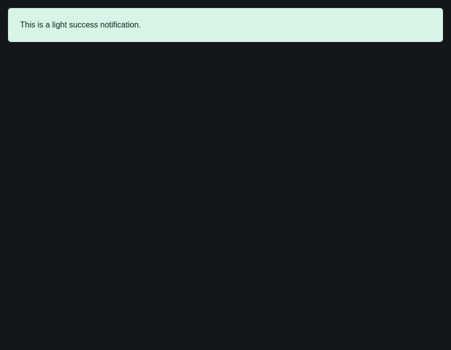
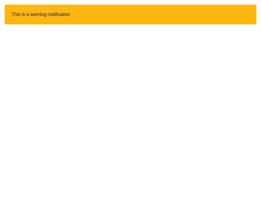
📸 Story screenshots at handoff —
|
| Light | Dark |
|---|---|
 |
 |
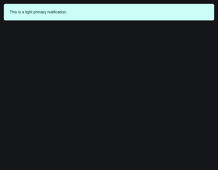
elements-notification--primary · Elements/Notification · Primary
| Light | Dark |
|---|---|
 |
 |
elements-notification--primary-light · Elements/Notification · Primary Light
| Light | Dark |
|---|---|
 |
 |
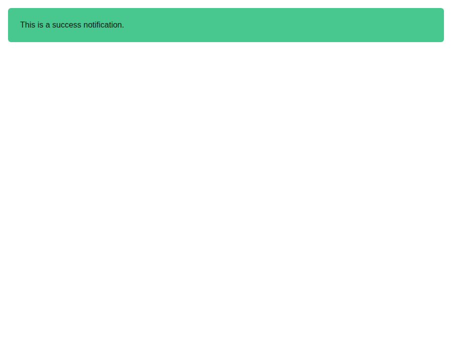
elements-notification--success · Elements/Notification · Success
| Light | Dark |
|---|---|
 |
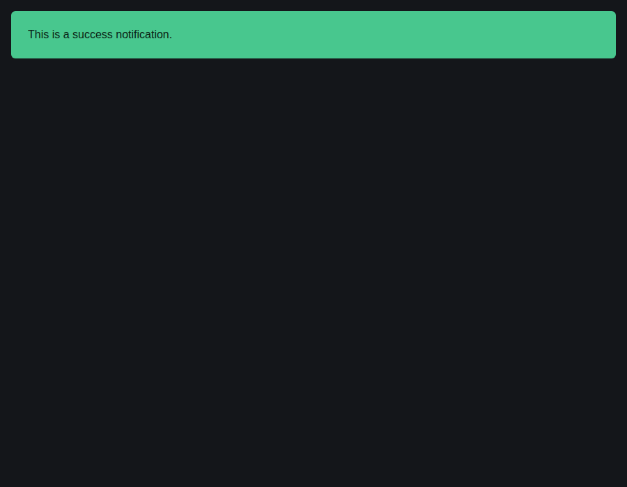 |
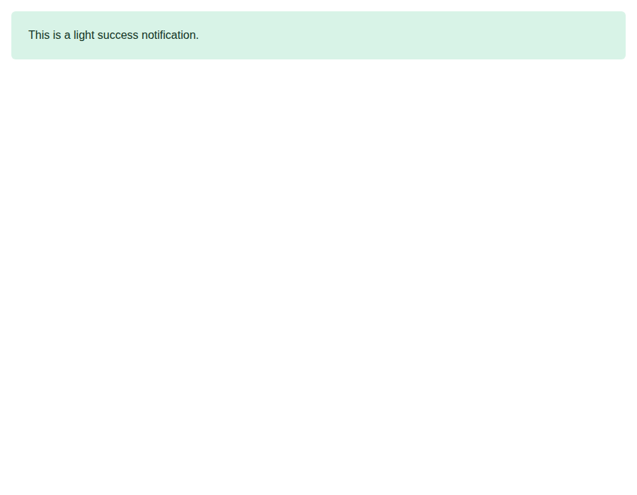
elements-notification--success-light · Elements/Notification · Success Light
| Light | Dark |
|---|---|
 |
 |
elements-notification--warning · Elements/Notification · Warning
| Light | Dark |
|---|---|
 |
 |
github-actions
Bot
added
the
review-converged

## [5.27.7](https://github.com/allxsmith/bestax/compare/@allxsmith/bestax-bulma@5.27.6...@allxsmith/bestax-bulma@5.27.7) (2026-10-10)

### Bug Fixes

* **bulma-ui:** keep a Notification's text clear of its close button ([#1017](#1017)) ([91ebb63](91ebb63))
* **bulma-ui:** name a composed DateRangeInputBase's group from a Field label ([75aa6cb](75aa6cb))
|
🎉 This PR is included in version 5.27.7 🎉 The release is available on: Your semantic-release bot 📦🚀 |
## [1.14.4](https://github.com/allxsmith/bestax/compare/bestax-mcp@1.14.3...bestax-mcp@1.14.4) (2026-10-10)

### Bug Fixes

* **bestax-mcp:** release with every bulma-ui release so the published index keeps up ([#1027](#1027)) ([618e483](618e483))
* **bulma-ui:** accept material-symbols 0.47 in the peer range ([539cca2](539cca2))
* **bulma-ui:** drop a Field label's for when nothing it holds takes it ([#1020](#1020)) ([3604c14](3604c14))
* **bulma-ui:** keep a Notification's text clear of its close button ([#1017](#1017)) ([91ebb63](91ebb63))
* **bulma-ui:** keep Theme's component-variable check out of production ([537d90d](537d90d))
* **bulma-ui:** let a caller's aria-label or aria-labelledby name both range Slider thumbs ([047ff7c](047ff7c)), closes [#974](#974)
* **bulma-ui:** name a composed DateRangeInputBase's group from a Field label ([75aa6cb](75aa6cb))
* **bulma-ui:** name a range Slider's thumbs from a hand-wired Field label's id ([355065b](355065b))
* **bulma-ui:** name Autocomplete's list from a hand-wired Field label's id ([ad46c06](ad46c06))
* **bulma-ui:** name Autocomplete's suggestion list from a surrounding Field's label ([190183f](190183f)), closes [#998](#998)
* **bulma-ui:** name each range Slider thumb from its label ([6b962e3](6b962e3)), closes [#981](#981)
* **bulma-ui:** name the date and time picker bases from a Field label ([e7ae797](e7ae797))
* **bulma-ui:** say a label placed in Field.Label reaches no thumbs or list ([07c2a99](07c2a99))
* **bulma-ui:** say FieldLabel renders the label column, not a label ([2a6ab10](2a6ab10))
* **bulma-ui:** say the label prop needs wiring to reach thumbs or list in an inner Field ([9b33d8d](9b33d8d))
* **bulma-ui:** say which controls a hand-wired Field label's id reaches ([514127f](514127f))
* **bulma-ui:** warn when Theme is given a variable Bulma sets on the component ([bb8f9b8](bb8f9b8)), closes [#1021](#1021)
* **create-bestax:** announce the starter's notifications through a status region ([91dbfd5](91dbfd5))
* **create-bestax:** give each starter notification a status region of its own ([f1ef4df](f1ef4df))
* **create-bestax:** keep focus on the counter when Reset disables itself ([733e505](733e505))
* **create-bestax:** keep the reason for the stylesheet order in every scaffolded entry file ([f4591e0](f4591e0))
* **create-bestax:** pin material-symbols to the newest range bestax-bulma accepts ([ff4f820](ff4f820))
* **create-bestax:** return focus when the starter's notification closes, and tighten guards ([67e3678](67e3678))
* **create-bestax:** say which helper props render nothing under the no-helpers flavors ([b29985b](b29985b))
* **create-bestax:** stop the no-helpers CLAUDE.md offering helper props as the way out ([a96c203](a96c203))
* **create-bestax:** stop the vite-ts build shadowing its config, and fix the starter page ([1dd964d](1dd964d))
* **docs:** give the mixin note the modifier caveat its lead carries ([1427f08](1427f08))
* **docs:** keep the modifier caveat for mixin variables in the MCP index ([e227663](e227663))
* **docs:** name the one edge of the rule for which variables Theme reaches ([b33ebfa](b33ebfa))
* **docs:** qualify the guide and the theming skill on what Theme reaches ([9c2347b](9c2347b))
* **docs:** read only a component's own mixin as its home ([f40cd2c](f40cd2c))
* **docs:** refuse a CSS-variable scope the page cannot fully word ([c815602](c815602))
* **docs:** say where component-scoped Bulma variables have to be set ([771d5bd](771d5bd)), closes [#1021](#1021)
|
🎉 This PR is included in version 1.14.4 🎉 The release is available on: Your semantic-release bot 📦🚀 |
1 participant

Bulma v1 pads a notification
1.375em 1.5emand puts.notification > .deleteatinset-inline-end: 1rem; top: 1rem, 1.25rem square. The button reaches further in than the end padding does, so on a narrow column the end of the first line runs under it. Bulma 0.9 padded the end wider (padding-right: 2.5rem), and v1 dropped that.<Notification hasDelete>renders Bulma's markup, so every bestax Notification with a close button had it, the create-bestax starter's included.I fixed it in bestax's own CSS, so every flavor gets it, and only for a notification that has a close button. One without keeps Bulma's padding.
_notification.scsspads the end by--bulma-notification-delete-padding-inline-end, 3rem by default. That's Bulma's 1rem inset plus the button's 1.25rem, plus the 0.75rem gap Bulma 0.9 left between the text and the button. The button is sized in rem, so the padding is too, and it's a logical property, so it follows the page direction the way Bulma'sinset-inline-enddoes.Notificationaddshas-deletewithhasDelete, and the rule keys on that class, so it doesn't need:has(). A second rule on.notification:has(> .delete)covers markup bestax didn't render, like aDeletepassed in as a child, which is what the Delete docs page shows. They're separate rules rather than one selector list, so a browser without:has()still keeps the first. Notifications from thenotificationAPI get the class too, since their close button is on by default.Deletepassed in withsizegets room for its size: a rule per Bulma size modifier (.notification:has(> .delete.is-small)and so on) adds or takes away the size difference from the same variable, so the gap stays the same at every size and overriding the variable moves them all. Bulma declares--bulma-delete-dimensionson the button itself, so a value set on a wrapper never reaches it, which is why this keys on the size class rather than on that variable..notificationpadding whichever stylesheet loads first (an app can linkextras.csson either side of its own Bulma), and they aren't!important, so a spacing helper likep="3"still sets the padding.iv.$class-prefixlike the others, so the prefixed flavors get.bestax-notification.bestax-has-delete.On the docs side, the Notification page's dismiss section explains the padding and the variable, and the
hasDeleteTSDoc, which feeds the props table, says the rule ships in bestax's stylesheets rather than Bulma's. The Delete page mentions the:has()case, and the theming skill's CSS variables reference names the new variable.pnpm genadded it to the Notification page's CSS & Sass Variables table and the MCP data. The modular Sass guide and the optimize skill's modular-build reference listscss/elements/notificationalongside the other partials, so a build that picks partials by hand can include it.Tests
Notification.styles.test.tsxcompiles the real partial and links it with Bulma's own CSS, before and after it, then works out the end padding the way a browser would (importance, specificity, then source order), since jsdom doesn't. It checks the padding applies withhasDelete, with aDeletechild, and withhasDeletein a browser that drops:has()rules, and that it doesn't apply without a close button or for aDeletenested further in. It does the same in a prefixed build against Bulma's prefixed CSS. It also reads the button's inset and size out of Bulma's CSS and checks the default leaves a gap past them, so a Bulma upgrade that moves or grows the button fails there instead of quietly putting it back over the text.:has()rule, dropping.notificationfrom the selectors, and shrinking the padding each turned some red.Notification.test.tsxchecks the class with and withouthasDelete, with a prefix, and on thenotificationAPI's notifications.has-deleteand with a bareDeletechild.Screenshots
There's a new
WithDeleteInANarrowColumnstory, a dismissible notification in a one-third column, so the fix shows up in the story screenshots.WithDelete's text is short, so its picture shouldn't move.Heads-up on visual regression: the create-bestax check screenshots the starter's success notification, which has a close button (
03-notification-visible.png). Once this ships, those baselines may change because the notification's end padding grows, and they'll need regenerating by the workflow.Listings
The one skill change is a paragraph in
bestax-theming's CSS variables reference. Under "What goes stale" that's editing a skill, so cursor.directory and ClawHub keep their copies of the old text, and the Tessl Registry and Skills Directory their old scans, until someone refreshes them. It also moves the plugin's version, which the entries that pin it only pick up when they're updated. None of that needs a manual update for one added variable.pnpm allpasses locally.Fixes #1000