Use design system component for USA banner#3957
Conversation
 aduth
force-pushed
the
aduth-uswds-banner-toggle
branch
from
aduth
force-pushed
the
aduth-uswds-banner-toggle
branch
from
001d613 to
5fb679c
Compare
app/javascript/app/utils/uswds.js
Outdated
There was a problem hiding this comment.
😂 so much indirection for one behavior! Looking forward to more in the future
There was a problem hiding this comment.
😂 so much indirection for one behavior! Looking forward to more in the future
Yep, definitely implemented it this way under the assumption of an opt-in approach to progressively adopting USWDS native component implementations.
It's also the less risky approach, though I do have to wonder what exactly might break if we would instead just load the default script and let it apply to all markup of the page 🤔 Accordions are the likely candidate here, since we use a custom implementation that would likely result in some conflicting / duplicated event handling. This has its own separate problems (LG-3194).
Ideally this code could be dropped altogether, where instead we just load the identity-style-guide script.
app/javascript/app/utils/uswds.js
Outdated
There was a problem hiding this comment.
querySelector returns only a single instance... do we want to look for all .usa-banner on a page? Or should we call behavior.on(document) instead?
From https://designsystem.digital.gov/documentation/developers/#js-customization:
on: Initialize a component’s JavaScript behavior by passing the root element, such aswindow.document.
There was a problem hiding this comment.
Or should we call
behavior.on(document)instead?
This ties into my comment at #3957 (comment) . Yes, ideally we don't have to cherry-pick elements from the page, but instead initialize all components in the entire document. All things considered, maybe it'd be less effort and less error-prone to do this from the start.
There was a problem hiding this comment.
Re: that other comment, I don't have strong opinions on cherry-picking or doing the whole page, both seem acceptable to me.
My main worry here is that if we happen to have two .usa-banner on a page, this will ignore the second one, that's the only thing I'd like to see addressed. Otherwise if we want to be clear it's only one, should we throw on an id? #usa-banner etc?
There was a problem hiding this comment.
It's a good point, and while it might not be quite as problematic for the banner specifically, once we apply this to other components, it's much more likely to anticipate there being multiple elements matching the selector. So if we decide to keep this, it should definitely support multiple results.
There was a problem hiding this comment.
Ok so should we just change to .querySelectorAll(...).forEach()?
|
I just re-read the original description:
I think this approach would be preferable, if I'm reading the code correctly, USDWS only uses So I think that we can avoid some future a11y bug reports if we make sure to use |
From what I can find, this was previously the case, but USWDS does now use the See:
This looks to have been included in the 1.6.11 release. Just to be sure, I also verified in this branch:
|
Oh perfect, thanks for confirming! |
|
On closer look, I think we can go ahead and bypass this selective opt-in and use the component library script directly. I was concerned that there would be existing use of component classes which would interfere with bringing in the design system code. I specifically recall the accordion being a concern of mine, in addition to this banner code. However, the accordion markup we use doesn't apply the same class names that would be picked up by the design system library, which expects For good measure, I did a quick check of all selectors in the design system code, and cross-referenced to our codebase: As expected, the only results are the banner component being updated here, which is exactly what we'd want. For action items then:
|
**Why**: As a user of assistive technology, I expect that collapsed content is ignored, so that I can navigate to skip content which is expected to be hidden by default, and so that toggle controls (aria-expanded buttons) control content visibility.

**Why**: As a developer, I want to reuse existing implementations of the design system (USWDS, Login.gov Design System), so that I can take advantage of upstream bug fixes, and avoid the overhead involved with maintaining an ad hoc reimplementation.
aduth
force-pushed
the
aduth-uswds-banner-toggle
branch
from
5fb679c to
6a92c62
Compare
**Why**: Since we do not need to selectively opt-in components but instead can apply all behaviors for all components, prefer the main entry point. Login.gov Design System is the preferred entry point over USWDS, as it includes component extensions
Since The updates in bbd1cc1 bring the overall revisions down significantly 🎉 And even better, it means we're now loading the Login.gov Design System component scripts. |
 zachmargolis
left a comment
zachmargolis
left a comment
zachmargolis
left a comment
There was a problem hiding this comment.
This looks way cleaner! LGTM
2 participants
Why: As a user of assistive technology, I expect that collapsed content is ignored, so that I can navigate to skip content which is expected to be hidden by default, and so that toggle controls (
aria-expandedbuttons) control content visibility.Why: As a developer, I want to reuse existing implementations of the design system (USWDS, Login.gov Design System), so that I can take advantage of upstream bug fixes, and avoid the overhead involved with maintaining an ad hoc reimplementation.
Screen Recording, Before, https://secure.login.gov:
Notes:
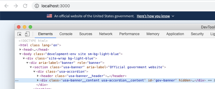
.hideclass behaves as a visually hidden styling, meaning that it is still navigable by screen readers. The USWDS implementation uses thehiddenattribute instead, replicated here.identity-style-guide, rather than reaching touswdsdirectly. Unfortunately, the distributable of theidentity-style-guidepackage does not (currently) support this sort of opt-in usage, and instead applies its component behaviors globally.Alternatives or follow-up tasks could include:
identity-style-guideto allow it to be used directlytoggle-banner.jsimplementation, but update it to operate using thehiddenattribute instead of thehideclass