Skip to content

Fix header navigation current link styling regression#352

Merged
aduth merged 16 commits intomainfrom
aduth-fix-nav
May 2, 2023
Merged

Fix header navigation current link styling regression#352
aduth merged 16 commits intomainfrom
aduth-fix-nav

Conversation

@aduth
Copy link
Contributor

@aduth aduth commented May 1, 2023

This resolves a regression introduced as part of the changes in the 7.0.0 release where the "current" link would be shown with a blue underline instead of a red underline.

Example from https://design.login.gov/brand/ :

image

Compare to https://login.gov/what-is-login/ :

image

After discussing with @nickttng , the changes here are a bit more of an extensive "reset" to USWDS stock styling, with minimal overrides to apply expected customizations:

  • Remove bold text styling from links other than the current header navigation linik
  • Change bar underline from blue ("primary" token) to red ("secondary" token)
  • Reduce horizontal padding between header navigation items from 2rem (32px) to 1.5rem (24px)
  • Reduce margins of logo
  • Increase vertical padding of side navigation and mobile navigation items from 0.5rem (8px) to 1rem (16px)
  • Change hover background color for side navigation and mobile navigation items from base-lightest (#f0f0f0) to primary-lightest (#f2f9ff)
  • Remove borders between submenu links in side navigation and mobile navigation
  • Edit: More revisions added based on feedback:
    • Remove border-radius from current link bar in side navigation and mobile navigation
    • Reduce size of mobile navigation "X" button
  • Edit 2: More revisions based on further testing with downstream projects:
    • Remove border below header when followed by dark section (e.g. hero)
    • Increase font size of header navigation to from 13px to 14px

The idea of resetting to the USWDS is...

  • Better understand divergence with USWDS
  • Eliminate divergence where possible to reduce maintenance overhead and CSS size
  • Align divergence with specific CSS selectors to reduce risk of future breakage

Open questions:

To review:

  • Header logo
  • Header navigation
  • Side navigation (impacted because it shares many of its stylings with mobile header navigation)
Component Before After
Header image image
Side navigation image image
Mobile navigation design login gov_components_side-navigation_(iPhone XR) localhost_4000_components_side-navigation_(iPhone XR)

@aduth aduth requested a review from nickttng May 1, 2023 19:29
Copy link
Contributor

@zachmargolis zachmargolis left a comment

Choose a reason for hiding this comment

The reason will be displayed to describe this comment to others. Learn more.

LGTM

Copy link
Contributor

@nickttng nickttng left a comment

Choose a reason for hiding this comment

The reason will be displayed to describe this comment to others. Learn more.

Overall, it looks solid to me.

Possible other revisions could include...

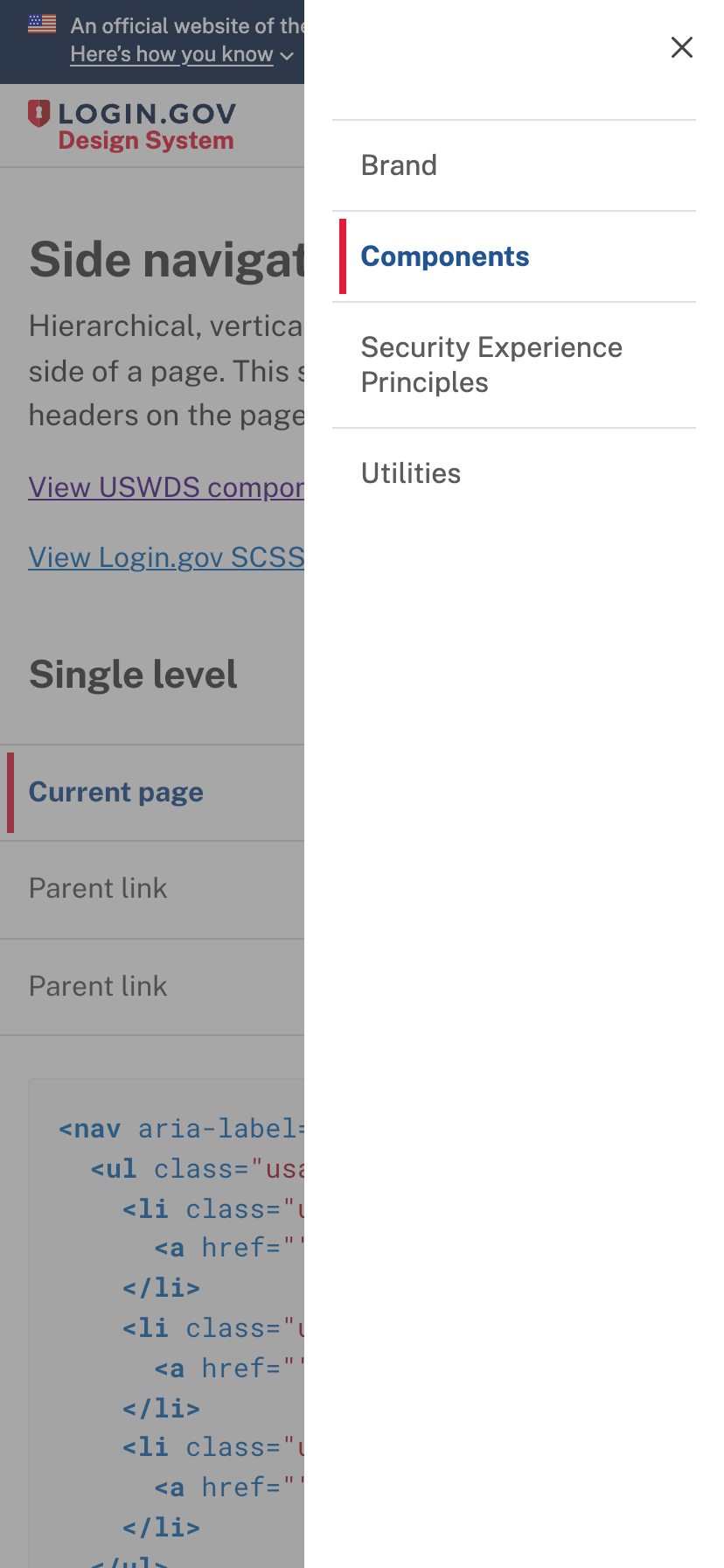
  • Changing side navigation and mobile navigation line to extend the full height of the list item

I am okay not having to extend if it means less maintenance cost. If anything to be consistent, I think updating the border-radius to 0 would align better with the desktop nav style

  • Reducing size of mobile navigation "X" button

Okay with reducing the resize of the "X" button as long it doesn't compromise the tap area size.

@aduth
Copy link
Contributor Author

aduth commented May 2, 2023

I removed the pill border radius and reduced the mobile navigation close icon in 9f59575 and e3a5d1f respectively.

Screenshots showing before the change and after. I'll update the original pull request comment with Before/After for "live" vs. proposed changes.

Before After
before localhost_4000_components_side-navigation_(iPhone XR) (1)
before image

@aduth
Copy link
Contributor Author

aduth commented May 2, 2023

I'm going to test this on local copies of the brochure site, developer site, and IdP to check how well some of changes are working out. I've pushed a few commits already based on findings (e68fd88, 06b9d13), will put back to draft temporarily while I work through any other findings.

@aduth aduth marked this pull request as draft May 2, 2023 14:28
@aduth
Copy link
Contributor Author

aduth commented May 2, 2023

Ok, I've finished testing on both desktop and mobile across the brochure site, help center, partner site, developer site, and IdP, and feeling pretty good now after the latest set of changes. It required a bit of extra work to account for things such as partner site header arrangement with search and mobile collapsible menu items. Overall it'll help simplify a lot of the markup and custom styles in those sites as well, which is nice.

The preview site includes the latest changes. If it's useful, I could also publish a beta release to get a preview going for those other sites, though maybe it's just as well to go ahead and publish the patch release and we can follow-up with another patch release if there's any further corrections to make.

@aduth aduth marked this pull request as ready for review May 2, 2023 19:23
@aduth
Copy link
Contributor Author

aduth commented May 2, 2023

I'm going to plan to merge this as-is and publish a beta release, which will allow us to test it more exhaustively in preview branches for the brochure site, partner site, and developer site.

@aduth aduth merged commit fa9c7d4 into main May 2, 2023
@aduth aduth deleted the aduth-fix-nav branch May 2, 2023 19:58
@aduth aduth mentioned this pull request May 2, 2023
@aduth
Copy link
Contributor Author

aduth commented May 2, 2023

I'm going to plan to merge this as-is and publish a beta release, which will allow us to test it more exhaustively in preview branches for the brochure site, partner site, and developer site.

See:

Sign up for free to join this conversation on GitHub. Already have an account? Sign in to comment

Labels

None yet

Projects

None yet

Development

Successfully merging this pull request may close these issues.

3 participants