Skip to content

Add interactive timestamp to brief messages.#3491

Merged
gnprice merged 1 commit into
zulip:masterfrom
ishammahajan:timestamp-each-message_v3
Jun 8, 2019
Merged

Add interactive timestamp to brief messages.#3491
gnprice merged 1 commit into
zulip:masterfrom
ishammahajan:timestamp-each-message_v3

Conversation

@ishammahajan
Copy link
Copy Markdown
Collaborator

Two problems have plagued user experience for a long time. One,
there is no separation between two different messages, that is, one
does not know when one message ends and another one begins. Two,
there are no timestamps displayed for brief messages.

This commit aims to solve both with a sliding label which shows the
timestamp of the message if clicked on it. We do this buy
introducing two elements under message-brief, timestamp-container
and timestamp-label.

Browsers, by default, increase the size of the viewport to fit the
size of any element inside it. This causes the horizontal size of
the viewport to increase if we attempt to 'slide' an element out of
the viewport. The only way to not allow the browser to increase the
size is if there were an element which always inside the browser,
and another element (our actual timestamp) nested inside it which
moves around inside our outer element (which has the overflow
property set to hidden). Doing this causes the browser to think that
we're not moving the element out of the viewport, but that it's
simply overflowing from the outer element.

Has been tested on both platforms.

@ishammahajan ishammahajan force-pushed the timestamp-each-message_v3 branch 2 times, most recently from c7d1f54 to 85b89c8 Compare May 22, 2019 09:07
@ishammahajan
Copy link
Copy Markdown
Collaborator Author

Had forgotten to upload a screenshot:
timestamp-each-message_v3

(all content is same, except that now all messages have the label, not only
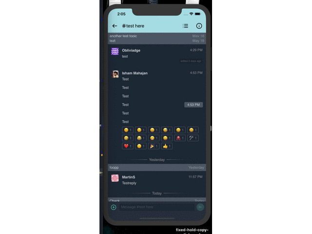
 message-brief messages.)

@gnprice
Copy link
Copy Markdown
Member

gnprice commented Jun 3, 2019

Thanks @ishammahajan !

Browsers, by default, increase the size of the viewport to fit the
size of any element inside it. This causes the horizontal size of
the viewport to increase if we attempt to 'slide' an element out of
the viewport. The only way to not allow the browser to increase the
size is if there were an element which always inside the browser,
and another element (our actual timestamp) nested inside it which
moves around inside our outer element (which has the overflow
property set to hidden). Doing this causes the browser to think that
we're not moving the element out of the viewport, but that it's
simply overflowing from the outer element.

Ah, clever solution -- and thanks for the clear explanation!

I've just played with this branch some, using it to read through some threads.

  • On the high-level design, I'll comment in the chat thread.

  • One detail I notice: when the timestamp is hidden and I tap on the part of the message where the timestamp would go if it were in view, the tap always seems to hit the timestamp, showing it... even if there's something else there, like a link.

    • This is a pretty significant chunk of the width of the message, so I think it's likely there'd often be surprises where someone meant to follow a link, or show an image, etc., and instead they just get the timestamp toggled.

@gnprice
Copy link
Copy Markdown
Member

gnprice commented Jun 3, 2019

Oh also, for cross-reference: the issue this addresses is #3375 .

@ishammahajan ishammahajan force-pushed the timestamp-each-message_v3 branch from 85b89c8 to a8de7ff Compare June 4, 2019 15:04
@gnprice
Copy link
Copy Markdown
Member

gnprice commented Jun 4, 2019

Thanks for the many swift updates!

I played with this version some, and I like it. I think there's still a risk it'll feel "busy" to people, but if so we can probably make the offscreen timestamps poke in a little less still.

So for the next step, I took a close look through the code. Comments below -- mainly a number of small things for code clarity, and a couple of nuances of behavior.

  • I notice the loading animation doesn't look right -- I think this is because .loading was lost in the CSS.

  • Can we call the class just timestamp instead of brief-timestamp? The "brief" part is no longer accurate; and it looks like the only place plain timestamp survives in this version is in the HTML for the loading animation (in messageLoadingHtml).

    • Feel free to rename the one in the loading case to loading-timestamp if you have a bunch of styles you don't want to apply to it; compare loading-subheader etc.
  • Ah, in fact: these changes are going to affect the loading animation, so let's be sure to test that case and make adjustments as necessary. Doesn't need to do anything new and fancy -- just make sure it continues to look right.

    • Here's a quick hack to test that locally:
    diff --git src/webview/html/htmlBody.js src/webview/html/htmlBody.js
    -<div id="message-loading" class="${showMessagePlaceholders ? '' : 'hidden'}">
    +<div>
    
    • Then please post a pair of before/after screenshots.
  • Small style nit: messageTime is only used once and has a short definition, so let's put the definition right before that one place it's used.

  • Small style nit: timestampHtml comes before bodyHtml when used (both times), so let's put their definitions in the same order.

  • Nit: color: rgba(0,0,0,0.65); should have spaces after commas. Similarly another color: line.

  • Nit: this is a no-op:

 .topic-header {
   background: #ccc;
+}
+.topic-header {
  • There are two .brief-timestamp style rules, and the second one overrides some properties in the first. Should fold it in.

  • Let's write this in HSL: background: #4b5663

    The webapp makes a practice of using HSL instead of RGB (there are a few exceptions, but I think those are where people just didn't know and it wasn't caught in review.) There are good reasons for this, because it makes it easier to understand what the color is, and also to make changes to it. See here and here for some good explanations.

    We aren't consistent about this ourselves -- it's about half and half, ignoring colors that are just flat gray -- but I'd like to push toward HSL. Especially for interesting new colors like this one. :-)

  • In this code:

+  if (target.closest('.message')) {
+    const briefMessageElement = target.closest('.message');
+    if (briefMessageElement) {

the outer if is redundant, right?

  • Also we can drop "brief" in the name.

  • In this code:

      const timestampElement = briefMessageElement.getElementsByClassName('brief-timestamp');
      if (timestampElement) {
        timestampElement[0].classList.toggle('show');

the local is called "element", but it's not actually an element, right? It's a collection, as the [0] shows. Also does the if test do anything? I'd expect it to just always be true.

Instead, let's put the [0] in the definition of timestampElement, so it becomes an element.

@ishammahajan ishammahajan force-pushed the timestamp-each-message_v3 branch from a8de7ff to 2ef801d Compare June 5, 2019 06:26
@ishammahajan
Copy link
Copy Markdown
Collaborator Author

Thanks for the quick review as well!

  • .loading was lost in the CSS

Oh, that must have happened because of the rebase onto master. Fixed though.

  • call the class just timestamp instead of brief-timestamp

That makes sense, thanks! The new loading screen looks like this.
Screenshot 2019-06-05 at 10 12 29 AM

  • messageTime is only used once and has a short definition

That expression was extracted into a variable because it was used twice, now that it isn't, I have removed the variable and put the expression straight into the one place it is used.

  • See here and here for some good explanations

Thanks for those links! I have refactored every color instance I add in this PR to hsla!

the outer if is redundant

True, fixed.

I'd expect it to just always be true.

It does come out to be always true (flow didn't give an error). That's strange. It could technically be null too, right (flow doesn't know that a message always contains a timestamp)?

[0] in the definition of timestampElement

Actually since the surrounding if is not needed, the function becomes a lot more cleaner.

const messageElement = target.closest('.message');
if (messageElement) {
  messageElement.getElementsByClassName('timestamp')[0].classList.toggle('show');
}

Have edited the commit message to reflect these changes.

ishammahajan added a commit to ishammahajan/zulip-mobile that referenced this pull request Jun 5, 2019
Changes the color scheme followed by mentions css to `hsla` instead
of `rgba` in order to make it easier to change if required.

Isn't related to the associated PR but is a pure refactor.
Related: zulip#3491 (comment).
@gnprice
Copy link
Copy Markdown
Member

gnprice commented Jun 5, 2019

Thanks for the updates! The revisions all look good. This is quite close to merge -- just a few comments on this version:

  • There are two .timestamp rules in the CSS. This confused me for a couple of minutes as I was looking at the rule lower in the file but not the one above it; for one thing, I noticed the old code had font-size: 0.9rem; and was wondering why that was lost. It wasn't, it just went into the other rule. :-)

    So let's fold the lower rule into the upper one.

    ... Oh! I see. That lower rule is the overrides for dark mode. 😝

    I should do something to make that more obvious -- this isn't the first time I've been confused about a diff that touches that dark-mode CSS.

    I had the same misunderstanding in yesterday's comment (except it was a .brief-timestamp rule.) Please do point out when something I say doesn't seem to make any sense -- sometimes in fact it doesn't make sense. 😉

  • Why drop the white-space: nowrap;?

  • How did you choose the background color for the timestamp pills? Now that it's in HSL 😄, I can see that it's a faintly greenish-blue gray. Why that particular color?

    ... Aha, now that I see it's only for dark mode, I also see that that hue (and others close to it) are used in the webapp for lots of things in dark mode. (Harder to tell in our CSS, because a lot of it's in RGB!) That's natural, then.

  • (Note to myself: the lack of return inside the last if of the click handler is a confusing mismatch, and also makes diffs like this one look a bit puzzling. I know it's caused by our linter settings; I'll go take care of it.)

@gnprice
Copy link
Copy Markdown
Member

gnprice commented Jun 6, 2019

  • Let's write this in HSL: background: #4b5663
    The webapp makes a practice of using HSL instead of RGB (there are a few exceptions, but I think those are where people just didn't know and it wasn't caught in review.) There are good reasons for this, because it makes it easier to understand what the color is, and also to make changes to it. See here and here for some good explanations.
    We aren't consistent about this ourselves -- it's about half and half, ignoring colors that are just flat gray -- but I'd like to push toward HSL. Especially for interesting new colors like this one. :-)

(BTW I just filed #3516, about doing this in general.)

@ishammahajan
Copy link
Copy Markdown
Collaborator Author

Thanks for the swift review!
I think since this is the design we're going with I'm changing this PR to ready to review.

  • I noticed the old code had font-size: 0.9rem; and was wondering why that was lost.

Actually, the previous version had both timestamp and brief-timestamp, which both had a common rule for font-size: 0.9rem. Since brief-timestamp was not needed, I changed it to timestamp and folded the common rules in, hence the confusion. Sorry, I should have made the change more explicit in a comment 😛.

  • white-space: nowrap;

That is a mistake I made. Sorry, fixed!

  • How did you choose the background color for the timestamp pills? Now that it's in HSL 😄, I can see that it's a faintly greenish-blue gray. Why that particular color?

So I wanted to make the background for timestamps a little lighter (on light mode) and a little darker (on dark mode) than the headers of the respective modes, in order to make them not look out of place and less flashy.
I went to this website to get the light mode header color, subsequently see the lighter version of that color (#CCCCCC -> #E0E0E0) and inserted the latter into an RGB to HSL converter. Did the same for dark mode, but instead of selecting a lighter color, chose a darker one.

I just filed #3516, about doing this in general

I'll pick that up, I think.

NOTE: Another small change I made during this revision, box-shadow is now properly scaled and even lighter (now that we use HSL I was able to precisely find the correct color I imagined 😄)

box-shadow: -1px 1px 2px 0 hsla(0, 0%, 0%, 0.3), 0 2px 4px 0 hsla(0, 0%, 0%, 0.3);
became
box-shadow: -1px 1px 2px 0 hsla(0, 0%, 0%, 0.3), -2px 2px 4px 0 hsla(0, 0%, 0%, 0.3);

and

background: hsl(0, 0%, 88%);
to
background: hsl(0, 0%, 92%);

Screenshot 2019-06-06 at 10 46 55 AM

to

Screenshot 2019-06-06 at 10 47 13 AM

Please play around with these colors and shadows, and tune them better if required, thanks!

@ishammahajan ishammahajan force-pushed the timestamp-each-message_v3 branch from 2ef801d to 864ae22 Compare June 6, 2019 05:18
@ishammahajan ishammahajan marked this pull request as ready for review June 6, 2019 05:18
@ishammahajan ishammahajan force-pushed the timestamp-each-message_v3 branch from 864ae22 to 976189f Compare June 6, 2019 05:30
@ishammahajan
Copy link
Copy Markdown
Collaborator Author

Rebased onto master!

ishammahajan added a commit to ishammahajan/zulip-mobile that referenced this pull request Jun 6, 2019
Changes the color scheme followed by mentions css to `hsla` instead
of `rgba` in order to make it easier to change if required.

Isn't related to the associated PR but is a pure refactor.
Related: zulip#3491 (comment).
When we show several consecutive messages from the same sender
without an intervening recipient header or date divider, we don't
repeat the sender.  This has also meant that there's
 * no way to tell where one message ends and another begins;
 * and no way to see the time the later messages were sent.

This commit aims to solve both with a sliding label which shows the
timestamp of the message if clicked on it.  We do this by replacing
the existing timestamp with another component in the message list
called `timestampHtml`.  Timestamp starts out hidden on
sender-implicit messages and 'expanded' on sender-showing messages.

Browsers, by default, increase the size of the viewport to fit the
size of any element inside it.  This causes the horizontal size of
the viewport to increase if we attempt to 'slide' an element out of
the viewport.  The only way to not allow the browser to increase the
size is if there were an element which is always inside the browser,
and another element (our actual timestamp) nested inside it which
moves around inside our outer element (which has the overflow
property set to hidden).  Doing this causes the browser to think that
we're not moving the element out of the viewport, but that it's
simply overflowing from the outer element.

Fixes zulip#3375.
@gnprice gnprice force-pushed the timestamp-each-message_v3 branch from 976189f to 8a1099f Compare June 8, 2019 01:07
@gnprice
Copy link
Copy Markdown
Member

gnprice commented Jun 8, 2019

Looks good -- merged! Thanks again @ishammahajan for all your work on this.

@gnprice gnprice merged commit 8a1099f into zulip:master Jun 8, 2019
gnprice added a commit that referenced this pull request Jun 14, 2019
This reverts 8a1099f "msglist: Add slide-in timestamp labels for
each message" aka #3491, so that we can apply #3488 instead in order
to make a beta release with that change.
gnprice pushed a commit to ishammahajan/zulip-mobile that referenced this pull request Jun 19, 2019
In 8a1099f (zulip#3491) we recently switched to a new "pills" design
for showing the timestamps of messages.  The new design had the
side effect of making them a lot more visually prominent.

Here, tone them back down:

* For sender-showing messages, switch from the new pills back to
  just gray text on the message list's normal background.
  (Compare to the `.timestamp` rule removed in 8a1099f.)

* Make the time pills' background more similar to the plain
  background.  Keep a little contrast, in order to differentiate
  the top of the pill from the message list.

* Adjust the time pills' shadows to be centered instead of leaning
  toward the left (lit from the right).  For fun, we make them
  exactly match a Material Design elevation of 2dp, as implemented
  in MDC Web:
    https://github.com/material-components/material-components-web/blob/master/packages/mdc-elevation/_mixins.scss.

[greg: expanded parts of commit message]
Sign up for free to join this conversation on GitHub. Already have an account? Sign in to comment

Labels

None yet

Projects

None yet

Development

Successfully merging this pull request may close these issues.

2 participants