Tabs
The tabs is used to hide some content, and to allow the uses select the content he wants to check. An example of the usage of it can be found in the BIOS example in Examples page.
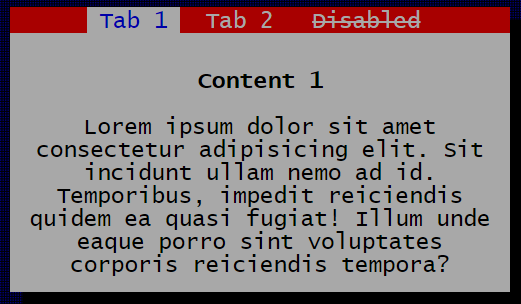
These are some examples for component:
<!-- Tabs example -->
<div class="tui-tabs">
    <ul>
        <li><a class="tui-tab active" data-tab-content="tab-1-content">Tab 1</a></li>
        <li><a class="tui-tab" data-tab-content="tab-2-content">Tab 2</a></li>
        <li><a class="tui-tab disabled" data-tab-content="tab-3-content">Disabled</a></li>
    </ul>
</div>
<div id="tab-1-content" class="tui-tab-content">
    ...
</div>
<div id="tab-2-content" class="tui-tab-content">
    ...
</div>
<div id="tab-3-content" class="tui-tab-content">
    ...
</div>For this component there is an specified attribute. Use data-tab-content to reference the content element that will be shown when the tab gets actived.
This is the table with available classes for this component.
| Class | Description |
|---|---|
.tui-tabs |
Creates a tabs menu |
.tui-tab |
Creates a tab. Use data-tab-content attribute in the tag with the content element id |
.active |
Actives the tab. Use it for default selected tab |
.tui-tab-content |
Represents the element as the tab content |