Input
To create inputs with TUI style, there is the class .tui-input. For checkboxes and radio buttons, it needs to have a specific structure specified in the Checkbox or Radio pages, but you can check some examples here too. The image example is available in the Examples page.
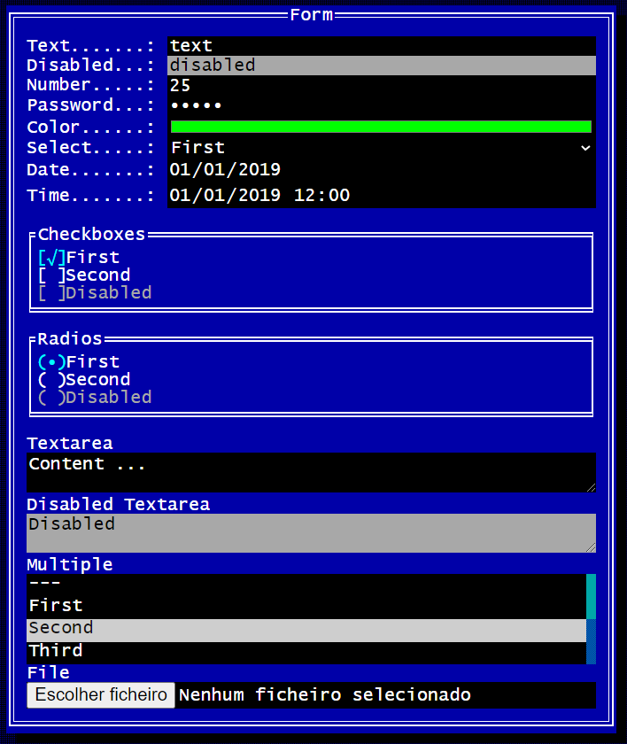
These are some examples for component:
<!-- Text -->
<input class="tui-input" type="text" />

<!-- Disabled Text -->
<input class="tui-input disabled" disabled type="text" />

<!-- Number -->
<input class="tui-input" type="number" />

<!-- Password -->
<input class="tui-input" type="password" />

<!-- Color -->
<input class="tui-input" type="color" />

<!-- Select -->
<select class="tui-input">
    <option value=""></option>
</select>

<!-- Date -->
<input class="tui-input" type="date" />

<!-- Time -->
<input class="tui-input" type="datetime-local" />

<!-- Checkbox -->
<label class="tui-checkbox">
    Checkbox
    <input type="checkbox" />
    <span></span>
</label>

<!-- Radio -->
<label class="tui-radio">
    Radio
    <input type="radio" name="group" />
    <span></span>
</label>

<!-- Textarea -->
<textarea class="tui-input"></textarea>

<!-- Disabled Textarea -->
<textarea class="tui-input disabled" disabled></textarea>

<!-- Multiple -->
<select multiple class="tui-input">
    <option value=""></option>
</select>

<!-- File -->
<input class="tui-input" type="file" />This is the table with available classes for this component.
| Class | Description |
|---|---|
.tui-input |
Creates an input with tui-style |
Note: To verify the checkboxes and radios classes, check the Checkbox and Radio pages.