Skip to content
New issue

Have a question about this project? Sign up for a free GitHub account to open an issue and contact its maintainers and the community.

By clicking “Sign up for GitHub”, you agree to our terms of service and privacy statement. We’ll occasionally send you account related emails.

Already on GitHub? Sign in to your account

Added Side Panel compact header #6560

Merged
merged 7 commits into from
Aug 7, 2024

Conversation

ehconitin
Copy link
Contributor

Fixes issue #6487
Added a new prop, isInRightDrawer to both the ShowPageSummaryCard and ShowPageRightContainer components. This prop allows for different styles to be applied based on the specific needs of the drawer..

Rather than creating a new component, I opted to add this prop to avoid code duplication. However, if you would prefer a separate component for this functionality, I'm happy to make that adjustment—please just let me know!

Also added box-sizing: border-box to ShowPageSummaryCard to make sure it aligns with figma designs.

2024-08-06.23-42-48.mp4

Copy link
Contributor

@greptile-apps greptile-apps bot left a comment

Choose a reason for hiding this comment

The reason will be displayed to describe this comment to others. Learn more.

PR Summary

The pull request introduces a new prop isInRightDrawer to the ShowPageSummaryCard and ShowPageRightContainer components to apply different styles when these components are rendered within a right drawer.

  • Updated /packages/twenty-front/src/modules/object-record/record-show/components/RecordShowContainer.tsx to pass isInRightDrawer prop to ShowPageSummaryCard and ShowPageRightContainer.
  • Modified /packages/twenty-front/src/modules/ui/layout/show-page/components/ShowPageRightContainer.tsx to conditionally style StyledFieldsBox based on isInRightDrawer.
  • Enhanced /packages/twenty-front/src/modules/ui/layout/show-page/components/ShowPageSummaryCard.tsx to adjust styles like flex direction, gap, and height based on isInRightDrawer.
  • Added box-sizing: border-box to ShowPageSummaryCard for alignment with Figma designs.

3 file(s) reviewed, no comment(s)
Edit PR Review Bot Settings

@FelixMalfait
Copy link
Member

You're on fire @ehconitin!

@FelixMalfait
Copy link
Member

Great work!

  • It's nice so I feel like we also want this when it's in mobile display, not just in right drawer mode
  • I find it nice that you leveraged the existing component and didn't create a new one.
  • It was an interesting idea to try to wrap the rich text editor into a grey property box, but I think we want to stick to having a full width/full height text. Even better would be if you can click anywhere on the zone up until the bottom (on show page or in right-drawer mode) and you would always get the pointer to be focused upon click, being able to write directly even if you clicked at the bottom of the drawer

@ehconitin
Copy link
Contributor Author

It's nice so I feel like we also want this when it's in mobile display, not just in right drawer mode

U mean in the left summarycard and fields?

image

this one? this should be easy.

I find it nice that you leveraged the existing component and didn't create a new one.

Your reviews helped alot!

It was an interesting idea to try to wrap the rich text editor into a grey property box, but I think we want to stick to having a full width/full height text. Even better would be if you can click anywhere on the zone up until the bottom (on show page or in right-drawer mode) and you would always get the pointer to be focused upon click, being able to write directly even if you clicked at the bottom of the drawer

So should the grey box be in full height and width ? And if yes just for TextEditor right?

@FelixMalfait
Copy link
Member

U mean in the left summarycard and fields?

Yes, I meant that you only display this compact header when in right drawer. But usually the right drawer view ~ the mobile view. There's no reason to deprive our mobile user from this beautiful compact header, we should also show it in that context :)

We already do things like const isMobile = useIsMobile() || isInRightDrawer; (maybe naming could have been better to reflect that it's mobile OR right drawer)

So should the grey box be in full height and width ? And if yes just for TextEditor right?
I think for rich text we shouldn't even have a grey box, I like how it is today:

Screenshot 2024-08-07 at 08 35 05

The only thing I don't like with how it is today, is that if you click at the bottom of the white zone, it doesn't automatically focus your cursor on the text zone (like it would in Google Docs or Notion for example)

Thanks!

@ehconitin
Copy link
Contributor Author

Got it!

@FelixMalfait FelixMalfait self-assigned this Aug 7, 2024
@ehconitin
Copy link
Contributor Author

Hi @FelixMalfait ,

I've made the changes based on your review.

Regarding the prop naming, what do you think about using isMobile for the header? If you have any other suggestions that might improve code readability, I'd love to hear them.

The only thing I don't like with how it is today, is that if you click at the bottom of the white zone, it doesn't automatically focus your cursor on the text zone (like it would in Google Docs or Notion for example)

I'll address this behavior in the indent bullet points issue.

I've also fixed the bug where empty icons were not being rendered in the center. (refer video):

2024-08-07.17-07-47.mp4

Here is how the code behave after this changes:

2024-08-07.17-38-09.mp4

Let me know your thoughts!
Thanks

Copy link
Member

@FelixMalfait FelixMalfait left a comment

Choose a reason for hiding this comment

The reason will be displayed to describe this comment to others. Learn more.

Great work!!!

@FelixMalfait FelixMalfait merged commit 8408cf6 into twentyhq:main Aug 7, 2024
5 of 11 checks passed
Copy link

github-actions bot commented Aug 7, 2024

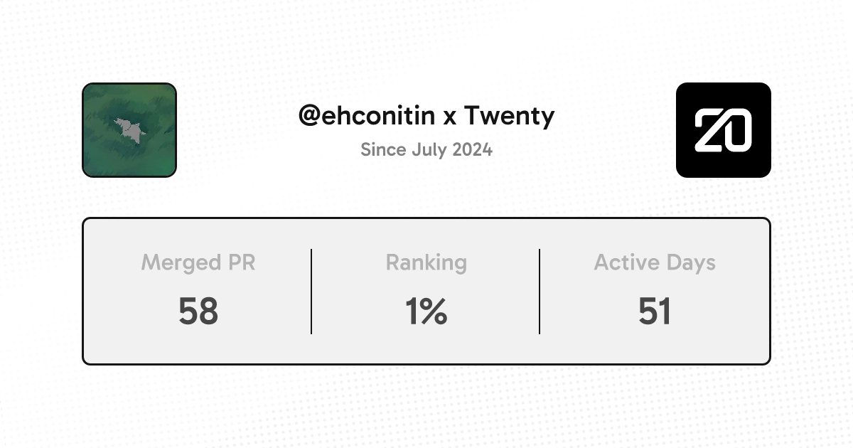
Thanks @ehconitin for your contribution!
This marks your 0th PR on the repo. You're top 0% of all our contributors 🎉
See contributor page - Share on LinkedIn - Share on Twitter

Contributions

@ehconitin ehconitin deleted the fixed-issue-6487 branch September 2, 2024 06:32
Sign up for free to join this conversation on GitHub. Already have an account? Sign in to comment
Labels
None yet
Projects
None yet
Development

Successfully merging this pull request may close these issues.

2 participants