VM details #200
VM details #200
Conversation
 lizsurette
left a comment
lizsurette
left a comment
There was a problem hiding this comment.
@Ranelim - Nice job working through this large amount of design :) I added a bunch of small comments.
Also wanted to mention to remember to update the README to link to this new set of documentation.
|
|
||
| ## Overview Tab | ||
|
|
||
|  |
There was a problem hiding this comment.
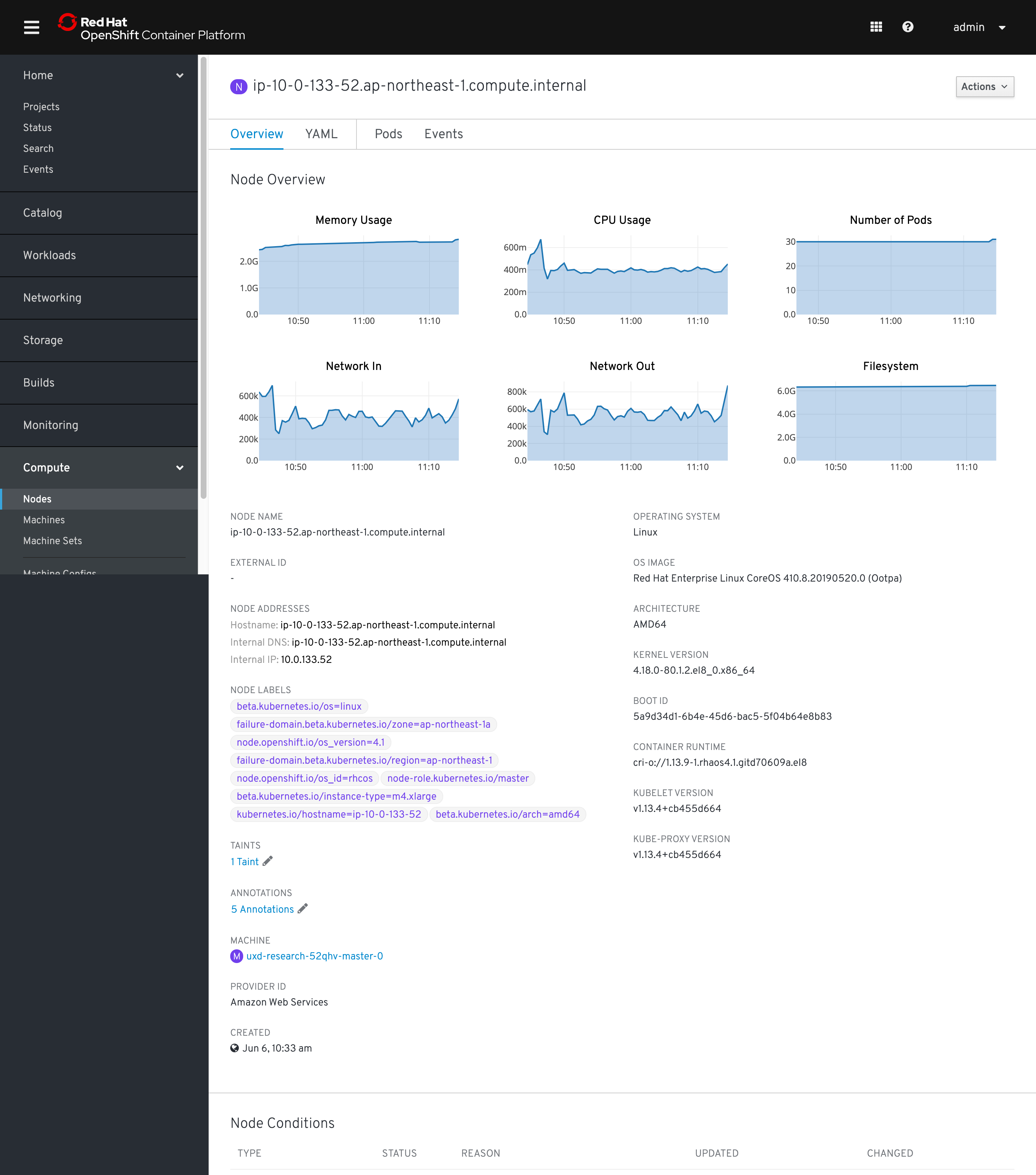
@cshinn Can you take a look at these charts? I believe these are using PF3 and we have updated charts in OpenShift to PF4. Also wondering if they belong above the standard detail info similar to how Nodes and Pods display charts at the top of the detail pages.
Separate nit...should we swap status and namespace in the detail fields? Probably not important but figured it would match other resources more closely. Also we should change the project label to say namespace with the green NS badge :)
There was a problem hiding this comment.
Status field
@lizsurette This is an oldie, but do you think the % uptime popover, accessed by clicking the info icon next to Status label, is necessary? I lean toward removing it along with the info icon entirely for discoverability, utility, and ambiguity reasons.
IP Addresses
Unfortunately I don't remember why there are two IPs included in this design. It might be worth checking with devs if these IPs are different in any way. If not then this is fine, but if they are we could probably add sub-labels like Node Details pages do:
Template
Should we use None instead of Blank. @matthewcarleton?
Project
As Colleen said, it looks like nearly every other workload object (Pod, Deployment, etc.) includes a field for Namespace instead of Project. We should probably do the same for VMs, with a green badge and no spaces within the Namespace title. Here's an example:
Flavor
CPU should be vCPU (which aligns with Matt's Create VM flow). @matthewcarleton I guess we can stick with GB for Memory for now, since IIRC that's what every other VM software vendor uses.
Node
Badge should be purple 🙂

There was a problem hiding this comment.
@lizsurette This is an oldie, but do you think the % uptime popover, accessed by clicking the info icon next to Status label, is necessary? I lean toward removing it along with the info icon entirely for discoverability, utility, and ambiguity reasons.
Are you suggesting we use the link here instead like we do on the table view? I like it, if so :)
Unfortunately I don't remember why there are two IPs included in this design. It might be worth checking with devs if these IPs are different in any way. If not then this is fine, but if they are we could probably add sub-labels like Node Details pages do:
VMs can have multiple IPs (I think there would be one per NIC?) In any case we could probably organize them better and maybe sub-label them.
There was a problem hiding this comment.
@beanh66, I chatted with @andybraren a bit and it seems like those specific chart visuals were intended mostly as a placeholder. I expect that they would end up using the pf4 line graph like we do on the nodes pages etc. For consistency's sake, they should probably go at the top of the page as well as they are on the other pages
There was a problem hiding this comment.
Are you suggesting we use the link here instead like we do on the table view? I like it, if so :)
@lizsurette I was suggesting removing it entirely, but I suppose the Status Popover pattern would be a natural place to include how long the VM has been running for, and when it was last powered on/off (if that's possible and we agree worth doing).
I'm just not sure what "uptime" means in a VM context and my googling isn't very fruitful. Is our "uptime" calculation how long the VM has been "Running" for? What would take it down from 100% to 97% in this example?
There was a problem hiding this comment.
@lizsurette I was suggesting removing it entirely, but I suppose the Status Popover pattern would be a natural place to include how long the VM has been running for, and when it was last powered on/off (if that's possible and we agree worth doing).
Yeah I would assume we should be consistent with what we do in the table for this value.
I'm just not sure what "uptime" means in a VM context and my googling isn't very fruitful. Is our "uptime" calculation how long the VM has been "Running" for? What would take it down from 100% to 97% in this example?
I think two values would be how long it's been running for and then how long it's been running in the last 7 days (%). I can't remember exactly where the original requirement came from though...it might be an oVirt carry over :)
There was a problem hiding this comment.
Here's an example of what those charts would look like (sorry for the delay. my cluster crashed on me yesterday)
There was a problem hiding this comment.
Nicely done @Ranelim, another big one almost done! Thank you for making so many updates to these screens. I hope the Sketch file wasn't too annoying to fix. 😄
And +1 to updating the README with a link to this work.
|
|
||
| ## Overview Tab | ||
|
|
||
|  |
There was a problem hiding this comment.
Status field
@lizsurette This is an oldie, but do you think the % uptime popover, accessed by clicking the info icon next to Status label, is necessary? I lean toward removing it along with the info icon entirely for discoverability, utility, and ambiguity reasons.
IP Addresses
Unfortunately I don't remember why there are two IPs included in this design. It might be worth checking with devs if these IPs are different in any way. If not then this is fine, but if they are we could probably add sub-labels like Node Details pages do:
Template
Should we use None instead of Blank. @matthewcarleton?
Project
As Colleen said, it looks like nearly every other workload object (Pod, Deployment, etc.) includes a field for Namespace instead of Project. We should probably do the same for VMs, with a green badge and no spaces within the Namespace title. Here's an example:
Flavor
CPU should be vCPU (which aligns with Matt's Create VM flow). @matthewcarleton I guess we can stick with GB for Memory for now, since IIRC that's what every other VM software vendor uses.
Node
Badge should be purple 🙂
| This is Network Interfaces tab. | ||
|
|
||
|
|
||
|  |
There was a problem hiding this comment.
3 nits:
Mac should be capitalized to MAC address.
The two Save buttons should be disabled until the next screen where all required fields have been filled.
I believe OpenShift italicizes default dropdown options like "Select modal" or "Select network" to visually distinguish them slightly from fields that have been selected. Here's an example (ignore the capitalization):

 matthewcarleton
left a comment
matthewcarleton
left a comment
There was a problem hiding this comment.
Hey Ran, this is looking great! Thanks for the work you've done.
Can you comment on/resolve any comments that aren't already. Unfortunately Github won't resolve comments when the updates are images :(
If you think this PR is in a good spot after that we can approve and merge.
Made changes and closed all Issues. Let me know if I missed anything. |
|
Awesome! |
Co-Authored-By: matthew carleton <[email protected]>
An overview of the VM details page including the following tabs:
@openshift/team-ux-leads