fix(ux): prevent three-panel layout from crushing center content on resize (#5545) - #5621
nankingjing wants to merge 2 commits into
Conversation


…esize (nesquena#5545)

Give .main a min-width floor (min(420px, 100%)) so the conversation
panel stays readable. Remove flex-shrink:0 from .rightpanel and set
min-width:260px instead, allowing the workspace panel to yield before
the center collapses. Raise the right-panel auto-hide breakpoint from
900px to 1020px so the panel collapses gracefully on narrow desktop
windows instead of squeezing the center unusably narrow.

|
| Filename | Overview |
|---|---|
| static/style.css | Breakpoint raised from 900→1020px throughout; rightpanel floor added with correct min-width:0 overrides in collapse rules; however, the new min-width:min(420px,100%) on .main causes horizontal overflow at 641–719px when the 300px sidebar is open |
| static/boot.js | _isCompactWorkspaceViewport matchMedia updated from 900→1020px to stay in sync with CSS breakpoint |
| static/outline.js | _outlineAllowed matchMedia updated from 900→1020px to stay in sync with CSS breakpoint |
| tests/test_issue2124_outline_panel.py | Test assertion updated from 900→1020px to match new breakpoint in outline.js |
| tests/test_issue2211_workspace_panel_reopen.py | Test assertion updated from 900→1020px to match new breakpoint in style.css |
| tests/test_mobile_layout.py | Test renamed and updated from 900→1020px breakpoint reference; _max_width_media_blocks call updated consistently |
Flowchart
%%{init: {'theme': 'neutral'}}%%
flowchart TD
    A[Browser viewport width] --> B{≤ 640px?}
    B -- Yes --> C[Sidebar = fixed overlay\nMain fills 100vw\nRightpanel hidden]
    B -- No --> D{≤ 1020px?}
    D -- Yes --> E[Sidebar 300px flex-shrink:0\nMain min 420px\nRightpanel display:none]
    D -- No --> F{workspace-panel closed/collapsed?}
    F -- Yes --> G[Sidebar + Main only\nRightpanel width:0 min-width:0]
    F -- No --> H[Sidebar 300px + Main min 420px\n+ Rightpanel min 260px\nTotal min = 980px]
    E --> I{Viewport 641–719px?}
    I -- Yes --> J["⚠️ 300 + 420 = 720px > viewport\nHorizontal overflow"]
    I -- No --> K[Fits cleanly ≥ 720px]
%%{init: {'theme': 'base', 'themeVariables': {"darkMode": true, "background": "#0d1117", "primaryColor": "#21262d", "primaryTextColor": "#e6edf3", "primaryBorderColor": "#8b949e", "lineColor": "#8b949e", "textColor": "#e6edf3", "edgeLabelBackground": "#161b22", "actorBkg": "#21262d", "actorBorder": "#8b949e", "actorTextColor": "#e6edf3", "actorLineColor": "#8b949e", "signalColor": "#8b949e", "signalTextColor": "#e6edf3", "noteBkgColor": "#373320", "noteBorderColor": "#d4a72c", "noteTextColor": "#f0e6c0", "labelBoxBkgColor": "#21262d", "labelBoxBorderColor": "#8b949e", "labelTextColor": "#e6edf3", "loopTextColor": "#e6edf3", "activationBkgColor": "#30363d", "activationBorderColor": "#8b949e"}}}%%
flowchart TD
    A[Browser viewport width] --> B{≤ 640px?}
    B -- Yes --> C[Sidebar = fixed overlay\nMain fills 100vw\nRightpanel hidden]
    B -- No --> D{≤ 1020px?}
    D -- Yes --> E[Sidebar 300px flex-shrink:0\nMain min 420px\nRightpanel display:none]
    D -- No --> F{workspace-panel closed/collapsed?}
    F -- Yes --> G[Sidebar + Main only\nRightpanel width:0 min-width:0]
    F -- No --> H[Sidebar 300px + Main min 420px\n+ Rightpanel min 260px\nTotal min = 980px]
    E --> I{Viewport 641–719px?}
    I -- Yes --> J["⚠️ 300 + 420 = 720px > viewport\nHorizontal overflow"]
    I -- No --> K[Fits cleanly ≥ 720px]
Reviews (2): Last reviewed commit: "fix(ux): add min-width:0 to rightpanel c..." | Re-trigger Greptile
![greptile-apps[bot]](https://avatars.githubusercontent.com/in/867647?s=60&v=4)

 nesquena-hermes
left a comment
nesquena-hermes
left a comment
nesquena-hermes
left a comment
There was a problem hiding this comment.
Thanks for tackling #5545 — the source change itself is clean and internally consistent: the panel breakpoint moves uniformly from 900px → 1020px across boot.js (_isCompactWorkspaceViewport()), outline.js (_outlineAllowed()), and all three style.css media queries, the JS auto-hide threshold matches the CSS breakpoint (1020/1021 boundary), and the .main{min-width:min(420px,100%)} + .rightpanel{min-width:260px} space-sharing is sound. node --check passes on both JS files.
Blocking issue — the breakpoint change breaks 3 existing tests that hardcode the old 900px value, so CI is red (test (3.11/3.12/3.13, shard 0/1/2) all fail). These are source-lock assertions that need to move to the new breakpoint alongside the source:
tests/test_issue2124_outline_panel.py:90— asserts"matchMedia('(max-width:900px)')"is inOUTLINE_JS.outline.jsnow emits1020px.
→ change to"matchMedia('(max-width:1020px)')"tests/test_issue2211_workspace_panel_reopen.py:24— asserts'@media(max-width:900px)'is in the CSS (guarding.workspace-panel-edge-toggle{display:none!important;}). That rule now lives under@media(max-width:1020px).
→ change to'@media(max-width:1020px)'tests/test_mobile_layout.py:578(test_compact_titlebar_keeps_hamburger_available) — builds_max_width_media_blocks(900); the block content moved to the1020pxmedia query.
→ change to_max_width_media_blocks(1020)
Recommended (not strictly blocking, but avoids silent staleness): a few sibling assertions still pass only coincidentally because an unrelated @media (max-width: 900px) rule for .msg-row[data-role="user"] remains at style.css:5772 — but their intent is the panel breakpoint, which you've moved. Consider also migrating the panel-breakpoint references in test_mobile_layout.py (~lines 172–179, 213) and test_issue781.py (~lines 47/50/53) from 900px → 1020px so they keep asserting what they mean.
Once the tests are green, this still needs a maintainer visual sign-off on the layout/breakpoint change before merge (it's a visible behavior change — .rightpanel can now shrink to 260px instead of never shrinking, and the right panel auto-hides later at 1020px). But the test fixes above are the mechanical blocker to clear first.
 nesquena-hermes
added
changes-requested
nesquena-hermes
added
changes-requested

🎬 Cutter preview — PR #5621
|
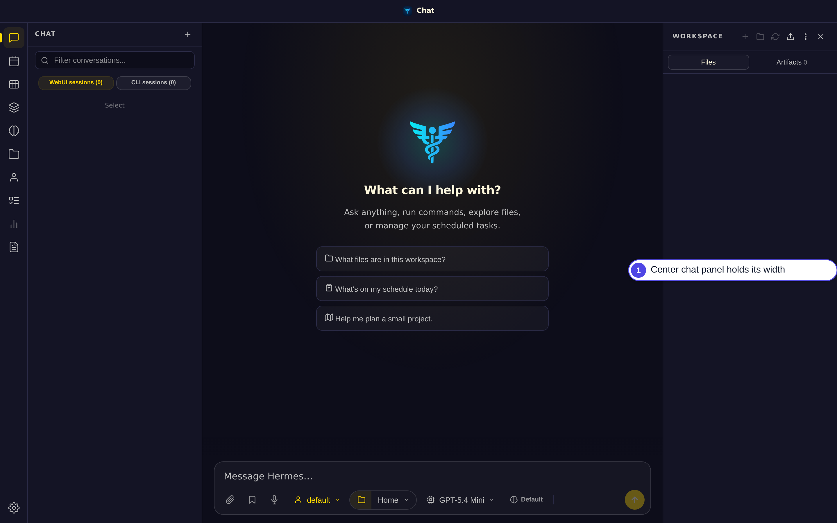
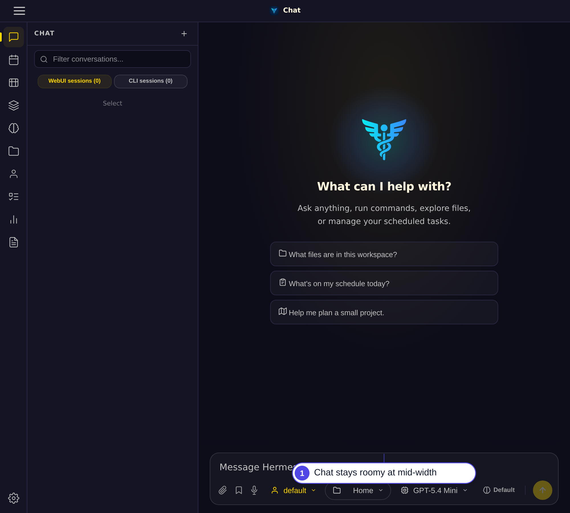
…020px

- Add min-width:0 to rightpanel collapse rules to prevent 260px ghost gap
  when the workspace panel is closed on viewports wider than 1020px
- Update 3 hardcoded 900px test assertions to 1020px (outline panel,
  workspace panel reopen, compact titlebar)
- Update test_mobile_breakpoint name and assertions to 1020px
|
Thanks for the review! All three tests have been updated to the new 1020px breakpoint:
Also added Ready for re-review. Fixed in commit e84f6f6. |

|
Closing as superseded — thanks @nankingjing. The three-panel center-crush issue (#5545) was fixed and shipped in v0.51.906 via #5594 (@rodboev's surgical center-floor: Your variant (raising the auto-hide breakpoints across 3 files) targets the same symptom; the shipped CSS-only floor was the preferred, more surgical approach. Appreciate the parallel effort. |
2 participants


Summary
Fixes #5545 — the three-panel layout no longer crushes the center conversation panel when the browser window narrows.
Root cause
Both
.sidebarand.rightpanelwereflex-shrink: 0, while.mainhadmin-width: 0. The only element flexbox was allowed to compress was the center panel. The right panel only auto-hid at <=900px, leaving a 901–1020px band where all three panels tried to coexist but the center collapsed to unusable width.Changes (3 files, +9/-9 lines)
static/style.css:.main:min-width: 0→min-width: min(420px, 100%)— center panel gets a floor so it stays readable.rightpanel: removeflex-shrink: 0,min-width: 0→min-width: 260px— workspace panel yields before the center collapsesstatic/boot.js:_isCompactWorkspaceViewport(): matchMedia900px→1020pxto stay in sync with CSSstatic/outline.js:_outlineAllowed(): matchMedia900px→1020pxto stay in sync with CSSVerification
Dock the browser window across the 700–1100px range with all three panels open. Confirm: