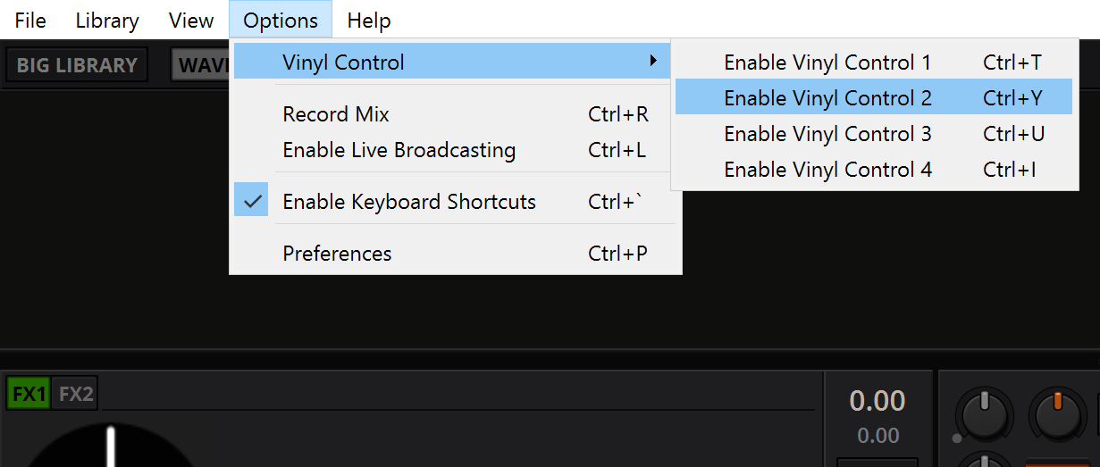
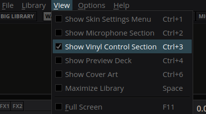
LateNight: style main menubar#3704
Conversation
|
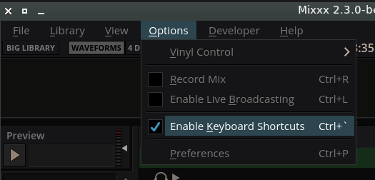
Before After On Windows10 (2560x1440)
|
|
I tried this on Windows7 and in general it works, but I noticed the following: Aestetical impressions: |
|
I can confirm that this work on Ubuntu Bionic with Ubuntu/Unity/Gnome Desktops |
|
Thanks for testing @NotYourAverageAl Then we can get into tweaking the details. |
|
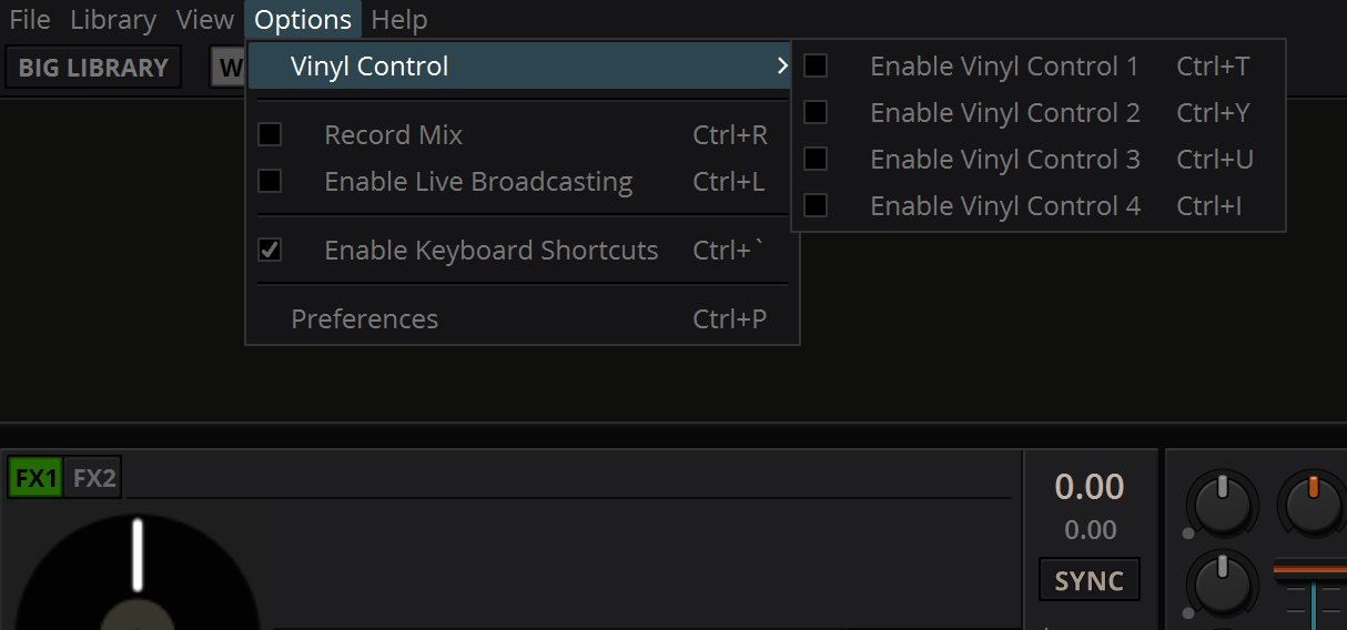
This is how it looks on Windows7: |
This PR doesn't change that behaviour. The launch screen style is parsed first, before actually loading the skin incl. menu style. For a Consistent Experience™ we could isolate the menubar styles as we do with the launch screen, or even include it there. |
Tbh I consider this an improvement. Even with an unfocused window in difficult lighting you can aim for a menu item, instead of clicking an emtpy place first to get a readable menu. |
|
Yeah, I see the main menu items could use more spacing.
should be sized like in the other menus. |
|
@daschuer Could you please share a screenshot of the menu with Gnome? This need some os-specific tweaks to look good, like the checkbox offset is computed differently on linux / windows for example. |
|
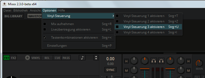
macOS 11.2.3 |
|
Yes that's the artifact build. |
|
Is the global menu of MacOS also skined? |
|
macOS dark mode: dark menu bar How would you end up with dark menu bar on light desktop scheme? That will never happen. The only thing currently off is the light title bar of mixxx window on macOS dark mode. But that is due to some xcode shenaningans which will not be addressed for 2.3. |
|
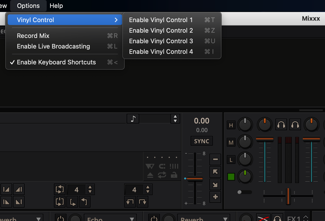
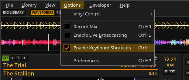
Here is the GNOME view on Ubuntu Bionic: |
|
I think the checkbox could use a color from the palette. Maybe green or orange. |
|
Agree with poelzi about colour. Also I think I liked the the storm trooper look, light menu bar & dark everything else..but that's just me |
|
@poelzi May be true. later I'll try to reenact my win10 installation and check on fullhd |
|
Fedora (before) Fedora (after) |
|
@uklotzde Your screenshots say this is a no-op PR ;) |
|
Until now it seems in Gnome and Xfce the checkbox is within the item padding, everywhere else (Fedora, Win7/10) it's added. |
|
In the end I'd try to make it look good on Linux for the most used desktop distros which appear to be Mint, Ubuntu, ... atm. |
|
This is how it looks on Arch Linux (GNOME Shell 3.38.4): |
|
Merge? |
|
obvioulsy not! Now picking relevant parts from Coming closer to make it look like this for both: I believe the folks who implemented the style parsing on certain platforms are not very popular... |
|
Sometimes the different behaviour of QT depending on the OS/Desktop Environment and version of QT is just confusing, the styling system in particular. I have seen the strange spacing problem as well on some desktops, but not others as well and gave up at some point ;) |
|
I will not mix up the main menu and the context menus for two reasons: But the new styles are quite compact and they are in separate stylesheets, so it's easy to remember what's what. So if I don't loose my mind I can start another PR once this here is merged. |
|
perfecto! |
|
LateNight Classic is included now: |
812e2ce to
19e6995
Compare
19e6995 to
48cdc29
Compare
|
On Arch/GNOME 40 the indentation for items without checkboxes is still slighty off but I don't know if that is fixable:
|
|
oh yeah, I noticed I screwed up some things with the consolidation into common style.qss |
48cdc29 to
595e0a9
Compare
|
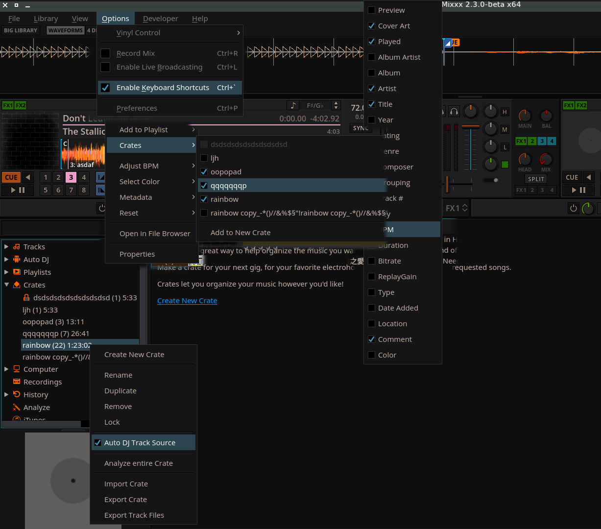
The main menu should now look the same on all OS, see picture below. Also, I took the opportunity to consolidate and clean up all QMenu styles and split off a few tweaks into style_windows.qss Please check all menus in
The only weird things I noticed (on linux) is that |
|
Unfortunately, I couldn't compare everything from the list because some references are missing from your composed screenshot. The things that I was able to compare matched and everything that I wasn't able to compare still looked like it was styled in accordance to the latenight theme. However, I encountered a major issue: I was not able to edit track metadata from within the library table. Selecting a table cell was no problem, but clicking on that cell again so bring up the editor just didn't work. |
|
okay, thanks. only the inline edit menu was missing, and that's the same for all spinboxes, track tag editing, cue label editing and the searchbox. Note that on windows there are no icons (same as in all other apps I checked).
@Swiftb0y |
I'm sorry for the false alarm, I wasn't aware of this preference option. Works as expected. Did you provide custom icons for that context menu? The one in your screenshot seem very latenight-ish but Qt seems to use the default ones. |
 Holzhaus
left a comment
Holzhaus
left a comment
There was a problem hiding this comment.
LGTM, thank you.
System:
gnome-desktop 1:40.0-1
qt5-base 5.15.2-5
xorg-server 1.20.10-3
No. I'd like to try that to have entirely themed, failsafe menus, but that is on hold until we tackle to style all dialogs like the preferences and track properties dialogs, too. |
|
Alright, nice! |
|
@ronso0 Great, this really helps to release the pressure form the menu bar topic. I notice that the menu bar is not styled during the load screen. Is this hard to solve? |
|
yes it looks great but I also realized how much space we waste with the menubar.. that it's unstyled initially is a minor annoyance. We could |
|
as mentioned: the pain with the menubar is only styling checkboxes and items concistently across all OS . so if we omit that we could set a minimal stylesheet (no the submenus, no checkboxes) until the entire skin is parsed. |
|
Thank you for looking into it. Both ideas are reasonable ... |
|
@ronso0 I already implemented #3189 a solution for the menubar problem. There is only one drawback I was not able to solve: native menubar on linux. QT seems to be very broken when the qaction associated with a menubar item is not owned by the menubar or outlives changes :-/ |
Wooh, I finally managed to tame the Qt stylesheet madness and untangle my previous attempts.
This first implementation is for LateNight only.
It is tested on Ubuntu with xfce. If that works okay on Win and Mac, too, I will start to port the styles to all skins.
Confirmed to work in
Linux, with xfce

It allows to save some vertical space but it also makes it obvious how much space is wasted by the menubar.
Consider this:
To style the main menubar we use the skin's font but
we try to preserve most other font properties set by
the operating system, such as the font weight, size and style.
This is because the user may use a HiDPI screen with fonts
slightly larger than the defaults but may NOT have scaled Mixxx.
Even though different fonts at the same point size don't necessarily
produce the same effective visual size the difference is
marginal inmy experience, except for some really weird fonts.