adapt visible Skin Settings in small Deck in Latenight#2011
adapt visible Skin Settings in small Deck in Latenight#2011nopeppermint wants to merge 11 commits intomixxxdj:masterfrom
Conversation
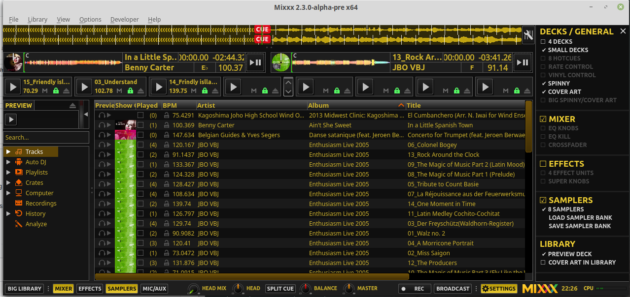
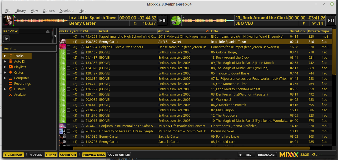
update toolbar for big library:
additional:
- 4 deck
- spinny
- cover art
- preview deck
- cover art in library

no longer visible: skin settings
add knobs to big library toolbar:
- head mix
- head gain
- balance
- master gain
add split cue button
|
This looks good! I bet our podcaster users will like the simplified interface. Does it make sense to have the keylock icon on all the samplers? Is it common for the rate to change on samplers? Apologies if that's not even something you changed :). Adding headphone button and eject to small decks sounds like a good idea. Personally I don't think eject buttons are super necessary (just load something new!), but there's space for them. |
I'm curious: what are podcasters and why do they need a simple interface? |
|
or I guess, streaming radio hosts. They usually use Mixxx for microphone input and autodj. They don't care about waveforms, or eq, etc. Mixxx's support for broadcasting to shoutcast is the best in the open source world so we have a lot of non-dj users in that space |
|
@nopeppermint Thanks for bringing this up again. Improvements:
|
|
@ all: should we do this for Deere and Shade as well? |
ok |
ok |
do you suggest a name change of this feature? |
Yup. So that we have 'regular' decks and 'minimal' decks. For the sake of consistency, the related control would be If we want to push the idea even further, we could add a toggle that hides decks when the library is maximized (opt-out, skins set |


I was not aware of this.. maybe we can set a minimal width based on the selected time format? |
we have 3 display options and 5 time formats = 15 possibilities for setting fixed width, and we didn't even take hours into account... |
wtf why we introduced so much options ... 👎 |
|
|
I would keep small deck to prevent a massive renaming ;-)
nice idea |
ok. In the toolbar I would keep the balance and master gain knob. |
Becasue all of them are valid. There are zillions of Mixxx users with quite a few different use cases and personal preferences. So I guess 15 theoretically possible combinations is not so much... |
That's kinda how I feel about this PR. I understand the desire to have the decks take less space, but I'm concerned this is heading down a path towards unmaintainable complexity, especially if we're making these "minimal decks" like the maximized library view but not exactly like them so we need to handle even more conditions in the mini deck template. Can you clarify what the use cases for this new option are? Otherwise we will struggle to decide how minimal is too minimal. For example, if the goal is to show only what is required for vinyl control users who have an external mixer, or controller users who don't want any info on screen that's visible on their controller, I think this may be enough as is. |
as easy as using |
|
@Be-ing I fear this complexity as well. That's pretty much why I'd insist on keeping the mini decks template as it is. I agree, in general we should pay attention that skins don't get even more complex. At some point it might be more reasonable to create a new skin focussing on a distinct use case. With color schemes this can adapt to personal preferences. |
|
..and maybe that's due to introducing Tango where there accumulated so many (valid) options over time which raised the bar so much that we now have to constrain further growth off all skins. Except Shade which fortunately has no settings menu.. ;) |
I solicited some feedback on facebook and started collecting it in a blueprint: https://blueprints.launchpad.net/mixxx/+spec/streaming-ui. We don't have to worry about this for now but it could provide some nice guidance for a small-deck mode that those users might like |
|
What is the state here? Conflicts have emerged. |
|
Considering the effort to resolve the merge conflicts: optional minimal & medium decks are in #2736 as well. I still like the idea of moving the master / headphone mixer to the toolbar, like in Deere. This would give us more space in the decks / mixer row. That mixer section should be hideable though for those who don't need it. |
we may continue in #2736 |
|
Alright, then we can close this. |
This PR:
Further more I would like to add an eject and headphone button to the small decks.
What do you think about the different points?