Deere :: add Key/BPM expansion indicators, put Key controls next to play position#1880
Conversation
|
I actually prefer to leave both open, and in particular to have the key controls open permanently. Expanding downward does make more sense though I think. |
|
Okay. Nevertheless, as soon as we add even small expansion indicators we don't have enough space with a standart mixer on small screens. |
|
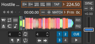
Other possibilities: move Key controls next to play position, expand left |
|
The stacked key and beatgrid controls looks good. But even if you go with the original it's not gonna ruin Mixxx for me or anything. It would be nice to have track time still visible but I appreciate it's difficult to work with limited space. |
|
@beenisss @Be-ing What do you think? That's a polished version from another branch ronso/deere-beatgrid-key-controls-2rows2. If you go along I'd force-push it into this branch here. |
|
I like it. Thumbs up from me. |
|
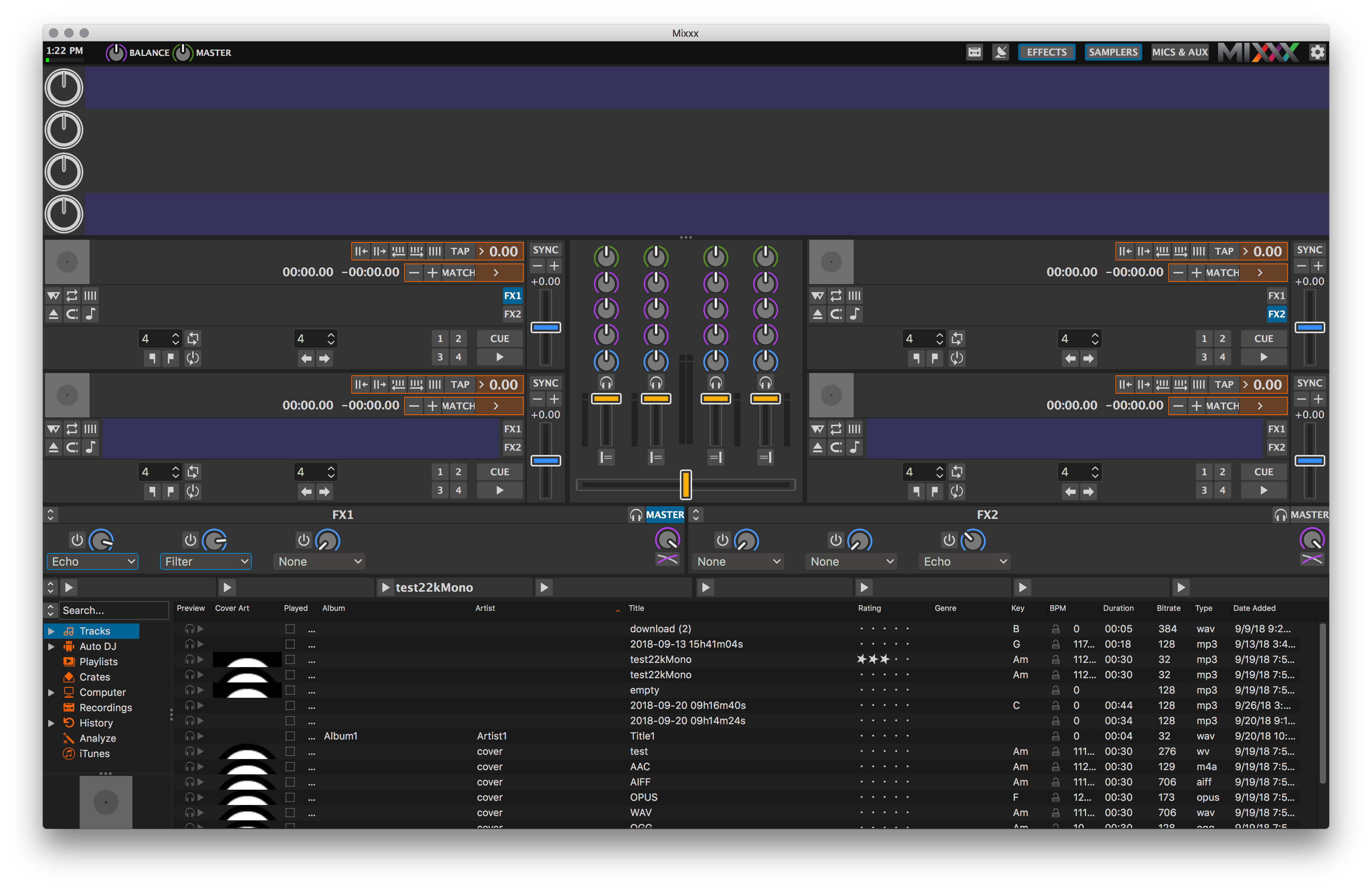
Do the waveforms resize when you expand/collapse the key/bpm sections? They do for me on macOS. |
|
I did notice some minor glitches when I tried it out. I haven't tested it properly, but let me know if I should. |
…wn, next to play position display
4d973e9 to
63c734a
Compare
I picked this commit so it's easier to test. Layout is fixed (no glitches). |
|
It works well for me now (horizontal expansion) and as you say helps to have them on separate rows, especially when at Deere's minimum size. 👍 The "MATCH" button text is cut off, but that's true for me without this PR too. |
|
LGTM so far, however there are some issues, not prevent merging for me:
|
@rryan @daschuer
The border and the highlight indicate that you don't need to hit that small arrow but the whole container is responsive. You think that doesn't suffice? |
…s under some conditions
|
I know, "perfect" is here probably not worth the effort. So we can IMHO merge it when you think it is ready. |
|
Yup, ready to go! |
|
@beenisss @rryan merge? |
|
SGTM |
|
👍 |
|
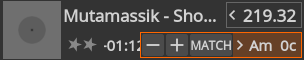
I have noticed a drawback of this design. The strings for different keys can be different widths, which can make the key adjustment buttons move from under the cursor when clicking them repeatedly. |
|
I've noticed that too, it usually catches me out if I double-click to drop down by two semitones and the second click just cancels out the first. |
|
yeah, we had that issue before. The tricky part:
My attempt to solve this: Openkey What do you think? Any other idea how to fix this? |


|
proposed changes are in #1925 |
https://bugs.launchpad.net/mixxx/+bug/1800705
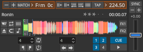
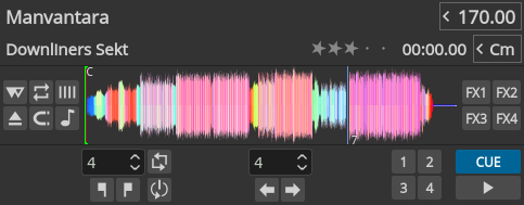
Either beatgrid or key controls can be expanded. They replace Stars and play position then.
I choose to expand downwards as horizontal expansion creates ugly situations i.e. if the track cover or the mixer incl. Kill buttons is visible. For the same reason Stars and play position are hidden. The preparation use case justifies hiding those IMO.
As soon as this would be merged I'll compact the SVGs.