Skip to content

Tango :: 2.1beta fixes#1473

Merged
daschuer merged 11 commits intomixxxdj:2.1from
ronso0:tango-update-2.1beta
Jan 20, 2018
Merged

Tango :: 2.1beta fixes#1473
daschuer merged 11 commits intomixxxdj:2.1from
ronso0:tango-update-2.1beta

Conversation

@ronso0
Copy link
Copy Markdown
Member

@ronso0 ronso0 commented Jan 6, 2018

I fixed some minor issues and improved UX:

  • made Vinyl controls toggle easier to discover
  • top bar layout is simplified, no more jumping when mixer is toggled
  • redesigned beatgrid buttons...again, Deere-inspired
  • enlarged Splitter handles
  • Q as cue mark in Previed deck & samplers

tango-2018-01-06

@nopeppermint
Copy link
Copy Markdown
Contributor

nice!
just two things:

  • couldn't you add a tooltip when you gray out the headphone/preview functionality if no Headphone is configured ?
    The first time I saw this it was really confusing to me..

  • missing right click functionality on hotcue buttons in sampler, but that's already fixed in branch 2.1 with
    bugfix skin tango #1471

@Be-ing
Copy link
Copy Markdown
Contributor

Be-ing commented Jan 6, 2018

couldn't you add a tooltip when you gray out the headphone/preview functionality if no Headphone is configured ?
The first time I saw this it was really confusing to me..

We are already in string freeze for 2.1, so no. If this is confusing, I think we should postpone the graying/hiding of headphone controls without headphones configured for 2.2.

@ronso0
Copy link
Copy Markdown
Member Author

ronso0 commented Jan 6, 2018

The first time I saw this it was really confusing to me..

Would it have been less confusing when hit you a Pfl button or Play in Preview deck and no sound would play? Either way you'd start investigation what's wrong with your sound devices.
Doing it 'the Tango way' ;) let's you know way before you try to click that button or load a track to preview deck.

Tooltip would be fine, but only half of a proper UX solution: it would be nice if we could add a click-functionality and an icon to that blocking overlay, which opens a dialog to either set up a headphone device or leave as it is (but know what's going on).
Something similar happens when you click an unconfigured Mic's Talk button, or Vinyl Control toggle or Passthrough toggle (but with out the option to cancel the process).

Issue tracked here: Bug 1741683

@nopeppermint
Copy link
Copy Markdown
Contributor

Either way you'd start investigation what's wrong with your sound devices.

that's true

Tooltip would be fine, but only half of a proper UX solution: it would be nice if we could add a click-functionality and an icon to that blocking overlay, which opens a dialog to either set up a headphone device or leave as it is (but know what's going on).
Something similar happens when you click an unconfigured Mic's Talk button, or Vinyl Control toggle or Passthrough toggle (but with out the option to cancel the process).

even better !

@ronso0
Copy link
Copy Markdown
Member Author

ronso0 commented Jan 9, 2018

I'm done here, so:
Ready, steady, test!

@Be-ing
Copy link
Copy Markdown
Contributor

Be-ing commented Jan 14, 2018

I understand why you changed the cue marker to the letter "Q", but... it feels weird to introduce a novel abbreviation that isn't obvious. What do others think?

Everything else in this PR LGTM.

@daschuer
Copy link
Copy Markdown
Member

The Q works for me.

@ronso0
Copy link
Copy Markdown
Member Author

ronso0 commented Jan 15, 2018

It works for me, too. Q is pronounced like 'Cue', it's used on Reloop controllers and it looks like HotCue_0 with a handle that makes it easier to grab. IMO the Cue button just needs any label to distinguish it from the HotCues, while being positioned close to them and the Play button. I think we could even label it X or M or introduce some funky icon (like Reloop uses the cup icon for Goto-Cue-and Play) because users will get used to it after first use. But we don't need to start a discussion about convention vs. intuition here.. ;)

@ronso0 ronso0 mentioned this pull request Jan 18, 2018
@ronso0
Copy link
Copy Markdown
Member Author

ronso0 commented Jan 20, 2018

I added another fix, related to lp:1673196 "Controls for Library focus":
orange borders to easily recognize focused Library section

tango-2018-01-20__focus_borders

I'd like to see this merged soon as it contains fixes to issues reported repeatedly, like overlapping beatgrid buttons

@ronso0
Copy link
Copy Markdown
Member Author

ronso0 commented Jan 20, 2018

IMO we should add a focus indicator to other skins, as well, but this doesn't necessarily be accomplished via a colored border.

@daschuer
Copy link
Copy Markdown
Member

OK, thank you!

@daschuer daschuer merged commit fc15720 into mixxxdj:2.1 Jan 20, 2018
@ronso0 ronso0 deleted the tango-update-2.1beta branch January 22, 2018 16:18
@foss-
Copy link
Copy Markdown
Contributor

foss- commented Jan 26, 2018

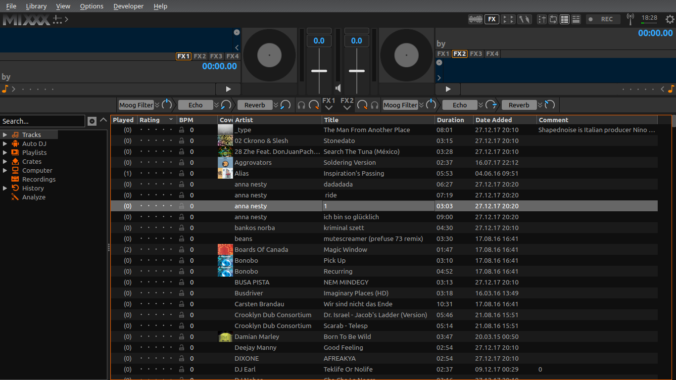
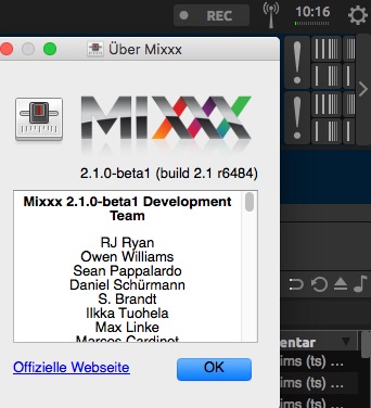
Although merged, on macOS 10.13.3 using 2.1.0-beta1 (build 2.1 r6484) (2.1 build from 25th jan 2018) I still see the problem with beatgrid controls being partly hidding behind the arrow to hide the beat grip controls:
hidden beat grid controls

@ronso0
Copy link
Copy Markdown
Member Author

ronso0 commented Jan 26, 2018

@foss-
Your pictur shows the old graphics, so it must be the old skin incl. overlap.
Are you shure you removed any old dev skins?
This is how the skin looks like when I extract it from mixxx.deb (linux app package), version 2.1-beta1-git 6488 from the official source:
tango-2 1-beta1-git6488

@foss-
Copy link
Copy Markdown
Contributor

foss- commented Jan 27, 2018

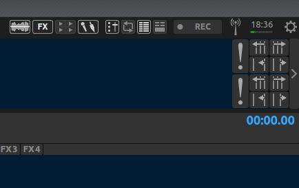
Excuse the noise. Not sure what happened. Installed mixxx-2.1.0-beta1-2.1-git6498-release-macintel64.dmg 26-Jan-2018 15:07 and the new graphics do show and nothing is cut off. Confirming the fix and thanks for that.

Sign up for free to join this conversation on GitHub. Already have an account? Sign in to comment

Labels

None yet

Projects

None yet

Development

Successfully merging this pull request may close these issues.

5 participants