Skip to content

Allow edit card dialog to be made wider#7492

Merged
bramkragten merged 1 commit intohome-assistant:devfrom
cnorick:feat-more-edit-space
Oct 27, 2020
Merged

Allow edit card dialog to be made wider#7492
bramkragten merged 1 commit intohome-assistant:devfrom
cnorick:feat-more-edit-space

Conversation

@cnorick
Copy link
Contributor

@cnorick cnorick commented Oct 26, 2020

Breaking change

Proposed change

To make more space for code-editing card dialogs (e.g. markdown or custom html cards), now you can click the title of the card to expand the width to fill the screen on desktop. This is similar to expanding the more info dialog.
demo gif

Type of change

  • Dependency upgrade
  • Bugfix (non-breaking change which fixes an issue)
  • New feature (thank you!)
  • Breaking change (fix/feature causing existing functionality to break)
  • Code quality improvements to existing code or addition of tests

Example configuration

Additional information

Checklist

  • The code change is tested and works locally.
  • There is no commented out code in this PR.
  • Tests have been added to verify that the new code works.

If user exposed functionality or configuration variables are added/changed:

@homeassistant
Copy link
Contributor

Hi @cnorick,

It seems you haven't yet signed a CLA. Please do so here.

Once you do that we will be able to review and accept this pull request.

Thanks!

Copy link
Contributor

@zsarnett zsarnett left a comment

Choose a reason for hiding this comment

The reason will be displayed to describe this comment to others. Learn more.

Please add a screenshot of how this looks

@spacegaier
Copy link
Member

Holy cow! Never knew that clicking on the title makes a card go wider. That is not easily clear for the user. Perhaps a pointer cursor should be shown when hovering?

@noxhirsch
Copy link
Contributor

image
I think a pointer cursor is not clear enough. Maybe there should be a button in the header to make it wider? (the title could still be clickable for users that know that trick). mdi:arrow-expand-horizontal seems to be perfect for that.

@spacegaier
Copy link
Member

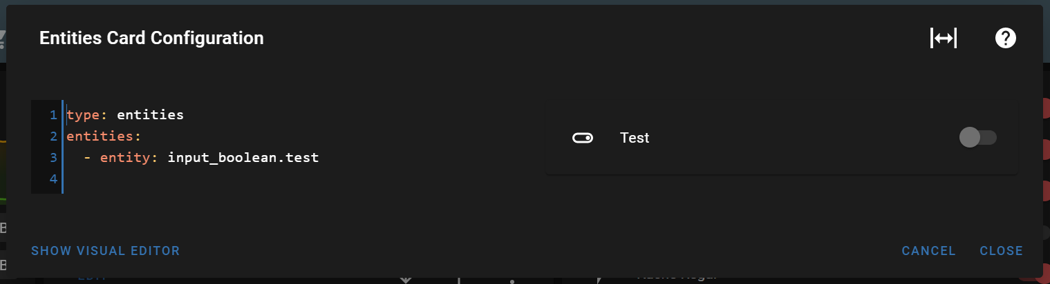
Just an observation: Some dialogs already contain three icons in the header, so a fourth one might start to clutter up things a bit. I thought for a second to propose only showing this new icon if the title is hovered, but that would only increase the visibility a bit plus in the worst case make the dialog box size jump.

Example with three buttons (counting the close button).
image

So perhaps we only show the proposed icon in some places, such as the code editors you mentioned.

@zsarnett
Copy link
Contributor

We should not have multiple ways to achieve this in different dialogs. Clicking the header is the best way for now unless we refactor all of our dialogs

@cnorick
Copy link
Contributor Author

cnorick commented Oct 27, 2020

I agree @zsarnett. I think consistency is more important than discoverability here. However, I like the idea of making resize more discoverable on all dialogs. Maybe we can turn that into another feature request?

@bramkragten bramkragten merged commit 40191a8 into home-assistant:dev Oct 27, 2020
@cnorick cnorick deleted the feat-more-edit-space branch October 27, 2020 15:01
@bramkragten bramkragten mentioned this pull request Nov 11, 2020
@Misiu Misiu mentioned this pull request Nov 20, 2020
9 tasks
@github-actions github-actions bot locked and limited conversation to collaborators Jul 5, 2022
Sign up for free to subscribe to this conversation on GitHub. Already have an account? Sign in.

Projects

None yet

Development

Successfully merging this pull request may close these issues.

Wider card code editor / Wide mode for card code editor

6 participants