WIP: add tap/hold actions to entity rows#2786
Conversation
 ghost
assigned
ghost
assigned
 iantrich
force-pushed
the
row-actions
branch
from
iantrich
force-pushed
the
row-actions
branch
from
dde9611 to
f1a9bba
Compare
iantrich
changed the title
|
ready for review |
iantrich
force-pushed
the
row-actions
branch
from
990ecab to
99810a8
Compare
* add customElement decorators

Chose to add to each row as in the future rows may not be restricted to just the entities card

Want timer and input number rows to be converted first, so will rebase once they are and add to them.
|
I'm starting to have second thoughts about this. Allowing people to override the name part of an entity row… are we really improving things? What is the use case ? Discoverability is poor of what an action will do, so we will only allow people to build more confusing interfaces. |
|
If you believe that, then your argument would hold for ALL our tap/hold actions which is most of our cards and elements; allowing it for rows makes them conform to what is common. e.g. If I want clicking on my climate row to start a script to toggle it for away mode and long-press for more-info, I think that is a valid and useful action. Not allowing it would make it so I have to have a script row and a climate row to achieve the same thing. In the end, it should be up to me how I want things to be handled as a user. |
|
We introduced click/long press for the picture elements. There they make sense. I think that this is a feature creep that will make editors and features more complex. If we don't show the away state on a climate card, how will you know the call was successful? There is no toast anymore. |
|
How does it make sense for only picture-elements? I strongly disagree your arguments. If you're concerned about not knowing if a service call was successful, we should have not taken away toasts, because that argument touches anything that does implement actions already; elements, picture-entity, picture-glance, entity-button, and glance. This is not feature creep, in my opinion. It is an alignment with the other items I listed above. |
|
Tap and hold actions are already supported in the non picture cards like Glance and Entity Button for example. Here is an example of one of my system glances which i find quite useful. It makes no sense to me that I can do this stuff in a glance card, but not in an entities card... The only difference to me (as an end user) is that one displays stuff horizontally and the other displays vertically. I think it's a good idea to have consistency amongst the core cards where it makes sense. |
|
Some reasoning from the past |
|
There is a big difference between glance and entities card, it's not just vertical vs horizontal. Entities card has entity rows and entity rows have controls. And because there are no controls, the icons look clickable. For entities card, it's a name next to actual controls. What we're proposing here is a UX footgun: the label next to the controls can now be configured to do anything. We should empower people to build UIs that everyone in their house can use. We have kept a tight lit on features that would be confusing for users. Shipping less features, but each feature is easier to understand and results in easier to understand UIs, is a big plus. Too many projects are getting feature creep'd to hell and get replaced. The Lovelace built-in cards, entity rows and elements should not aim to cover every feature or aim to please everyone. The built-ins should focus on creating an easy to use set of elements to build UIs that cover 80% of the use cases. |
|
Icons are clickable in our UI, that is a fact, even in the entities card; we're merely giving it more control. And I still argue this is not creep; this is alignment with our other cards. |
|
Alignment only makes sense if the feature actually suits the card. I argue that in this case, UX-wise it doesn't make sense. Can you give me some examples of how this feature will be used that also gives a good user experience? The reason I didn't like the "away mode" toggle example you gave earlier was because we don't show the current away mode on the controls, so allowing it to be toggled, but you don't know what you're toggling to, is bad UX. If away mode is shown on the card, maybe we should allow changing it from the controls too? Custom rows like the mini media player show that we still have a lot of room to expand controls. |
|
Here is my above Glance example with the same exact thing re-created in an Entities card. And another example of a room presence card in both Glance and Entities format: In my opinion, the Glance cards do not appear to be any more clickable than the Entity cards. There's no obvious visual cues like button shapes or different colored / underlined text to indicate they're clickable. The only reason I know that the Glances in theses screenshots have associated click actions is because I added the necessary tap_action and hold_action commands to them myself. And that same reasoning would hold true for the Entities card too. It makes sense to keep the default behavior as simple as possible, but this is not default behavior. This is an option that the user must first manually add and configure themselves. And when you're the one configuring something to your liking, you would know exactly how it works. There shouldn't be any confusion imo. |


|
@SeanPM5 you're input on a compromise: |
|
I'm thinking the state would be best displayed below the name with a smaller size and the secondary color |
|
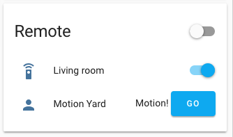
For me personally, much of the appeal here was that it was minimal, so I'm not a huge fan of the "Go" button idea. It takes up room from and sorta draws attention away from the entity name and state. And I assume this would likely mean that only the button is tappable now, rather than the entire row? I don't know if this is possible, but here is how Apple kind of handles this scenario with iOS: The icons on the right indicate it takes you to another screen, but the entire row is still tappable. So maybe you can put a similar icon there (mdi:chevron-right) instead of the button? I think that would be a slightly better compromise if possible. |

|
I do like that design much more |
|
Thinking about resurrecting this and do believe that @SeanPM5 example of glance vs entities highlights that this is a matter of alignment. While I think that a state/action generic row could be a nice addition as well, I think all rows should still allow for custom actions. |
|
@balloob what do you think about adding just hold_action to rows, maintaining our current default tap actions? |
|
I do still believe this would be useful, even more so now that Home Assistant Cast is a thing. Cast relies on functionality like this in order to navigate between views on device. A lot of other card types support this, and even the weblink special row (which can be placed inside of an entities card) supports this now. Feels a little weird that entity row is the one place it's omitted IMO. |
|
Cast is a very good point. In fact makes the argument for tap action to be included |
iantrich
changed the title
5 participants
Fixes home-assistant/ui-schema#238