[Lens] small visual flyouts adjustments#124970
Conversation
75bc384 to
e03594e
Compare
|
Pinging @elastic/kibana-vis-editors @elastic/kibana-vis-editors-external (Team:VisEditors) |
5e7c0f6 to
bb89b7c
Compare
bb89b7c to
d33a39f
Compare
 dej611
left a comment
dej611
left a comment
There was a problem hiding this comment.
Great improvement of the UI. 👍
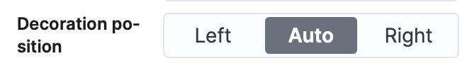
Perhaps the only ambiguity I see (not harmful) is the Decoration position control, which has a different layout compared to other controls with the same values:
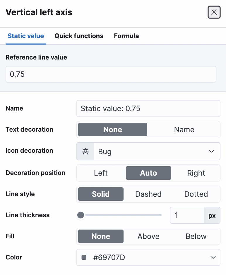
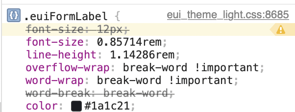
Also, it would be nice to have a word wrap that prevent to break words half-way, as the case above.
|
Thanks for putting this together, @mbondyra! I'll begin my review shortly. Regarding the "not implemented" portion of your PR notes, I'll leave my comments below:
I'll plan to work up some quick SVG icons and get them added to EUI as soon as I can this week (as I imagine they may have use outside Lens as well). Will let you know when those have been merged in.
Yeah, I agree with you on this. I changed it to "area" in my wireframes for the sake of space and avoiding a line break at smaller viewport sizes, but it's probably better to have the line break and have the label make more sense than not. I'm fine with keeping it as "position" or changing to another more appropriate name.
I picked "placement type" here because the user is selecting how the annotation or reference line is to be placed on their visualization. It also seemed to pair well with the subsequent "placement" heading. "Category" sounds a little broad/vague to me, but maybe I'm overthinking it. In any case, I'm not super passionate about the label name. If you or others have a better alternative, I'm not resistant to changing it.
Understood. Hopefully it's something that can be reconsidered during the annotation development phase, as I do think they help to break-up the forms nicely and give users good visual landmarks. |
 MichaelMarcialis
left a comment
MichaelMarcialis
left a comment
There was a problem hiding this comment.
Hey, @mbondyra. Thanks for make some of these preliminary changes that were suggested in the annotation wireframes. These look great overall. I've left a few comments below for your review:
-
For the sake of simplicity, I had suggested changing the current use of the "Display name" label to "Name" (for all dimension configurations) in the annotation wireframes. Is that something we want to change here, or does such a change require more discussion?
-
When both "Text decoration" and "Icon decoration" are set to none, can we hide the "Decoration position" form row, rather than disabling it? I tried to explain my rationale for my modus operandi change in the annotation wireframes, but let me know if you have any questions.
-
Out of curiosity, is it possible to show the icon selected (in addition to the selected icon's name) in the
EuiComboBoxdefault state? I didn't see anything that indicated we could do so via the EUI docs, but just checking to see if there's anything I may have missed.
x-pack/plugins/lens/public/editor_frame_service/editor_frame/config_panel/add_layer.tsx
Outdated
Show resolved
Hide resolved
x-pack/plugins/lens/public/indexpattern_datasource/dimension_panel/dimension_editor.scss
Outdated
Show resolved
Hide resolved
Co-authored-by: Michael Marcialis <michael@marcial.is>
done!
done!
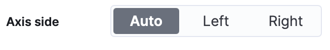
I didn't find a way, but I submitted a feature request in eui: elastic/eui#5628 and @miukimiu helped me out here with adding a decoration and axis positionsThe design proposed change is to keep 'left, auto, right' and 'top, auto, bottom'. However, for the axis position, at the moment we have 'auto, left, right' and 'auto, bottom, top'. What's the one we should have? My opinion is
|
Yes, with Chrome it works better. This is not a regression, so no problem with that. |
x-pack/plugins/lens/public/xy_visualization/xy_config_panel/reference_line_panel.tsx
Outdated
Show resolved
Hide resolved
Yeah, I saw that. I'm good with adopting the pattern that Elizabet mentions there.
I like your reasoning here regarding the change to bottom/auto/top. Lets use left/auto/right and bottom/auto/top, and make sure we're consistent in our usage across the app. |
|
@elasticmachine merge upstream |
💚 Build SucceededMetrics [docs]Async chunks
History
To update your PR or re-run it, just comment with: |
Summary
Changes:
Fixes [Lens] unnecessary empty space in static value flyout #124966
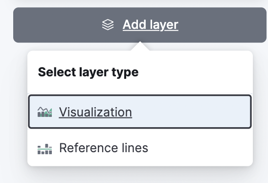
Add layerdesign changes:before:
after:
(not impacting a user)Removing warning about missing keys for errors on color range.
Changes to reference options naming & order
a.
Show display namelabel changed toText decoration. EuiSwitch converted to EuiButtonGroup.b.
Iconlabel changed toIcon decorationc.
Decoration positionorder changed fromauto, left, righttoleft, auto, rightd. Added
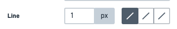
pxto line thicknesse. Order updated just like on the wireframes.
Not implemented
2. In my opinion calling renaming `decoration position` -> `decoration area` is more confusing, I would confuse it with `fill`... Can we give it a round more?Placement type. How about justcategory?