Revising drag and drop for accessible interactive and complex patterns. #5568
Conversation
|
Preview documentation changes for this PR: https://eui.elastic.co/pr_5568/ |
* Adding documentation for custom and interactive patterns props.
* Adding changelog entry.
src-docs/src/views/drag_and_drop/drag_and_drop_disable_blocking.js
Outdated
Show resolved
Hide resolved
|
Preview documentation changes for this PR: https://eui.elastic.co/pr_5568/ |
|
QA looks great to me, and I personally strongly prefer the cognitive separation of the drag handle vs. the buttons on the "Interactive elements" demo 👏 Code generally looks good - my blocking change requests are around ensuring we add unit tests for the new props, and not adding demo-specific CSS to our source code. |
Agreed! |
|
Preview documentation changes for this PR: https://eui.elastic.co/pr_5568/ |
| <EuiPanel className="custom" paddingSize="m"> | ||
| <EuiFlexGroup alignItems="center" gutterSize="l"> |
There was a problem hiding this comment.
Super visual minor spacing suggestions, I think this brings it back closer to what it looked like originally. Feel free to wait for @miukimiu on this one though
| <EuiPanel className="custom" paddingSize="m"> | |
| <EuiFlexGroup alignItems="center" gutterSize="l"> | |
| <EuiPanel className="custom" paddingSize="s"> | |
| <EuiFlexGroup alignItems="center" gutterSize="m"> |
There was a problem hiding this comment.
I added a new screenshot in the description to highlight this change.
|
Preview documentation changes for this PR: https://eui.elastic.co/pr_5568/ |
|
Preview documentation changes for this PR: https://eui.elastic.co/pr_5568/ |
 cee-chen
left a comment
cee-chen
left a comment
cee-chen
left a comment
There was a problem hiding this comment.
Woohoo, thanks for the responsiveness and feedback rounds! This looks awesome. @miukimiu, did you want to take a look at this before merging?
There was a problem hiding this comment.
Thanks, @1Copenut! The PR is looking good! 🎉
I tested in Chrome, Safari, Firefox, and it works well! 👍🏽
I have a few suggestions below.
Let me know if there's any problem on replacing the <div {...provided.dragHandleProps} /> with a <EuiPanel {...provided.dragHandleProps} />. If not, I think visually it would look better.
If we go for this suggested change I would also consider changing the Custom drag handle example to use the <EuiPanel /> instead of a <div />. So both examples, Custom drag handle and Interactive elements would have similar elements.
| <EuiFlexGroup alignItems="center" gutterSize="m"> | ||
| <EuiFlexItem grow={false}> | ||
| <div {...provided.dragHandleProps} aria-label="Drag Handle"> | ||
| <EuiIcon type="grab" /> | ||
| </div> |
There was a problem hiding this comment.
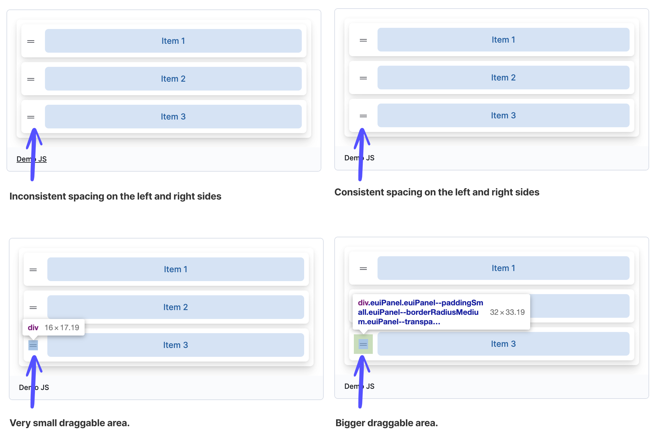
I would suggest using a transparent EuiPanel with a padding instead of a div.
- This would give us a bigger size draggable area.
- It would ensure more consistent spacing between the icon and the button.
| <EuiFlexGroup alignItems="center" gutterSize="m"> | |
| <EuiFlexItem grow={false}> | |
| <div {...provided.dragHandleProps} aria-label="Drag Handle"> | |
| <EuiIcon type="grab" /> | |
| </div> | |
| <EuiFlexGroup alignItems="center" gutterSize="s"> | |
| <EuiFlexItem grow={false}> | |
| <EuiPanel | |
| color="transparent" | |
| paddingSize="s" | |
| {...provided.dragHandleProps} | |
| aria-label="Drag Handle" | |
| > | |
| <EuiIcon type="grab" /> | |
| </EuiPanel> |
There was a problem hiding this comment.
Thank you @miukimiu! These suggestions were easy to implement, and made the button hit space larger and more consistent. Ready for next review.
| {content} | ||
| </EuiButton> | ||
| {(provided) => ( | ||
| <EuiPanel className="custom" paddingSize="s"> |
There was a problem hiding this comment.
Is the className "custom" necessary?
There was a problem hiding this comment.
I took a few passes adding/removing the "custom" class and can't see any difference. I'll go ahead and remove it as part of the next code push.
|
Preview documentation changes for this PR: https://eui.elastic.co/pr_5568/ |
|
Preview documentation changes for this PR: https://eui.elastic.co/pr_5568/ |
 elizabetdev
left a comment
elizabetdev
left a comment
elizabetdev
left a comment
There was a problem hiding this comment.
Thanks, @1Copenut for making the changes.
I tested again in Safari, Chrome, and Firefox. I also looked at the code changes and LGTM! 🎉
5 participants
Summary
Our interactive elements drag and drop pattern had focusable buttons that could not be reached by keyboard, and wouldn't announce to screen readers. We also had a draggable group that was a
div[role="button"]which was preventing keyboard navigation. I refactored both patterns to retain the existing visual design as much as possible, and add the needed updates to pass an axe check and improve keyboard and screen reader experience.Closes #5294
Design change
I made a visual change to the interactive elements pattern by leveraging the custom drag handle. I went this direction to fix a nested focusable element error. If the container will receive keyboard focus, the interactive element(s) will not be usable by keyboard events, and will not be announced to screen readers. I am attaching a screenshot of my proposed change below, and happy to make changes to visual design as needed.
Checklist