Skip to content

Conversation

@doup
Copy link
Contributor

@doup doup commented Apr 7, 2022

  • In preparation for [Merged by Bors] - Improve header navigation #315, add new tree-menu CSS component
  • Update Books, Assets & Example to use this new component
    • In Books only the active book section is automatically opened, other sections with sub-sections start closed
    • Assets/Examples are always open, but are collapsible
bevy-tree-menu.mp4
bevy-tree-menu-long.mp4
bevy-tree-menu-responsive.mp4

@cart
Copy link
Member

cart commented Apr 7, 2022

Oooh this is pretty slick. I'll give it a run.

@cart
Copy link
Member

cart commented Apr 7, 2022

Some assorted thoughts:

  • I was skeptical at first, but removing the section and subsection numbers feels like a win. It buys more room in the sidebar and reduces the general feeling of "clutter". And these sections in practice are "unstable". You cant really safely refer to "section 2.4" anywhere because theres a possibility that a new section or subsection will be inserted in front of it.
  • Triple-nested sections should be relatively uncommon, but I'd appreciate it if we tested that arbitrary nesting still works
  • I sort of miss the "deselected items get out of your way via reduced lightness" design, rather than using blue text and box highlights to denote selected / hovered items. It adds a level of dimensionality that I liked. That being said, the new approach is much more standard and probably more legible to some people. Before merging I'll probably play with applying the "old" approach, just to see how I feel about it in the new context.
  • I like that we're now using the whole area of a section as the "hit box" rather than the text itself. The old behavior was a nasty little paper cut.
  • I think I'm on board for the addition of casing to sections. I initially opted for lowercase to emphasize the "get out of your way" design (and to add a bit of character), but I think casing makes it feel more professional + gives us the ability to encode more semantic information, when needed.
  • What is the license and provenance of the chevron svg?

New vs Old Image (for a side by side comparison):
image

@BlackPhlox
Copy link
Contributor

BlackPhlox commented Apr 7, 2022

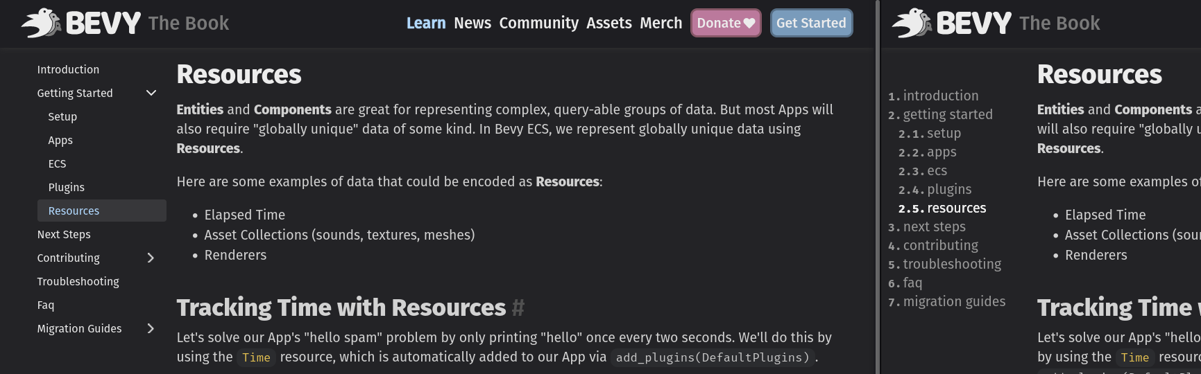
Since we're redesigning the side menu. We already have a dedicated column for the side menu, wouldn't it be a good idea to have the side menu fixed when having desktop width? Since there is no fixed burger menu when scrolling down for desktop means that there is no quick access to the side menu, and users have to be at the top.
EDIT: Nvm, has already been addressed in #315.

@doup
Copy link
Contributor Author

doup commented Apr 7, 2022

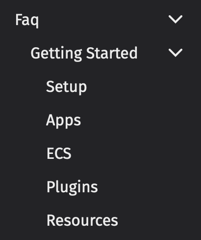
Now I see that maybe I over-stepped on some decisions, sorry for that. In any case, any of the points you mention should be easy to revert (although, looks like it won't be necessary 😅). Dimming of the non-selected items (as it's now in prod), sounds like a nice UX win; let me know if you prefer me to look into it.

I did the chevron myself in Figma; it's actually in the same "file" as the chart in #290. Same for the hamburger and the "X" icons used in #315. I gave @alice-i-cecile the ownership of that file… but now that I think it, probably you should be the owner. ^_^

Oh, btw, the Tera macro is recursive so nested menus work as well. I just copied the "Getting Started" folder inside "FAQ" and it just works:

image

@BlackPhlox yup, the sticky menu is done in #315. I've actually made this PR because of that PR, on mobile the docs menu looks a little bit off: small text, with small hit bboxes. Once I sync with this PR the mobile menu should look muuuuch better.

@doup
Copy link
Contributor Author

doup commented Apr 7, 2022

Oh, btw, the idea/design is a copy from: https://docusaurus.io/docs 😇
The code is implemented from scratch though (and without JS).

@alice-i-cecile
Copy link
Member

I was skeptical at first, but removing the section and subsection numbers feels like a win. It buys more room in the sidebar and reduces the general feeling of "clutter". And these sections in practice are "unstable". You cant really safely refer to "section 2.4" anywhere because theres a possibility that a new section or subsection will be inserted in front of it.

Agreed.

Triple-nested sections should be relatively uncommon, but I'd appreciate it if we tested that arbitrary nesting still works

I should be able to work around this in the book, but it can't hurt if it works.

I sort of miss the "deselected items get out of your way via reduced lightness" design, rather than using blue text and box highlights to denote selected / hovered items. It adds a level of dimensionality that I liked

I liked this too.

I think I'm on board for the addition of casing to sections. I initially opted for lowercase to emphasize the "get out of your way" design (and to add a bit of character), but I think casing makes it feel more professional + gives us the ability to encode more semantic information, when needed

Yeah, I think that I'm fine either way here.

I gave @alice-i-cecile the ownership of that file… but now that I think it, probably you should be the owner. ^_^

Ideally we'd have a Bevy organization, or a shared Bevy user account :)

@cart
Copy link
Member

cart commented Apr 7, 2022

I gave @alice-i-cecile the ownership of that file… but now that I think it, probably you should be the owner. ^_^

For now, if you can agree to give me full ownership / usage rights (or alternatively ... just license it permissively), I'd appreciate it. Until we get a legal Bevy org spun up, Id prefer to be the single steward of "legal assets" to simplify the transition, when it comes.

@doup
Copy link
Contributor Author

doup commented Apr 8, 2022

I agree to give full ownership/usage rights of static/assets/icon-chevron-down.svg to @cart.

Copy link
Member

@cart cart left a comment

Choose a reason for hiding this comment

The reason will be displayed to describe this comment to others. Learn more.

Brilliant! I'm happy with the dimming. I think this is good to go

@cart
Copy link
Member

cart commented Apr 8, 2022

bors r+

bors bot pushed a commit that referenced this pull request Apr 8, 2022
- In preparation for #315, add new `tree-menu` CSS component
- Update Books, Assets & Example to use this new component
  - In Books only the active book section is automatically opened, other sections with sub-sections start closed
  - Assets/Examples are always open, but are collapsible

https://user-images.githubusercontent.com/188612/162277066-bf9ab366-79ce-402e-af02-691ed2c4a279.mp4

https://user-images.githubusercontent.com/188612/162277084-cbbd3a9a-d436-4388-a7df-8e34d77433f0.mp4

https://user-images.githubusercontent.com/188612/162277125-924d7f84-b66a-47fb-ae08-c771a6a80a5a.mp4
@bors
Copy link

bors bot commented Apr 8, 2022

Pull request successfully merged into master.

Build succeeded:

@bors bors bot changed the title Improve side menu in Book, Assets & Example [Merged by Bors] - Improve side menu in Book, Assets & Example Apr 8, 2022
@bors bors bot closed this Apr 8, 2022
@doup doup deleted the feature/improve-side-menu branch April 21, 2022 06:54
Sign up for free to join this conversation on GitHub. Already have an account? Sign in to comment

Labels

None yet

Projects

None yet

Development

Successfully merging this pull request may close these issues.

4 participants