[Merged by Bors] - Improve header navigation #315
Conversation
- This is in preparation for the layout improvements
- Add `$max-width` & move non-color vars to `General` section
…improve-header

# Conflicts:
#	sass/_utils.scss
#	sass/components/_headerbar.scss
 doup
changed the title
doup
changed the title
…improve-header

# Conflicts:
#	templates/index.html
|
I'm encountering a strange issue when I use Chrome DevTools or Firefox Devtools. When the screen is narrow the page appears to extend past the width of the screen. I think it might be due to an issue with position: fixed.
|
…improve-header

# Conflicts:
#	sass/_mixins.scss
#	sass/site.scss
…improve-header

# Conflicts:
#	sass/site.scss
|
Alright, there's still the book menu that gets hidden by the nav bar when you scroll all the way down, but it's not a super big deal. Other than that I haven't noticed anything wrong visually. I'll do a final pass on the code before approving. |
|
I think that there isn't much to do with the menu, it's how You mentioned Btw, I noticed I forgot to add the "section title" part on the header… I need to add it back. 😓 |

|
OK, fixed: |

|
Oh, good catch with the section title, I was so focused on everything else when testing it I didn't even realize it was gone 😅 And yeah, for the menu thing it's not a big issue. I prefer the cleaner, simpler approach that isn't perfect in all cases instead of making something super hacky. Seeing, your link to procreate.art now reminds me that it would be cool if we had a night/day mode switch. I love my dark themes, but plenty of people prefer light themes. |
|
I dig the changes functionally. Just a few changes to address:
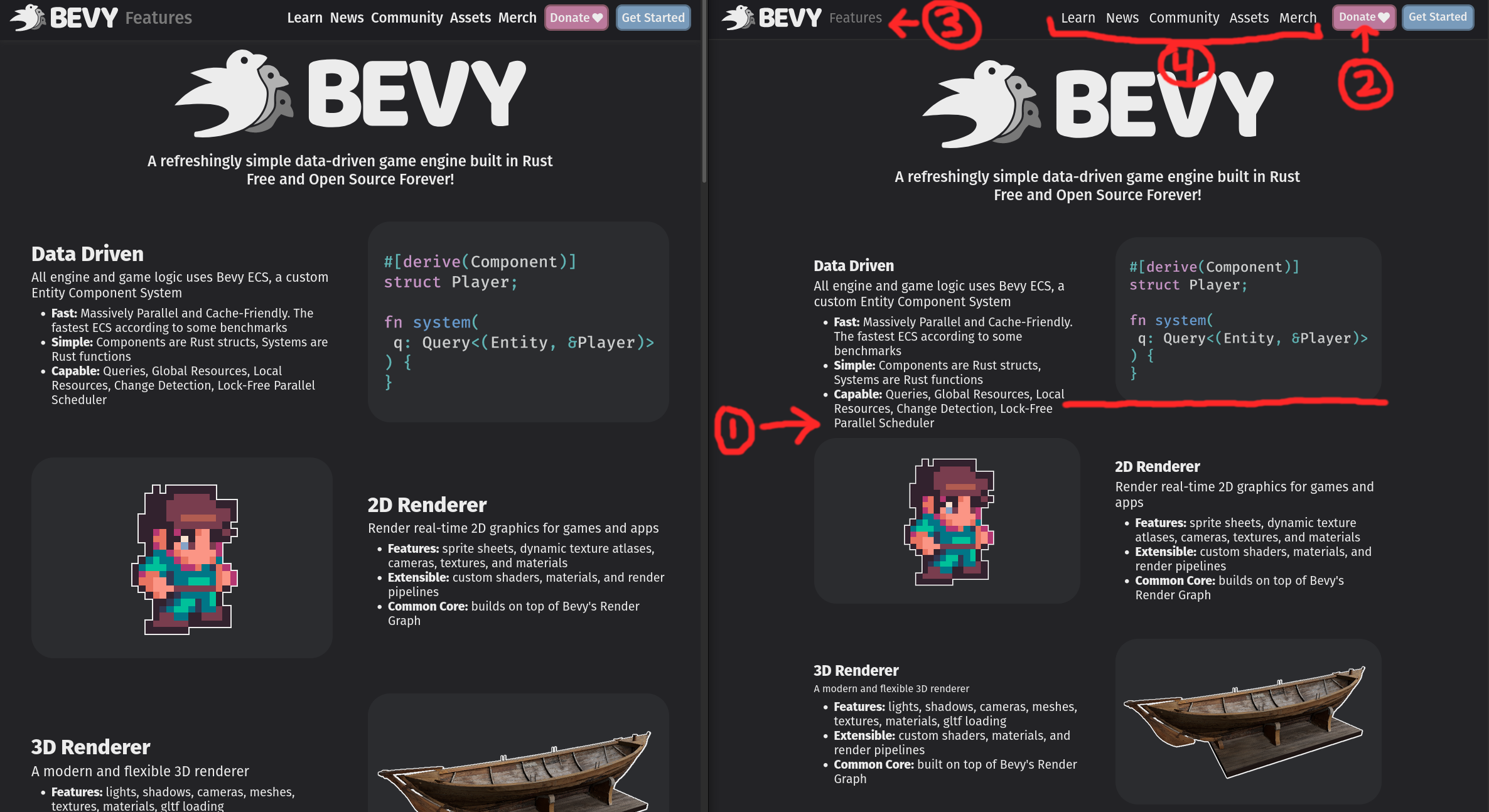
Left is "before" (current main). Right is "after" (this pr).
|
…improve-header

# Conflicts:
#	templates/layouts/base.html
|
I've fixed all the issues you pointed out @cart. For the first one (the feature page layout) I've just made it similar to what's now on production, and I've also improved responsive. It's not very good, but at least it doesn't break on mobile/tablet… The homepage needs some love, but that's for another PR. |
|
Love the changes. The potential for "feature image background aspect ratio" changes when scaling the width down is slightly regrettable, but the improved use of space during scaling feels like a worthwhile trade to me. Great work! |
|
bors r+ |
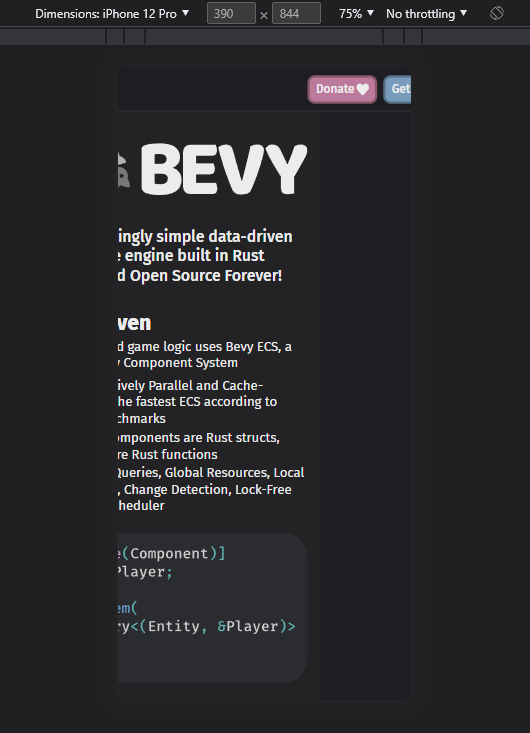
**UX changes:** - Improved responsive header, call-to-actions are visible on all breakpoints - Header is fixed, it always stays on top - Improved mobile menu, it joins both the main menu & page menu (book, assets & examples). When there isn't a page level menu it shows just the main menu. -⚠️ Please note that I haven't changed the style of the page menus on mobile, they're too small and should be improved. **But that's for another PR**. - Page level sidebar menus now are sticky, user has access to the page menu always **Code changes:** - Self contained CSS "components" following BEM naming convention - New "page-with-menu" layout added Fixes #135, Fixes #307 https://user-images.githubusercontent.com/188612/161392786-63110a84-bb56-40af-8914-753a44df9ae1.mp4
|
Pull request successfully merged into master. Build succeeded: |
 bors
bot
changed the title
bors
bot
changed the title
5 participants
UX changes:
Code changes:
Fixes #135, Fixes #307
bevy-improved-header.mp4