Show feature image next to text #310
Conversation
|
Pretty! Can you get a new screenshot with "Features" removed? |
|
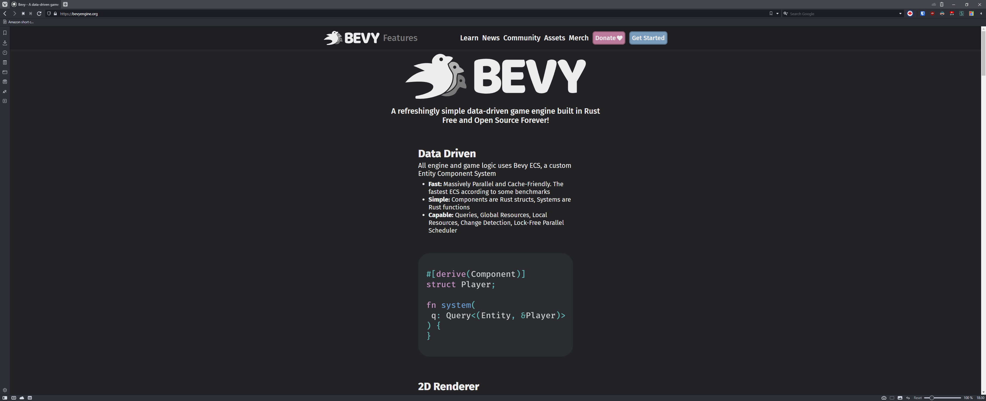
I updated the screenshot |
|
I made a small change to how we do this. Instead of relying on adding a container-reverse class manually I used the css selector It has 95.28% browser support on caniuse so I think it's not an issue https://caniuse.com/mdn-css_selectors_nth-child |
|
What sort of device are you testing with? Both But I don't think that this makes the images too small, and if there's some common screen size that now displays the page side-by-side then that's good. |
|
Interesting, I'm just using an old 1080p desktop monitor and I also tried it on a 1440p ultrawide monitor and they both show everything lineraly like this:
That's using vivaldi (so chromium) with windows 10. I haven't tried it in other browsers though. I agree that the numbers seem arbitrary. I tried a few combinations and 28 was the one that worked. There's a different approach that uses float left/right instead of using flex and hoping it wraps correctly. |

|
Oooh, interesting, so in edge and firefox it does work correctly without any changes. |
|
Chrome seems fine too... |
|
Alright, found the issue. Apparently my default font size was set to 18 instead of 16 and that just broke everything. |
|
@IceSentry what do you think we should do with this pr now that you've tracked down the root cause? |
|
Well, I'm trying to find ways that don't rely on a width proportional to the font size. It makes sense sometimes, but I'm not sure it's the best approach here. There's an option to use float left and float right, but it doesn't adjust correctly on mobile. Technically, this PR also fixed an issue where one of the image is not in a container which seems like an oversight to me. So, I'll keep it open a bit, but if I don't find anything better I'll just close it. |
|
After the changes to improve the header (#315) I've slightly broken the typography on my branch, which at the same time has broken the features page. Since I need to fix it, I'll improve the code and fix this issue also. (👇 broken layout on my branch) |

|
I've fixed this on #315, please take a look at the video. |
|
This will be fixed by the multiple layout improvements of @doup so I'll close this. |
So that was pretty easy. Everything was already setup correctly except that the max-width was slightly too wide to allow flex to do it's thing and show the features side by side.
I also moved the image for the cross platform section inside the container.
Closes #308