Replace themes with a single "iceberg-theme" that's shared by landing-page and docs site #91
Conversation
|
@samredai a few things I noticed:
*With larger spacing in between the groups. |
|
Thanks @djamegoldston ! I removed the min-width from the markdown-body css and added grouping to the topnav elements. As for removing the Iceberg logo, that content actually comes from the Here are some additional things I've fixed based on some offline feedback:
Here's my PR against the |
|
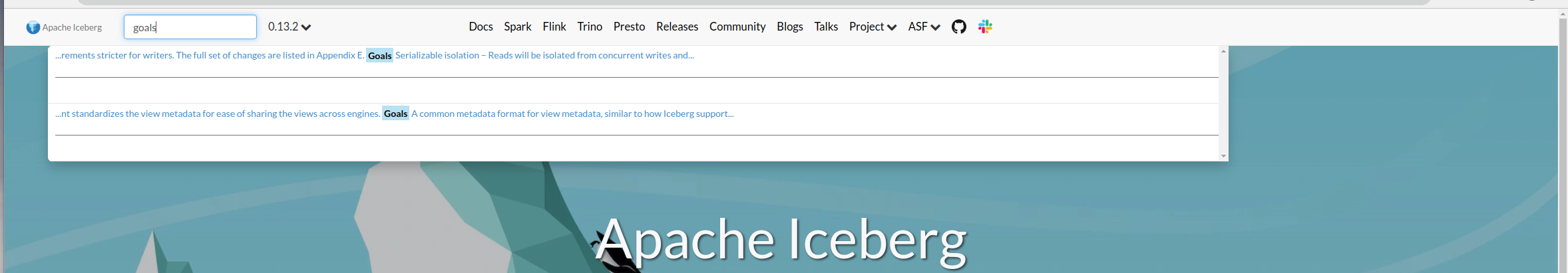
There are a couple things to fix with the top bar. Here's what I'm seeing:
Also, the content scroll looks better, but there is still a double scroll bar on the right:
I think we should roll back to the way it was with just one scroll bar. The second active scroll bar makes it awkward because it's common to move your mouse all the way to the right, then click & drag, but that doesn't work with an extra disabled scroll bar. Another issue is that I can't actually click on the active scroll bar, so something is definitely broken there. In the docs site, the scroll bar for the left nav is still there, disabled:
I also still see the community section of pages, which is at the top under Project now. Last, but probably not something to fix right now, the pages under each section are ordered alphabetically rather than by what people are most interested in. That puts Evolution and Maintenance as the first topics under Tables, which is awkward. I know we're cleaning this up so it isn't urgent, but we should make sure that there is a logical order to those pages and links. |
Fixed to match the font-size of the links.
Looks like this is due to some more missing titles, fixed by commit 2be1565
Fixed!
Do you mean "How to Release" and "How to Verify Release"? Are you saying that should be moved to a dropdown under community? Is this right?: Community (Dropdown)
Project (Dropdown)
Fixing this is just a matter of setting all of the weights in the config. I'll make sure to do that before this PR is merged!
There might be a catch-22 here: If we want to have a single scroll bar to the right, we'll have to allow the table of contents to scroll with the page (GraphQL schema docs as an example). I employed a bit of a hack to get this working on the site that's currently live which is basically adding a big right side margin to the content and fixing the TOC into that margin area. This creates other issues where a long TOC can't scroll if it's on a smaller screen or zoomed in. I'll look into a layout that can get us both but we might end up having to choose between:
As an aside, I would have liked to keep this change outside of this PR but this logic needed to be changed to account for the left-nav in the docs site which previously didn't need to be considered when the logic was only used for the landing-page. I could also fix the left-nav into a large margin area set on the content but that doubles the issue of no scroll on smaller/zoomed screens. |

|
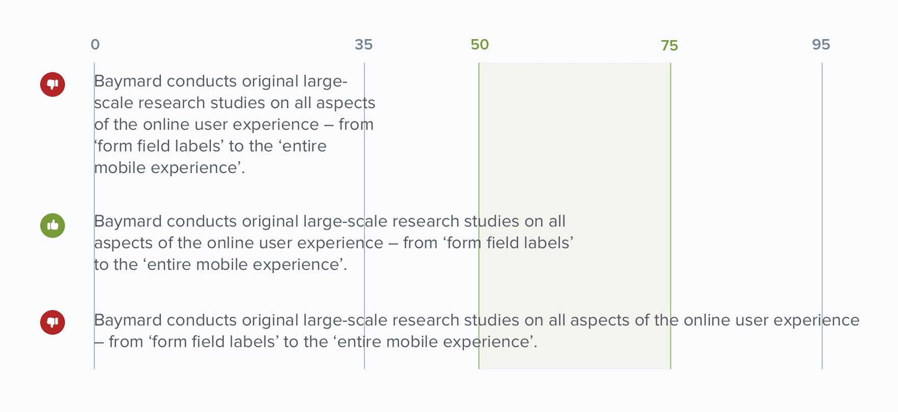
After reading this article, I narrowed the content area a bit for readability. This nice chart shows a recommended readability range of 50-75 characters. Currently the site is somewhere around 130 characters on a line--way past that limit. With a more narrow content reading area it gets us to about 85 characters which is still slightly over the recommended range but looks much more readable.
Here's a video: iceberg-theme2.mp4 |
…h docs and landing-page site
This is so markdown files won't be committed when temporarily added for running locally
…ts appear cut-off
|
Changed the TOC to be fixed in the margin space of the content and rearranged the topnav menu. Video: iceberg-theme3.mp4 |
|
Nice work @samredai! Great to have this in! |
This adds an
iceberg-themehugo theme and symlinks it into bothdocs/themesandlanding-page/themes. This will ensure a uniform feel across the entire site. The sites will still exist as two independent sites and all CI and deployment instructions will remain unchanged.UPDATE: This is now ready to review. To test it out, pull down this PR and run
(cd docs && hugo serve)or(cd landing-page && hugo serve). For the docs site, you'll have to copy the docs over from theicebergrepo, specifically the new format captured in PR #5115.Here's a video preview of the site.
iceberg-theme.mp4