Repository navigation
fix(bulma-ui): fix the date and time pickers' arrow keys, wheel focus and seeded seconds - #960
Conversation


The time wheels are spinbuttons, but ArrowUp lowered the value and
ArrowDown raised it, the opposite of a spinbutton and of the docs.
ArrowUp and PageUp now raise it and ArrowDown and PageDown lower it.
Home and End still go to the lowest and highest value.

The mouse wheel keeps its direction. Scrolling down moves the items up
and raises the value, as dragging the wheel up does, and ArrowUp now
moves the items that way too.
The DateInput, TimeInput and DateTimeInput pages said ArrowDown opens the
popover when openOnFocus is off. In a segmented format ArrowDown steps the
active segment instead, and Alt+ArrowDown stepped it too, so the keyboard
had no way to open the popover.

Alt+ArrowDown now opens it and Alt+ArrowUp closes it from the input, as on
a combobox, and neither steps the segment. Free-form entry, with no
segment to step, still opens on a plain ArrowDown. The docs, stories and
the openOnFocus TSDoc now say Alt+ArrowDown.
Enter on the footer's Time button showed the wheels but left focus on the
button, so Tab went on to Reset and Done and only Shift+Tab reached them.
Escape with focus on a wheel then dropped it to the page.

The hours wheel now takes focus as the wheels open, and closing them hands
focus back to the Time button, from Escape, the button or a click outside
the card. Focus the keys have moved on to another control, such as a
calendar day, stays there, so the calendar still only follows focus it has.
Picking a day on an empty DateTimeInput with Enter gave midnight plus the
seconds and milliseconds of the clock, because the calendar's focused day
starts at the current time. The same leak reached the value from the time
wheels and from typing into an empty field, and an empty DateInput picked
its day at the clock's full time of day.

setTimeOfDay now takes milliseconds. A picked day takes the value's whole
time of day, seconds included, or midnight in an empty field, whether it
comes from a key or a click. The wheels on an empty DateTimeInput or
TimeInput start from a whole minute, or a whole second with enableSeconds.
Typing into an empty DateTimeInput starts from the clock without the
milliseconds, and without the seconds unless enableSeconds is on. An empty
DateInput focuses today at midnight, and unselectableTimes is asked about
whole seconds.

|
Warning Review limit reachedYou've used all free OSS reviews for now. Wait for the free limit to reset to keep reviewing this public repository. Next included review available in 50 minutes. View limit detailsLimit details: You’ve used the included review currently available. Review configuration: ⚙️ Run configuration
📒 Files selected for processing (32)
Thanks for using CodeRabbit! It's free for OSS, and your support helps us grow. If you like it, consider giving us a shout-out. Comment |

Preview DeploymentPreview URL: https://7b61c8e0.bestax.pages.dev |
![claude[bot]](https://avatars.githubusercontent.com/in/1236702?s=60&v=4)

|
deep-review: fresh The last run on 0af2e71 was cancelled at the runner limit after it posted three threads (two on |
Enter on a calendar day commits the focused date, which keeps the time of
whatever it came from: a value with a time of day, a value typing moved,
or a max with one that the focus was clamped to. A click on the same day
gives its cell, at midnight, so Enter and a click disagreed.

A pick is now the day at midnight whichever way it arrives, so the empty
field's focused date needs no midnight of its own and goes back to now.
Without segment mode, which a read-only field never has, ArrowDown opened
the popover, and a day or time picked there reached onChange, though
focus, a click and the launcher all leave a read-only picker closed.
ArrowDown and Alt+ArrowDown now open it only when the launcher could.
Closing still works however the field is set.
…segments

The openOnFocus TSDoc said ArrowDown alone steps the active segment, which
is false with editable off or an Intl format, where a plain ArrowDown
opens the popover. The rest of the sentence holds in every configuration,
and the docs pages already cover free-form entry.
|
deep-review: fresh Two runs on 0af2e71 were cancelled at the runner limit before posting a summary. Between them they posted six threads: two on |
Alt+ArrowUp closed the popover only from the input, but opening it moves
focus onto a calendar day or a time wheel, where the key read as a plain
ArrowUp, so the calendar moved a week back and a wheel turned. The
calendar and the wheels now leave Alt+ArrowUp and Alt+ArrowDown to the
popover, which closes on Alt+ArrowUp as it does on Escape, so the docs'
Alt+ArrowUp row holds where focus is. The keyboard tables inside the
popover list it too.
…ut of reach

The time wheels float over the calendar on a dimmed overlay, but the
calendar's days and header buttons stayed tab stops, so Shift+Tab from the
hours wheel reached a day the user could not see, where the arrows moved
the date. The calendar is inert while the wheels are open, so Tab walks
the wheels and the footer, and assistive tech skips what they cover. The
attribute is set on the element, since React 18 has no inert prop.
|
deep-review: fresh Three runs on 0af2e71 were cancelled at the runner limit before posting a summary. Between them they posted seven threads: two on |
…meets the bounds

The onChange TSDoc said a picked day keeps the value's time of day,
seconds included. It keeps the milliseconds as well, and min and max judge
the picked day at that whole time, so seconds or milliseconds the field
doesn't show can put a day past a bound. The TSDoc now says both.
Preview DeploymentPreview URL: https://2ee4fca8.bestax.pages.dev |

There was a problem hiding this comment.
Deep review (verify) — 9 resolved · 0 open
| Thread | Outcome | How it was settled |
|---|---|---|
bulma-ui/src/form/DateInputBase.tsx:323 — startOfDay before the clamp |
✅ Verified fixed | handleSelect normalises with startOfDay(picked) before the bounds test (DateInputBase.tsx:415); four tests cover value / typed value / max / min |
bulma-ui/src/form/_pickerInternals/useSegmentedEntry.ts:522 — no readOnly gate on the open branch |
✅ Verified fixed | The branch now gates on popover && !disabled && !readOnly, the same conjunction as canOpen; all three bases pass both props in |
bulma-ui/src/form/DateInputBase.tsx:196 — openOnFocus TSDoc reason |
✅ Verified fixed | Clause deleted in all three Base components; the remainder is true in every configuration |
bulma-ui/src/form/_pickerInternals/useSegmentedEntry.ts:427 — Alt+↑ unreachable, stepped the calendar |
✅ Verified fixed | isPopoverToggleKey early-returns in the three calendar key handlers and in WheelInner; PickerPopover closes on altKey && ArrowUp beside Escape |
bulma-ui/src/form/_pickerInternals/TimeWheels.tsx:411 — wheel vs. arrow direction |
✅ Reason accepted | Deliberate: scroll and drag share one item-motion metaphor; the advisory existed to put the trade-off on the record |
bulma-ui/src/form/DateTimeInputBase.tsx:649 — covered calendar still a tab stop |
✅ Verified fixed | inert toggled on a calendar wrapper while timeOpen; findTabStops skips inert, and the layout is unaffected (a position: relative wrap, no child-combinator CSS) |
bulma-ui/src/form/DateTimeInputBase.tsx:472 — sub-second parts in onChange and the bounds test |
✅ Reason accepted | Deliberate, with evidence that the click was the outlier on main; the onChange TSDoc now names milliseconds and the bounds behaviour |
| PR body — read-only claim | ✅ Verified fixed | ba74bf7 landed with this push; the sentence now matches the gate exactly |
| PR body — inert claim | ✅ Verified fixed | c7f674c landed with this push; toggleAttribute sets inert while the wheels are open, and the contradicting test was replaced |
Overall: this pass settled threads and reviewed no commits. Every finding the earlier review left open is now either fixed in code with a test that asserts the behaviour, or answered with a reason that holds — the two accepted reasons (wheel direction, preserved sub-second parts) are deliberate trade-offs, and the second arrived with the documentation made exact rather than left overselling. The two PR-body findings were a timing artefact: the body described commits that landed with this push, and both sentences are true at 35364673. Nothing is left open for a human to rule on.
Residual risk: refuted for every thread this pass touched —
- Enter-vs-click divergence on
DateInput: refuted.startOfDaysits at the single pick site every arm funnels through, and themin-with-a-time case resolves by the midnight cell being out of range rather than by a second code path. - A key opening a read-only picker: refuted. The gate is now the same conjunction as
canOpen, and segment mode cannot be reached on a read-only or disabled field, so there is no second branch to miss. - Alt+↑ read as a plain arrow inside the popover: refuted. The guard is a shared helper applied to all four in-popover handlers, and the close listener is document-level, so it fires wherever focus sits in the panel.
- Focus behind the wheel overlay: refuted.
inerton the wrapper covers tab stops, pointer and the AT tree in one attribute, and the test asserts the inert ancestor through the full open/close cycle. - Verification basis: 6 suites / 669 tests across
DateInput,TimeInput,DateTimeInput,Calendar,PickerPopoveranduseSegmentedEntrypass on35364673.
🏄 Nine threads paddled out, nine came back in clean — the gnarly ones got real code, and the two judgement calls got honest reasons instead of hand-waving. Totally good to go.
 github-actions
Bot
added
the
review-converged
github-actions
Bot
added
the
review-converged
 allxsmith
added
the
needs-human-review
github-actions
Bot
removed
the
review-converged
allxsmith
added
the
needs-human-review
github-actions
Bot
removed
the
review-converged
📸 Story screenshots at handoff —
|
| Light | Dark |
|---|---|
 |
 |
form-dateinput--controlled · Form/DateInput · Controlled
| Light | Dark |
|---|---|
 |
 |
form-dateinput--sizes · Form/DateInput · Sizes
| Light | Dark |
|---|---|
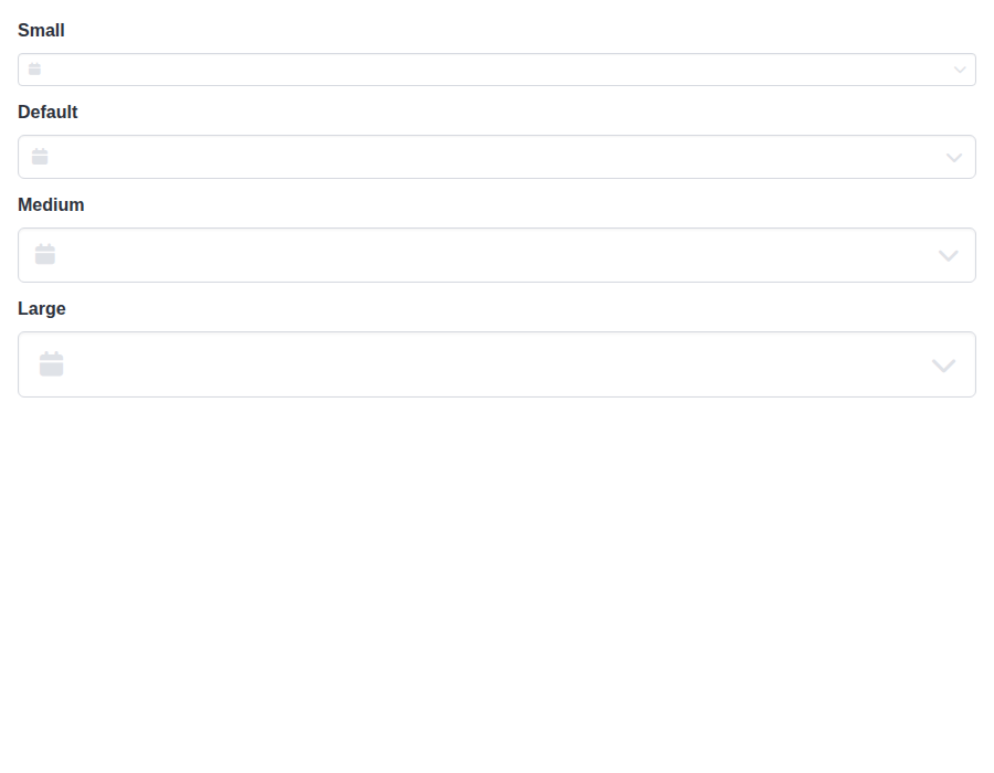 |
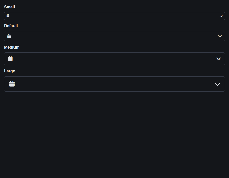 |
form-dateinput--colors · Form/DateInput · Colors
| Light | Dark |
|---|---|
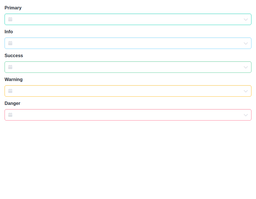 |
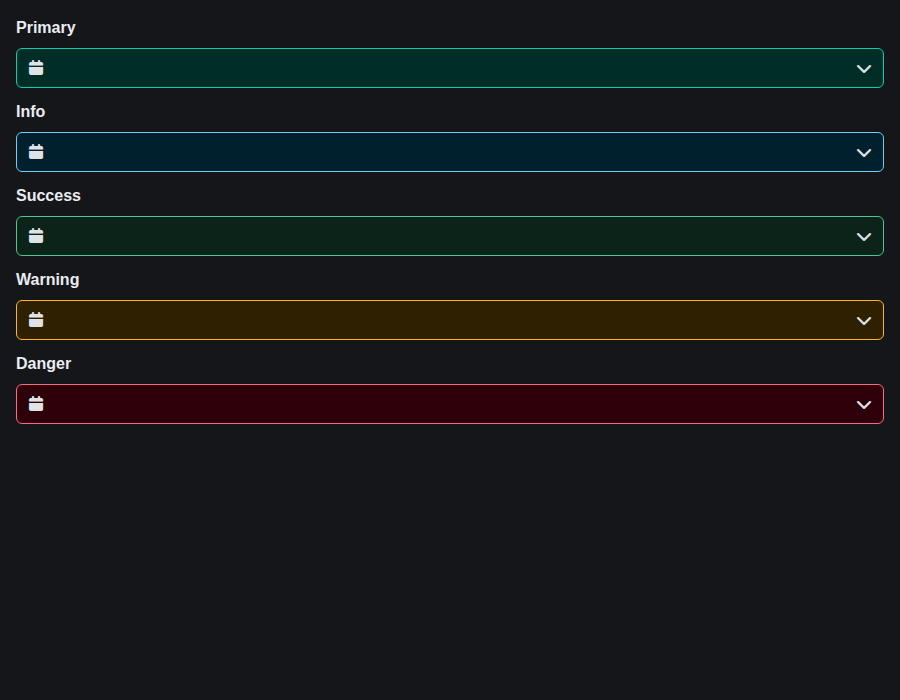 |
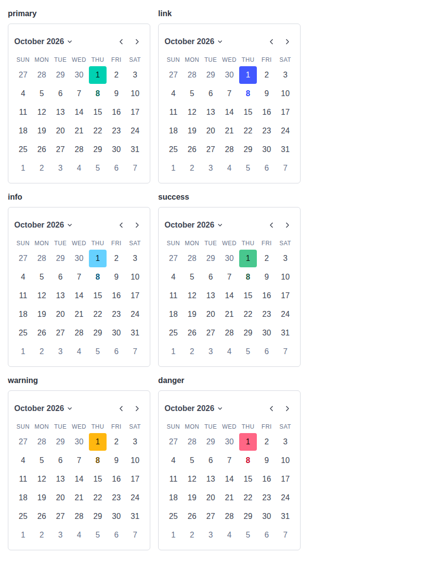
form-dateinput--inline-colors · Form/DateInput · Inline Colors
| Light | Dark |
|---|---|
 |
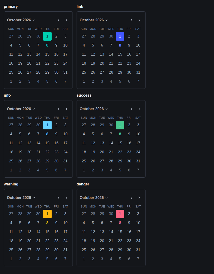 |
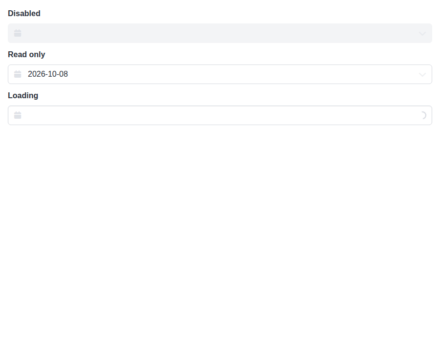
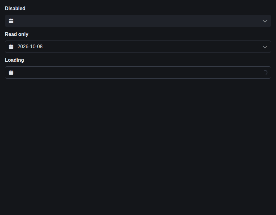
form-dateinput--states · Form/DateInput · States
| Light | Dark |
|---|---|
 |
 |
form-datetimeinput--default · Form/DateTimeInput · Default
| Light | Dark |
|---|---|
 |
 |
form-datetimeinput--controlled · Form/DateTimeInput · Controlled
| Light | Dark |
|---|---|
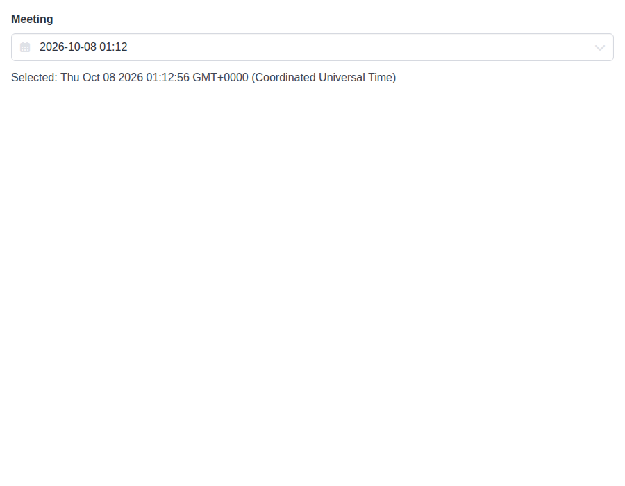 |
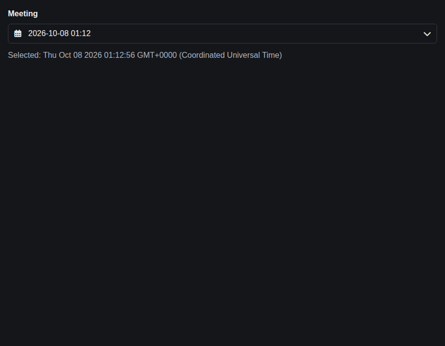 |
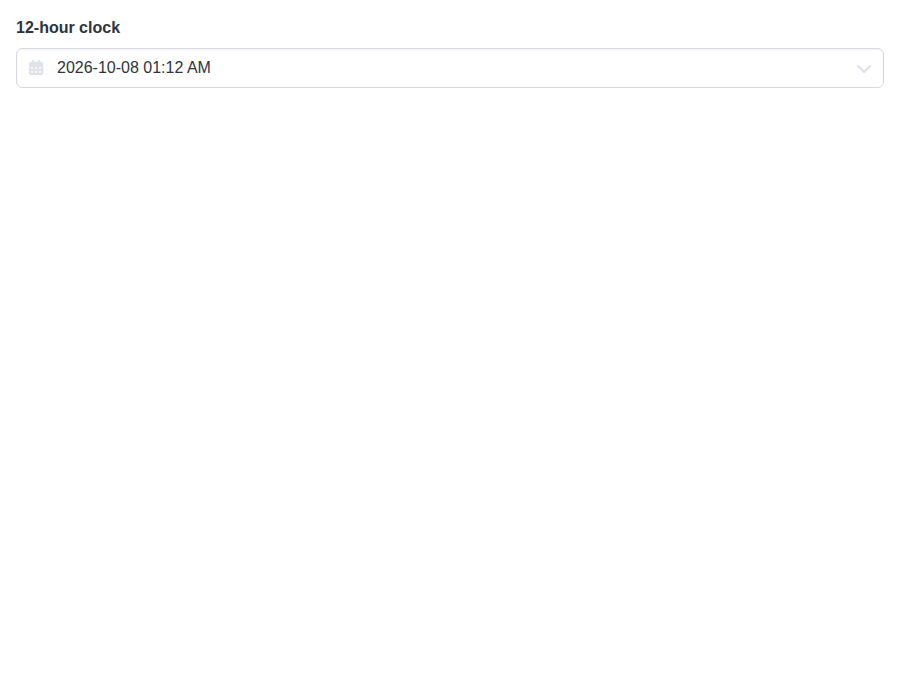
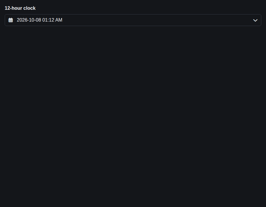
form-datetimeinput--format-12-h · Form/DateTimeInput · Format 12 H
| Light | Dark |
|---|---|
 |
 |
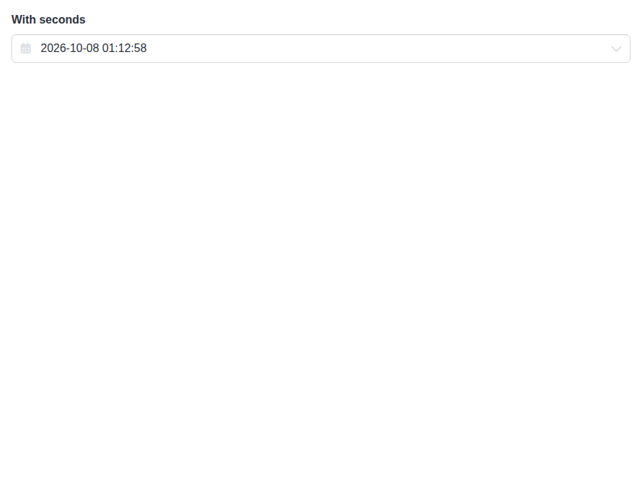
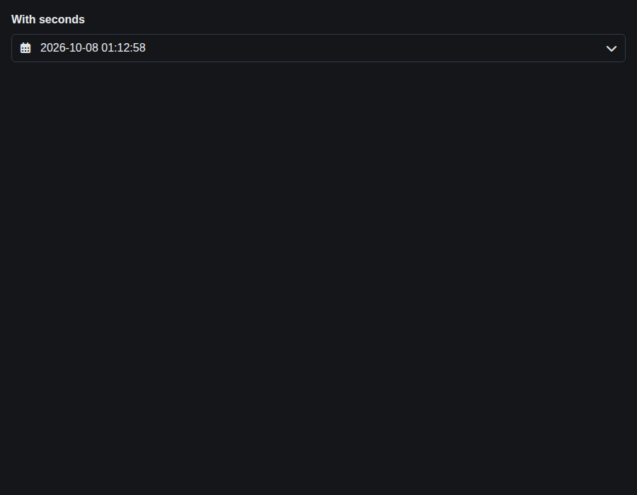
form-datetimeinput--with-seconds · Form/DateTimeInput · With Seconds
| Light | Dark |
|---|---|
 |
 |
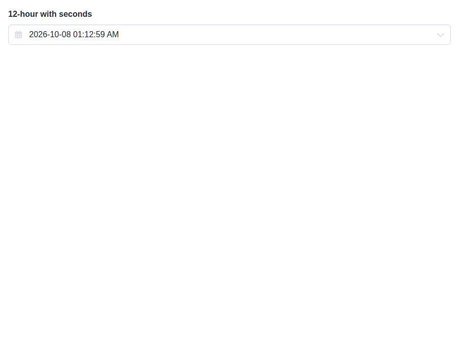
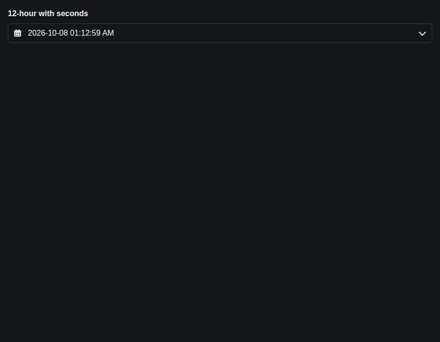
form-datetimeinput--format-12-h-with-seconds · Form/DateTimeInput · 12-hour with seconds
| Light | Dark |
|---|---|
 |
 |
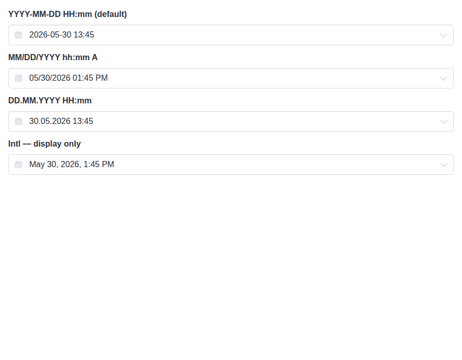
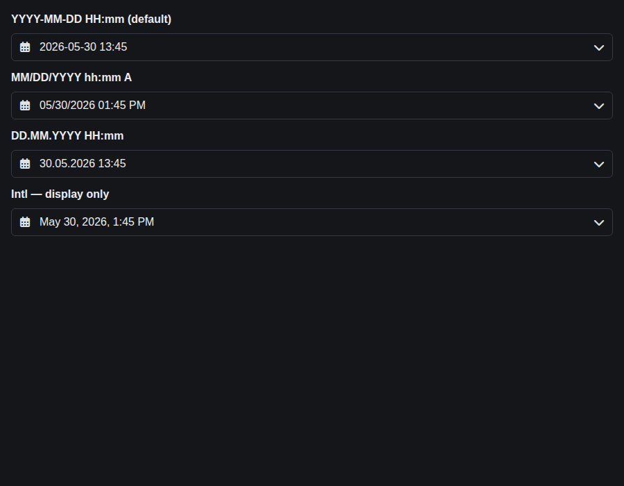
form-datetimeinput--formats · Form/DateTimeInput · Formats (compare)
| Light | Dark |
|---|---|
 |
 |
form-timeinput--default · Form/TimeInput · Default
| Light | Dark |
|---|---|
 |
 |
form-timeinput--controlled · Form/TimeInput · Controlled
| Light | Dark |
|---|---|
 |
 |
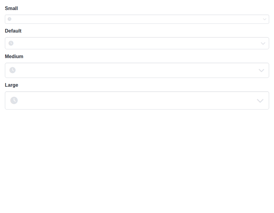
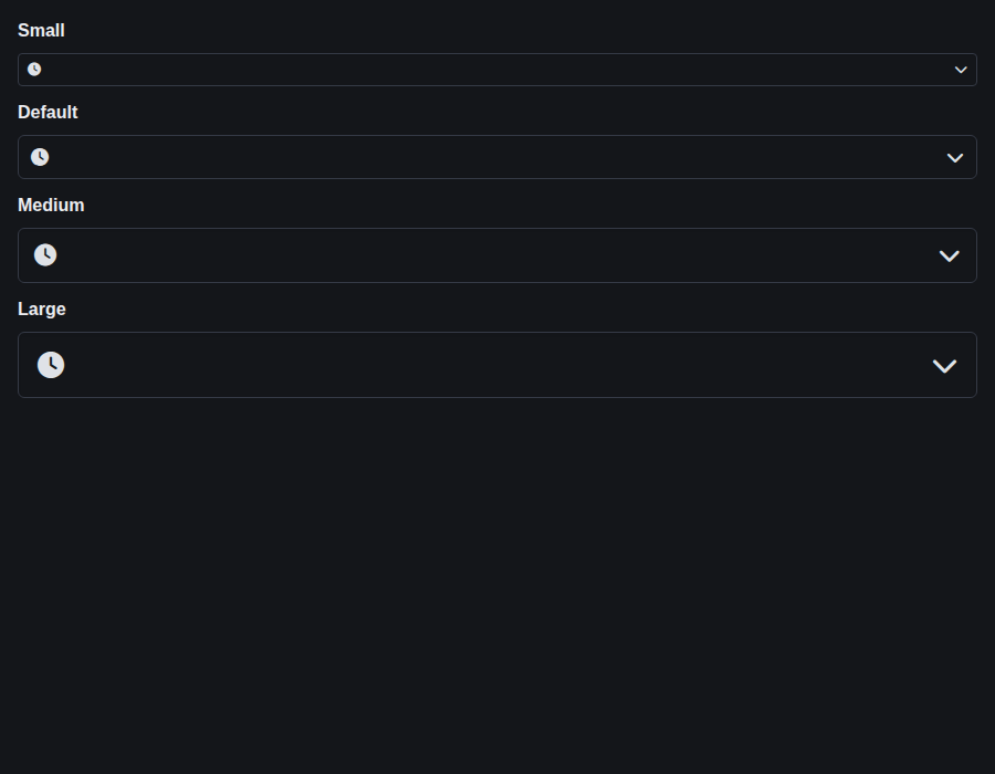
form-timeinput--sizes · Form/TimeInput · Sizes
| Light | Dark |
|---|---|
 |
 |
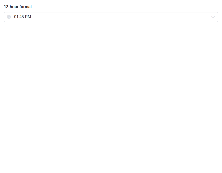
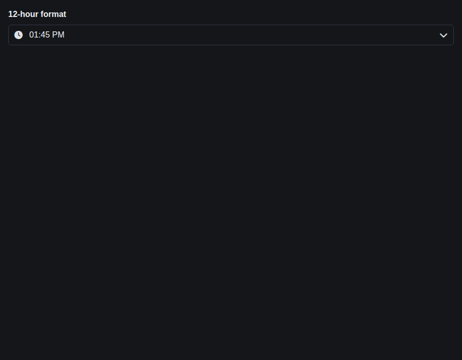
form-timeinput--format-12-h · Form/TimeInput · Format 12 H
| Light | Dark |
|---|---|
 |
 |
form-timeinput--with-seconds · Form/TimeInput · With Seconds
| Light | Dark |
|---|---|
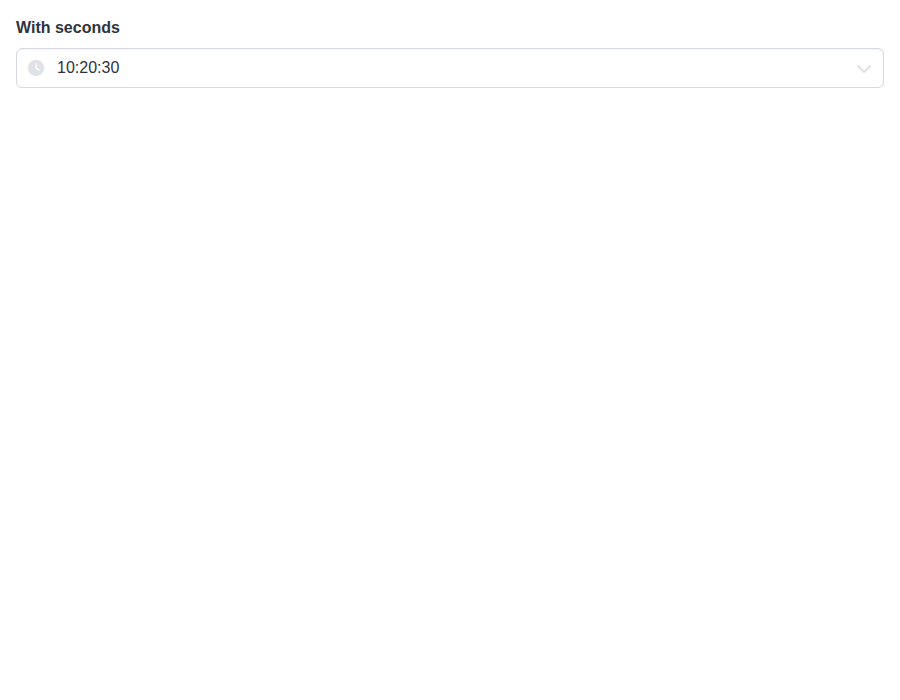 |
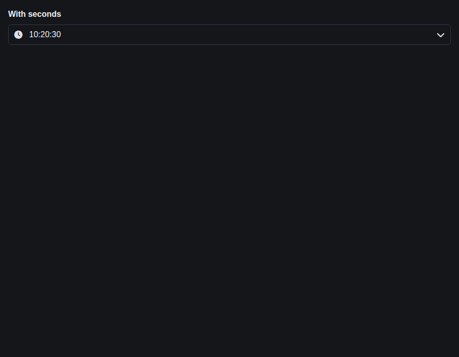 |
form-timeinput--increment-steps · Form/TimeInput · Increment Steps
| Light | Dark |
|---|---|
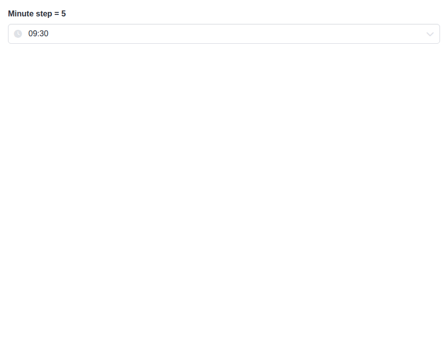 |
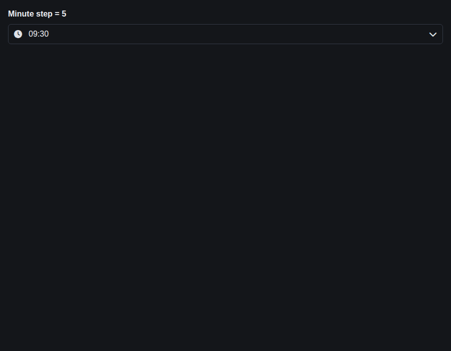 |
github-actions
Bot
added
the
review-converged
# Conflicts:
#	bulma-ui/src/form/DateInputBase.tsx
… other pickers

DateRangeInput's docs and story said ArrowDown opens the calendar with
openOnFocus off. With the segmented entry it shares, ArrowDown steps the
focused input's segment, and Alt+ArrowDown opens the popover while
Alt+ArrowUp closes it, from the inputs or the calendar. The docs, the
story and the openOnFocus TSDoc now say so, and the calendar's keyboard
table lists Alt+ArrowUp. The test that opened it with ArrowDown on an
unfocused input now focuses it first, as a browser does.
…l warning

#952 taught the date and time pickers to name their default left icon when
an icon size or column set on them inside a Control does nothing, so the
advice rebuilds what their own Control drew. DateRangeInput landed in the
meantime without it, so its advice left out iconLeftName="calendar" and
the shared Control-level tests failed on main. It now passes its default
icon for the advice, as the other pickers do.
|
deep-review: fresh Main is merged in to clear a conflict with DateRangeInput (#953), DateRangeInput now takes Alt+ArrowDown like the other pickers, and the branch carries #985's one-line DateRangeInput icon fix so main's red test passes here, so this review posts every finding, advisory included, as its own thread. It reviews 9cbe7ca. |
github-actions
Bot
removed
the
review-converged
Preview DeploymentPreview URL: https://1c9fc9e0.bestax.pages.dev |
There was a problem hiding this comment.
Deep review — 0 blocking · 3 advisory
| # | Severity | Area | Finding | Location |
|---|---|---|---|---|
| 1 | 🔵 Advisory | Robustness | inert is written from a passive effect instead of through the library's own inertProps helper, so it lands a frame late and is invisible to React |
bulma-ui/src/form/DateTimeInputBase.tsx:437 |
| 2 | 🔵 Advisory | Accessibility | Alt+↑ on a time wheel closes the whole popover while Escape there only collapses the wheels — deliberate per ARIA, but the shared docs row reads as equivalent |
bulma-ui/src/form/_pickerInternals/PickerPopover.tsx:114 |
| 3 | 🔵 Advisory | Accessibility | The Time button now moves focus into a region it has no aria-controls to, and that region has no role or name |
bulma-ui/src/form/DateTimeInputBase.tsx:687 |
Overall: this is sound and unusually well evidenced — each of #940's four items has a test that fails without its change, and I confirmed the arithmetic empirically rather than by reading: 44 suites / 2638 tests green across src/form, and I traced every path in the four pickers that starts a time from the clock (see below) to check the seconds fix is complete rather than spot-fixed. The two commits added since the last review are the low-risk half: c0e22ec2 changes no DateRangeInput code at all — Alt+↓/Alt+↑ arrive through the useSegmentedEntry and PickerPopover changes it already shares — and 9cbe7caa adds the one defaultIconLeftName line that makes DateRangeInput match the three pickers #952 taught, which bare-control.test.tsx holds to the real manifests. The riskiest part is the keyboard contract rather than the values: Alt+↓ replaces a documented plain ↓ on three components, and the keys now mean different things depending on whether the format yields segments (segment mode) or not (free-form, where plain ↓ still opens). Focus first on finding 2 — decide whether Alt+↑ from the wheels should step back to the calendar like Escape or dismiss the picker, because the docs currently let a reader expect either.
Residual risk — for the clock-seeded-value class, I enumerated every site in the four pickers that builds a time from new Date() and checked each:
DateInputBase.makeBaseDate(setHours(0,0,0,0)),TimeInputBase.makeBaseDate(setHours(12,0,0,0)),DateRangeInputBase.today()(startOfDay) andmakeEndBase(startOfDay(start)) — refuted, all already whole.TimeInputBase's footer Now button, the one clock seed the diff does not touch: refuted.snapTimeToIncrementends inr.setHours(h, m, s, 0)withs = enableSeconds ? r.getSeconds() : 0, so it was already dropping exactly what the field hides.DateTimeInputBase.focusedDate, whichclampDate(value ?? new Date(), …)still seeds with sub-second parts: refuted. Its only two consumers arehandleDateSelect(which now overrides hours→milliseconds outright) andhandleTimeChange(which passesseconds: parts.seconds ?? 0, milliseconds: 0on the empty-field arm); nothing else commits it.DateRangeInput's keyboard range picks, which the PR body claims land at midnight: refuted independently —Calendar.pickRangeDaydoesstartOfDay(picked)before it ever reachesonRangeSelect, so key and click share one normalisation.- A
mincarrying a time of day now makes the min's own day unpickable byEnteras it already was by click (startOfDay(picked)sits before theisWithintest). Refuted as a regression:Calendarreceives the rawmin, so that cell rendersaria-disabled— the key path stopped being the outlier. The PR's own test documents it ("Midnight on the min's own day is before the min, so that day can't be picked"). - Open, tracked:
Enteron the seconds wheel still does nothing — it is the oneWheelinTimeWheelswith noonCommit, whiletimeinput.md's wheel-column table promises "Commit live value, close popover". Declined in the PR body and tracked in #959, so out of scope here, but it lives in the handler this PR rewrote. - Open, pre-existing:
TimeWheels'unselectableTimesprobe is built onnew Date(), so for aDateTimeInputit asks about today's date at the candidate time, not the selected day's. The diff fixes its milliseconds without changing that.
🏄 Four real bugs caught in a smoke test, four surgical fixes, each with a test that actually fails first — and the merge just carries the shared keys over to DateRangeInput for free. Nothing left but three things to jot in the logbook. Send it.
|
🎉 This PR is included in version 5.27.0 🎉 The release is available on: Your semantic-release bot 📦🚀 |
|
🎉 This PR is included in version 4.2.13 🎉 The release is available on: Your semantic-release bot 📦🚀 |
|
🎉 This PR is included in version 2.25.1 🎉 The release is available on: Your semantic-release bot 📦🚀 |
|
🎉 This PR is included in version 1.14.1 🎉 The release is available on: Your semantic-release bot 📦🚀 |
1 participant

The date and time pickers had keyboard and value bugs found in a smoke test. Each fix is its own commit with tests that failed first, and each was checked in Chromium, Firefox and WebKit with Playwright against a small bundle of the components.
The time wheels stepped the wrong way. The wheels are spinbuttons, but ArrowUp lowered the value and ArrowDown raised it. ArrowUp and PageUp now raise the value and ArrowDown and PageDown lower it, as on a spinbutton and as the docs already said. Home and End still go to the lowest and highest value. The mouse wheel keeps its direction: scrolling down moves the items up and raises the value, as dragging the wheel up does, and ArrowUp now moves the items the same way. The values run down each wheel, so someone who reads a wheel as a list could expect ArrowDown to step to the value shown below the band. The keys follow the spinbutton role that screen readers announce instead. The TimeInput keyboard table now lists Home, End and the arrow keys between columns.
↓ never opened the popover. The DateInput, TimeInput and DateTimeInput pages said that with
openOnFocus={false}you could press ↓ to open the popover. In a segmented format ↓ steps the active segment, and Alt+↓ stepped it too, so the keyboard had no way in. Alt+↓ now opens the popover from the input and Alt+↑ closes it, as on a combobox, and neither steps the segment. Plain ↓ can't do both jobs, so the docs, stories andopenOnFocusTSDoc now say Alt+↓. Free-form entry, with no segment to step, still opens on a plain ↓, and the docs say so. Inside the open popover Alt+↑ closes it too, the way Escape does, handing focus back to the input: the calendar's views and the wheels leave Alt with the arrow keys alone. A read-only or disabled picker no longer opens on ↓ or Alt+↓, since those keys now open the popover only when the launcher could.Opening DateTimeInput's time wheels left focus on the Time button. The hours wheel now takes focus when the footer's Time button opens the wheels. Closing them with Escape, the button, or a click outside the card hands focus back to the Time button. If focus had already moved on to Reset or Done, it stays there. While the wheels are open the calendar under them is inert, so Tab walks the wheels and the footer and assistive technology skips what the card covers. Inline pickers behave the same way.
Picking a day on an empty DateTimeInput kept the clock's seconds and milliseconds. The calendar's focused day starts at the current time, and Enter hands that date over, so the value came out as midnight plus the clock's seconds.
setTimeOfDaynow takes milliseconds, and every path that starts a time from the clock drops what the field doesn't show:enableSeconds.enableSecondsis on.unselectableTimesis asked about whole seconds.A day picked on a field that has a value now keeps that value's whole time of day, down to seconds and milliseconds the field doesn't show, whether by key or by click, and
minandmaxjudge the picked day at that time. Before, a click dropped seconds the display hides while Enter kept them. DateInput had the same leak: Enter on the focused day picked it at whatever time of day the focus carried, the clock's on an empty field, or a typed value's or amax's otherwise. Every DateInput pick now lands at midnight, by key or by click.DateRangeInput (#953) landed on main first and uses the same segmented entry, so it moves with the other pickers: Alt+↓ opens its calendar from either input, Alt+↑ closes it, and its docs, story and
openOnFocusTSDoc say so. Its keyboard range picks were checked against the clock-seed fix and land at midnight.This branch also carries #985's one-line DateRangeInput change, which main needs for its Control-level warning tests to pass. Whichever of the two merges second, the change is identical on both sides.
Left out: #959's other two items, the seconds wheel's Enter and TimeInput's repeated id. Its read-only item is fixed here.
pnpm allpasses locally.Fixes #940