-
Notifications
You must be signed in to change notification settings - Fork 4.2k
New issue
Have a question about this project? Sign up for a free GitHub account to open an issue and contact its maintainers and the community.
By clicking “Sign up for GitHub”, you agree to our terms of service and privacy statement. We’ll occasionally send you account related emails.
Already on GitHub? Sign in to your account
Try compensating nested blocks for block padding #6408
Conversation
core-blocks/quote/editor.scss
Outdated
| @@ -1,6 +1,10 @@ | |||
| .wp-block-quote { | |||
| margin: 0; | |||
|
|
|||
| // compensate nested blocks for collapsing margins | |||
| padding-top: 1px; | |||
There was a problem hiding this comment.
Choose a reason for hiding this comment
The reason will be displayed to describe this comment to others. Learn more.
Is there a way to apply those styles to all blocks that use nesting? It might not scale well if we will have to do the same trick for all existing containers like Columns or Pullquote, soon Cover Image or List.
There was a problem hiding this comment.
Choose a reason for hiding this comment
The reason will be displayed to describe this comment to others. Learn more.
Yes, mentioned in the PR:
This PR adds that to the blockquote block itself, but if we think the general approach in this PR has merit, then we should find a way to make this more generic. For example a block that has nested children, if it had a
has-childrenclassname, then we could simply add the padding to that.
So, if we think this approach has merit, what do you think of applying a has-children class to the parent block container? If we add that generic class, I can also make this code generic.
There was a problem hiding this comment.
Choose a reason for hiding this comment
The reason will be displayed to describe this comment to others. Learn more.
Yes, this could be done with hooks in a similar way we add data-align to the block wrappers. Not sure if another class name or data attribute is better, but we could use such general solution 👍
|
I'll take a look. How did you get the citation to show up? |
|
Thanks for all the reviews. Do you think you can help me with the data-attribute or class? Pretty please? :D Not urgent — I won't have time to work on this branch today, and I'm AFK tomorrow. |
Sure thing :) |
|
Citation issue is tracked in #6404 |
|
Blocked on |
44024fa
to
5887ec5
Compare
|
I think this is ready for a review again. It has been rebased, and now works with the new outlines. Since the quote is not nested anymore, this is simply a move to make the nested block styles generic. A future patch will look at enabling collapsing margins, but for now that's not part of this PR. |
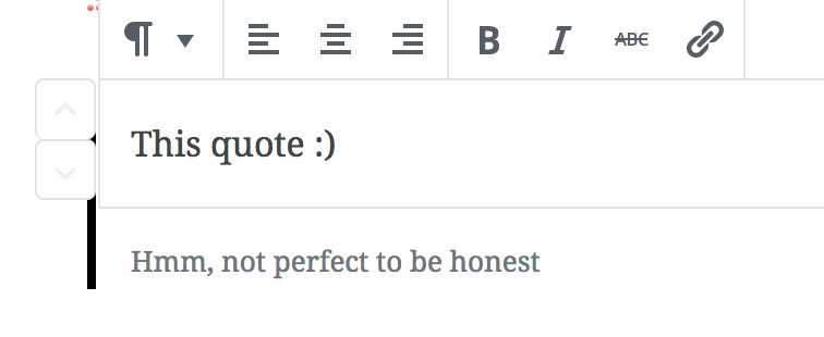
As we make more and more blocks support nested blocks, we need to think about a way for nested blocks to compensate for their block padding. That's the 14px that surrounds the block itself, and on which the 1px selected-block border is painted.

If we don't, any block that goes from non-nested blocks to nested blocks will suddenly have an extra 14px amount of padding inside.

This PR is an experiment to fix that, and adds compensation before and after any nested context. What's missing here is a fix for collapsing margins — otherwise the negative top and bottom margins will apply to the _parent_, not the nesting context. The way to fix this is to apply a padding to any context in which childrens margins should not collapse into the parent. This PR adds that to the blockquote block itself, but if we think the general approach in this PR has merit, then we should find a way to make this more generic. For example a block that has nested children, if it had a `has-children` classname, then we could simply add the padding to that.
d3b3121
to
d08b459
Compare
|
@gziolo rebased, are your questions addressed? Thanks. |
|
All good 👍 |
|
Yay, thank you! |


As we make more and more blocks support nested blocks, we need to think about a way for nested blocks to compensate for their block padding. That's the 14px that surrounds the block itself, and on which the 1px selected-block border is painted.
If we don't, any block that goes from non-nested blocks to nested blocks will suddenly have an extra 14px amount of padding inside.
This PR is an experiment to fix that, and adds compensation before and after any nested context. What's missing here is a fix for collapsing margins — otherwise the negative top and bottom margins will apply to the parent, not the nesting context. The way to fix this is to apply a padding to any context in which childrens margins should not collapse into the parent. This PR adds that to the blockquote block itself, but if we think the general approach in this PR has merit, then we should find a way to make this more generic. For example a block that has nested children, if it had a
has-childrenclassname, then we could simply add the padding to that.Before:
After: