-
Notifications
You must be signed in to change notification settings - Fork 4.2k
New issue
Have a question about this project? Sign up for a free GitHub account to open an issue and contact its maintainers and the community.
By clicking “Sign up for GitHub”, you agree to our terms of service and privacy statement. We’ll occasionally send you account related emails.
Already on GitHub? Sign in to your account
Refine multiselect. #19121
Refine multiselect. #19121
Conversation
|
See #19121 (comment) instead, it has better screenshots. |
|
@jasmussen Thanks for exploring all the options. I don't really mind hiding the native selection. The most important part for me is to use native selection underneath to power block multi selection because it's really smooth. I don't really care so much how it's styled or if it's hidden, but I do wonder what is most clear and visible. It appears that both have pros and con, and I agree that having both is a bit strange. Let me think about this for a bit. :D |
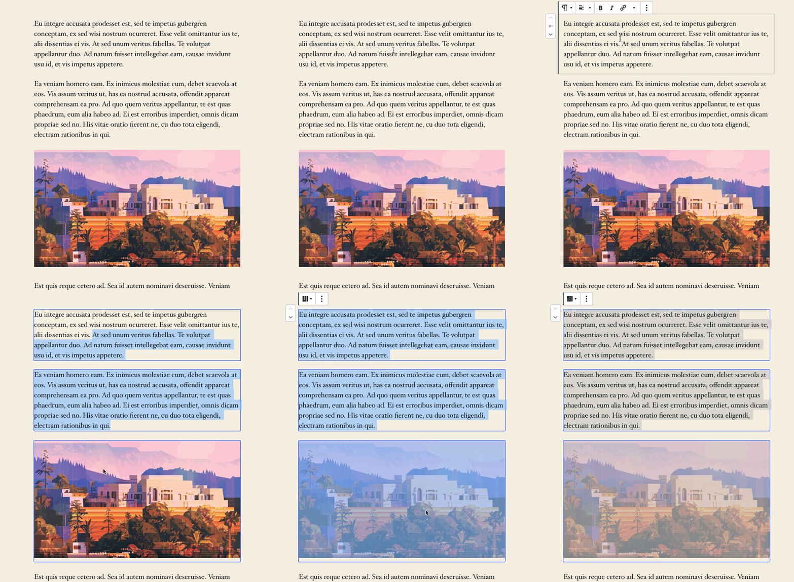
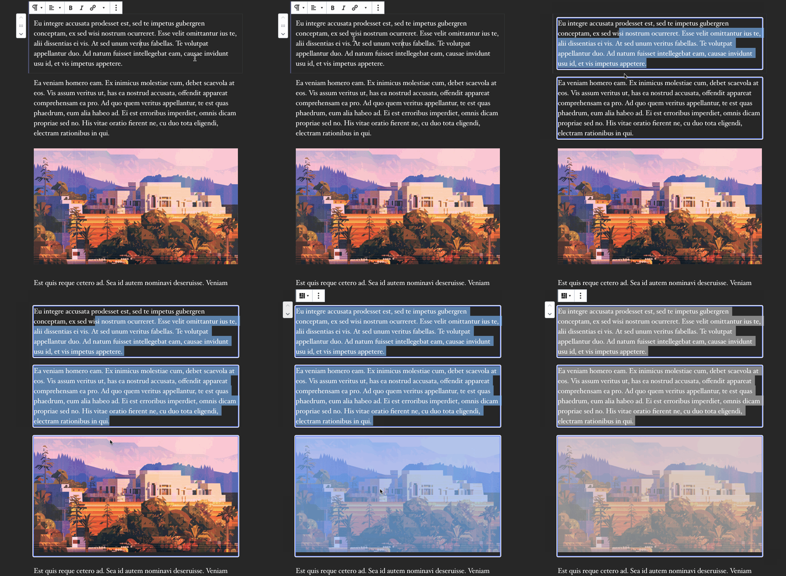
This restores the native selection in addition to the borders.

Additionally, it changes the cross-block selection border to also have a white outline.
8495e4a
to
f2c5c23
Compare
I agree, this is still present, it's only a visual change. I pushed and rebased and added a white extra border. Here's how it looks: |
|
I like that. With the extra white border (love it), how do you feel about the text selection? Should it stay or should it go? I don't have an opinion. |
| @@ -182,7 +182,7 @@ | |||
| .block-editor-block-list__block.is-multi-selected { | |||
| // Show selection borders around every non-nested block's actual footprint. | |||
| > .block-editor-block-list__block-edit > [data-block] { | |||
| box-shadow: 0 0 0 2px #057cba; | |||
| box-shadow: 0 0 0 2px $blue-blueberry, 0 0 0 4px $white; | |||
There was a problem hiding this comment.
Choose a reason for hiding this comment
The reason will be displayed to describe this comment to others. Learn more.
Love this. Guaranteed to see something.
There was a problem hiding this comment.
Choose a reason for hiding this comment
The reason will be displayed to describe this comment to others. Learn more.
I played a bit with a dashed line (white and blue), but it's a bit too busy. Perhaps if the dashed lines could be longer, it would work better (maybe border image). In any case this is looking good.
There was a problem hiding this comment.
Choose a reason for hiding this comment
The reason will be displayed to describe this comment to others. Learn more.
Awesome. I like the blueberry colour too. :)
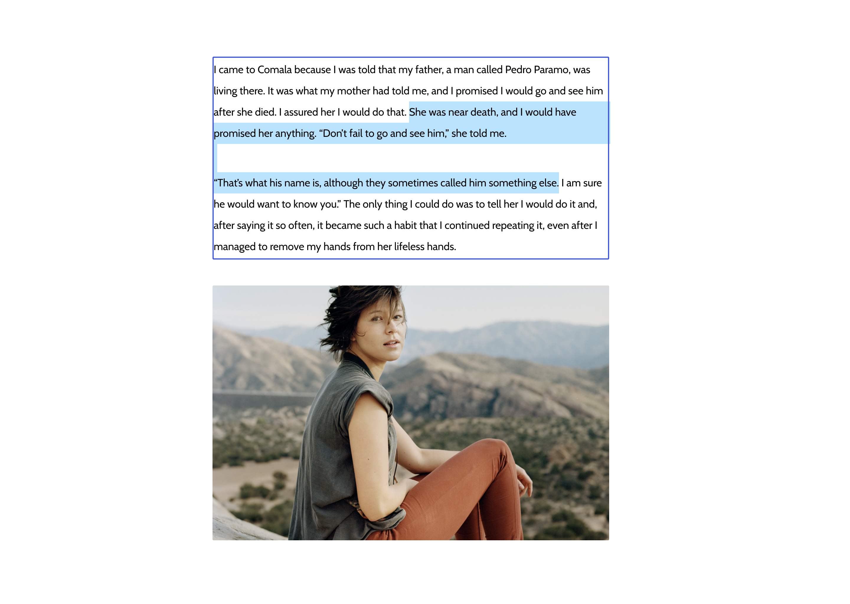
If, one day, we can make it so you can select partial text between two subsequent paragraphs and delete to merge, then the text selection marker should be visible ony between those two, like in this image. If we were to merge this in as a 7.1.1 improvement, which maybe isn't necessary, then I think it should stay across all blocks as it is. Otherwise I think the text selection marker should remain only inside text. |
|
@jasmussen Feel free to remove or leave the text selection. |
|
(The border change is a great improvement on its own.) |
|
Thanks for the review. I will wait for a few more thoughts on the text selection, then merge after! |
|
Alright, I've had a good long think about this, and I've changed my mind on a few things.
I think it looks and balanced. @ellatrix feel free to re-review. I realize it's a big change. |
|
I trust you with this stuff! Feel free to merge. :) I do really like the blueberry but yeah maybe not the right time for it. The theme setting sounds good too. |
Thanks. I'm not over the blueberry yet, I hope to see it return in style! Appreciate the re-review. Have a great weekend! |
|
Just one person's feedback: I quite like how the multi-selection works across paragraph blocks in v7.1.0 of the plugin, where it feels much more like working with a seamless sequence of text moreso than a collection of distinct blocks. I realize there's a balance here in the truth that they are a collection of blocks, and that we need to have a behavior which accounts for selecting across non-paragraph blocks, but at least for that specific interaction, I'm personally a bit disappointed in the change. |
|
Your feedback is very valid, @aduth! What so excited me about Ella's work was that it as the first substantial step towards breaking the barrier between paragraphs, potentially (but still a technical hurdle) so that you could select from the middle of one paragraph, into the next, press Delete, and merge the two. We'd basically make an exception for multi-select so that so long as you select in paragraphs, it's one continuous text selection, like this. Only when you then select into a non-text block would it convert into this. So why bring in the border around each block? A couple of reasons:
Example of 3: This is a little misleading as it might suggest the thing you copy, if you copy/paste, is "Text Cover Text", when in fact you're copying the entire markup of a sequence of three blocks. Finally, if we do manage to break the boundary between consecutive Paragraph blocks, we'll still want to have movers available, and unless we actually show some sort of boundary, you might think that only the partial selection is what gets moved, forcing a split or something. Theoretically we'd want to do something like this to indicate what actually gets moved: I understand what excitement the native selection brought, I share it. I still think magical things could be in our future, but I also think we have to take mindful steps towards it. And in the interim, to solve the problems outlined above, I believe the borders are necessary. |
|
I think the biggest change for me is that previously, it felt as though there was a continuation between the two paragraphs which which helped to reinforce a seamless feel associated with some future of partial paragraph selections. In other words, if the goal is partial paragraph selections, v7.1.0 felt like a large step forward, but the more recent changes feel like small steps backward again (at least for the interaction between paragraphs). I think the last image you shared in your comment would be a reasonable compromise to retain this sense of continuity. If that's what you're suggesting be the direction, I can get on board with that. |
The last mockup is that I'm hoping/dreaming of us accomplishing. Absolutely. |
The biggest issue for me was from a usability and expectations perspective — it seemed like you had selected text across blocks, but in reality the blocks themselves as a whole were selected. Actions like backspace or moving up / down would apply to the entire blocks, which wasn't very clearly communicated. |
|
We can have both things. No border in the future for blocks that are partially selectable, and border for the rest. I’ll work on partial selection sometime soon. |
|
Yes, once we have the mechanisms in place we can tweak the presentation to make it always clear what is happening. |


This restores the native selection in addition to the borders.
Based on feedback by @ellatrix in #19094 (comment) here's some refinement. GIFS:
This is both a solid point, but also something that was the intent of the #19094. We can't always rely on the text selection marker being sufficient to indicate selection, for example a Cover block with no text will not show as selected because it has only a background. 19094 took the extreme and removed the text selection entirely, due to the idea that having two selection indicators might be confusing.
The efforts are inspired by these mockups:
In those, an exception is made for consecutive paragraphs, which if combined with improvements to the writing flow would be just delightful. But as soon as selection enters a non-text block, it converts to a fully bordered selection instead. The reason being that when you copy, you copy the blocks, not just the text inside.
So going back to the question, how do we ensure the selection color is visible on all backgrounds? We can't use
mix-blend-modeorfilter, as there are no colors that always are contrasty to their backgrounds, regardless of configuration.Even the native selection color is not always visible. Here, the editor background is the same color as the MacOS selection color:
You can barely make out the selection.
What does Figma do?
By default they have a lovely blue, like us:
What if the background is that blue?
Only the rectangles are visible. So maybe two colors is an option, I'll follow up with a comment.