Replies: 13 comments 14 replies
-
|
Also, all icons are not properly aligned. there are slight differences. Look carefully at the lower right corner. |
Beta Was this translation helpful? Give feedback.
-
|
@hazarek I've made the PR #618 to generate the icons with a script. I can easily update it with a newer icon if you can provide it. |
Beta Was this translation helpful? Give feedback.
-
|
All I need is a positive vote to switch to the new icon. @stripedpajamas What do you think of the new icons? |
Beta Was this translation helpful? Give feedback.
-
|
@daiyam Can you share all generated icns files as zip? I want to examine .. |
Beta Was this translation helpful? Give feedback.
-
|
@daiyam smaller fixed version; |
Beta Was this translation helpful? Give feedback.
-
|
@daiyam thanks. Looks good. |
Beta Was this translation helpful? Give feedback.
-
|
This is another matter of discussion I think it should be updated; |
Beta Was this translation helpful? Give feedback.
-
|
Yeah let's go ahead and use the proposed better contrast icons. |
Beta Was this translation helpful? Give feedback.
-
|
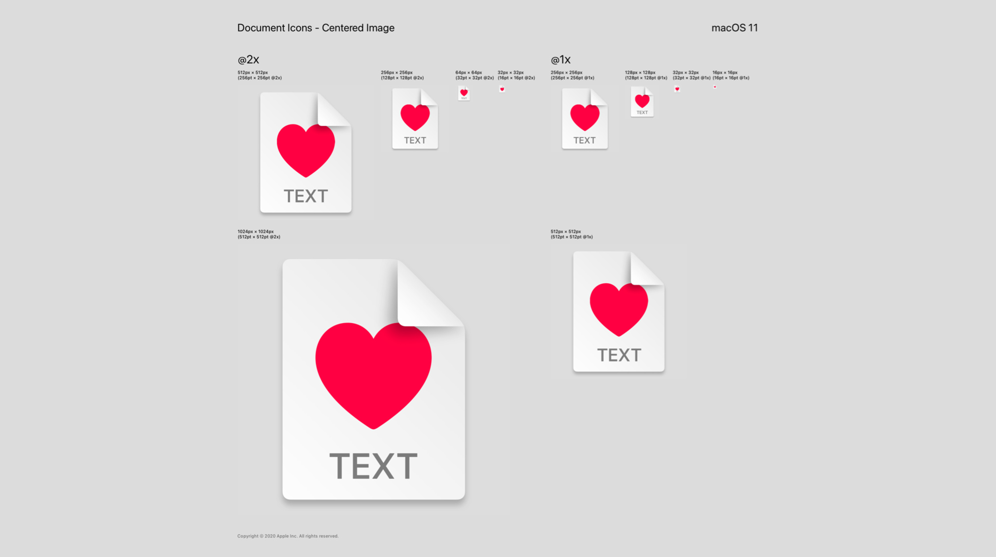
This design doesn't adhere to the macOS Human Interface Guidelines in the slightest which will result in a non-native look. The use of small icons at the edge of the document looks more like a visual spillover from old Windows visuals. This is what a macOS (Big Sur) document icon looks like: |
Beta Was this translation helpful? Give feedback.
-
|
@yusf There is no point in discussing these. Changes are accepted by voting. people will not accept this proposal. |
Beta Was this translation helpful? Give feedback.
-
|
@hazarek Great work! Could you share a vector version of this higher-contrast icon with white outline, if available? I am thinking of proposing a PR with similar changes to yours for Linux platform. |
Beta Was this translation helpful? Give feedback.
-
|
Good job @hazarek for pushing the visuals to adhere to Apple HIG. |
Beta Was this translation helpful? Give feedback.


-
Document icons proposal compatible with the new macOS Big Sur App icon
Screenshots on Finder with dark and light mode


Thanks to @daiyam for related Pull Request #618
Beta Was this translation helpful? Give feedback.
All reactions