feat(platform): add color toggle to follow button on research page#2205
feat(platform): add color toggle to follow button on research page#2205NoHara42 wants to merge 5 commits intoONEARMY:masterfrom
Conversation
|
What is the testing philosophy here, do we test extensively? |
 davehakkens
added
the
Review allow-preview ✅
davehakkens
added
the
Review allow-preview ✅
4 failed tests on run #3177 ↗︎
Details:
|
|||||||||||||||||||||||||||||||||||||||
| Test | Artifacts | |
|---|---|---|
| map > [By Admin] > should delete a map pin |
Output
Screenshots
|
|
 settings.spec.ts • 1 failed test • ci-chrome
| Test | Artifacts | |
|---|---|---|
| [Settings] > [Focus Machine Builder] > [Edit a new profile] |
Output
Screenshots
|
|
notificationBanner.spec.ts • 1 failed test • ci-chrome
| Test | Artifacts | |
|---|---|---|
| [Notification Banner] > [By Authenticated user with filled profile] > [Notification Banner is visible for user with blank profile] |
Output
Screenshots
|
|
events.spec.ts • 1 failed test • ci-chrome
| Test | Artifacts | |
|---|---|---|
| [Events] > [Create an event] > [By Authenticated] |
Output
Screenshots
|
|
This comment has been generated by cypress-bot as a result of this project's GitHub integration settings.
|
Visit the preview URL for this PR (updated for commit 3d39ad2): https://onearmy-next--pr2205-feat-follow-button-c-qjjwgn3f.web.app (expires Sat, 27 May 2023 13:38:02 GMT) 🔥 via Firebase Hosting GitHub Action 🌎 Sign: 6d65e4f8fee2f6ab2da0c1c3b85b8797d66afa59 |
|
Thanks for raising the PR so quickly @NoHara42, we've some documentation on the testing approach here: https://onearmy.github.io/community-platform/Testing/overview, although it looks a little out of date. Recently I have been introducing tests at a lower level using jest and react testing library, primarily to speed up the feedback cycle whilst working. You could look at extending the existing ResearchArticle test coverage to cover this scenario: |
|
Are you able to finish this @NoHara42 or need help? |
|
@davehakkens hey Dave, I still intend to finish this up. Sorry the last few days were busier than I thought. |
|
let me know if you are able to finish this @NoHara42. If not no worries we will take over. |
|
@davehakkens hey Dave, I will take another look right now and will comment again if I'm not able to complete it this session. Currently working on a farm in the south of Spain so my time is a bit limited. 🐵 |
|
Had some issues setting up the Dev environment on my system today, some WSL drama... I would like to take another crack at it tomorrow, as I have a test written. @davehakkens do you (or perhaps @thisislawatts) have some time in the evenings to reassure me that the tests I'm writing are valid and my Dev environment is setup correctly? I am getting a bunch of errors when I run all the projects unit tests. I have run |
|
Hi @NoHara42 what tests are you running? The I don't think these should be failing.. Let me know |
@AlfonsoGhislieri I am running unit tests, I realised the "errors" I had are just warnings: But the suggestion this warning suggests isn't upheld in the codebase, I'll ignore it for now. @davehakkens I've added 2 unit tests for both the "Follow" and "Following" states of the button. |
| ) | ||
| ? 'orange' | ||
| : 'black' | ||
| } |
There was a problem hiding this comment.
Issue: Would be a lot cleaner to not have these colors hardcoded, would be nicer to add them to the theme/use the theme instead (eg: subscribed: 'orange', not-subscribed: 'black'). You can find the theme files in packages/themes/src.
Let me know if you have any questions or need any help for this. BUT, if this is too much extra work and you don't have time I'm happy to approve this and add it to my TODO.
| <Icon glyph={props.icon} /> | ||
| <Icon glyph={props.icon} color={props.iconColor} /> | ||
| </Flex> | ||
| )} |
There was a problem hiding this comment.
Suggestion following issue above: here you should use sx to so that you can access the theme colors directly. Eg: <Icon glyph={props.icon} sx={{ color: props.iconColor }} />
There was a problem hiding this comment.
I had to add sx to the IconWrapper Component directly, as it uses styled components, which didn't seem to work well with the theming I had defined.
|
Thanks for this @NoHara42, great to also have the tests in here! Just a small issue regarding the hardcoded colors. Would be good to add these to the themes instead eg: Also the commits are not passing the linting check (needs to adhere to https://www.conventionalcommits.org), you can use |
 NoHara42
force-pushed
the
feat/follow-button-color-toggle
branch
from
NoHara42
force-pushed
the
feat/follow-button-color-toggle
branch
from
d54efe5 to
be91da7
Compare
 NoHara42
force-pushed
the
feat/follow-button-color-toggle
branch
from
NoHara42
force-pushed
the
feat/follow-button-color-toggle
branch
from
be91da7 to
cfed652
Compare
|
@AlfonsoGhislieri Should be done with your suggestions, also refactored some repeated theme colors while I was at it. Sorry about the force pushes, I'm not the subtlest of git history cleaners. 🥲 |
|
Thanks for this @NoHara42! Really appreciate the extra work refactoring the themeing! I just raised #2251 to fix the unit tests that were failing and made some minor changes (sorry for hijacking), just removed some uncessary themeing and the use of hyphens. Your commits are still there in the history so your hard work is not unaccounted for! 🙃 |
|
🎉 This issue has been resolved in version 1.49.0 🎉 The release is available on GitHub release Your semantic-release bot 📦🚀 |
5 participants
PR Checklist
PR Type
Description
First PR to an open-source project, woop!
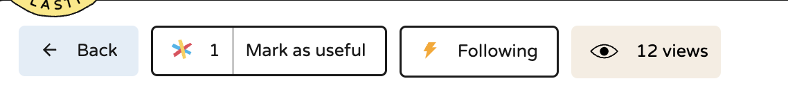
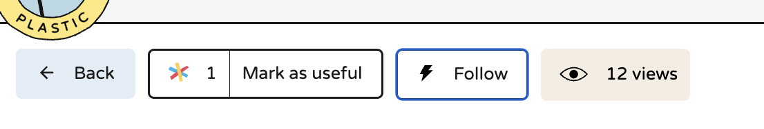
Adds the same color as the active notification icon to the thunderbolt inside any research item.
Git Issues
Closes #2200
Screenshots/Videos
If useful, provide screenshot or capture to highlight main changes