Conversation
Will need to update where it gets used, since this appears to be the
first instance of the icon
-- What
We have replaced half a dozen existing icons with new SVGs. These have
different names in some cases, so the references need to be replaced
in templates. Additionally, these icons require larger display sizes
given their circular shape, so we need to find corresponding template
tags and make sure they are given the correct dimensions (88x88px)

changelog: Internal, Assets, updating icon images and references
changelog: Internal, Assets, updating icon images and references
changelog: Internal, Accessibility, updating icons
changelog: Internal, Accessibility, updating accessible icons
changelog: Internal, Accessibility, updating to more accessible icons
changelog: Internal, Accessibility, updating to more accessible icons
changelog: Internal, Accessibility, switching to more accessible icons
 zachmargolis
left a comment
zachmargolis
left a comment
zachmargolis
left a comment
There was a problem hiding this comment.
LGTM, might be good to add some before/after screenshots to the PR, or maybe some URLs/screens
| @@ -2,7 +2,7 @@ | |||
| position: relative; | |||
|
|
|||
| &::before { | |||
There was a problem hiding this comment.
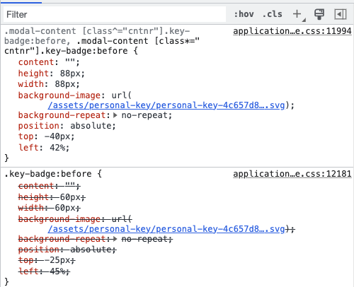
Is this a duplicate style from the other in _modal.scss. I see both are being applied to the element, it seems like we should only have one.
Also updating any corresponding templates to use the new
localizations.

changelog: Internal, Accessibility, updating to more accessible icons
changelog: Internal, Accessibility, adding more accessible icons
changelog: Internal, Accessibility, adding more accessible icons
changelog: Internal, Accessibility, updating to more accessible icons
|
Based on the previous comments by @aduth , and noticing how the modals are implemented throughout the application currently, I have made some slight but wide reaching changes to how icons are displayed. Recent commits include the following changes:
|
changelog: Internal, Accessibility, adding more accessible icons
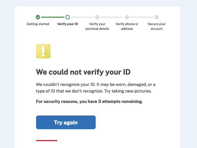
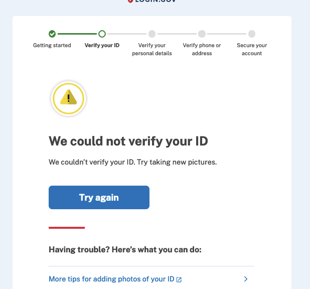
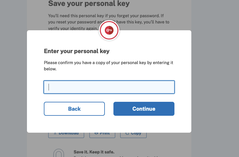
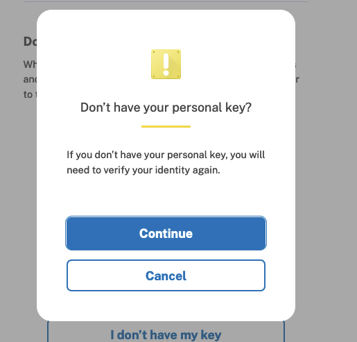
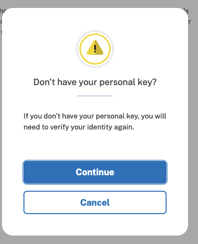
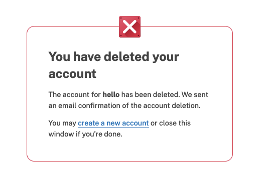
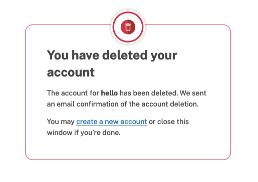
Some Before and AftersCould Not Verify IDBEFORE
AFTER
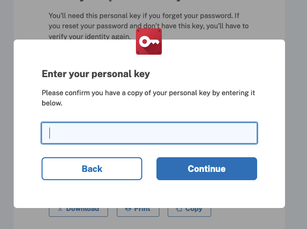
Confirm Personal KeyBEFORE
AFTER
Don't Have Your Personal Key?BEFORE
AFTER
Account DeletedBEFORE
AFTER
|
changelog: Internal, Accessibility, adding more accessible icons
Co-authored-by: Andrew Duthie <andrew.duthie@gsa.gov>
Also updating the signature of the initialization method

changelog: Internal, Accessibility, adding more accessible icons
changelog: Internal, Accessibility, adding more accessible icons
changelog: Internal, Accessibility, adding more accessible icons
changelog: Internal, Accessibility, adding more accessible icons
changelog: Internal, Accessibility, adding more accessible icons
changelog: Internal, Accessibility, adding more accessible icons
Also updating and corresponding location references.

changelog: Internal, Accessibility, adding more accessible icons
| size: '40', alt: t('devise.registrations.start.bullet_6_img'), class: 'margin-top-05 grid-col-auto', | ||
| <%= render AlertIconComponent.new( | ||
| icon_name: :personal_key, | ||
| size: '40', alt: t('devise.registrations.start.bullet_6_img'), class: 'margin-top-05 grid-col-auto' |
There was a problem hiding this comment.
Based on the failing build, you'll either need to remove, update, or account for the size attribute here, since it's incompatible with the AlertIconComponent's own default width and height.
| size: '40', alt: t('devise.registrations.start.bullet_6_img'), class: 'margin-top-05 grid-col-auto' | |
| width: 40, | |
| height: 40, | |
| alt: t('devise.registrations.start.bullet_6_img'), | |
| class: 'margin-top-05 grid-col-auto', |
Or something like this in AlertIconComponent:
def size_attributes
  if tag_options[:size].present?
    { size: tag_options[:size] }
  else
    { width: DEFAULT_WIDTH, height: DEFAULT_HEIGHT }
  end
end| <%= image_tag( | ||
| asset_url('p-key.svg'), | ||
| size: '40', alt: t('devise.registrations.start.bullet_6_img'), class: 'margin-top-05 grid-col-auto', | ||
| <%= render AlertIconComponent.new( |
There was a problem hiding this comment.
On second thought, do we actually want to be updating this icon? It will introduce inconsistency with the rest in the context it's shown (the sign in page when authenticating with an SP at IAL2).
There was a problem hiding this comment.
I see now. The p-key.svg that was hanging out at the root level (which I deleted) should have been in get-started with the rest of them. Restoring now.
There was a problem hiding this comment.
Old screen (now restored)
There was a problem hiding this comment.
It's kinda strange to me that the icon for personal key is red when the rest are blue, but I'm assuming it's always been that way, so I think it's something to follow-up with separately.
| <% title t('forms.backup_code.confirm_delete') %> | ||
|
|
||
| <%= image_tag(asset_url('status/warning.svg'), alt: t('errors.alt.warning'), width: 54, class: 'display-block margin-bottom-4') %> | ||
| <%= render AlertIconComponent.new(icon_name: :warning, class: 'display-block margin-bottom-4 alert-icon') %> |
There was a problem hiding this comment.
The 'alert-class' class would be added by the component itself, so I wouldn't expect to see it here.
| <%= render AlertIconComponent.new(icon_name: :warning, class: 'display-block margin-bottom-4 alert-icon') %> | |
| <%= render AlertIconComponent.new(icon_name: :warning, class: 'display-block margin-bottom-4') %> |
changelog: Internal, Accessibility, adding more accessible icons
Also reverting to plain image_tag for the rendering, as with other
sibling icon images in the partial

changelog: Internal, Accessibility, adding more accessible icons
changelog: Internal, Accessibility, adding more accessible icons
 aduth
left a comment
aduth
left a comment
aduth
left a comment
There was a problem hiding this comment.
Few more comments, but nothing blocking. LGTM 👍
| en: | ||
| image_description: | ||
| camera_mobile_phone: Camera flashing on a mobile phone | ||
| delete: Red trash can |
There was a problem hiding this comment.
I'd have a light preference to have these strings at components.alert_icon to have a clear and consolidated source for component strings. Not a blocker though.
| alt={alt} | ||
| width={88} | ||
| height={88} | ||
| className="display-block margin-bottom-4 alert-icon" |
There was a problem hiding this comment.
Would be good to follow-up to align the componentization of AlertIcon in React to match the corresponding ViewComponent implementation.
Co-authored-by: Andrew Duthie <andrew.duthie@gsa.gov>
changelog: Internal, Accessibility, adding more accessible icons
We are also adding a couple of tests to ensure that AlertIconComponent
is correctly handling the logic if width, height, and size attributes

changelog: Internal, Accessibility, adding more accessible icons
changelog: Internal, Accessibility, adding more accessible icons
changelog: Internal, Accessibility, adding more accessible icons
It's not currently being used, so we are removing any handling of this
option

changelog: Internal, Accessibility, adding more accessible icons
| def initialize(status: :error, icon: nil) | ||
| if !ICONS.key?(status) | ||
| raise ArgumentError, "`status` #{status} is invalid, expected one of #{ICONS.keys}" | ||
| if !VALID_STATUS.include?(status) |
There was a problem hiding this comment.
[comment] prefer if with a positive test, or consider unless in a guard clause, e.g. raise ... unless VALID_STATUS.include?(status)
| <div id="personal-key-confirm" class="display-none" tabindex='-1'> | ||
| <%= render layout: '/shared/modal_layout', locals: { role: 'dialog' } do |label_id, description_id| %> | ||
| <div class="padding-y-8 padding-x-2 tablet:padding-x-8 cntnr-skinny bg-white radius-lg key-badge"> | ||
| <div class="padding-y-8 padding-x-2 tablet:padding-x-8 cntnr-skinny bg-white radius-lg iconic-modal-badge personal-key-badge"> |
There was a problem hiding this comment.
is this indentation intentional?
| @@ -1,10 +1,10 @@ | |||
| <% if @webauthn.platform_authenticator %> | |||
| <% title t('forms.webauthn_platform_delete.confirm') %> | |||
| <% title t('forms.webauthn_platform_delete.confirm') %> | |||
| <% title t('forms.webauthn_platform_delete.confirm') %> | ||
| <% else %> | ||
| <% title t('forms.webauthn_delete.confirm') %> | ||
| <% title t('forms.webauthn_delete.confirm') %> |
|
|
||
| it 'includes informative image' do | ||
| expect(rendered).to have_css("[src*='warning'][alt=#{t('errors.alt.warning')}]") | ||
| expect(rendered).to have_css("[src*='warning'][alt='#{t('image_description.warning')}']") |
There was a problem hiding this comment.
[suggestion] consider using a helper, if possible, for this interpolation
|
|
||
| it 'includes informative image' do | ||
| expect(rendered).to have_css("[src*='error'][alt=#{t('errors.alt.error')}]") | ||
| expect(rendered).to have_css("[src*='error'][alt='#{t('image_description.error')}']") |
There was a problem hiding this comment.
[suggestion] consider using a helper, if possible, for this interpolation
 kbighorse
left a comment
kbighorse
left a comment
kbighorse
left a comment
There was a problem hiding this comment.
Made some non-blocking comments. 👍🏾
4 participants
What
This PR replaces some of the current iconography with better, more accessible versions. We also update the templates in which these icons are used so that they specify better dimensions for the new designs.