Conversation
There was a problem hiding this comment.
Description lists have a default bottom margin of 2 so I wanted to override it to match the div that was here previously
config/locales/idv/fr.yml
Outdated
There was a problem hiding this comment.
This translation got messed up in this PR -- this restores it to what it should be
…pdate' language instead of 'Change'
 sheldon-b
force-pushed
the
sbachstein/lg-6349-content-changes-to-doc-auth-flow
branch
from
sheldon-b
force-pushed
the
sbachstein/lg-6349-content-changes-to-doc-auth-flow
branch
from
e419a71 to
86aa542
Compare
sheldon-b
force-pushed
the
sbachstein/lg-6349-content-changes-to-doc-auth-flow
branch
from
c166628 to
5a5ec17
Compare
| <div class="margin-bottom-4"> | ||
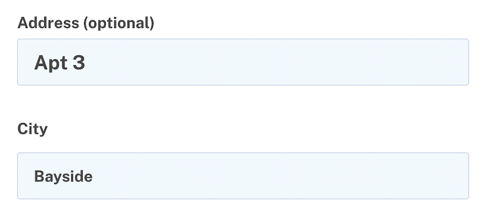
| <%= f.input :city, label: t('idv.form.city'), required: true, maxlength: 255, wrapper: false, | ||
| input_html: { aria: { invalid: false }, class: 'usa-input', value: @pii['city'] } %> | ||
| input_html: { aria: { invalid: false }, value: @pii['city'] } %> |
There was a problem hiding this comment.
This styling was making the city input text smaller than the other inputs:
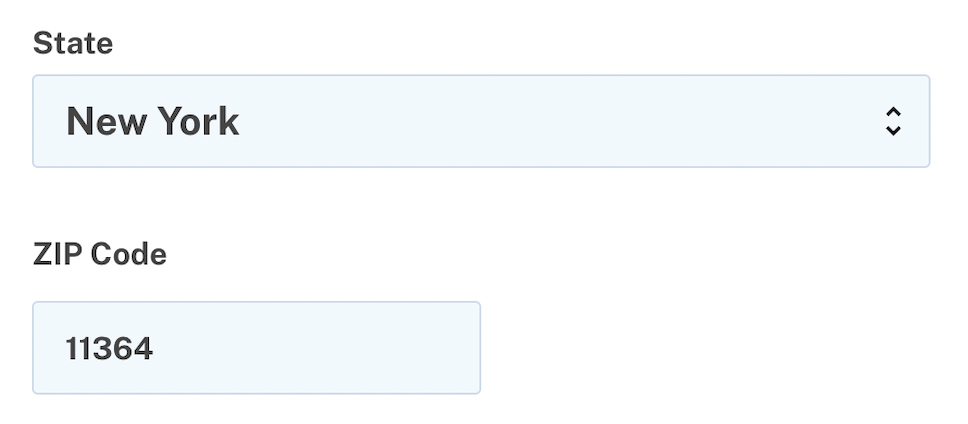
| pattern: '(\d{5}([\-]\d{4})?)', | ||
| wrapper: false, | ||
| input_html: { aria: { invalid: false }, class: 'usa-input', value: @pii['zipcode'] } %> | ||
| input_html: { aria: { invalid: false }, value: @pii['zipcode'] } %> |
There was a problem hiding this comment.
This styling was making the ZIP code input text smaller than the other inputs:
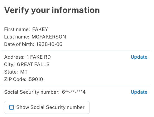
| <%= "#{t('doc_auth.forms.first_name')}: #{pii[:first_name]}" %> | ||
| <dt class="display-inline"> <%= t('idv.form.first_name') %>: </dt> | ||
| <dd class="display-inline margin-left-05"> <%= pii[:first_name] %> </dd> |
There was a problem hiding this comment.
I took this opportunity to implement Andrew's suggestion to improve the HTML semantics of this page by using description lists
There was a problem hiding this comment.
We may not need both the margin-left-05 and the explicit " " space, since my intention with the margin-left-05 in the other component was as a substitute for the space character.
There was a problem hiding this comment.
Oh good call, for some reason I thought I needed the left margin but the space alone is better. Set the margins to 0 in 9abec01 (there is a default margin that is way too big)
sheldon-b
changed the title
sheldon-b
requested review from
a team,
NavaTim,
WheresHJ,
rutvigupta-design,
tomas-nava and
zachmargolis
and removed request for
a team and
rutvigupta-design
I expect these changes would need to be reflected in the partner-facing Figma designs for identity verification. Has this been / can we communicate to the UX folks? |
 aduth
left a comment
aduth
left a comment
aduth
left a comment
There was a problem hiding this comment.
Happy to defer to another with more context here, but changes LGTM! Some great refactoring here too.
| <%= "#{t('doc_auth.forms.first_name')}: #{pii[:first_name]}" %> | ||
| <dt class="display-inline"> <%= t('idv.form.first_name') %>: </dt> | ||
| <dd class="display-inline margin-left-05"> <%= pii[:first_name] %> </dd> |
There was a problem hiding this comment.
We may not need both the margin-left-05 and the explicit " " space, since my intention with the margin-left-05 in the other component was as a substitute for the space character.
| <div class='margin-top-4 margin-bottom-2'> | ||
| <div class="grid-row grid-gap grid-gap-2 padding-bottom-1"> | ||
| <div class='grid-col-fill'> | ||
| <dl class="grid-col-fill margin-bottom-0"> |
There was a problem hiding this comment.
At some point we may want to consider creating a convenience CSS class for these sorts of term:value lists, so that we can avoid the margin utility here and the display-inline below.
There was a problem hiding this comment.
Makes sense. Could you link me to an existing CSS class so I can see how that's currently done in the codebase? Not planning to do it as part of this ticket but I'd like to know how for next time
There was a problem hiding this comment.
Makes sense. Could you link me to an existing CSS class so I can see how that's currently done in the codebase? Not planning to do it as part of this ticket but I'd like to know how for next time
That's a good question. The stylesheets are a bit scattered as far as patterns go.
I could imagine a few options:
- Treat it like a "component" for description list, optionally of an "unstyled" variety
- e.g.
.description-listor.term-listor.description-list.description-list--unstyledin a new file_description-list.scssor_term-list.scss - Ideally these component stylesheets would map to a Rails component or React component, which we could do, but I don't think is strictly necessary unless you think there's some value in it.
- e.g.
- Add a utility class, maybe even to one of the existing (typography?)
- I'm not a huge fan of the utility classes since they're a hodgepodge of miscellaneous things, but this feels like it fits as a miscellaneous thing
| buttons: | ||
| cancel: Cancel and return to your profile | ||
| change_address_label: Change address | ||
| change_label: Update |
There was a problem hiding this comment.
Were we intending to change the text here from "Change" to "Update" ?
The links on the right:
Edit: I see this update is proposed in the Figma attached to LG-6285. Two follow-up points:
- Do we also need to revise the accessible
aria-labels to match? Since my understanding is that those are supposed to be essentially the same, but more contextualized for assistive technology (link purpose) - Similar to other comment, I expect these would need to be updated in the partner-facing Figma designs
There was a problem hiding this comment.
@aduth yeah I've talked with Annie about making these changes to the doc auth flow in addition to the IPP flow. I'll let her know that we should update the partner-facing Figma designs
Good point about the aria labels, I agree that those should change
There was a problem hiding this comment.
I'll also aim to get the Spanish and French translations for all of these label changes (the visible and aria labels) included as we do IPP content translations
There was a problem hiding this comment.
Updated the English aria labels in 87f7c0c. I've updated LG-6337 to track getting translations for the Spanish and French translations of this change (eg Change => Update in Spanish and French for the various labels and buttons)
6 participants
📋 Not included
📺 Demo
You can try these changes in the sbachstein sandbox.
Verify page (doc auth)
Change address page (doc auth)
Verify page (in-person proofing)
Change address page (in-person proofing)
Change state ID page
Change SSN page
Note: this is the doc auth page which is the same for in-person except in-person's step indicator is different.