Use ButtonComponent for new account actions#5910
Conversation
**Why**: So that we're consistently using icons in buttons.
Invalid for <a> element
|
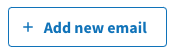
The amount of space between the "+" and the text feels a bit excessive here:
Part of this is due to the fact that the icon itself has pretty generous padding: https://github.com/uswds/uswds/blob/develop/src/img/usa-icons/add.svg But we could also revisit the margins we use between the icon and accompanying text. Currently that is set to
|

app/views/accounts/_emails.html.erb
Outdated
| class: 'usa-button usa-button--outline margin-top-2', | ||
| ) %> | ||
| <%= render ButtonComponent.new( | ||
| action: ->(content, type:, **tag_options) { link_to(content, add_email_path, **tag_options) }, |
There was a problem hiding this comment.
Couple usability thoughts:
- Excluding
type:is not very obvious- Maybe we shouldn't be adding this into
tag_optionsin the ButtonComponent implementation, and instead rely on the consumer to pass it in? After all, this is how one would need to use a<button>element. - Maybe we could have a short-hand for this use case, like a
href:keyword argument toButtonComponent.
- Maybe we shouldn't be adding this into
- It's a bit odd that the
actionimplementation deals with how to usecontentas an argument, when we control what that content is going to be assigned to just a few lines below this.- One could argue we just specify that translation string here and drop the parameter.
- Then again, "content" is a formal concept of ViewComponent, and we'd need to support the block form regardless for the default behavior of
action.
There was a problem hiding this comment.
We can pass &block to the action and expect that it passes it along too right?
There was a problem hiding this comment.
Another idea to make excluding type: more obvious?
| action: ->(content, type:, **tag_options) { link_to(content, add_email_path, **tag_options) }, | |
| action: ->(content, **tag_options) { link_to(content, add_email_path, **tag_options.except(:type)) }, |
There was a problem hiding this comment.
We can pass
&blockto theactionand expect that it passes it along too right?
To what end would you have in mind? I guess it could feel a bit more natural to do something like...
        action: ->(**tag_options, &block) do
          content_tag(:'lg-custom-button', **tag_options, data: { extra: '' }, &block)
        end,
Another idea to make excluding type: more obvious?
It seems like an easy thing to miss that a developer must explicitly exclude it.
Another idea could be to add the default type only in the default action implementation:
action: ->(content, **tag_options) { button_tag(content, **tag_options, type: tag_type) },
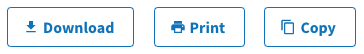
I agree, thanks for noticing that. Have you tried what it looks like with an icon that is very square and takes up the whole space, though? Like the print, copy, download icons? I would probably want to try the bulkiest icons we've got before deciding to close up to |
Yep, this builds on the work in #5904, so this is the same styling as what's shown in the screenshots there (and that you can preview in in the dev sandbox now if you'd like).
If we reduced the margin down to
One thing I neglected to mention is that there's a bit of a negative left offset on the icons as well, so they're not padded as much on the left. Today, the icon styling has In the second screenshot of this comment and of #5910 (comment), I updated both, to We could tinker with this more to find a compromise, like
|


**Why**: Avoid dealing with exceptional behavior for links, also behave like one would expect to use an HTML button element.
|
|
||
| def initialize( | ||
| action: ->(content, **tag_options) { button_tag(content, **tag_options) }, | ||
| action: ->(**tag_options, &block) { button_tag(**tag_options, &block) }, |
There was a problem hiding this comment.
so now just to clarify, we've stopped doing the positional args at all, content must come from the block
It might be overkill but maybe we should wrap the block, so we can check to make sure it was yielded to? ex in the button component, just to save a step if somebody ever had to debug "why didn't my content show up?"
def content
  @was_called = true
  super
end

# or some other hook
def after_render
  if !@was_called
    raise "content block was not called!!! don't forget to yield or pass &block in action"
  end
  super
endThere was a problem hiding this comment.
so now just to clarify, we've stopped doing the positional args at all, content must come from the block
Correct 👍 Though, based on how ViewComponent works, this can also be done with .with_content and produce the same outcome.
It might be overkill but maybe we should wrap the block, so we can check to make sure it was yielded to? ex in the button component, just to save a step if somebody ever had to debug "why didn't my content show up?"
It's pretty easy to hook before_render (that's the actual method name) but a corresponding after_render doesn't exist, best I can tell. We could achieve the same effect by overriding the render_in method like what we did in #5475. To be honest, I'm not super-convinced it's necessary, or at least I can never get a comfortable gauge on how much validation is too much validation, and this feels pretty borderline to me.
There was a problem hiding this comment.
Sounds good, we can leave out validation and always come back if we get burned by it
app/views/two_factor_authentication/otp_verification/show.html.erb
Outdated
Show resolved
Hide resolved
Co-authored-by: Zach Margolis <zachmargolis@users.noreply.github.com>
**Why**: Icon positioning should be appear left of the accompanying text, offset just enough to account for default minimum padding of icons within the SVG viewbox.
|
@anniehirshman-gsa and I met on Friday to chat about icon positioning, and I pushed updates in d41fbfe to reflect the agreed-upon outcome. Effectively: Icon positioning should appear to the immediate left of the accompanying text plus
|


3 participants
Why: So that we're consistently using icons in buttons, and toward an eventual removal of the
prefix_with_plushelper.Also fixes an issue where
typeattribute was being wrongly assigned to link implementations of these icon buttons.