Update document capture file input to display per design specifications#3999
Merged
Update document capture file input to display per design specifications#3999
Conversation
aduth
commented
Jul 31, 2020
**Why**: Login Design System uses BEM
 aduth
force-pushed
the
aduth-file-input-styling
branch
from
aduth
force-pushed
the
aduth-file-input-styling
branch
from
17f50a7 to
7b73e68
Compare
Contributor
Author
|
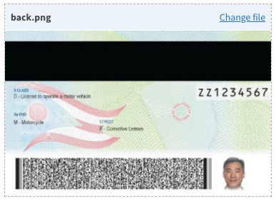
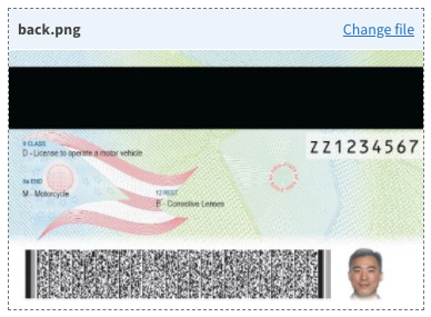
Per design feedback from @anniehirshman-gsa , in 6ae77d1 the images will now scale to their natural full width. The primary difference is that the container height may expand or shrink according to the proportions of the image, whereas previously the container would always remain at the fixed "ID-like" proportion, regardless whether a value was assigned or not.
|
Contributor
Author
|
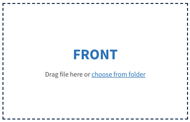
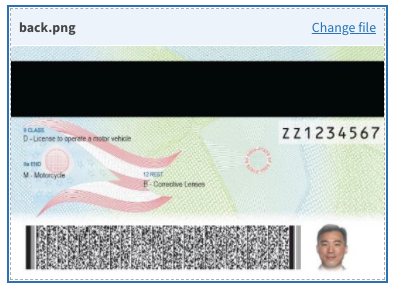
Per design feedback from @anniehirshman-gsa , updated focus and hover styles in 8f8a727 , primarily to ensure that the focus ring appears outside the dashed border.
|
This was referenced Aug 4, 2020
This file contains hidden or bidirectional Unicode text that may be interpreted or compiled differently than what appears below. To review, open the file in an editor that reveals hidden Unicode characters.
Learn more about bidirectional Unicode characters
Sign up for free
to join this conversation on GitHub.
Already have an account?
Sign in to comment
2 participants
Add this suggestion to a batch that can be applied as a single commit.This suggestion is invalid because no changes were made to the code.Suggestions cannot be applied while the pull request is closed.Suggestions cannot be applied while viewing a subset of changes.Only one suggestion per line can be applied in a batch.Add this suggestion to a batch that can be applied as a single commit.Applying suggestions on deleted lines is not supported.You must change the existing code in this line in order to create a valid suggestion.Outdated suggestions cannot be applied.This suggestion has been applied or marked resolved.Suggestions cannot be applied from pending reviews.Suggestions cannot be applied on multi-line comments.Suggestions cannot be applied while the pull request is queued to merge.Suggestion cannot be applied right now. Please check back later.
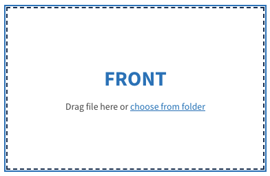
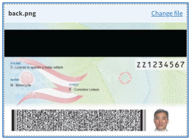
This pull request seeks to update the
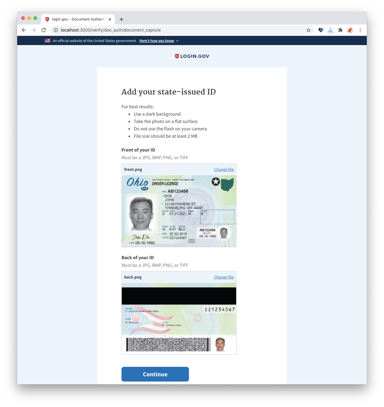
FileInputReact component introduced to #3978 to appear more stylized and in line with the current design specifications.Specifically, it adds support for:
It brings the design in line with the branded variation:
FilePickercomponent broadly)There are some device-specific considerations:
This is intended as a milestone work-in-progress, and does not yet implement:
Note that mobile detection is performed based on the user agent. You can simulate in this browser using developer tools simulation.
Screen recording:
cc @anniehirshman-gsa