Change streams tabs to a stack, initially show subscribed only, issue #5424#5443
Change streams tabs to a stack, initially show subscribed only, issue #5424#5443gnprice merged 1 commit intozulip:mainfrom
Conversation
 nol13
changed the title
nol13
changed the title
 gnprice
left a comment
gnprice
left a comment
gnprice
left a comment
There was a problem hiding this comment.
Thanks @nol13! This looks good -- glad to have this change.
In our Git commit style, each commit should be a single coherent change with a clear commit message. (That helps make it easier to review, and also helps a lot with understanding what happened when reading the Git history.) In this case, I think that means squashing the changes together into a single commit. So please do that, and then give it a commit message in our format.
Please also post screenshots on this PR thread of the main parts of the UI that were changed. That's also helpful for reviewing, particularly for folks who don't have the mobile dev environment open all day to give review on the UX and design.
Other than that, just a few comments below, most of them quite small.
| rightItem: { | ||
| marginLeft: 'auto', | ||
| }, |
There was a problem hiding this comment.
nit: It looks like this bit doesn't get used.
| }, | ||
| streamsText: { | ||
| textTransform: 'uppercase', | ||
| color: '#666699', |
There was a problem hiding this comment.
Interesting, was this color specified in the design prototype? I don't think I'd seen specific colors mentioned, except in a couple of places related to stream colors.
When I switch to a dark theme, it looks like this color doesn't get good contrast. Presumably as the new design gets to a later stage, Vlad will work out a pair of colors to use here for the light and dark themes.
For now, let's do the same thing here as NestedNavRow does and use the theme's color property. (In NestedNavRow, this appears directly for the icons, and is handled for the text down in ZulipText.) That's a color chosen to have good contrast against the respective theme's background color.
There was a problem hiding this comment.
Ah, ya I probably should have asked about that. I used an eyedropper tool to pull the color from the prototype. Sounds good.
| return ( | ||
| <Touchable onPress={handlePressAllScreens}> | ||
| <View style={[appStyles.listItem, styles.allStreamsButton]}> | ||
| <ZulipTextIntl style={styles.streamsText} text="All Streams" /> |
There was a problem hiding this comment.
nit: Let's make the text "All streams". That's our usual style for UI text; here it doesn't affect what's displayed, because of the all-caps transform, but it does make for a small bit less work for our translation contributors because we already have the string "All streams".
|
On your questions above:
Cool -- thanks for explaining your reasoning, and the approach in this PR looks good to me. I expect that in a future where we've completed the UI redesign that that prototype is part of, we'll have a lot more places in the UI that are similar to this and we'll want a reusable component. But for now, I suspect using NestedNavRow verbatim wouldn't look right in this context -- it's designed for a somewhat different context, like a settings UI. So having a local ad-hoc component sounds good.
Yeah, I think this version works OK though it doesn't look pretty. Once you post screenshots, it'll be easier to see if others have suggestions for tweaks to its styling. Definitely we'll stick to something simple there for now.
Yeah. Changing the set of sections is an issue of its own: #5425. I think leaving the separators as-is is a good solution for now. Thanks again! |
|
BTW for everyone's ease of reference, the mock/prototype we're discussing here is the one posted in this message: The relevant screen from it is here: |
|
|
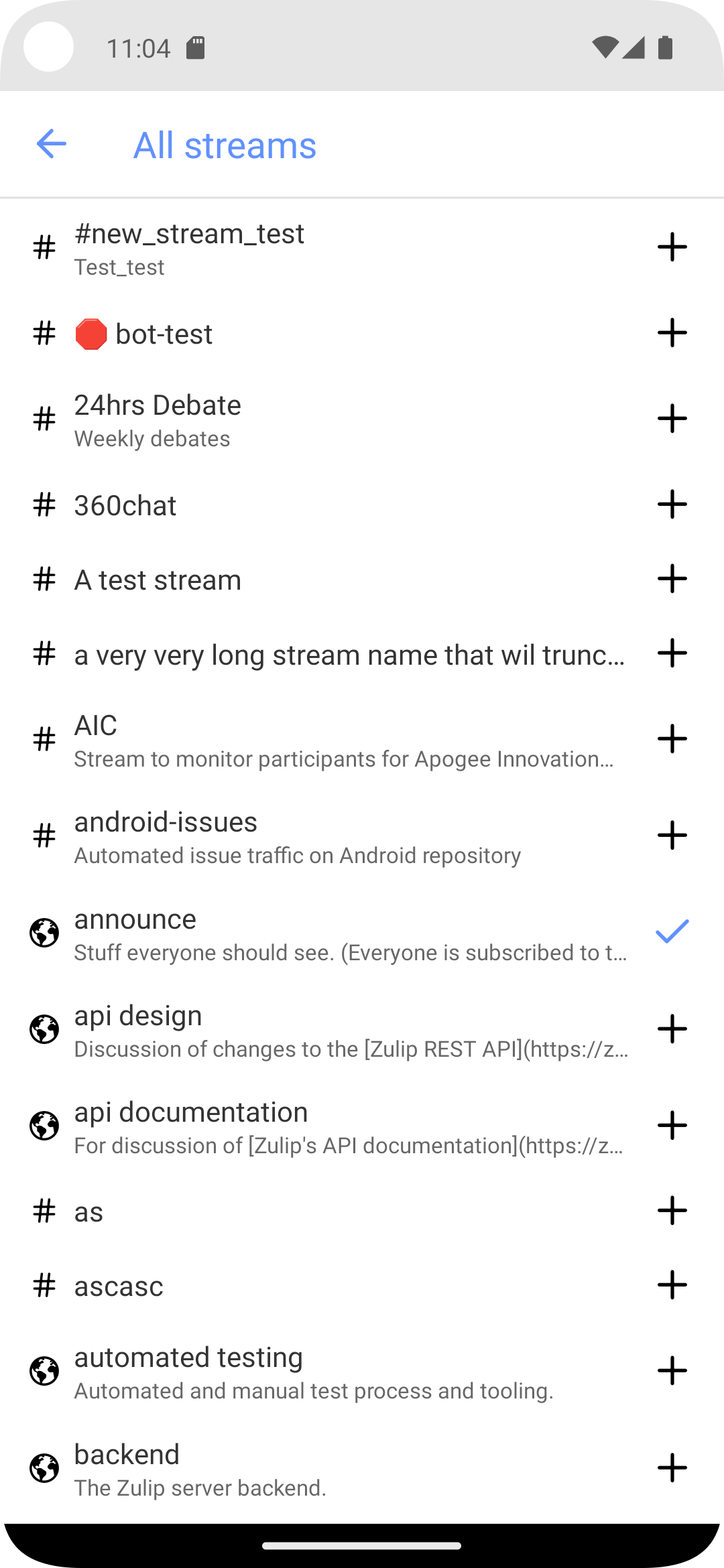
This removes StreamTabsScreen and sets the streams tab in
MainTabsScreen to a stack navigator, with SubscriptionsScreen on
top, and a button at the bottom of SubscriptionsScreen to navigate
to StreamListScreen.

I have tested this in an Android emulator but I have not yet run it
on iOS.

Fixes: zulip#5424
|
Thanks @nol13 for the revision! This looks good -- merging. |
|
Thanks, both! I noticed the changes when developing on
I think I wouldn't say that it's only for use in settings UIs. I guess I agree, in theory, that it could use some narrowing of its interface, and we might even make another reusable component one day. Here's the jsdoc: Still,
Looking closer, I think the differences in style are mostly due to warts in I'll send a PR that cleans up the styling warts, and I'll include a commit that switches this site to use |
We might not keep this change, but I do like how it trims out
duplicated code and guards against misuse of the UI metaphor that we
primarily describe in NestedNavRow (i.e., a right-facing arrow to
navigate to a nested screen).

I've said more about this here:
  zulip#5443 (comment)
I definitely agree it's not just for settings UIs. What I was thinking was something like: in this screen, we have the app-provided UI text "All streams" appearing in the same scrollable list with user-provided text, the names of streams. If the text were styled the same way, then it'd be likely to blend in almost as if it were another stream named "All streams". So having a more emphasized style of text here is helpful for contrasting it with the streams. Whereas in other UI contexts, no such contrast is needed because the other text that it's parallel to really is similar in its character. For example, in a settings UI, where both this row and the other rows are app-provided UI text.
Will take a look! |
We might not keep this change, but I do like how it trims out
duplicated code and guards against misuse of the UI metaphor that we
primarily describe in NestedNavRow (i.e., a right-facing arrow to
navigate to a nested screen).

I've said more about this here:
  zulip#5443 (comment)
We might not keep this change, but I do like how it trims out
duplicated code and guards against misuse of the UI metaphor that we
primarily describe in NestedNavRow (i.e., a right-facing arrow to
navigate to a nested screen).

I've said more about this here:
  zulip#5443 (comment)
3 participants
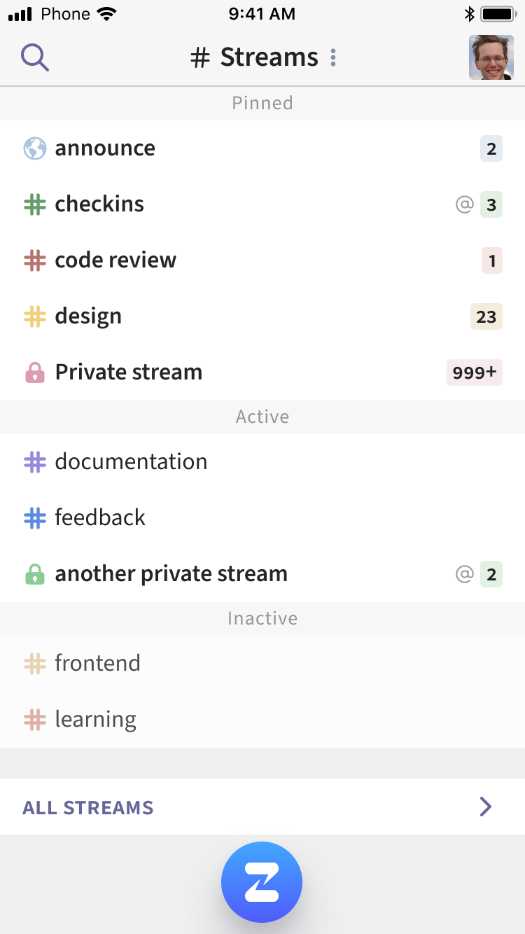
Resolves #5424
The heading is still the basic header with blue text, wasn't sure if it needed any styling yet, or just to wait for the new header that's shown in the mock.
Same with the separator above the button, which has a gray spacer in the mock. I started to update the separator, and update the separators between the sections to show the "Pinned" and "Active" text above each section, but since it still only has "Pinned" and "Unpinned" sections I left it as is for now.
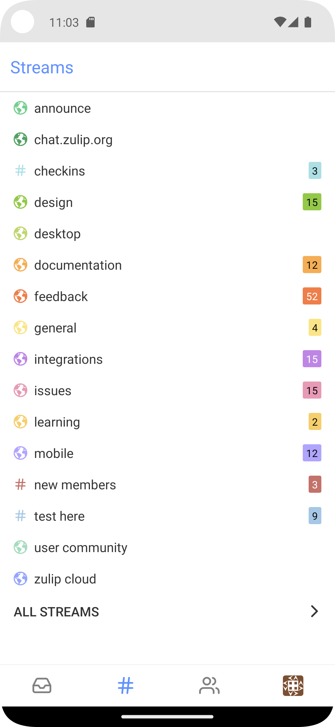
For the "All Streams" button I was going to use the NestedNavRow component but there were a few styling differences. Possibly NestedNavRow could be updated to work here too, or if this button will be reused, break it out into a component.