stream settings: Prep for radio-button UI, to handle more than two privacy options#5360
Conversation
| // TODO: Group all the stream's attributes together (name, | ||
| // description, policies, etc.), with an associated "Edit" | ||
| // button that gives a UI for changing those attributes. For the | ||
| // grouping, try react-native-paper's `Card`, with a | ||
| // ZulipTextButton in its `Card.Actions`. See | ||
| // https://callstack.github.io/react-native-paper/card-actions.html | ||
| // Or their `Surface`: | ||
| // https://callstack.github.io/react-native-paper/surface.html |
There was a problem hiding this comment.
It seemed like it might take a while to get react-native-paper set up just right, so this stuff isn't in my plan for getting #5250 out the door. But I wanted to write it down.
 chrisbobbe
force-pushed
the
pr-stream-settings-prep
branch
from
chrisbobbe
force-pushed
the
pr-stream-settings-prep
branch
from
58fe7b9 to
13c584b
Compare
|
If it would be helpful to review the UI, a screenshot would be great. :) |
|
Thanks! These code changes all look good. I see there are some small UI changes. I think it's a good practice for us to try to always have at least a quick review of UI changes too -- so either a screenshot posted, or look together in the office. Let's perhaps do the latter this afternoon. |
|
Sure, makes sense! I'll post screenshots in two separate comments, coming up. |
A list of Apr-28-2022.11-38-55.mp4Apr-28-2022.11-43-10.mp4 |
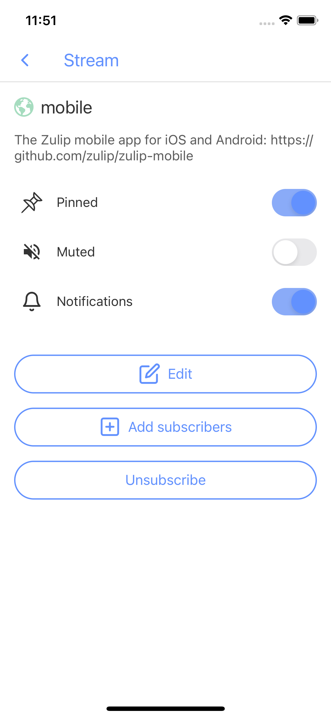
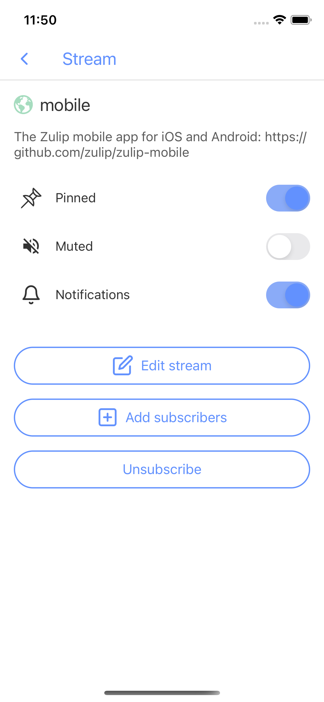
Before/after (it just changes the button's text from "Edit" to "Edit stream"):
|
 chrisbobbe
force-pushed
the
pr-stream-settings-prep
branch
from
chrisbobbe
force-pushed
the
pr-stream-settings-prep
branch
from
13c584b to
02b603c
Compare
|
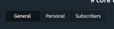
The wording change in the stream settings looks good to me. For a bigger reorg in the future, we should think about lining it up better with the organization/terminology in the web UI: |
|
I'm having a hard time visualizing precisely how status and language picker will be affected, but having the checkmark be a standard size and reserving the space for it sounds great. |
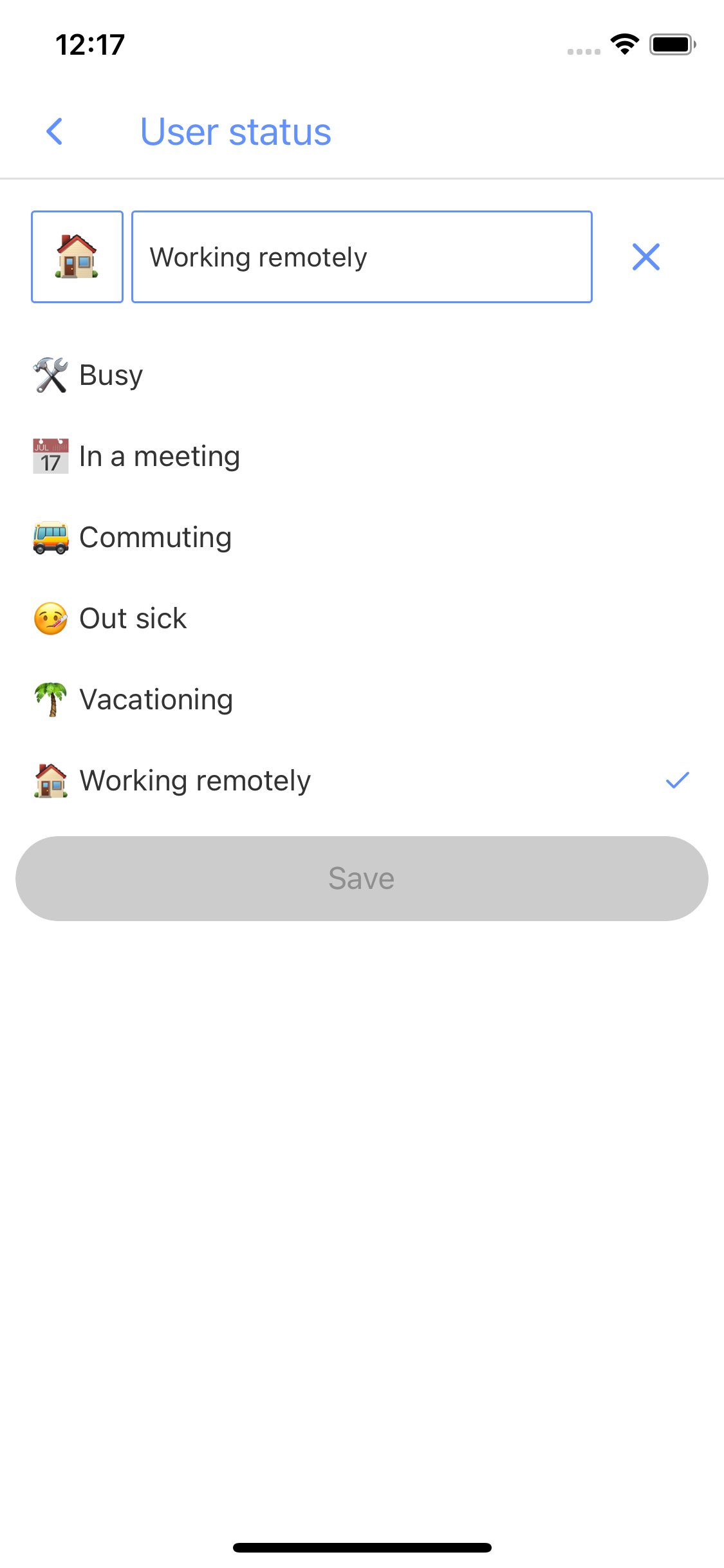
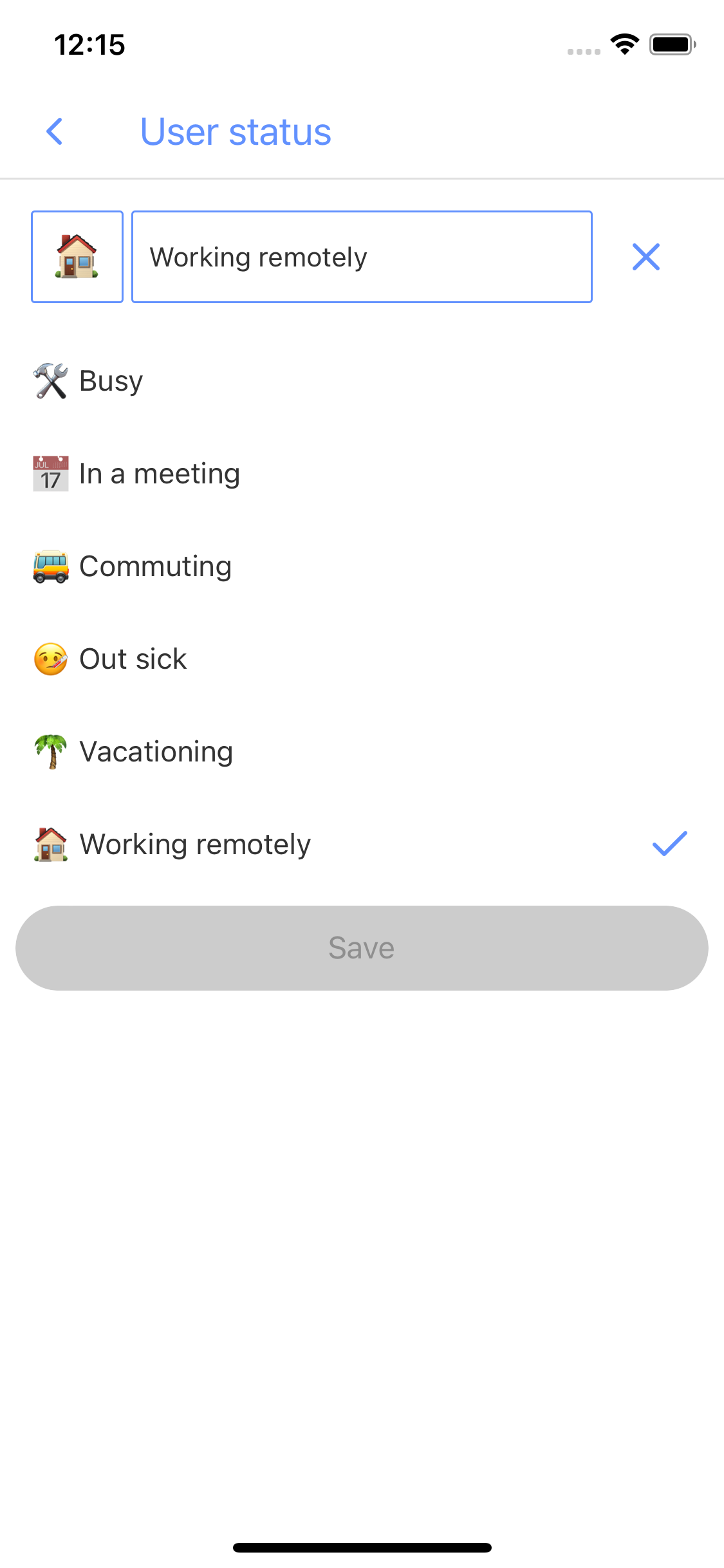
Good point, I forgot to screenshot those! Here we are: Status suggestions before/after:
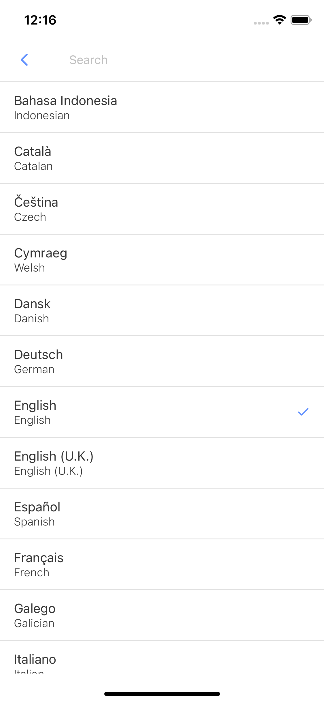
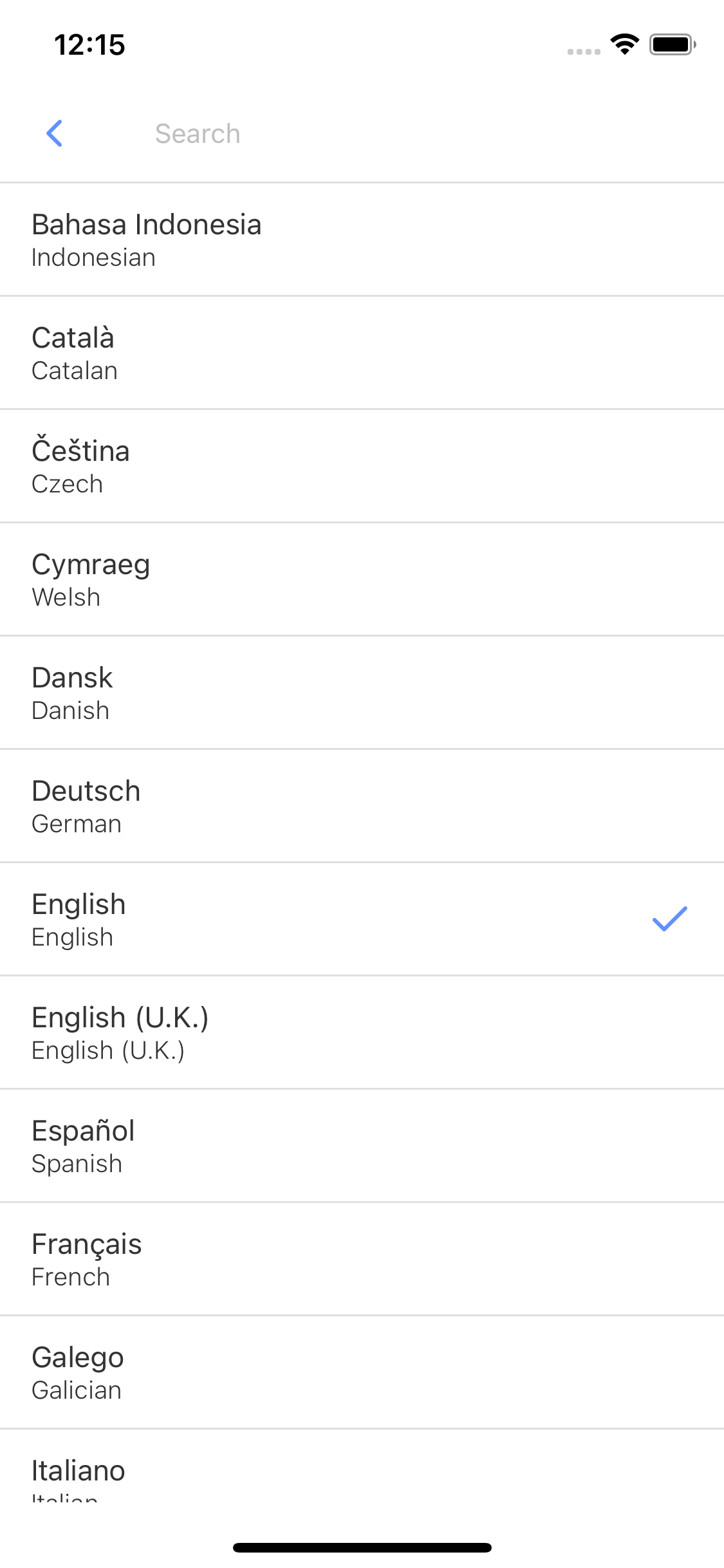
The "reserve-space" change means that all rows have enough height for the checkmark, not just the row(s) with a checkmark. That's another way the layout won't change distractingly when a row's selected state changes. I guess this change becomes noticeable with the icon's size increase from 16 to 24, for rows that have just one line of text, with the standard font size. Language picker before/after:
|
 chrisbobbe
force-pushed
the
pr-stream-settings-prep
branch
from
chrisbobbe
force-pushed
the
pr-stream-settings-prep
branch
from
02b603c to
062815d
Compare
 gnprice
left a comment
gnprice
left a comment
gnprice
left a comment
There was a problem hiding this comment.
Catching up after my vacation. One code comment on the new revision, below. Now reading the thread above…
|
|
||
| try { | ||
| await api.createStream(auth, { name, description, invite_only }); | ||
| api.createStream(auth, { name, description, invite_only: privacy === 'private' }); |
There was a problem hiding this comment.
This lost the await, which means the try/catch will have no effect. Perhaps unintentional from the rebase?
There was a problem hiding this comment.
Yep, thanks for the catch!
|
OK, all looks good modulo that code comment. Thanks for the screenshots! |
…ected

So that the word wrapping of the subtitle, when long, doesn't change
when `selected` changes. That'd be distracting.
And leave a TODO for something better.

The screen currently gives a jumbled collection of

- attributes about the stream and a button to change them

- a subscribe/unsubscribe button, and, if the user is subscribed,
  details about the subscription and switches to change the details

- a way to change who else is subscribed (but only by adding
  subscribers, and with no way to see the state before or after a
  change)

Each of these bullet points should be given its own coherent section
in the UI. Probably we should experiment with react-native-paper's
`Card`, as mentioned in the comment. This would be similar to what
Slack on iOS does.
We'd like to add more stream-privacy options soon.
chrisbobbe
force-pushed
the
pr-stream-settings-prep
branch
from
062815d to
f82defe
Compare
|
Thanks for the review! Merged. |
3 participants
I've got a draft for an input component that lets the user choose from more than two options, radio-button style, for #5250. These are some small improvements I've noticed while working on that draft.