Automatically follow user's OS-level dark/light preference.#4555
Automatically follow user's OS-level dark/light preference.#4555Gautam-Arora24 wants to merge 5 commits intozulip:mainfrom
Conversation
 Gautam-Arora24
force-pushed
the
theme_preference
branch
from
Gautam-Arora24
force-pushed
the
theme_preference
branch
from
10a7c53 to
75a8c12
Compare
 chrisbobbe
left a comment
chrisbobbe
left a comment
chrisbobbe
left a comment
There was a problem hiding this comment.
Thanks, @Gautam-Arora24! In particular, I appreciate your attention to the commit message! 🙂 See some comments below.
Also, there's a point mentioned at #4009 (comment) about changing the name for the 'default' theme to something else, like 'light', and Greg also mentions at #4009 (comment) that the naming for the dark mode/theme should use 'dark' instead of 'night'. Let's do those renames in a separate NFC commit or two; could go before or after the functional changes of the PR. Or it could go in a separate PR as a followup, if you'd prefer to focus on the more exciting changes in this PR (we should just be sure not to forget about it). 🙂
| // only apply the device level, not within the app. See | ||
| // https://github.com/zulip/zulip-mobile/issues/4009#issuecomment-619280681. | ||
| export type ThemeName = 'default' | 'night'; | ||
| export type ThemeName = 'default' | 'night' | 'automatic'; |
There was a problem hiding this comment.
Let's separate the work of
- using the new UI with a new screen and a FlatList, and
- adding the third, "automatic", option to the list of options
into separate commits. That way, it'll be easier to consider the details of how each thing is done. 🙂
| ]; | ||
|
|
||
| class ThemeScreen extends PureComponent<Props> { | ||
| static contextType = ThemeContext; |
There was a problem hiding this comment.
nit: ThemeScreen could begin its life as a function component, instead of a class component. It's not highly urgent to convert all our components to function components that use React Hooks, but it seems like the way of the future, and I think it'd be easy to write this component as a function component.
There was a problem hiding this comment.
Made it a functional component 😄
|
|
||
| // A helper function to avoid WET(Write Everything Twice) code. | ||
| // Used to dispatch the correct theme which | ||
| // it will get from handleThemeChange function. |
There was a problem hiding this comment.
If I'm understanding correctly, I think this.dispatchTheme is in fact called only once, not twice. Do you expect that we'll eventually have to call it from somewhere other than handleThemeChange?
If not, I think it's simpler to just keep this code inside handleThemeChange; it means one less layer to look through when reading the code. 🙂
Gautam-Arora24
force-pushed
the
theme_preference
branch
4 times, most recently
from
526ad0c to
f6ed310
Compare
chrisbobbe
left a comment
chrisbobbe
left a comment
There was a problem hiding this comment.
Thanks, @Gautam-Arora24! See some comments below.
| class ThemeProvider extends PureComponent<Props> { | ||
| static defaultProps = { | ||
| function ThemeProvider(props: Props) { | ||
| ThemeProvider.defaultProps = { |
There was a problem hiding this comment.
nit: Greg has a neat explanation for a way we can make code like this more readable, without using ThemeProvider.defaultProps = { ... }: #4440 (comment)
| } | ||
|
|
||
| export default connect(state => ({ | ||
| theme: getSettings(state).theme, |
There was a problem hiding this comment.
nit: Since ThemeScreen is already a function component, we don't have to use connect from react-redux; instead, we could use useSelector, as in 641cb16, for example. Let's do that; I think it makes things simpler, and it means one less item in the component tree. 🙂
There was a problem hiding this comment.
Ahh, it looks reasonable to use useSelector along with useDispatch. So now it will look something like this ->
const theme = useSelector(state => getSettings(state).theme).
| <FlatList | ||
| ItemSeparatorComponent={OptionDivider} | ||
| data={themeData} | ||
| value |
There was a problem hiding this comment.
What are we trying to do by passing true for FlatList's value prop in this commit (the second one in this revision, "ThemeScreen: Add ThemeScreen file and wire it with AppNavigator.")?
There was a problem hiding this comment.
Removed the value prop, since it's of no use.
| data={themeData} | ||
| value | ||
| renderItem={({ item }) => ( | ||
| <Touchable> |
There was a problem hiding this comment.
In this revision, I find that in the third commit—
d2517a2 SettingsScreen: Add navigation logic to navigate to ThemeScreen.
—it's impossible for a user to change the theme at all. 🙂 Let's fix it up so that no commits introduce regressions.
In particular, none of these buttons respond to touch:
(Which makes sense; I see that the Touchable component here isn't given an onPress.)
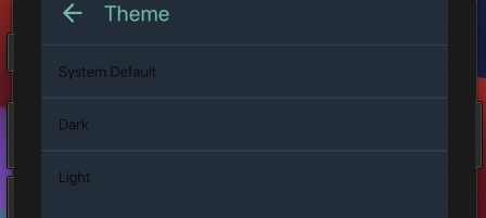
Also, I'm seeing the "System Default" button at that commit, which is earlier in the PR than I expected to see it.
Here's what I'm thinking:
- The PR starts by changing from the current switch UI to this new UI with a new "Theme" screen—but, as it does so, it maintains the property that we can only switch between the two existing options; there is no third option (yet).
- Then, the PR adds the third option and sets it up to work.
Steps 1 and 2 can each be separated into multiple commits, as appropriate, but I'd really like to see a separation between 1 and 2 so that we can focus conversation and review on each part. 🙂
There was a problem hiding this comment.
Here is how I am following the commit sequence for this PR now ->
- First commit changes the "Night Mode" label to "Theme".
- Second commit introduces a new component called 'ThemeScreen' with just two theme options (Dark and Light).
- Third commit adds the navigation logic and wires the 'ThemeScreen' with AppNavigator.
- Fourth commit is NFC commit which converts the class-based
ThemeProviderto a functional component. - Adding the logic for the third theme option called "System Default" (WIP).
| <Touchable onPress={() => handleThemeChange(item)}> | ||
| <View style={styles.listItem}> | ||
| <View style={styles.listWrapper}> | ||
| <Text style={{ color }}>{item.name}</Text> |
There was a problem hiding this comment.
Instead of using Text with a color style, let's use Label, which, to quote from its jsdoc, "ensures consistent styling for the default and night themes".
There was a problem hiding this comment.
Does this means I have to only replace the Text with Label?
| listItem: { | ||
| flexDirection: 'row', | ||
| alignItems: 'center', | ||
| paddingTop: 16, |
There was a problem hiding this comment.
It looks like these styles were borrowed from LanguagePickerItem, but with paddingTop and paddingBottom set to 12 instead of 16. Can you talk about the choice for what goes in styles?
There was a problem hiding this comment.
Ahh, I think I missed the changes I made to the styles. I am now using the same styles as mentioned in the LanguagePickerItem i.e setting the paddingTop and paddingBottom to 12 again.
| const colorScheme = useColorScheme(); | ||
| let themePreferred = theme; | ||
|
|
||
| if (themePreferred === 'automatic') { |
There was a problem hiding this comment.
I think themeToUse might be a bit better name than themePreferred, though I see that it's tricky to find the best names for things when we've already got theme and colorScheme floating around. 🤔
The reason is that this variable holds the answer (which we arrive at with help from theme and colorScheme) to the question, "So what theme should we actually use?". And, in particular, it doesn't represent the user's preference in the same sense that the user expresses a preference for light or dark when they press one of those items in the new Theme screen. (Because this variable might be light or dark as a result of following the OS-level setting.)
Originally discussed here:
  #4440 (comment)
(with a bit of additional rationale) when this question first came up.

It's come up a couple more times since then, as we've continued
converting a lot of our components to functions with Hooks:
  #4555 (comment)
  #4699 (comment)
so it's definitely time to have it written down in a proper place.
Gautam-Arora24
force-pushed
the
theme_preference
branch
from
f6ed310 to
4ac5abb
Compare
This commit changes the "Night Mode" label to "Theme".
This commit introduces a new component called 'ThemeScreen' which
will be used to provide different options (currently 'Dark' and
'Light') to change the theme in the app.

Fixes part of zulip#4009
Gautam-Arora24
force-pushed
the
theme_preference
branch
from
4ac5abb to
fbfcd86
Compare
I will be making a separate followup PR for this part once this PR is merged 🙂 |
Gautam-Arora24
changed the title
Create a new action called 'navigateToThemeScreen' which will help
the 'Theme' OptionButton to navigate to 'ThemeScreen' component
on clicking. Also wired it up with the 'AppNavigator'.

Since, the logic for changing of theme is handled by the 'ThemeScreen' so
there is no use of 'handleThemeChange' function in the 'SettingsScreen'.
Similarly there is no use of Dispatch and the theme prop so all these
are removed in this commit.

Fixes part of zulip#4009
Convert to functional component. Make use of 'useSelector` hook
instead of 'connect'. Removed Dispatch and the theme props since
they are not required now.
Along with "night" and "default", made a third option called
"automatic". This option will check the system settings and
automatically provide the correct theme to ThemeProvider's
value prop.

Discussion of this in CZO [1].

[1] https://chat.zulip.org/#narrow/stream/48-mobile/topic/Automatic.20dark.2Flight.20preference

Fixes part of zulip#4009
Gautam-Arora24
force-pushed
the
theme_preference
branch
from
fbfcd86 to
b82d99a
Compare
|
Thanks @Gautam-Arora24 for your work on this! Closing, as I think subsequent developments have simplified what's needed here so that a fresh PR for this issue will look rather different: #4009 (comment) |
3 participants
Previous Functionality
Earlier, there was just a switch in the
SettingsScreento enable or disable the Night mode.Screen.Recording.2021-03-22.at.12.26.33.AM.mov
Changes Done
This PR creates a new component called
ThemeScreenand provides 3 options to a user for the theme in the Zulip mobile app.Screen-Recording-2021-03-21-at-12.31.42-PM.mov
PS - One useful shortcut to change the Appearance on iOS simulator is
Cmd + Shift + AFixes: #4009