-
Notifications
You must be signed in to change notification settings - Fork 14
New issue
Have a question about this project? Sign up for a free GitHub account to open an issue and contact its maintainers and the community.
By clicking “Sign up for GitHub”, you agree to our terms of service and privacy statement. We’ll occasionally send you account related emails.
Already on GitHub? Sign in to your account
Logo Proposition for Documentation Enhancement (#76) #82
Comments
|
we also need a version that remains readable at small sizes, for example for the logo displayed at the repository overview. For inspiration on that, see xarray's collection (we don't have to be as thorough, though, as far as I remember that was created by a professional designer). The logos so far look great, but I'm missing the relation to |
|
You are right. I think it would meaningful to somehow visualise the 1-D index array in conjunction with a global cell grid, either in an unfolding/decomposition way (like the current xarray xvec or zarr logos) or superimposed over a globe? I think a globe of some sort would be meaningful, though, after all DGGS are for spatial data on the globe (not just in some rectangular projected plane) |
|
For example, one of the coarsest resolution, a gradient along the index id, and then a 1-D array with the same gradient, with max 10-20 cells so to say? |
|
what about taking a level-0 grid, plot a (section of a) 3D globe of that with the pixel edges in a certain color, and at the side a 2D field with one axis in the same color? Edit: (not sure if that's what you were suggesting) |
Yes, but not a 2D-field (well yes, one axis), but the 1-D index array same color coded. |
|
with 2D field I meant a variable like Otherwise agreed, that might be good (but I won't insist on anything except that it should somehow icon-ify xarray + DGGS) |
|
@benbovy your images are "empty" for me. I like the idea to reuse the same colours and layout than the Xarray logo! |
|
What about having a copy of the logo proposals in Penpot? I've used it for other OSS projects and it's useful to keep track of future branding and export material across different formats, sizes, etc. |
|
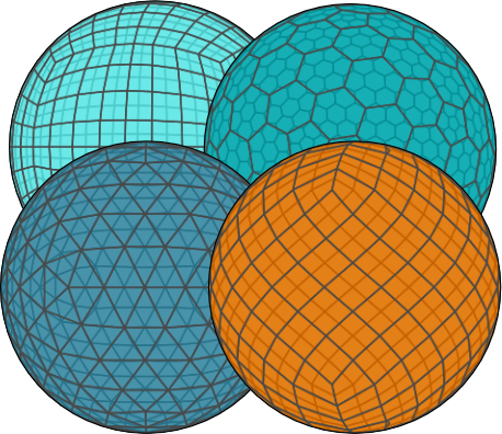
@annefou Yes if noticed that too when seeing this thread from the github mobile app. Here is the SVG version in case anyone wants to play around with it: (note: the cell boundaries have been rasterized to significantly reduce the number of elements drawn. I've used matplotlib / cartopy, which seem to draw all cells as independent features - thus duplicate edges - including the cells on the hidden sides of the spheres). |
|
We have incorporated @benbovy's suggestion and created a preliminary logo. Currently, the landing page still displays the xarray logo. Would it be possible to update it to the xdggs_preliminary_logo? 
|
I don't think that's possible, it seems that's the organization's profile image, not the repository's. For example, |


Hi all,
I believe having a logo (similar to what xvec does) would really help illustrate the documentation #76 more effectively.
Does anyone have any suggestions or ideas for a potential design? It could add a nice visual touch to our project!
The text was updated successfully, but these errors were encountered: