Problem
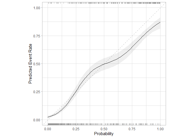
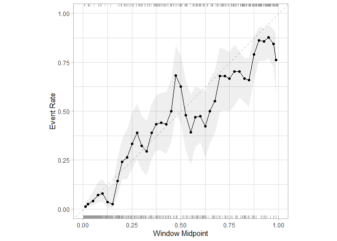
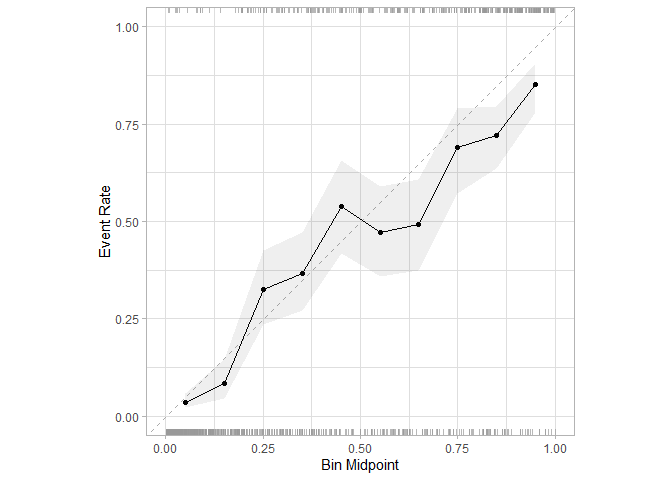
cal_plot_logistic has a different y-axis labels from cal_plot_windowed or cal_plot_breaks. Consistency ("Event Rate" for cal_plot_logistic would be nice).
The current version ("Predicted Event Rate") is confusing to me. I thought the y-axis was the 'truth' and the x-axes in these graphs were derived from model predictions.
Reproducible Example
library(ggplot2)
library(dplyr)
#>
#> Attaching package: 'dplyr'
#> The following objects are masked from 'package:stats':
#>
#>     filter, lag
#> The following objects are masked from 'package:base':
#>
#>     intersect, setdiff, setequal, union
library(probably)
#>
#> Attaching package: 'probably'
#> The following objects are masked from 'package:base':
#>
#>     as.factor, as.ordered
cal_plot_logistic(
  segment_logistic,
  Class,
  .pred_good
)
cal_plot_windowed(
  segment_logistic,
  Class,
  .pred_good,
  window_size = 0.05
)
cal_plot_breaks(
  segment_logistic,
  Class,
  .pred_good,
  window_size = 0.05
)
Created on 2026-01-30 with reprex v2.1.1
Problem
cal_plot_logistichas a different y-axis labels fromcal_plot_windowedorcal_plot_breaks.Consistency ("Event Rate" for cal_plot_logistic would be nice).The current version ("Predicted Event Rate") is confusing to me. I thought the y-axis was the 'truth' and the x-axes in these graphs were derived from model predictions.
Reproducible Example
Created on 2026-01-30 with reprex v2.1.1