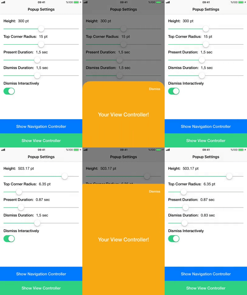
BottomPopup provides a popup-like presentation style to any view controller
It is a custom presentation style for view controllers to present any view controller with slide animation from bottom of the screen.
Actually depends on your view controller, a real world examples can be seen below;
Using CocoaPods (Recommended)
Add below line to your Podfile;
pod 'BottomPopup'
Then you can install it with pod install command.
Manual
Download the project, just drag and drop classes under BottomPopupController file to your project.
After install, simply make your view controller subclass of BottomPopupViewController.
For navigation controllers, it works exactly in same way, make your navigation controller subclass of BottomPopupNavigationController.
Congratulations, your view controller is ready to show 🎉
Then you can present your controller with native presentViewController:animated:completion: method, bottom popup controller will handle rest.
Bottom popup comes with couple of customizable properties. Since your view controller subclass of BottomPopupViewController now, you can override following properties in your view controller to change behaviour;
-
popupShouldDismissInteractivelty: Bool
Determines the popup should dismiss whether interactively or not. If it is set to yes, user can dismiss popup with pulling down it down. Default is YES
-
popupHeight: BOOL
Height value. Default is 377 pt. For example you can return UIScreen.main.bounds.size.height to give it full screen height.
-
popupTopCornerRadius: BOOL
Corner radius of popup. Default is 10pt
-
popupPresentDuration: Double
Present animation duration. Default is 0.5 sec
-
popupDismissDuration: Double
Dismiss animation duration. Default is 0.5 sec
-
popupDimmingViewAlpha: CGFloat
Target alpha value of the black-colored dimming view after present animation. Default is 0.5
-
popupShouldBeganDismiss: BOOL
Basically controls whether user can close the popup or not. You can change this variable at the runtime to control dismiss behaviour on spesific actions. Tap on dimming view, swipe down on dimming view and pan gesture on popup dont work if this variable set to false during these actions
-
popupViewAccessibilityIdentifier: String
Accessibility identifier of popup's view. Default is bottomPopupView
You can see how changing of these properties changes popup's behaviour below. (Gifs are extracted from example project)
UIViewController UINavigationController
If you want to track popup lifecycle or current dismiss interaction percent, you can set popupDelegate;
popupVC.popupDelegate = self
Methods;
func bottomPopupViewLoaded()
func bottomPopupWillAppear()
func bottomPopupDidAppear()
func bottomPopupWillDismiss()
func bottomPopupDidDismiss()
func bottomPopupDismissInteractionPercentChanged(from oldValue: CGFloat, to newValue: CGFloat)
Just send me an email ([email protected])


