More compact layout #349
More compact layout #349
Conversation
|
@sam-19 I am requesting your review as a confirmation that this change is okay for you as the one person most involved in the frontend development in our team. |
|
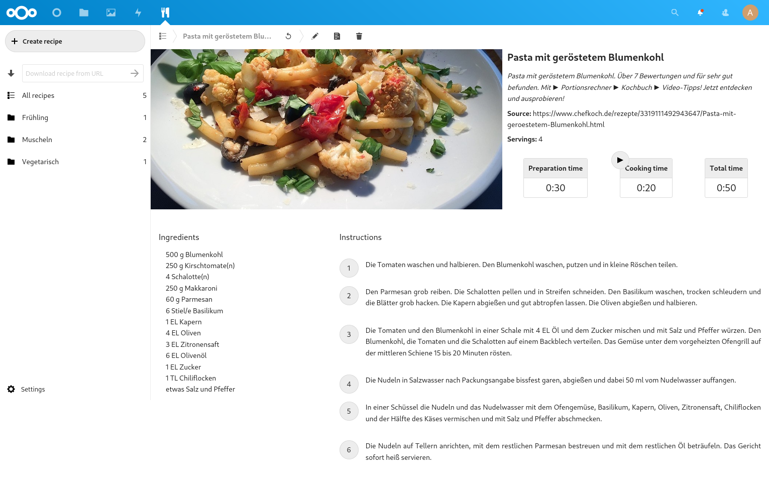
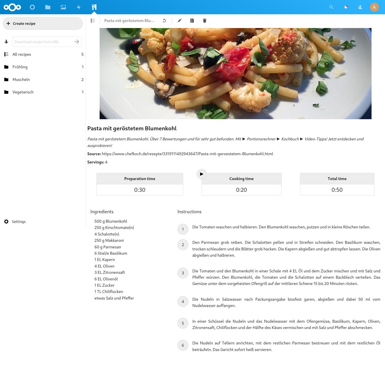
Here are two screenshots of the page close to the boundary of 1600px window width.
|
|
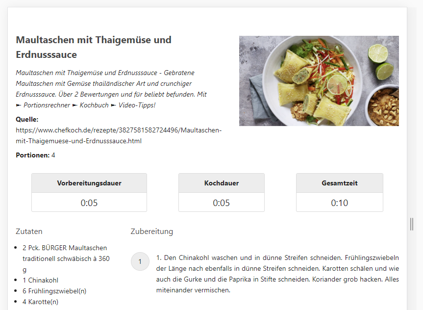
Hi @christianlupus , first of all thanks for the great work on this app, I really enjoy it! 👍 By chance I have just today experimented with something similar on my version of your app. I like to print recepies with an image, but the current version takes way to much space for the image when printing, causing most of my recepies to be printed on multiple pages. Just after that I found your change here!
|
|
I just tried it out and adopted the CSS to reflect your suggestions, @dekrabor. Here is a PDF example printout: |
|
That is perfect, by far better then before! |
|
I made a small change to the CSS to alight the left border of the meta section when it is positioned below the image (the margin to the navigation pane was very narrow). About the timers: should we try and reduce the margins between them when they are positioned next to the image and possibly try to make them the same width? Edit: I just noticed that the layout places the meta next to an image container even if there is no image. I'll see if I can fix this in the template. |
|
Sorry for the rebase mess. At least I finally found out what was wrong with my settings. Still don't understand why DCO doesn't accept GPG-signed commits. Now the layout only adjusts when there is an actual image present. I noticed the style section uses a mix of pixels and rems. The styles should (maybe later) be changed to use only pixels. |
DCO is not about the GPG signature bug about the last line of the form Signed-off-by:. I think this is due to 5802c1b. As you only merged the commits together somehow, this commit is still buried somewhere in the history. I will try to rebase it if you do not mind.
For me that looks good. I have not tested it on my dev instance. I can do so, if it is desired. Just tell me. |
7056dc2 to
e694533
Compare
…eens

Signed-off-by: Christian Wolf <[email protected]>
Signed-off-by: sam-19 <[email protected]>
Signed-off-by: Christian Wolf <[email protected]>
Signed-off-by: sam-19 <[email protected]>
Signed-off-by: Christian Wolf <[email protected]>
Signed-off-by: sam-19 <[email protected]>
Signed-off-by: sam-19 <[email protected]>
Signed-off-by: sam-19 <[email protected]>
Signed-off-by: Christian Wolf <[email protected]>
e694533 to
45752c0
Compare
Signed-off-by: sam-19 <[email protected]>
|
I made the time field margins narrower when it is aligned next to the image. This way there is enough room that at least the English field names are never wrapped. |
Signed-off-by: Christian Wolf <[email protected]>
# Conflicts:
#	CHANGELOG.md
#	src/components/RecipeView.vue
This PR fixes #328.
Starting at a certain screen width of currently 1600px the title and times are shifted to the right.
I am open to further suggestions