Deere 2.1 knobs & faders redesign#1399
Conversation
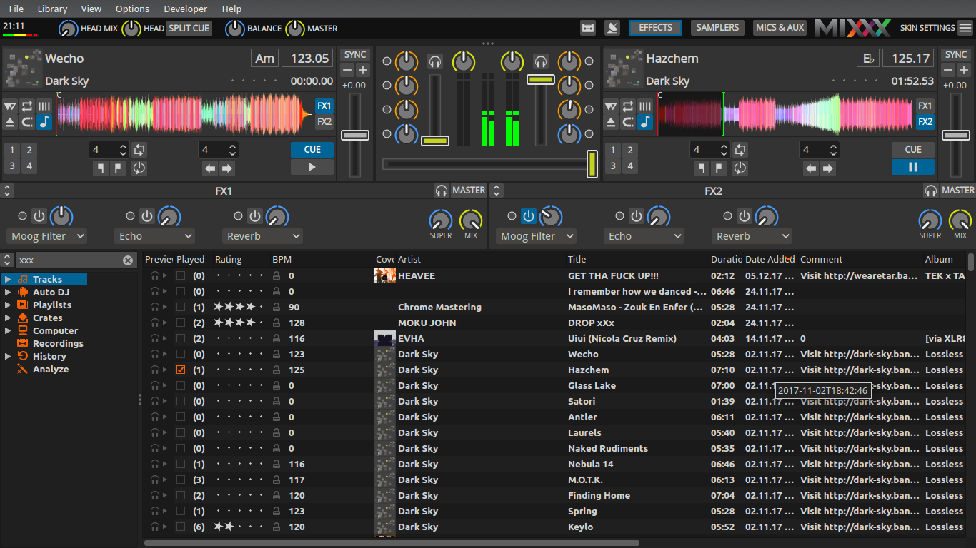
Improved visibility for various big knobs (EQ, effect Dry/Wet, Meta knobs etc.)
by applying the color coding to the knob ring rather than its pointer.
Increased contrast for small effect parameter knob.
|
I like it! I think there could be a bit more contrast between the center of the knobs and the notches though. This may be a good solution to the colorblindness issues. Do you have any ideas for improving the small effect parameter knobs? |
|
I like the change. It makes things easier to see at a glance. I noticed that some of the ring colors don't match the previous pointer colors though. Was that intentional? |
Even more? I'm afraid they'd blend too much with the mixer background and the pointers would seem to float.
Yes! I think it's an improvement to assign the ring colors to certain control categories: |
|
The small knobs could look like this Edit Don't know if we should add a scale here, like the big knobs have it. |
|
I made the pointer a little shorter |
Hmm, you might be right. I think it's worth trying though. Have you thought about changing the color of the insides of the knobs? I don't know if that's a good idea, but it might be worth experimenting with too. |
I agree, and there are bars below them already anyway that take up less room. |
What do you have in mind? It should stay dark to contrast with the pointers, otherwise we're back to square one. |
|
@Be-ing I played around but didn't find a nice color. |
|
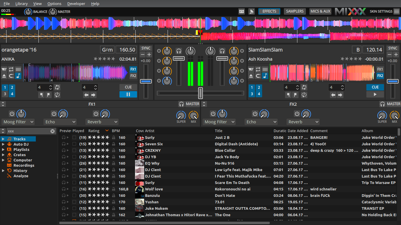
With grey outlines the slider grooves are now visible even with bright light. |
|
@ronso0 @Be-ing There are now 2 massive PRs for Deere which both seem to be (almost?) finished. I would like get this nice work merged ASAP! Which of those PRs should I consider first for merging? Or is #1343 superseded by this PR? I will not do any XML code reviews, just some final testing. The most valuable feedback about functionality and usability will come from our alpha and beta testers, so let's get started. |
|
This PR is just for checking the design. #1343 should be merged first, I'll rebase in case of conflicts. |
|
@ronso0 can you rebase this on master? |
|
voilá. Any ideas, objections? |
|
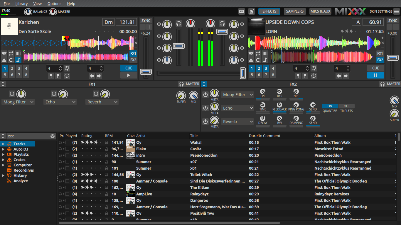
In general, I like it, but I'm not sure about the color around the EQ knobs. I tried switching it to the yellow used by the EQ notches before but that is too bright so it makes the notch not stand out as much. How about making the orange a bit redder, like #fc9d00ff? I also feel that the insides of the slider handles pop out slightly too much. How about desaturating them a tiny bit to #338dfbff? |
|
The coloured indicators are a helpful addition! Just some ideas after my first impressions and without following your previous discussions very closely:
|
|
The master is coloured in red, too. I still would prefer a more consistent scheme that matches the distinction between level and frequency controls. |
Alternatively, the handles of the sliders could be switched to red.
Yes, I think we should do this. |
Yes, good idea! Consequently all Meta/Super knob indicators would be red as well. Pitch sliders could be light grey to distinguish them from the Vol faders. |
|
The purple is too dark and also very saturated and heavy. Maybe the lime colour that is used for the EQ knobs in the current version of the Deere skin could fit? It's a light colour that doesn't yell at you and is easily distinguishable from the light blue and light orange. |
|
check Lime. It looks okay, but IMO the whole skin is way to colorful now. What about grey? |

I like Lime |
|
I was thinking about this yellow/lime from the current Deere skin: #D6E20E upload of sample image doesn't seem to work |
Ah, I didn't perceive it as Lime. Everybody's happy now? |
|
Ehh, I feel that the yellow slider handles look strange. Maybe yellow for the knobs and purple for the fader handles? Or is that too many colors? |
|
👍 Great, I like that! Nicely fits into the colour scheme. |
|
Do we actually need to color the slider handles? I would be fine with colored knob rings. |
Yes, this is too much IMO. So many colors trying to get attention...
For me, light grey fader handles would be totally okay. |
|
IMO fader handles are important and should be emphasized. Likewise for effect unit dry/wet knobs. On the other hand, gains shouldn't need frequent adjustment and I don't think they need to be emphasized. |
|
I really think colored rings and white/grey handles are sufficient to make knobs and faders easy to discover. IMO faders don't necessarily need colors, they already stand out because they're much brighter than their surrounding. One very last option that comes to mind is to color the fader handles outline. |
|
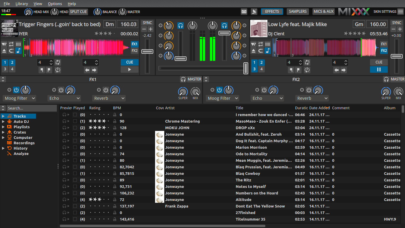
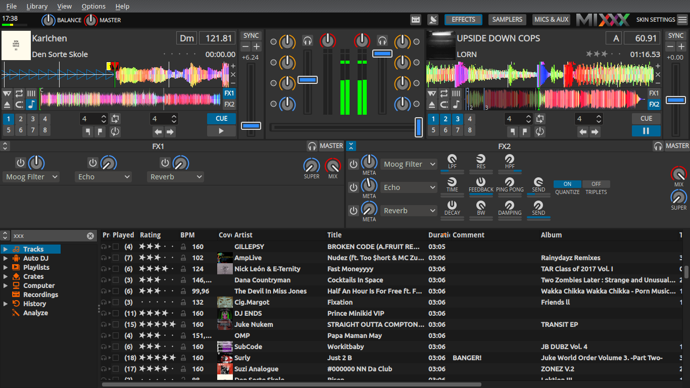
What is left to do here? Here are my two cents: I have just tested it and from terms of my taste, I like the old one with white rings more, because the knobs are less eye catching. Especially the read color is the problem, it is the Alarm color which overrules all others. The channel volume slider should not be highlighted by red at all, because this is not the case on any hardware mixer. Can we use a shade of Bordeaux for instead of red for the gain knobs like on many hardware Mixers? |
|
The pink version was also better. The xfader and the channel fader should have the same color. It is obvious what is what by the orientation. The rate slider should have a different color. |
|
This is a color scheme I like to mixxx with |
|
Great, I like it as well. LGTM. Ready for merge? |
|
No, I don't like the use of gray. IMO the volume faders and crossfader are the most important things to keep an eye on while mixing so they should pop out visually. I like the purple screenshots posted above the best but the purple color could use a little adjustment to not pop out quite as much. |
IMO yes. To summarize:
IMO it's a reasonable step from the previous ring design to this, not too many eye-catching colors. Before we merge: is the center gap looking okay on HD and netbook screens? |
I really don't see a reason to color the Vol and crossfader handles. They are clearly visible, even in the minimized images in this thread. If you're having issues recogniznig them please try to make them brighter. |
|
Ok, so let's merge this 14 commits PR. If there is still something to do, it can go to an other PR. |
|
I've just realized that this design suffers from the same problem that my branch #645: @ronso0 Could you remove the notch on the META and the SUPER knobs? @daschuer This got me thinking: when you were reviewing my branch you noted that the correct "neutral position" for the superknob depends on how the effects parameters are tied to it. But this does not only apply to the position where the knob ring is not visible, but also to knob design items like the notch introduced in this PR and also to the position where the knob jumps when reset. So we have a more general problem here. |
|
@ferranpujolcamins |
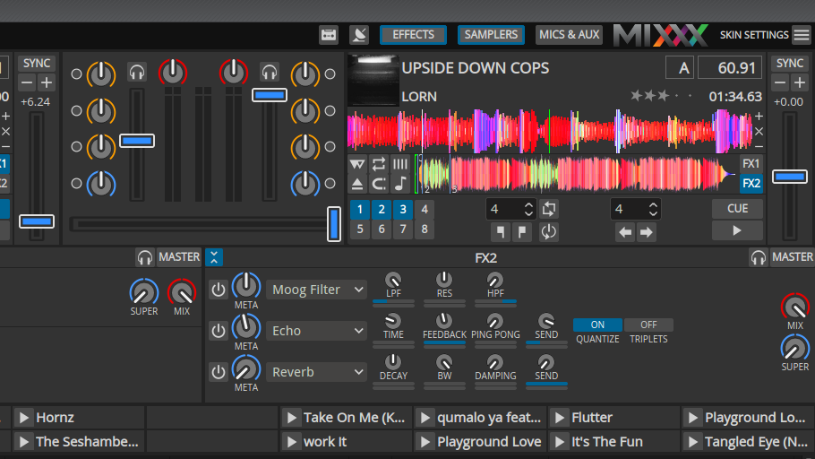
Here I propose a new design for the knobs and faders in Deere as discussed here.
It drastically improves visibility of knob position and applies color coding to the rings rather than the pointers.
Faders are reduced in complexity to match the overall Deere design and can IMO be scaled down a bit if we agree on the shape.
Current design
New design
To enable testing with a fresh design, this is based on Be's Deere PR #1343
What do you think?
Any ideas for further improvement, i.e. the small knobs?